
Your cart is currently empty.
In New Zealand, the standard size for a business card is 90mm x 55mm. This classic rectangular shape is what most Kiwi professionals use, and for good reason – it’s designed to slip perfectly into wallets and cardholders right across the country.
Your Guide to Standard Business Card Sizes
While 90mm x 55mm is the go-to here, business card dimensions do change slightly depending on where you are in the world. It’s a bit like a power adapter; what works perfectly in one country won't necessarily fit in another. A card that’s too big or an odd shape might not make it into a new contact’s wallet, getting left behind on a desk instead.
Understanding these subtle differences is crucial if you network internationally. Here in New Zealand, our 90mm x 55mm standard is almost identical to Australia's. It's a touch larger than the North American standard of 89mm x 51mm (or 3.5 x 2 inches) and is very close in size to a standard credit card, which makes it feel familiar and easy to store. If you're curious, you can explore more about these global standards and how they came to be.
To help you get a real feel for these small but significant variations, here’s a quick comparison of standard sizes from around the globe.
International Business Card Size Comparison
| Region | Dimensions (mm) | Dimensions (inches) |
|---|---|---|
| New Zealand / Australia | 90mm x 55mm | 3.54" x 2.16" |
| North America (USA / Canada) | 89mm x 51mm | 3.5" x 2" |
| United Kingdom / Western Europe | 85mm x 55mm | 3.34" x 2.16" |
| Japan (Yongo) | 91mm x 55mm | 3.58" x 2.16" |
As you can see, the differences are often just a matter of millimetres, but those millimetres count when it comes to making a seamless first impression.
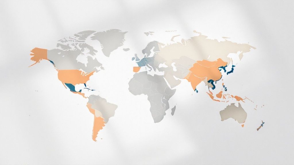
A Visual Comparison of Global Dimensions
Sometimes, seeing is believing. This graphic really helps to put those numbers into perspective, showing how the NZ standard stacks up against other common sizes.

It’s clear from the chart that the New Zealand size offers a generous amount of space for your design while still being perfectly practical. It strikes a great balance between making an impact and being convenient for the person receiving it.
Why Does This Small Difference Matter?
You might be thinking, "Does a couple of millimetres really matter?" In the world of business networking, it absolutely does.
Using the standard local size shows you've done your homework and respect local customs. It feels familiar and professional. On a purely practical level, it guarantees your card will fit into wallet slots, business card scanners, and desktop holders designed for that specific dimension. You don't want your card to be the one that gets trimmed down or folded just to fit.
The bottom line: Sticking to the 90mm x 55mm standard in New Zealand is your safest bet. It ensures your card is practical, professional, and makes a seamless first impression every time.
Why the 90mm x 55mm Standard Works So Well
Ever wondered why the 90mm x 55mm business card is so common in New Zealand? It's no accident. This size has become the standard for some very practical reasons, hitting that sweet spot between having enough room for a great design and being genuinely convenient.
It just feels right in your hand.
Think of it as the Goldilocks of card dimensions—not too big, not too small. That 90mm width gives you plenty of horizontal space. Your logo, name, and contact details can breathe without looking squashed, which is essential for making a solid first impression and keeping everything readable.
The 55mm height, on the other hand, keeps the card trim and compact. And here’s the clever bit: its dimensions are almost identical to a standard credit card (85.6mm x 53.98mm), an object designed from the ground up to slip perfectly into any wallet or cardholder.
The Power of Practicality
This smart alignment with credit card sizing is really the secret to its success. When you hand over your card, the last thing you want is for it to be an awkward fit. If it's too big or an odd shape, it creates a moment of hesitation. That's when your card ends up on a desk or shoved in a pocket, easily forgotten.
The 90mm x 55mm size neatly sidesteps this issue. It fits into the established system of how we carry important cards. It's a subtle but strong signal that your brand is professional, considerate, and gets how things work.
This standard size isn't just about fitting into a wallet; it's about fitting into the established ecosystem of professional networking. It ensures compatibility with everything from desktop card scanners to display rolodexes.
This widespread adoption has created a loop. Printers, designers, and businesses all gear up for this dimension, making it the most cost-effective and efficient size to produce. The market has basically voted with its wallets, cementing it as the default choice.
A Standard Built on Trust and Expectation
At the end of the day, the 90mm x 55mm card works because it's what people expect. It’s the unofficial uniform for business networking here in New Zealand. When you hand someone a card this size, it feels familiar and professional, letting them focus on your message, not the medium.
The numbers back this up, too. In New Zealand, the 90mm by 55mm size accounts for over 85% of all business cards printed nationwide. That kind of dominance shows just how well it nails the brief for practicality. You can find more insights on Kiwi business card trends from local design experts at sonidesign.co.nz.
Sticking with this tried-and-true business card size is a simple way to make sure your first impression is a smooth one.
Getting Your Edges Right: A Guide to Bleed and Safe Zones
Nailing the right dimensions for your business card is a great start, but it's only half the battle. To get a truly professional print, you need to understand how to set up your design file correctly. This is where you’ll hear designers and printers talk about bleed, the trim line, and the safe zone.
They might sound like technical jargon, but the idea behind them is surprisingly simple. Think about framing a photo. You always make sure the most important parts—like people's faces—are well away from the edges of the frame, right? And you want the background to fill the entire space so there are no awkward white gaps. Setting up a business card for print works on exactly the same principle.
Why Bleed is Non-Negotiable
Have you ever been handed a flyer and noticed a tiny, distracting white sliver down one side? That’s the classic sign of a design file that was created without a bleed. Commercial printing involves machines cutting huge stacks of paper at high speed, and tiny shifts—we're talking fractions of a millimetre—are inevitable.
A bleed is your design's safety net against these tiny movements. It’s simply an extra bit of your background colour or image that extends past the final cut edge of your card. So, for a standard Kiwi business card, your design file will actually be a little bigger than the card you hold in your hand.
- Finished Card Size: 90mm x 55mm
- Your Design File Size (with bleed): 96mm x 61mm
Here in New Zealand, the industry standard is to add a 3mm bleed to every side. This extra margin ensures that when the guillotine comes down, it cuts through your background colour or image, giving you a perfect edge-to-edge finish every time. No white slivers, guaranteed.
Don't Live Dangerously: Respect the Trim and Safe Zones
Once your bleed is set up, two other imaginary lines become crucial: the trim line and the safe zone. They work together to make sure nothing important gets lost.
The trim line is exactly what it sounds like—it marks the final 90mm x 55mm edge of your card. This is where the printer aims to cut. Everything outside this line, in the bleed area, is destined for the recycling bin.
The safe zone (sometimes called the safety margin) is an area just inside the trim line. It’s your internal buffer. Every critical piece of information—your logo, your name, your phone number—needs to live comfortably inside this zone. If you push any text or logos right up against the trim line, you're running the risk of them getting partially sliced off during that final cut.
As a rule of thumb, always keep your essential text and logos at least 3mm to 5mm inside the trim line. This not only protects them from the blade but also gives your design a much cleaner, more professional, and less-cramped feel.
Bringing It All Together
Let's quickly map this out for a standard 90mm x 55mm business card so you can see how the layers stack up.
| Area | Dimensions (mm) | What It's For |
|---|---|---|
| Total Artwork Size | 96mm x 61mm | This is the full size of your design file, including the 3mm bleed on all sides. |
| Trim Line | 90mm x 55mm | The final size of your business card after it has been cut. |
| Safe Zone | ~84mm x 49mm | The 'no-go' border where all your key content must stay inside. |
Getting this wrong is one of the most frequent (and frustrating) mistakes people make when ordering print. Taking a couple of minutes to set up your bleed and safe zone correctly is the simple secret to avoiding a costly reprint and ensuring your card looks as polished and professional as you are.
Thinking Beyond the Standard Rectangle
The standard 90mm x 55mm business card is the go-to for most professionals here in New Zealand, and for good reason—it’s familiar and practical. But sometimes, you need to step outside that neat little rectangle to really get noticed.
Breaking with convention can be a brilliant way to make your brand stick in someone's memory. It’s a classic balancing act, though: creativity versus practicality.
Before you jump into a completely custom design, it’s worth checking out some of the popular alternatives. Each one has a different vibe and says something unique about your brand's personality.
Exploring Different Orientations and Shapes
The easiest way to mix things up? Just flip it. A portrait card (55mm x 90mm) immediately feels a bit more modern and elegant. This vertical layout is becoming a favourite in creative fields, like design agencies and tech start-ups, because it subtly disrupts expectations without being a pain to store.
If you want to make a bolder statement, you can move beyond a simple flip and play with the shape itself.
- Square Cards: These are often around 65mm x 65mm and have a striking, minimalist feel. They create a beautifully balanced canvas that’s perfect for brands with a strong, simple logo.
- Mini Cards: Sometimes called slimline cards, these little guys (around 70mm x 28mm) are definitely unique and can be more budget-friendly to print. Their small size makes them feel quite precious, but you have to be clever with the limited space.
- Die-Cut Cards: This is where you can let your imagination run wild. A die-cut card can be custom-shaped to echo your logo or hint at what you do. Think of a coffee-cup shape for a café or the outline of a house for a real estate agent.
Choosing an unconventional shape isn't just a design choice; it's a branding strategy. It turns your card from a simple piece of paper with your details into a conversation starter. It’s the kind of card that gets shown to other people, not just tucked away in a wallet.
Balancing Creativity with Practicality
As cool as a unique business card is, it’s not without potential downsides. The biggest hurdle is storage. A card that’s too big, too small, or an awkward shape might not fit into a standard wallet or cardholder. If it's inconvenient for the person you give it to, you run the risk of it being left behind or lost.
On top of that, custom shapes and non-standard sizes usually mean higher printing costs because of the specialised cutting required. You have to weigh up whether that extra expense is worth the potential impact.
The sweet spot is finding a design that's distinctive enough to be memorable but not so out-there that it becomes impractical.
How Card Stock and Finish Shape First Impressions
While getting the size right means your card slips perfectly into a wallet, the materials you choose are what someone actually feels. This tactile experience is a huge, often subconscious, part of making a great first impression. A flimsy, thin card can come across as cheap and forgettable, quietly undermining your professional image before a single word is even read.
Think of it like a handshake. A thick, premium card stock has the same effect as a firm, confident handshake—it communicates substance and quality. A flimsy card feels more like a weak handshake, suggesting uncertainty. The key metric here is the paper’s weight, measured in GSM (grams per square metre).
Here in New Zealand, a solid starting point for a professional business card is around 350 GSM. This gives it a substantial feel without being too rigid. Drop below 300 GSM, and you risk the card feeling a bit weak. If you really want to make an impact, stocks of 400 GSM or higher create a truly memorable sense of durability and premium quality.
Choosing Your Card's Personality with Finishes
Beyond the paper's weight, the finish is what gives your card its personality. This final coating doesn't just protect the card from scuffs; it completely changes its look and feel, directly influencing how your brand comes across.
A glossy finish is like the outgoing, vibrant life of the party. Its reflective sheen makes colours explode and photos look incredibly sharp. This makes it a fantastic choice for brands that are bold, visual, and energetic—think photographers, graphic designers, or event planners.
A matte finish, on the other hand, is the sophisticated, understated guest. It offers a smooth, non-reflective surface that feels both modern and elegant to the touch. It's perfect for brands aiming for an impression of calm confidence, luxury, or minimalist style. Plus, it has the practical bonus of being easy to write on.
Your card's finish isn't just a protective layer; it's a strategic choice. It aligns the physical texture of your card with your brand's core values, ensuring the first touchpoint is consistent with the message you want to send.
A Quick Guide to Business Card Finishes
Choosing the right finish can feel like a tough call, but it’s simpler when you think about the lasting impression you want to leave. This quick guide breaks down the most common options to help you decide what best reflects your brand.
| Finish Type | Key Characteristics | Best For |
|---|---|---|
| Gloss | High-shine, reflective surface that makes colours vibrant and images sharp. | Visually-driven brands, photographers, and designs with bold, colourful graphics. |
| Matte | Smooth, non-reflective, and modern feel. Reduces glare and fingerprints. | Professional services, minimalist designs, and brands aiming for a sophisticated look. |
| Uncoated | Natural, textured paper feel. Very absorbent and easy to write on. | Eco-friendly brands, rustic businesses, and anyone wanting an organic, tactile feel. |
Ultimately, the right card stock and finish work together to create a cohesive brand experience. It’s about making sure the physical object you leave behind genuinely reflects the quality and character of your business, making an impression that sticks around long after the meeting is over.
How NZ Business Card Sizes Evolved Over Time
The standard business card size we use today didn't just appear out of thin air. Its journey, particularly here in New Zealand, is a story of practicality, global influence, and a move away from frustrating inconsistency.
If you travelled back a few decades, you’d find there was no single "correct" size for a business card. The final dimensions were often just down to the printer's equipment and personal preference, which meant you'd end up with a messy collection of odd shapes and sizes. For any professional trying to keep their contacts organised, it was a bit of a nightmare.
The Shift Towards a Standard
The push for a consistent size really picked up steam in the second half of the 20th century. As the business world became more connected, it became clear that a universal format was needed. For Kiwi businesses, two major factors helped shape the standard we now rely on.
- Influence from Across the Tasman: New Zealand's printing industry has often followed trends set in Australia. The Aussies were early adopters of the 90mm x 55mm format, and to make business dealings smoother between our two countries, it made sense for us to align.
- The Global Wallet Standard: Think about it – the credit card created a default size for what fits neatly into a wallet. A business card that matched those dimensions stood a much better chance of being kept, rather than being tossed away because it was too awkward to carry.
While sizes used to vary all over the world, New Zealand’s standards were heavily shaped by Australian trends and the practical need for global consistency. By the 1980s, the 90mm x 55mm card was firmly established. If you're curious about the bigger picture, you can read more about the global history of business card sizes on printplace.com.
This evolution wasn't just about picking a size; it was about transforming a simple piece of paper into a universally accepted tool for professional networking, built on a foundation of convenience and consistency.
At the end of the day, the 90mm x 55mm card won out because it solved a simple, practical problem. It guaranteed that every time you exchanged details, the experience was professional and seamless.
Even with all the technical specs covered, a few common questions always pop up just as you're about to hit 'send' on your design file. Let's tackle them head-on so you can finalise your card with total confidence.
Think of this as your final pre-flight check. We'll clear up the last few details that can make or break your design, ensuring everything is perfect for printing.
What’s the Best Font Size to Use?
This is a big one. You could have the most stunning design in the world, but if nobody can read it, it's not doing its job. While the perfect size will vary a little depending on the font you choose, there are some solid rules of thumb.
Here’s a simple hierarchy that works for most designs:
- Your Name: This should be the star of the show. Aim for 10pt to 12pt to make it stand out.
- Title & Company: To create a clear visual order, step this down a notch to around 8pt to 10pt.
- Contact Info: Your phone number, email, and website can sit comfortably at 7pt to 9pt. I'd strongly advise against going any smaller than 7pt – you don't want potential clients squinting to figure out how to contact you.
At the end of the day, it's all about effortless communication. If someone has to struggle to read your details, you've put a hurdle in their path. Always choose clarity over trying to cram more onto the card.
What File Format Do Printers Prefer?
To make sure what you see on your screen is exactly what you get in your hand, New Zealand printers will almost universally ask for a high-resolution PDF. This is the gold standard for a reason.
A PDF essentially freezes your design in place, locking in all your fonts, images, and layout elements so nothing gets jumbled or substituted when the printer opens the file. Just make sure your final PDF is set to 300 DPI (dots per inch) and includes that crucial 3mm bleed we talked about earlier. Sending a print-ready PDF is the single best way to guarantee a sharp, professional finish.
Ready to create a business card that genuinely reflects your brand? At SONI DESIGN, we specialise in turning your ideas into a high-quality card that leaves a lasting impression. Let's design something extraordinary together!
Leave a Comment
Stay home & get your daily
needs from our shop
Start You'r Daily Shopping with Nest Mart