
Your cart is currently empty.

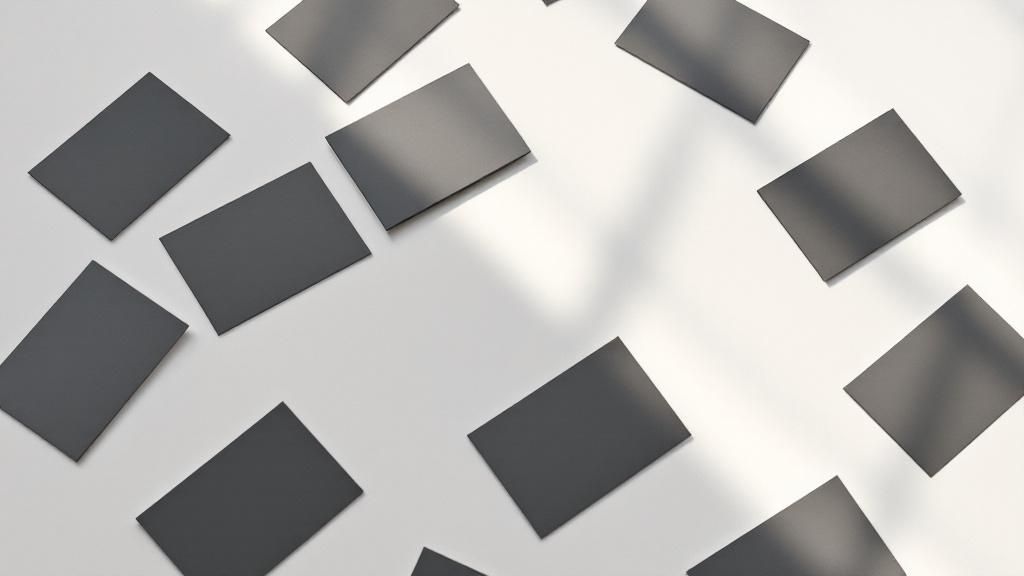
When you're designing a business card in New Zealand, one of the first things to lock down is the size. The standard, go-to dimension you'll find just about everywhere is 91 x 55 mm.
Getting this right from the start is crucial. It ensures your card feels familiar, professional, and, most importantly, fits perfectly into any wallet or cardholder without a fuss.
Standard Business Card Dimensions in New Zealand
For quick reference, here are the standard dimensions broken down into different units. It's a handy little chart to keep nearby, especially when you're toggling between design software settings.
| Unit | Width | Height |
|---|---|---|
| Millimetres (mm) | 91 mm | 55 mm |
| Centimetres (cm) | 9.1 cm | 5.5 cm |
| Inches (in) | 3.58 in | 2.16 in |
Having these measurements on hand makes it easy to set up your design file correctly, no matter what unit of measurement your software defaults to.
So, Why This Specific Size?

It might seem arbitrary, but there’s a good reason why 91 x 55 mm became the Kiwi standard. It's all about creating a uniform, predictable experience for everyone.
Think about it – when someone hands you a card, you instinctively know what to do with it. This standard size is the result of a few practical considerations:
- It’s Wallet-Friendly: The dimensions are specifically designed to slip neatly into the credit card slots of a standard wallet or purse. No awkward folding or forcing required.
- Printing is Cheaper: Printers can fit the maximum number of cards onto a single sheet of cardstock when they're all a standard size. This efficiency keeps your printing costs down.
- Regional Harmony: This size is very close to what's used in Australia and many European countries, which is great for anyone doing business across the ditch or further afield.
It's worth noting that our local standard is a touch wider and taller than the common North American size of 89 x 51 mm. It’s a small difference, but one to be aware of if you network internationally. If you're curious about other options, you can explore a full guide on custom business card designs to see how sizes vary.
Sticking to the 91 x 55 mm standard is a simple way to make sure your card is professional and practical. It’s one of those small details that makes a big difference in how your card is received and, more importantly, kept.
So, Why Did New Zealand Land on 91 x 55 mm?
Ever wondered why the standard business card in New Zealand is exactly 91 x 55 mm? It's no accident. This specific size is the result of a clever mix of practicality, historical ties, and a bit of global influence. Understanding how we got here actually tells a bigger story about professional standards.
Think about it – this size is almost identical to a standard bank card. That’s by design. When a business card feels familiar in your hand and slides neatly into a wallet slot, you’re far more likely to hang onto it. It's a simple, smart way to make sure your details don't get tossed aside.
Printing efficiency also played a massive part. Printers figured out how to get the most cards out of a single large sheet of cardstock. By settling on a standard size, they could minimise waste and cut down on production costs, making professional cards more affordable for everyone.
How Our Neighbours Shaped Our Standards
New Zealand’s close relationship with countries in our region was a major factor. For a long time, our standard business card size has mirrored Australia's, with both countries settling on a format around 90 mm by 55 mm in the latter half of the 20th century.
This wasn't just a coincidence. It was a conscious move to align with broader European and Asia-Pacific norms, which made networking and trade a lot smoother. It made more sense to adopt a widely used international size rather than the slightly smaller North American standard. If you're curious about the different sizes around the globe, it's worth taking a world tour of business card sizes to see how they vary.
At the end of the day, the New Zealand business card is a product of smart, practical choices. It’s a perfect balance of wallet-friendliness, printing economics, and international compatibility. This ensures your card feels right at home, whether you're handing it over in a local cafe or at a conference on the other side of the world.
Getting to Grips with Print Design Lingo
Once you've picked the perfect business card size, the next challenge is getting your design ready for the printer. To get a flawless result, you need to understand a few key technical terms: bleed, trim, and the safe zone. Think of it like framing a picture – you always need a little extra room around the edges to make sure the final product looks polished and professional.
This visual guide breaks down the common business card sizes and orientations you'll encounter.
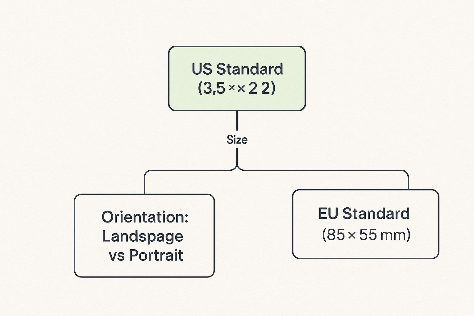
As you can see, the differences between regions can be small but are definitely important to get right for a local audience.
Setting up your file correctly from the start is the best way to avoid expensive and frustrating printing mistakes. Let's use an analogy: imagine your finished card is a photograph. The trim line is the physical edge where the printer's machine will cut the card. This is your final, finished dimension, like the standard NZ size of 91 x 55 mm.
But here's the thing – printers are powerful machines, but they aren't flawless. The cutting process can have tiny mechanical variations. To account for this and stop any ugly white slivers from appearing on the edge of your card if the cut is a fraction of a millimetre off, we add what's called a bleed.
Why Bleed and the Safe Zone Are Your Best Friends
A bleed is simply extra background colour or imagery that extends beyond the trim line. We typically add 3 mm of bleed on all four sides. It’s like painting on a slightly larger canvas and then trimming it down, which guarantees your background colour or design goes right to the very edge of the card, no matter what.
On the flip side, the safe zone is an inner margin, usually 3 mm inside the trim line. This is the protected area where all your crucial details – your name, logo, and contact information – must live.
To make this crystal clear, here’s a quick breakdown of how these areas work together on a standard NZ business card.
Understanding Your Business Card Layout
| Design Area | Purpose | Recommended Size (mm) |
|---|---|---|
| Bleed Area | The extra background that gets trimmed off. It prevents white edges. | 97 x 61 mm |
| Trim Line | The final cut size of your business card. | 91 x 55 mm |
| Safe Zone | The inner area where all important text and logos should be placed. | 85 x 49 mm |
Think of these guides as your design's safety net. By keeping all the good stuff inside the safe zone and extending your background to the bleed line, you ensure your card will look exactly as you planned.
Fortunately, you don't have to be a seasoned graphic designer to get this right. It’s worth exploring how graphic design tools like Canva are democratizing design, as many of these platforms have built-in templates with the bleed and safe zones already marked out for you.
How Business Card Sizes Vary Globally
While we're used to the standard 91 x 55 mm business card here in New Zealand, you'll quickly find this size isn't universal. When you're doing business overseas, adapting to local norms is crucial, and that includes the humble business card you hand over. Using a card that fits local expectations is a small but powerful gesture that shows you've done your homework.
If you find yourself networking in the United States or Canada, for example, you'll notice their cards are a little shorter and wider. The North American standard is 3.5 x 2 inches, which translates to 89 x 51 mm. It’s a subtle difference, but it means a Kiwi card might awkwardly stick out of a standard American wallet or cardholder.
It's these little details that highlight why understanding local sizes is so important for anyone working internationally.
A Quick Global Comparison
Hop across the Atlantic to Europe, and the dimensions start to feel more familiar. Most European countries, including the UK, Germany, and France, have settled on an 85 x 55 mm card. It’s almost the same height as our NZ standard but a touch narrower, making it roughly the same size as a credit card.
Here’s a quick rundown of the most common international sizes:
- New Zealand / Australia: 91 x 55 mm
- North America (USA/Canada): 89 x 51 mm (3.5 x 2 inches)
- Most of Europe: 85 x 55 mm
- Japan (Meishi): 91 x 55 mm
Interestingly, the Japanese business card, or meishi, shares the exact same dimensions as our own. But don't be fooled by the familiar size—the cultural ritual of exchanging them is a far more formal and significant affair.
The key takeaway is this: while the differences in millimetres might seem trivial, they represent distinct professional cultures. Handing someone a locally-sized card shows respect and cultural awareness, making a much stronger first impression.
Ultimately, these regional quirks come down to historical printing standards, the way wallets are made, and simple tradition. Knowing the standard business card size in the country you're visiting is a simple, effective way to show you value the connection you’re trying to build. It’s a small gesture that speaks volumes about your professionalism.
Designing a Card That Makes an Impact
Alright, you've got the technical specs sorted—the right size, the bleed lines, all that good stuff. Now for the fun part: creating a design that actually leaves a lasting impression. Think of your business card as a pocket-sized billboard for your brand. It’s more than just contact info; every choice, from the font to the feel of the paper, tells a story.
The first thing to get right is the visual hierarchy. This is just a fancy way of saying you need to guide the reader's eye. Your logo and name should grab attention first. Your title and company come next. All the other details, while important, can be a little more subtle. Get this right, and someone can grasp the most important info in a single glance.
Choosing Your Design Elements
Above all else, your card needs to be readable. For your contact details, stick with clean, simple fonts like Helvetica or Lato. A good size is somewhere between 8pt and 10pt – any smaller and you’re making it hard for people to actually contact you. You can bump your own name up a bit, maybe to 10pt to 12pt, to give it the emphasis it deserves.
Colour is another powerful tool. The psychology behind it is real: blues tend to feel trustworthy and professional, which is why you see them so often in corporate designs. Greens can signal growth or an environmental focus, while bright oranges and yellows scream creativity and energy. The goal is to match your colour scheme to your brand's personality. If you're curious about how much of a difference these choices make, looking at a few iconic rebranding examples can be a real eye-opener.
Your business card isn’t just a piece of paper; it's a physical extension of your professional identity. The texture of the paper, the clarity of the font, and the balance of the design all contribute to the first impression you make.
Finally, don’t be afraid to add a modern touch like a QR code. Just make sure it actually works! A scannable QR code needs to be at least 2 cm x 2 cm and have a bit of clear space around it (the "quiet zone") so phones can read it properly. This is a brilliant way to instantly connect people to your website, portfolio, or LinkedIn profile, bridging the gap between your physical card and your digital world. By blending classic design with smart functionality, you’ll have a card that’s not just beautiful, but genuinely useful.
Got Questions About Business Card Design?
Once you dive into the nitty-gritty of designing a business card, a few common questions always seem to surface. It's one thing to know the standard dimensions, but getting the execution perfect is a whole different ball game. Let's walk through some of the most frequent queries to make sure your final design is spot-on.
Can I Use a Custom Size in New Zealand?
You sure can! While 91 x 55 mm is the go-to standard here, many printers offer custom die-cutting services to create all sorts of unique shapes and sizes. This can be an incredible way to make a first impression that truly sticks.
But before you go all-in on a wild design, think about the practical side of things. A card that’s too big or an odd shape might not tuck neatly into a wallet or a standard cardholder. That little bit of inconvenience can sometimes mean it gets left behind. If your main goal is to stand out from the crowd, a unique shape is fantastic, but for everyday networking, sticking close to the standard size is usually the safest bet.
What’s the Best Resolution for Printing?
This one is non-negotiable for a professional result: your design file needs to be at least 300 DPI (dots per inch). Anything less, like the 72 DPI often used for web images, will give you a blurry, pixelated card that just doesn't look the part.
Make it a habit to set up your document at 300 DPI right from the start in your design software, whether you're using Adobe Illustrator or Canva. It saves a lot of headaches later on and ensures everything from your logo to the fine print is perfectly crisp.
Here's a pro tip: getting the colour mode right is just as important as the resolution. Always design in CMYK, not RGB. Think of RGB for screens and CMYK for print. Starting your project in CMYK from the get-go prevents nasty surprises when your cards come off the press, making sure the colours you see are the colours you get.
Should I Design in CMYK or RGB?
This is a classic technical point that catches a lot of people out. You absolutely must design your business card in CMYK (Cyan, Magenta, Yellow, Key/Black). This is the four-colour process every professional printer uses to mix inks on paper.
RGB (Red, Green, Blue), on the other hand, is the colour system for digital screens. Your computer monitor and phone use light to create colour, which allows for a much wider and more vibrant spectrum than ink can ever reproduce.
If you create your design in RGB, the colours will have to be converted to CMYK for printing. This often results in them looking muted, dull, or just plain different from what you approved on your screen. To keep complete control and avoid disappointment, always start your design in CMYK mode.
Ready to bring your perfect business card to life? The team at SONI DESIGN is passionate about creating stunning, high-quality print materials that tell your unique story. Let's work together to make your vision a reality. Find out more about our design services.
Leave a Comment
Stay home & get your daily
needs from our shop
Start You'r Daily Shopping with Nest Mart