
Your cart is currently empty.

Think of your store signage as your most valuable employee. It works tirelessly, 24/7, acting as your silent salesperson to make that all-important first impression. It’s so much more than just a name on a building; it's a powerful business asset that delivers on your brand’s promise, pulls in foot traffic, and makes you stand out from the crowd.
Why Your Store Sign Is Your Most Important Employee
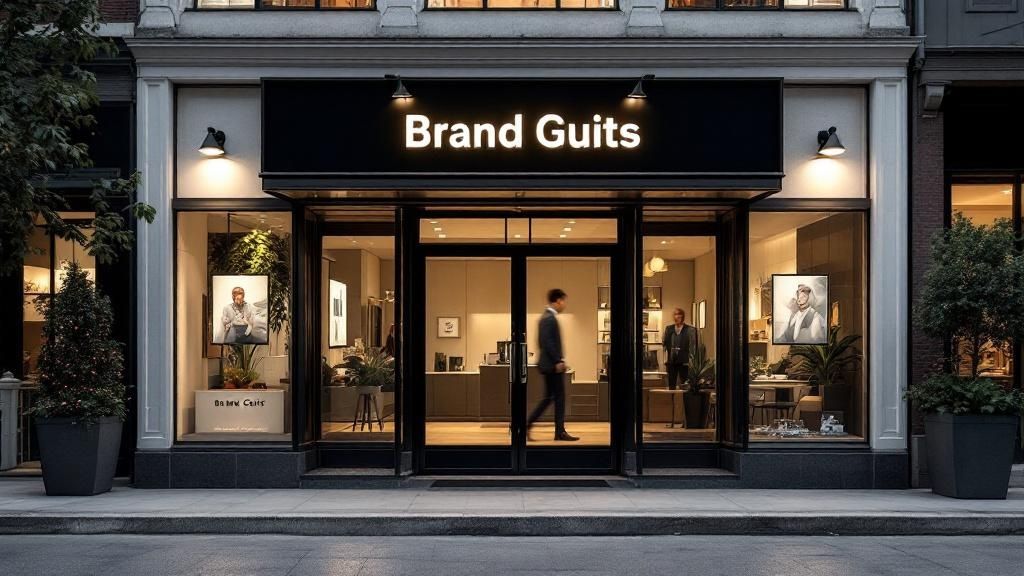
Let’s be honest. When was the last time you decided to wander into a shop you’d never seen before? What prompted you to go inside? More often than not, it was probably the sign that caught your eye. Great store signage acts like a beacon, guiding potential customers straight to your door and making a split-second promise about the experience that awaits them.
The psychology behind this is fascinating. The colours, fonts, and materials you choose aren't just for looks—they're powerful signals that shape how people perceive your business and influence whether they decide to buy. In fact, countless shoppers admit to entering an unfamiliar store based on its sign alone.
The Silent Language of Signage
The design elements you select speak volumes. A bold, modern font might suggest an innovative, tech-savvy brand. On the other hand, a classic serif font can convey a sense of heritage and trustworthiness.
Materials play a huge part, too. Warm, natural timber can signal an organic or rustic feel, while sleek metal and glowing acrylic give off a more contemporary, premium vibe.
Ultimately, your sign is the summary of your brand's story, told in a single glance. It needs to do three things exceptionally well:
- Grab Attention: It has to cut through the visual clutter of a busy street.
- Convey Identity: It must instantly tell people who you are and what you offer.
- Inspire Action: The end goal is simple—turn a passer-by into a customer.
A well-designed sign doesn’t just identify your business. It starts a conversation with your ideal customer before they even step inside. It’s the handshake, the smile, and the opening line, all rolled into one.
To truly nail your store's first impression, your signage should be part of a bigger picture. For a deeper dive into creating a cohesive and compelling customer experience, exploring comprehensive visual merchandising guidelines is a fantastic next step. It will help you create a powerful, unified look that turns window shoppers into loyal fans.
Defining Your Brand Before You Design
It’s tempting to jump straight into the fun stuff—picking out cool fonts and your favourite colours. But hold on. That's one of the most common missteps I see business owners make. Before you even think about design, you need to nail down your brand foundation.
Think of your sign as a visual handshake. It’s your first chance to introduce your business to the world, so you need to be crystal clear about what you want it to say. Is your brand personality sophisticated and exclusive, or is it warm and family-friendly? Are you modern and innovative, or do you lean more traditional and trustworthy? Figuring this out first ensures your signage sends the right message from the get-go.
Audit Your Brand Identity
First things first, let's get to the core of your brand. This isn't just fluffy marketing talk; it's the strategic groundwork that will shape every single design choice you make. A powerful brand identity is always clear, consistent, and feels genuine.
Ask yourself these critical questions:
- What are our core values? Beyond profit, what does your business truly stand for? Is it community, sustainability, craftsmanship?
- Who is our ideal customer? Get specific. Picture them in your mind. What do they care about? What kind of experience are they after?
- What is our unique selling proposition (USP)? Let's face it, the market is crowded. What makes you different? Is it your exceptional service, one-of-a-kind products, or unbeatable prices?
Your answers become the brief for your entire signage project. For example, a boutique selling handcrafted, sustainable goods needs a completely different sign than a discount electronics store. The first might go for natural timber and an elegant script font, while the second will likely choose something bold, bright, and impossible to miss.
Analyse the Local Landscape
Once you've got a handle on your own brand, it's time to look around. Take a walk or drive through your neighbourhood and really study the signage. I’m not just talking about your direct competitors—look at the overall visual vibe of the area.
Your goal isn't to blend in, but to stand out for the right reasons. A sign that’s completely out of place might get noticed, but if it clashes with what customers expect from your type of business, it could just create confusion.
This competitive analysis helps you find that perfect balance where your sign feels both unique and appropriate. This idea of brand differentiation isn't new. In fact, New Zealand has a long history of protecting unique visual identifiers, with the first Trade Marks Act passed way back in 1866. This legislation highlighted how crucial distinctive branding is—a principle that’s just as relevant for effective store signage today. You can read more about New Zealand's intellectual property history and its impact on branding on the IPONZ website.
By first defining who you are and then understanding the world you operate in, you create a strategic filter for every design decision that follows. This ensures your final sign isn't just a pretty decoration, but a hard-working asset that pulls in the right customers and helps your business grow.
Picking the Right Materials and Construction for Your Sign
Choosing the right materials for your store's sign is a real balancing act. You're juggling looks, budget, and how long you want the thing to last. The materials don't just shape how your sign looks; they dictate how it will survive New Zealand's unique and often harsh weather—from the salty air in coastal towns to the intense UV rays we get everywhere. A smart choice here means your investment looks great and stands the test of time.
Think about it: a cosy cafe in Queenstown might go for natural timber to blend in with the stunning scenery. On the other hand, a sleek tech shop in Auckland's CBD will probably want something like brushed aluminium or crisp acrylic to give off a modern, clean vibe. Every material tells a story and has its own practical pros and cons.
Common Materials and Where They Shine
Making a good call starts with knowing what your options are. The right material can make your design pop, but the wrong one can lead to faded colours, damage, and a costly replacement sooner than you'd like.
Here’s a quick rundown of some popular choices:
- Timber: Perfect for a warm, natural, or rustic feel. It works wonders for cafes, artisan shops, or any business aiming for an eco-friendly look. Just remember, it needs a bit of love and regular maintenance to protect it from our sun and rain.
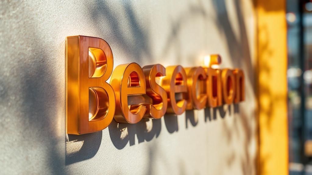
- Acrylic: A really versatile and modern choice that comes in all sorts of colours and finishes. It’s fantastic for creating vibrant, illuminated 3D letters and logos, giving retail stores and professional services a premium, polished look.
- Metal (Aluminium, Steel): You can't beat metal for durability and a sophisticated finish. Aluminium is light and won't rust, making it a reliable workhorse. Corten steel, with its popular weathered look, is another great option. Metal is often the go-to for permanent, high-end signs that need to make a statement.
- Vinyl: The budget-friendly, flexible champion. It’s ideal for window graphics, short-term promotions, or plastering your logo onto any flat surface. While it’s not as permanent as other options, the design possibilities are practically endless.
The image below gives you a clue about which types of signs are most likely to catch a passerby's eye. This can help you figure out where to place your sign once you've picked your material.
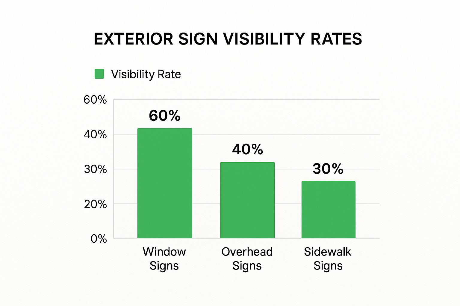
As you can see, window signs are often real attention-grabbers, so what you choose for your window vinyl or acrylic displays is especially important.
Fabrication and Finishing Touches
Beyond the basic material, how the sign is built is what truly brings your design to life. 3D fabricated letters, for instance, add depth and create interesting shadows that make your business name stand out. Illumination is another game-changer. Modern LED lighting is your best bet here—it's energy-efficient, lasts for ages, and gives a bright, even glow. Many now prefer it over traditional neon because it’s more reliable and cheaper to run.
For hospitality businesses or modern retail spaces, you might even consider going digital. There are some incredibly versatile and impactful digital menu board solutions out there, like pop-out video walls, that can display dynamic content and really draw customers in.
Signage Material Comparison for NZ Businesses
Choosing the right material means weighing up its toughness against our local conditions, your budget, and how much effort you're willing to put into upkeep. This table breaks down the most common options to help you decide what’s best for your Kiwi business.
| Material | Durability | Cost | Maintenance | Best For |
|---|---|---|---|---|
| Timber | Moderate | Mid-Range | High (needs regular sealing/staining) | Cafes, wineries, heritage buildings, eco-conscious brands |
| Acrylic | High | Mid to High | Low (simple cleaning) | Modern retail, professional services, illuminated 3D logos |
| Aluminium | Very High | Mid-Range | Very Low (rust-proof) | Permanent outdoor signs, building fascias, professional look |
| Vinyl | Low to Moderate | Low | Low (but short lifespan) | Window displays, temporary sales, vehicle graphics |
Ultimately, the best material will align with your brand's image and be tough enough to handle its specific location, whether that's a sun-drenched spot in Hawke's Bay or a windswept corner in Wellington.
Mastering Visuals: Typography, Colour, and Layout

This is where the real design work begins—where your brand strategy gets turned into a tangible, visual handshake with every person who walks past. The success of any great sign comes down to three core elements: its typography, its colour palette, and its layout.
When you get these right, you create something that does more than just state your business name. You create a sign that genuinely captivates and connects. Think of them as the key ingredients in a recipe; each one is crucial on its own, but they have to work together perfectly to create something memorable.
Let's break down how to get each part right.
Choosing Fonts That Speak Volumes
Typography is so much more than just picking a font you like the look of. The right typeface communicates your brand's personality before a single word is even processed. More importantly, it absolutely must be legible from a distance. A sign that can't be read in a few seconds is a sign that has failed.
When you're sifting through font options, keep these points in mind:
- Legibility Is King: Generally, sans-serif fonts like Helvetica or Futura are cleaner and far easier to read from the street than intricate serif or script fonts. If your brand absolutely needs a decorative font, a smart move is to pair it with a simple, highly readable font for the essential info.
- Align With Your Brand: Your font choice has to feel right for your business. A children's toy store can pull off a playful, rounded font, whereas a high-end law firm would naturally lean towards something more traditional and authoritative.
- Don't Overdo It: Using more than two or three different fonts is a classic mistake. It makes your sign look cluttered, confusing, and unprofessional. Stick to a primary and secondary font to keep the design clean and organised.
Research into font psychology has shown that certain typefaces can directly influence how customers see your brand. For instance, fonts with soft, rounded edges are often perceived as more friendly and comforting, while sharp, angular fonts can communicate strength and efficiency.
The Psychology of Colour
Colour is easily one of the most powerful tools in your design kit. It grabs attention from across the street, triggers emotions, and can even nudge purchasing decisions. The trick is to develop a colour palette that’s not just eye-catching, but also strategically reinforces the message you want to send.
For Kiwi businesses, it pays to think about colours that work well in our unique environment and stand out in our specific lighting conditions. A bright, sunny yellow can feel energetic and cheerful—perfect for a local cafe. A deep, rich green, on the other hand, can suggest a connection to nature and quality, making it a great choice for an organic food store or a garden centre.
When it comes to signs, high contrast is your best friend. A classic combo like black text on a white background or a vibrant yellow on a deep blue offers fantastic readability. You'll want to avoid low-contrast pairings like light grey on white, as they can become almost invisible in the bright New Zealand sun.
Creating a Balanced and Effective Layout
Layout is all about arranging your visual elements—the logo, the text, any graphics—into a design that’s cohesive and easy to digest at a glance. A well-executed layout guides the viewer's eye exactly where you want it to go, ensuring your most important message gets seen first.
- Establish a Visual Hierarchy: First, decide on the single most important piece of information on the sign. For most, this is the business name. Make it the biggest and boldest element. Secondary details, like your tagline or what you sell, should be smaller.
- Embrace the White Space: Don't be scared of empty space! A cluttered sign is hard to read and just looks chaotic. This "negative space"—the empty area around your text and logo—gives your design room to breathe and makes the key elements pop.
- Find Your Balance: Arrange the elements so the design feels stable, not like it's about to tip over. This can be a symmetrical layout (mirrored on both sides) or an asymmetrical one where you balance a large item with several smaller ones.
A crucial part of getting these visual elements right is seeing them in action before you go to print. Creating and reviewing design visualization mockups is the best way to preview the final product. It allows you to see how your choices work together in a real-world context before you commit your budget to production.
Navigating Council Rules and Sign Placement
https://www.youtube.com/embed/khQ5CTe_ocQ
You’ve poured your heart and soul into the perfect sign design. It’s a perfect reflection of your brand, the materials are sorted, and the colours are just right. But hold on a moment. Before you get that sign made, let alone installed, you've got a critical, often-overlooked hurdle to clear: your local council.
An incredible sign is completely useless if it doesn't comply with local regulations. Getting this wrong can lead to hefty fines or, even worse, being forced to take it all down.
Here in New Zealand, every local council operates under its own District Plan, which spells out exactly what’s allowed for commercial signage. These rules aren't just red tape; they’re in place to preserve a neighbourhood's character, keep the public safe, and stop our streets from becoming a mess of visual clutter. Trust me, ignoring them is a recipe for a massive headache.
Your very first step, before you commit to anything, should be a visit to your local council's website. Look for terms like "signage bylaws," "District Plan," or "planning rules for signs." This isn't optional homework—it's essential.
Decoding Your Local Council's District Plan
Wading through official documents can feel a bit intimidating, but they contain the answers to some of the most important questions you'll have. You need to get clear on the specifics that will shape your final design.
Keep an eye out for common restrictions, which usually cover:
- Size and Scale: Councils almost always have strict limits on a sign’s total size, often measured in square metres and tied to the building’s frontage.
- Illumination: You'll find rules on whether your sign can be lit, how bright it can be, and if any flashing or moving elements are permitted.
- Placement: Regulations will dictate how far a sign can jut out from a building, how high it needs to be above the pavement, and its distance from intersections.
- Heritage Zones: If your shop is in a historic or special character area, expect the rules to be much tighter. They often dictate the exact materials, colours, and even fonts you can use.
Interestingly, this isn't a new phenomenon. New Zealand's old trading laws, which heavily restricted shopping hours for decades, had a real impact on signage. With only a short window to attract shoppers, stores needed clear, functional signs to shout about their opening times and what they sold. You can see how this history of regulation has subtly shaped our modern retail landscape, and it's fascinating to learn more about how NZ's shopping history influenced retail.
Strategic Placement for Maximum Impact
Once you're armed with a clear understanding of the rules, you can shift your focus to the fun part: strategic placement. The goal here is simple—make your sign impossible for your ideal customers to miss, whether they're walking past or driving by.
The best way to do this? Get outside. Stand across the street. Walk 50 metres down the road. Look at your storefront from every possible angle. Is there a pesky tree or a bus stop blocking a key line of sight?
You have to walk the path your customers take. A sign that looks brilliant when you're standing right under it can easily disappear from a distance or at a slight angle. Sit in a car and see what the driver sees.
Think about these key factors:
- Viewing Distance: How far away do people need to be able to read your sign? The greater the distance, the bigger and bolder your typography needs to be.
- Traffic Flow: Pay attention to how people move past your shop. A sign that sticks out perpendicular to the building (often called a 'blade sign') can be fantastic for grabbing the attention of pedestrians on the footpath.
- Environmental Factors: Consider the sun's path during the day. The last thing you want is for your stunning new sign to be wiped out by intense glare every afternoon at 3 PM.
By marrying a solid grasp of the council rules with smart, customer-centric placement, you’ll create a sign that not only looks great but works incredibly hard for your business.
Answering Your Top Store Signage Questions
Getting a new sign for your business can feel like a massive undertaking. It’s natural to have a heap of questions, from “How much is this going to set me back?” to navigating the maze of council rules. It's easy to get a bit swamped.
We’ve heard all the common queries from business owners across New Zealand, so we’ve put together some straight-up, expert answers to help you get moving with real confidence. Getting these things right from the start will save you a world of headaches, time, and money later on.
How Much Should I Actually Budget for My Store Signage?
This is the big one, isn't it? The honest answer is: it varies wildly. A simple vinyl decal on your window could be a few hundred dollars, while a big, bespoke illuminated sign that’s part of the building's architecture could easily climb into the tens of thousands.
For a new business just starting out, a good rule of thumb is to set aside 1-3% of your total setup budget for signage. If you're an established business looking for a refresh, earmarking a similar chunk of your annual marketing budget is a solid approach.
The final figure really comes down to a few key things:
- Size and Detail: It’s simple, really. The bigger and more intricate the design, the more it will cost to produce.
- Materials: There’s a huge price gap between standard sign-writer's vinyl and premium options like weathered corten steel or custom-shaped acrylic.
- Lighting: Adding LED illumination will bump up the initial price, but trust me, it’s one of the best investments you can make for 24/7 visibility.
- Installation: A tricky install—think working at heights, needing special access, or structural supports—will add to the final bill.
My advice? Always get a few detailed quotes from reputable local sign writers. And remember, spending a bit more on quality materials from the get-go often means you’re not forking out for repairs or a full replacement in just a few years.
What’s the Single Most Important Thing for Great Signage?
While a clever design and fancy materials are great, the one thing that trumps everything else is legibility. Plain and simple. If people can't read your sign quickly and easily, it’s failed its most basic job.
A sign that’s hard to decipher is just a missed opportunity—a potential customer walking right on by. This is exactly why you have to test your design in the real world before committing.
Before you give the final sign-off, print a mock-up of the design. Actually take it down to your shop. Look at it from across the road, from different angles, and from the distance a driver would see it. If it’s not instantly clear, it’s time to go back to the drawing board.
To nail legibility, zero in on three elements: a clean, straightforward font; high contrast between your text and the background (like dark lettering on a light surface); and a size that’s right for how far away people will be when they see it.
Do I Need Council Consent for My New Sign?
It depends. Here in New Zealand, whether you need a resource consent comes down to your local council’s District Plan. Every council has its own set of rules, so you can’t just assume what’s sweet in Auckland will be fine down in Christchurch.
Generally, you might get away without consent for smaller signs mounted flat against your building. But for anything bigger, a sign that projects out, one that’s lit up, or anything in a heritage area—you’ll almost certainly need council approval.
Your very first step should be to check the signage guidelines on your local council's website or, even better, give their planning department a call. Sorting this out early prevents costly delays and some hefty potential fines. A good, experienced sign writer will be up to speed on the local regulations and can often help steer you through the process.
At SONI DESIGN, we know that great design is a journey, not a destination. From that first spark of an idea to the final installation, we’re all about bringing your brand’s story to life with signage that gets you noticed, vibrant prints, and unique promotional gear. Let’s work together to create something truly special.
Find out how we can help your business stand out by visiting us online.
Leave a Comment
Stay home & get your daily
needs from our shop
Start You'r Daily Shopping with Nest Mart