
Your cart is currently empty.

In a world saturated with digital ads, the humble sandwich board sign is your most direct and affordable salesperson, standing right on the footpath to greet potential customers. Think of it as a daily handshake, a simple yet powerful tool that turns passing foot traffic into paying clients by announcing specials, showing off your brand’s personality, or promoting an event.
Why Sandwich Board Signs Are Your Silent Salesperson
Picture your storefront as a website and the street outside as a search engine. How do you convince people "clicking" by with their feet to step inside your "site"? While online ads and social media definitely have their place, the sandwich board offers an immediacy that digital marketing often can't replicate. It's the original mobile ad—a physical link between your business and the community walking past your door every single day.
It’s like a friendly, non-intrusive tap on the shoulder. For someone wandering down the street, a well-placed A-frame sign can be the one thing that makes them stop, turn their head, and pop in for a look. It answers the silent question every passerby has: "What's in there for me?"
The Unspoken Conversation with Customers
A great sandwich board starts a conversation without saying a single word out loud. It’s a brilliant tool for all sorts of Kiwi businesses, from busy city cafés to local retail shops and service providers. Its magic lies in just how simple and versatile it is.
So, what kind of conversation can it start?
- The "Special Offer" Chat: "Come on in! We’ve got a two-for-one coffee deal with your name on it."
- The "Personality" Introduction: "Our soup of the day is whisky. Just kidding, it’s tomato."
- The "Helpful Guide" Direction: "Open Home this way! →"
- The "New & Exciting" Announcement: "Fresh Blueberry Muffins just out of the oven!"
This direct line of communication works wonders. A creatively designed sign can stop people in their tracks, turning a casual glance into genuine interest. It’s all about creating a small moment of connection that feels personal and relevant.
A Cornerstone of Local Marketing
In many ways, these signs are fundamental to hyperlocal advertising. They target the most qualified audience you could ask for—people who are already right outside your business. This makes them a non-negotiable tool for boosting walk-in traffic and building brand awareness in your neighbourhood, fast.
While sandwich board signs are fantastic on their own, they truly shine as part of a wider marketing mix. To explore more ways to boost your business's presence and growth, delve into comprehensive local business marketing strategies. When you integrate your physical signage with other local efforts, you create a powerful, unified message that reinforces your brand and drives real results.
2. Picking the Right Material for Your Sandwich Board
Choosing the right material for your sandwich board is a bit like picking the right tool for a job. You wouldn't use a delicate paintbrush to paint a whole house, and you wouldn't use a flimsy sign in a windy spot. The material you select says a lot about your brand and determines how well your sign will hold up against the elements.
Let's break down the most common materials to figure out which one is the perfect fit for your business.
Wood: The Rustic Classic
There’s a reason wooden A-frame signs are so popular with cafes, bakeries, and boutique shops. They have a timeless, rustic charm that feels warm and inviting. A well-crafted wooden sign can make your business seem more authentic and established.
They are fantastic for businesses aiming for an organic or artisanal vibe. However, keep in mind that wood requires a bit more care. It needs to be treated to withstand rain and sun, and it can be heavier than its plastic or metal counterparts, making it a little less portable.
Metal: Sleek and Professional
If you're after a more modern, durable, and polished look, a metal A-frame is an excellent choice. These are often used by real estate agents, professional services, or retailers who want a sign that looks sharp and can handle frequent use.
Metal frames are built to last. They stand up well to daily wear and tear and often come with a powder-coated finish to resist rust and fading. The real advantage is their versatility—most are designed to hold interchangeable printed panels, so you can swap out your message for different promotions with ease.
Plastic: The Durable Workhorse
When it comes to pure practicality and resilience, moulded plastic signs are hard to beat. Think of them as the all-terrain vehicles of the sign world. They're lightweight, incredibly tough, and virtually weatherproof.
Many plastic models come with brilliant features like a handle for easy carrying or a hollow core you can fill with sand or water. This makes them incredibly stable, even against a classic gusty Wellington wind. They're the go-to choice for outdoor events, high-traffic retail areas, and any situation where durability is the top priority.
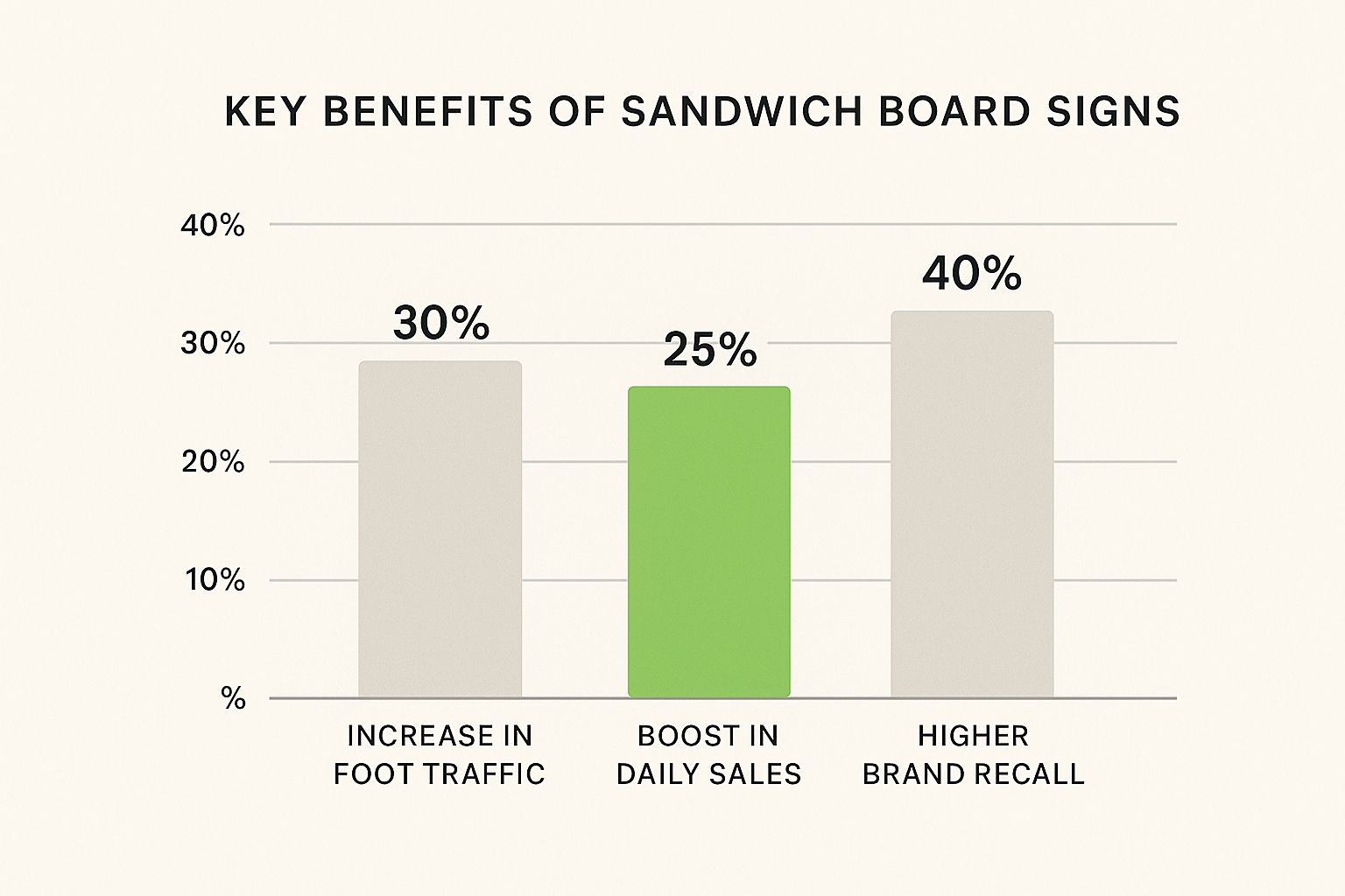
As you can see, a great sign does more than just sit on the footpath—it actively works for you. The statistics show that these signs are proven to increase foot traffic by 20%, boost sales by 15%, and improve brand recall by 30%. Choosing the right material is the first step to unlocking that potential.
Comparing Common Sandwich Board Sign Materials
To make the decision even easier, here’s a quick comparison table breaking down the key factors for each material.
| Material Type | Ideal Business Use | Key Advantages | Potential Downsides | Care Level |
|---|---|---|---|---|
| Wood | Cafes, boutiques, florists, bakeries, artisan markets | Natural, warm, and inviting aesthetic; highly customisable. | Heavier; requires weather-proofing; can be prone to wear. | Moderate to High |
| Metal | Real estate, corporate offices, retailers, professional services | Durable, professional look; great for swappable inserts. | Can be heavy; may rust if the coating is damaged. | Low to Moderate |
| Plastic | Outdoor events, construction, high-traffic retail, service stations | Lightweight, highly durable, and weatherproof; often very stable. | Can look less premium than wood or metal. | Very Low |
Ultimately, the best material depends entirely on your specific needs—where you'll place the sign, how often you'll move it, and the brand image you want to project. By weighing these factors, you can invest in a sign that not only looks great but works hard for your business for years to come.
Designing a Sign That Actually Stops Traffic

A brilliant sandwich board does more than just announce you’re open for business; it interrupts someone’s day in the best way possible. You’ve got about three seconds flat to catch their eye, make a connection, and give them a reason to step inside. It’s a big job for a humble A-frame, but with a bit of smart design, it’s completely achievable.
Think of your sign as a tiny, compelling story. It needs a killer headline, clear visuals, and a call to action they can’t refuse. A poorly designed sign is just footpath clutter, but a great one acts like a magnet for people walking by. It's not just what you say, but how you say it.
The Science of the Three-Second Glance
As people stroll past your business, their brains are constantly filtering out thousands of sights and sounds. To cut through that noise, your sandwich board needs to be understood in an instant. This is where visual hierarchy comes in – the art of arranging your design to guide the viewer’s eye exactly where you want it to go.
The most crucial bit of information, like your main offer or a witty hook, should be the biggest and boldest thing on the board. Any supporting details can be smaller, creating a clear path for the eye to follow. It sounds simple, but this is what separates a sign that gets read from one that’s completely ignored.
A study on outdoor advertising revealed that signs with high colour contrast can boost message recall by up to 70%. Your design choices directly impact whether people remember you.
Often, the foundation of a great sign is a professional custom logo design, which makes your business instantly recognisable. A strong logo becomes a visual anchor, reinforcing your brand identity at a single glance.
Choosing Colours That Pop
Colour is your most powerful tool for grabbing attention from a distance. The name of the game is contrast. Forget about subtle, muted tones; you need combinations that leap out from the busy backdrop of a street.
Consider these classic, high-impact pairings:
- Black and White: It's timeless, bold, and always easy to read. A classic chalkboard with crisp white lettering is a perfect example.
- Yellow and Black: There’s a reason this combo is used for warning signs – it’s physically impossible to miss.
- White and Blue: This pairing feels clean, professional, and trustworthy, making it very easy on the eyes.
Stay away from colours that clash or have low contrast, like putting yellow text on a white background or red on purple. These combinations make your words hard to figure out from a few metres away, causing most people to just give up and walk on.
Fonts That Work From a Distance
Your choice of font is just as vital as your colour scheme. That beautiful, flowing script might look fantastic up close, but from across the street, it’ll just be an unreadable smudge. When it comes to sandwich board signs, readability is king.
Go for clear, bold, and simple fonts. Sans-serif fonts like Helvetica, Arial, or Futura are fantastic because they don’t have the little decorative strokes (serifs) that can make letters look cluttered. Make sure the font is chunky enough to be seen easily and that there’s enough space between letters and lines to stop them from blurring together.
Follow this simple checklist for writing copy that works:
- Lead with a Hook: Ask a question, crack a joke, or describe a mouth-watering offer.
- Keep It Short: Stick to seven words or less. People are walking, not stopping to read a novel.
- Use Simple Language: Avoid industry jargon or complicated words. The message has to be crystal clear.
- Have a Clear Call to Action: Tell people exactly what you want them to do. "Come In," "Try Our New Special," or "Sale On Now!" are direct and get the job done.
By mixing a strong visual layout, high-contrast colours, readable fonts, and snappy copy, your sandwich board can transform from a passive object into an active, persuasive member of your sales team.
Navigating NZ Council Rules for Footpath Signs
You've got your shiny new sandwich board, and you're ready to capture the attention of everyone walking past. But before you place it on the pavement, there's a crucial step every Kiwi business owner needs to take: checking in with the local council. It might feel like just another piece of admin, but these rules are in place for a really good reason.
Think of it this way: council rules ensure a fair go for everyone. They let you advertise effectively while keeping our footpaths safe and clear for parents with prams, people in wheelchairs, and anyone using a mobility scooter. A clear walkway is essential for an inclusive community. Getting it wrong can lead to fines or having your sign impounded, and nobody wants that.
Understanding Common Council Requirements
While the fine print can change from one district to the next, most New Zealand councils operate on a similar set of principles for footpath advertising. If you get your head around these common themes, you'll be in a great position, no matter where your business is based.
Generally, you can expect councils to have clear guidelines on:
- Size and Dimensions: There will almost always be a limit on how big your sign can be. This is simply to stop signs from becoming massive obstacles on the pavement.
- Placement and Clearance: Councils will be specific about where your sign can go. This usually means keeping it hard up against your building and leaving a minimum clear width on the footpath for people to get by.
- Permits and Licences: In many places, especially busy city centres, you'll need to apply for a permit or a licence before you can legally put your sign on public land.
- Safety and Stability: Your sign has to be stable. It can't be a trip hazard, and it needs to be heavy enough that it won't blow over in a classic Kiwi southerly.
At the end of the day, these regulations are all about maintaining order and safety. When you follow the rules, you’re not just complying with a bylaw—you're being a good neighbour and a responsible part of your local business community.
A Real-World Example: Wellington City Council
To see how these rules play out in the real world, let's take a look at the capital. Wellington is a great example of a council balancing business needs with public safety. The Wellington City Council requires businesses to get a sandwich board licence before placing any sign on a public footpath.
This licence runs for one year, from 1 July to 30 June, and you have to renew it annually. The whole point is to keep pedestrians safe by making sure signs don’t block walkways or create hazards. The council won’t even grant a licence until they've done a safety check, and any sign without a valid sticker is at risk of being removed. Digging into Wellington's specific requirements is a great way to see how a major city handles footpath signage.
How to Find and Follow Your Local Rules
So, how do you find out exactly what the rules are in your neck of the woods? The process is usually pretty simple and will save you a world of trouble later on.
- Visit Your Local Council Website: This is your best first stop. Search for terms like "sandwich board signs," "footpath signs," "A-frame signs," or "business signage bylaw."
- Locate the Bylaw Document: Most council websites have a searchable section for their bylaws. Find the right one, download it, and read the part about signage carefully.
- Check for an Application Process: If you need a licence, the website should have all the forms and instructions you need. It's often an online process these days.
- Contact the Council Directly: If you're unsure about anything, don't guess. Just pick up the phone or send an email. The licensing or compliance team is there to help you get it right.
By taking a few minutes to do this research, you can put your sandwich board out with confidence, knowing you’re promoting your business responsibly and playing by the local rules.
How Local Bylaws Shape Your Signage Strategy
Getting a handle on general council guidelines is a great first step, but the real insights come when you dig into your specific local bylaws. These rules aren't just bureaucratic hurdles. They're actually carefully considered frameworks designed to keep our footpaths safe, accessible, and looking good for everyone.
When you understand the why behind the rules, you can make smarter decisions that not only keep you on the right side of the council but also make you a better contributor to your local community.
Take the Auckland Council’s 2022 Signs Bylaw as a case in point. It was created to tackle real-world problems like footpath clutter, abandoned signs from closed businesses, and safety risks for pedestrians. The goal isn't to stop you from advertising; it's to make sure it’s done in a way that respects the shared public space we all use.
Breaking Down a Typical Bylaw
No matter where you are in New Zealand, most council bylaws for signs have a similar structure. Getting familiar with these core components will make the whole process much less intimidating.
Here’s what you can generally expect to find:
- Application Process: This is the 'how-to' part, explaining the steps you need to take to get your sign approved. You'll usually need to provide details about your business, your sign's design, and exactly where you plan to put it.
- Fees and Charges: Most councils have fees for permits and applications. This isn't just a money-grab; it helps cover the admin costs of managing signage and making sure everyone sticks to the rules.
- Conditions of Approval: Once you're approved, the council will give you a set of conditions. These are the specific rules of the game, covering things like where your sign can go, what hours it can be out, and who's responsible for keeping it in good nick.
- Compliance and Enforcement: This section lays out what happens if you don't follow the rules. Think fines, having your sign removed, and the process for appealing any decisions.
Realising this structure helps you see that council rules are about more than just red tape. They’re a way to balance a business's need to attract customers with the public's right to a safe, tidy, and pleasant streetscape.
The Auckland Example: A Closer Look
Auckland’s bylaw is a fantastic example of a modern, practical approach. It directly addresses the kind of issues that can make a street feel rundown, like old signs left behind after a business has moved on.
A key part of Auckland Council’s 2022 Signs Bylaw, which becomes fully effective from 4 March 2025, is that signs must be removed promptly when a business closes. This simple rule prevents derelict signs from becoming eyesores.
The bylaw gives the council clear authority to approve or decline applications based on what’s submitted. If you don't comply with the conditions, they can take action, including removing the sign themselves and sending you the bill. It's a firm stance, but one that underscores the city's commitment to keeping its public spaces clean and safe for everyone.
By taking the time to understand these local specifics, you're setting yourself up for success. Your sandwich board will be a compliant, effective, and welcome part of the neighbourhood for years to come.
Getting Your Sandwich Board Placement Just Right
Knowing the local bylaws is the first hurdle, but the real magic happens when you figure out how to place your sign for maximum impact while keeping everyone safe and happy. It's a delicate dance between grabbing attention, ensuring public safety, and just being a good neighbour. Think of your sign as a friendly welcome mat for the whole street, not an annoying obstacle.
Ultimately, you want your sign to be seen by the right people at the perfect moment. This means getting strategic about visibility, foot traffic, and how close it is to your front door. A well-placed sign can effortlessly pull customers inside, whereas one that’s just a few metres off might as well be invisible.
Finding the Sweet Spot: Visibility Meets Safety
Nine times out of ten, the best spot for your sandwich board is directly in front of your business. It needs to be close enough to your entrance that people can easily connect the dots and wander in. Your aim is to put it in the natural flow of foot traffic, but—and this is crucial—without blocking the path or creating a trip hazard.
To find this sweet spot, step outside and see your shopfront through your customers' eyes. Walk towards it from both directions. Can you clearly read your sign from 15-20 metres away? Does it pop, or does it get lost in the visual clutter of the street? The answers will tell you if you've nailed the placement.
Try to think like a pedestrian. Your sign should catch their eye as they approach, but you must leave a wide, clear path for prams, wheelchairs, and people walking together. A safe, considerate placement says a lot about your business.
A Real-World Example: Queenstown's Rules
Local councils give you the rulebook. The Queenstown Lakes District Council, for example, has clear guidelines to keep things tidy and safe. They limit sandwich boards to a maximum size of 1 square metre per face and allow only one sign per business. Importantly, these signs must be kept entirely within your own property boundary so they don’t get in the public's way.
This is a perfect illustration of the core idea: advertising within set boundaries. When you stick to these local rules, you’re not just avoiding a fine; you’re helping create a streetscape that's uncluttered and appealing for everyone, which is good for all businesses.
Your Daily Placement Checklist
Before you haul your sign out each morning, run through this quick mental checklist. It only takes a second.
- Is it stable? Make sure it won’t tip over in a gust of wind or if someone bumps into it.
- Is it highly visible? Glance at it from up and down the street. Does it catch your eye?
- Is it blocking anyone? Check that there's plenty of room for people to pass by comfortably.
- Is it near your entrance? The sign should act as a clear pointer to your front door.
- Is it compliant? Are you 100% sure you’re following all local council rules on size and location?
Got a Question About Sandwich Board Signs?
Even with the best plan, you probably still have a few questions about getting sandwich board signs to really deliver for your business. Let’s tackle some of the most common queries we hear from fellow Kiwi business owners so you can advertise with confidence.
What Makes a Good Sandwich Board?
A brilliant sandwich board is a perfect mix of smart design and solid, practical construction. It needs to be visually punchy, using high-contrast colours and bold, legible text that someone can absorb in a three-second glance. At the same time, it must be sturdy enough to stand up to a bit of weather without toppling over.
Think of it as your silent salesperson on the footpath. Its mission is to grab attention, get a clear message across, and ultimately, entice people to step inside. A clever line or an eye-catching design can be the simple thing that turns a passerby into a paying customer.
A sign's number one job is to momentarily interrupt someone's journey and spark their curiosity. The signs that work best are simple, direct, and show off a bit of your brand’s personality.
Are Sandwich Boards Still Effective?
You bet they are. In an age where we're all swimming in digital notifications, a well-placed physical sign on the pavement offers something refreshingly direct. It creates an immediate, real-world connection with the people who are literally right outside your door—the most qualified customers you could ask for.
They remain one of the most cost-effective, high-impact marketing tools available. Time and again, studies have shown that good outdoor signs can lead to a noticeable jump in foot traffic and sales, proving this traditional method is still incredibly powerful for local businesses.
What Is the Difference Between a Sandwich Board and an A-Frame Sign?
Honestly, there isn't one. The terms "sandwich board" and "A-frame sign" are used interchangeably because they describe the exact same thing: a portable, two-sided sign hinged at the top that stands on its own in an 'A' shape.
The name "sandwich board" is a quirky holdover from the 19th century, when advertisers would hire men to wear two boards strapped over their shoulders, literally sandwiching them in between. The freestanding A-frame we know today is just the modern version of that old-school idea.
How Do I Keep My Sign From Blowing Over?
Keeping your sign upright is a real concern, especially on a windy day in New Zealand. The best way to tackle this starts with choosing the right kind of sign.
- Weight it Down: Many modern plastic A-frames are designed with a hollow base that you can easily fill with sand or water for instant stability.
- Choose a Heavier Material: A sign made from solid wood or metal will naturally be heavier and much less likely to get knocked over by a gust of wind.
- Strategic Placement: Try positioning your sign close to the wall of your building or in a nook that provides a bit of a windbreak.
Making sure your sign is secure isn’t just about protecting your investment; it's a critical safety step to ensure it doesn't become a hazard for people walking past.
At SONI DESIGN, we know that a great sign is where art meets strategy. We pour our passion for design into every project, creating signs that not only look fantastic but also tell your story and connect with your community. Let us help you bring your vision to life with signage that gets noticed. Find out more at https://www.sonidesign.co.nz.
Leave a Comment
Stay home & get your daily
needs from our shop
Start You'r Daily Shopping with Nest Mart