
Your cart is currently empty.

You've seen them everywhere: the humble A-frame sign perched on the pavement outside a bustling café, a local boutique, or a real estate open home. This is sandwich board signage, and it’s one of the most classic and effective ways to stop people in their tracks and pull them into your business.
Think of it as your silent salesperson, standing right on the street. It’s a friendly, physical invitation that cuts through the digital noise and speaks directly to people in your immediate neighbourhood.
Don't Underestimate the A-Frame Sign
In an age of endless online ads, it's easy to overlook something as simple as a sign on the footpath. But that's precisely where its power lies. A sandwich board works because it's real, tangible, and right there in front of potential customers.
The psychology is simple. People are walking by, often on autopilot, and your sign interrupts their journey. A clever message, a delicious-sounding daily special, or an irresistible discount can be just the nudge they need to break their routine and step inside your door. It’s about triggering that impulse.
Why This Old-School Method Still Crushes It
The beauty of a sandwich board is its directness. There are no algorithms or ad-blockers to worry about—just a clear, simple message placed exactly where your customers are. This is especially true in busy retail and hospitality areas where you're competing for every glance.
- Hyper-Local Focus: It’s impossible to get more targeted than the people walking right past your front door.
- Bang for Your Buck: The initial cost is low, and with no recurring fees, the return on investment is fantastic.
- Ultimate Flexibility: Got a new lunch special or a flash sale? You can change your message in minutes.
These signs are such a fixture of local business that they're a big part of how councils manage public spaces. In New Zealand, councils like Auckland have specific bylaws for portable signs to make sure they're used safely and don't block the pavement. That alone shows you just how widespread and impactful they are.
A great sign is so much more than just a board with some writing on it. It’s the perfect mix of a great message, smart design, and clever placement.
On top of everything else, these signs are a key part of bigger, powerful local business marketing strategies. They act as a physical touchpoint that builds your brand's personality and helps you become a memorable part of the local landscape.
Choosing the Right Materials for Your A-Frame Sign
Picking the right material for your sandwich board is a bit like choosing the right tyres for your car. You wouldn't put city tyres on a farm ute, and you shouldn't put a flimsy indoor sign on a gusty Wellington street corner if you expect it to last the day. The material you choose dictates your sign's lifespan, its look and feel, and how practical it is to use every day.
This decision is critical. It directly affects how well your sign represents your brand and whether it can handle New Zealand's famously four-seasons-in-one-day weather. A rustic wooden chalkboard, for instance, has a certain charm that’s perfect for a café advertising its soup of the day. It’s flexible and looks great, but it needs to be brought in at the first sign of rain and requires daily effort.
At the other end of the spectrum, a sturdy plastic A-frame with an interchangeable correflute insert is all about durability and convenience. This is a brilliant setup for a real estate agent who needs a weatherproof sign they can reuse for dozens of open homes just by swapping out the printed panel.
This handy flowchart breaks down the three pillars of great signage: message, design, and placement. Getting these right is the key.
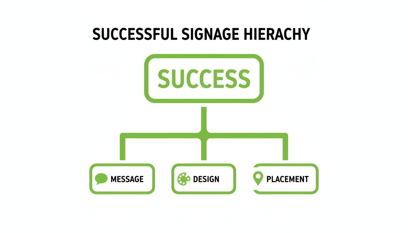
Ultimately, your sign's success hinges on balancing these three elements. Your choice of material plays a huge role, influencing both the final design and how well it holds up over time.
Key Factors in Your Material Decision
To make sure you're making a smart investment, you need to think through a few practical points. Where will the sign live? Who's going to be lugging it in and out? How often does the message need to change?
Here are the main things to weigh up:
- Weather Resistance: Is your sign going to be baking in the Auckland sun or getting lashed by sideways rain in Dunedin? Materials like heavy-duty plastic, metal, and aluminium composite are built to handle the elements far better than standard wood.
- Portability: Think about your team. Who will be responsible for bringing the sign in at night and putting it out in the morning? Lightweight options like correflute or PVC are a breeze for anyone to handle, whereas solid wood frames or water-fillable plastic bases can be a real mission to move.
- Visual Appeal: The material should feel like a natural extension of your brand. A sleek, minimalist metal frame might be perfect for a modern tech retailer, while a beautifully crafted wooden board is the ideal match for an organic grocer.
Remember, the best material isn’t just the toughest or the cheapest; it's the one that best serves your specific business needs, from branding to day-to-day usability.
Comparing Common Sandwich Board Materials
To make things easier, let's look at the most common materials you'll come across and what they're best suited for. Each has its pros and cons, so it's all about finding the right fit for your situation.
| Material Type | Best For | Durability | Weather Resistance | Typical Cost |
|---|---|---|---|---|
| Wood | Cafés, boutiques, artisans needing a rustic, customisable look. | Moderate | Low (needs treating/protection) | $$ - $$$ |
| Plastic (PVC) | Professional services, retail, and long-term outdoor use. | High | High | $$ |
| Correflute | Short-term events, real estate inserts, budget-friendly promos. | Low | Moderate | $ |
| Metal (Steel/Aluminium) | High-wind areas, premium brands, and maximum longevity. | Very High | Very High | $$$ |
| Chalkboard/Whiteboard | Hospitality or businesses with daily changing specials. | Moderate | Low (best under cover) | $$ |
As you can see, a cheap and cheerful correflute sign is fantastic for a one-off weekend event, but a powder-coated steel A-frame is the real workhorse if you need something to last for years on a busy street.
Choosing wisely from the start means your sandwich board will be a valuable asset that keeps working for you, not a recurring expense you have to replace every season.
Crafting a Message That Stops Foot Traffic
You’ve got about five seconds. That’s the tiny window you have to catch someone’s eye as they walk past your shop. Your sandwich board is your secret weapon in this battle for attention, so your message has to be sharp, scannable, and strong enough to literally stop people in their tracks.
Think of your sign as a bold headline, not a detailed brochure. A passerby won’t stop to read a paragraph; they'll only glance and absorb a few key words. The whole point is to create a message that’s both compelling and easy to digest from several metres away.
Embrace the Power of Brevity
When it comes to effective sandwich board copy, the golden rule is simple: less is more. You want a message that someone can read and understand in under five seconds. Cramming your board with too much text is the quickest way to guarantee it gets completely ignored.
A great way to approach this is by using a simple hierarchy to structure your message:
- A Bold Headline: This should be your biggest text, grabbing attention with the main offer (e.g., "Coffee & Muffin Deal").
- A Key Detail: Next, add the single most important piece of information, like the price or a time limit (e.g., "$8 Before 10 AM").
- A Call to Action: Finally, tell people exactly what you want them to do (e.g., "Come On In!").
This structure feels natural to the eye and delivers all the necessary info without overwhelming someone. It’s all about clarity first, creativity second.
"Your sign's message should be an invitation, not a novel. Make it easy for people to say 'yes' by giving them a clear, concise reason to step inside."
Typography and Colour That Command Attention
The fonts and colours you pick are just as crucial as the words themselves. They’re the visual tools that make your message pop and ensure it’s readable from a distance.
For typography, legibility is everything. Steer clear of thin, overly decorative, or curly fonts that are a pain to read at a glance. Stick with clean, bold sans-serif or serif fonts. Make sure you leave enough space between letters and lines (kerning and leading) so the text doesn’t look like a jumbled mess from afar.
Colour contrast is your best friend for visibility. High-contrast combinations like black on white, yellow on black, or white on a dark blue background make your text jump off the board. Low-contrast pairings like grey on white or light pastels are a no-go, as they’ll just wash out in the bright sunlight.
A good rule of thumb is to test your design. Step back, squint your eyes, and look at it. If the message becomes hard to read, your contrast isn't strong enough. Getting these design elements right ensures your brilliant message actually gets the attention it deserves.
Where Can I Put My Sign? Navigating Placement Rules and NZ Regulations
Figuring out the perfect spot to catch people's eye is one thing, but making sure your sign is placed legally is a whole different ball game. You can’t just pop your A-frame sign down wherever you fancy in New Zealand. There’s a web of national transport guidelines and local council bylaws designed to keep our footpaths safe and clear for everyone.
And trust me, you don't want to get this wrong. An awkwardly placed sign is more than just an inconvenience; it can be a real hazard for people with visual impairments, parents navigating prams, or anyone in a wheelchair. Getting it wrong can lead to a fine or, even worse, having your shiny new sign confiscated by a council officer. That kind of defeats the whole purpose, right?
Getting to Grips with the Basics
While the nitty-gritty rules can differ slightly from one council to the next, the core idea is the same everywhere. It's all about striking a balance between a business's need to get noticed and the public's right to a safe, clear walkway.
Just think of the footpath as a shared space. Your sign is a temporary guest, and it needs to be a well-behaved one. That means it can never block the main flow of foot traffic or become a sneaky trip hazard.
At its heart, the rule is simple: always leave a clear, continuous path for pedestrians. If someone has to step onto the road to get around your sign, you’ve put it in the wrong spot.
This idea of a "clear path" isn't just a friendly suggestion. Most councils define it with a specific minimum width in their bylaws, which is usually somewhere between 1.5 and 1.8 metres.
The Golden Rules of Placement
To keep your sign out of trouble, there are a few non-negotiables to remember. These rules are there to protect people on the footpath and drivers on the road.
Here are the most common restrictions you’ll come across:
- Keep it Close: The safest and most common practice is to place your sign flat against the front of your own building, right along your shop's frontage.
- Don't Block Access: Make sure your sign isn't in front of fire hydrants, pedestrian crossings, bus stops, or public benches.
- Maintain Sightlines: This is a big one. Your sandwich board must never block the view for drivers pulling out of driveways or trying to see around a corner.
On top of this, national guidelines are in place to prevent signs from distracting drivers. Waka Kotahi (NZTA) has very clear requirements for how far signs need to be from the road. For instance, in areas where the speed limit is 70 km/h or less, signs must be at least 2 metres back from the edge of the road. That distance jumps up to 5 metres in faster zones. For a deep dive into the specifics, you can check out the Waka Kotahi policy manual on advertising signs.
Checking Your Local Council's Bylaws
Ultimately, your local council has the final say, so it’s absolutely essential to check their specific rules.
A quick search online for something like "[Your City] Council Signage Bylaw" or "[Your Town] Footpath Management Policy" should get you the documents you need. They’ll have the exact measurements and placement diagrams for your area, removing all the guesswork so your sign can do its job without causing any headaches.
Creative Signage Ideas for Every Industry
Alright, we’ve covered the basics of what makes a good sandwich board sign. Now for the fun part: seeing how Kiwi businesses are putting them to work in clever, creative ways. A-frame signs are ridiculously versatile, and with a bit of imagination, they can fit just about any business need. The trick is to think beyond a generic "Open" sign and tailor your message to your industry and what you want to achieve right now.
For a lot of businesses, these signs aren't just ads. They're a dynamic way to talk to people, build a brand, and get customers in the door. They can be funny, direct, helpful, or promotional—sometimes all at once.
Retail and Hospitality Hot Tips
Cafés, bars, and shops are the undisputed champions of the A-frame. Why? Because they treat their signs like a daily conversation with the neighbourhood.
Instead of just scrawling "Coffee," a great café uses its board to show off its personality. A witty one-liner that gets a smile or a question that makes someone stop and think can turn a simple sign into a memorable moment in their day.
Here are a few tried-and-true ideas you can steal:
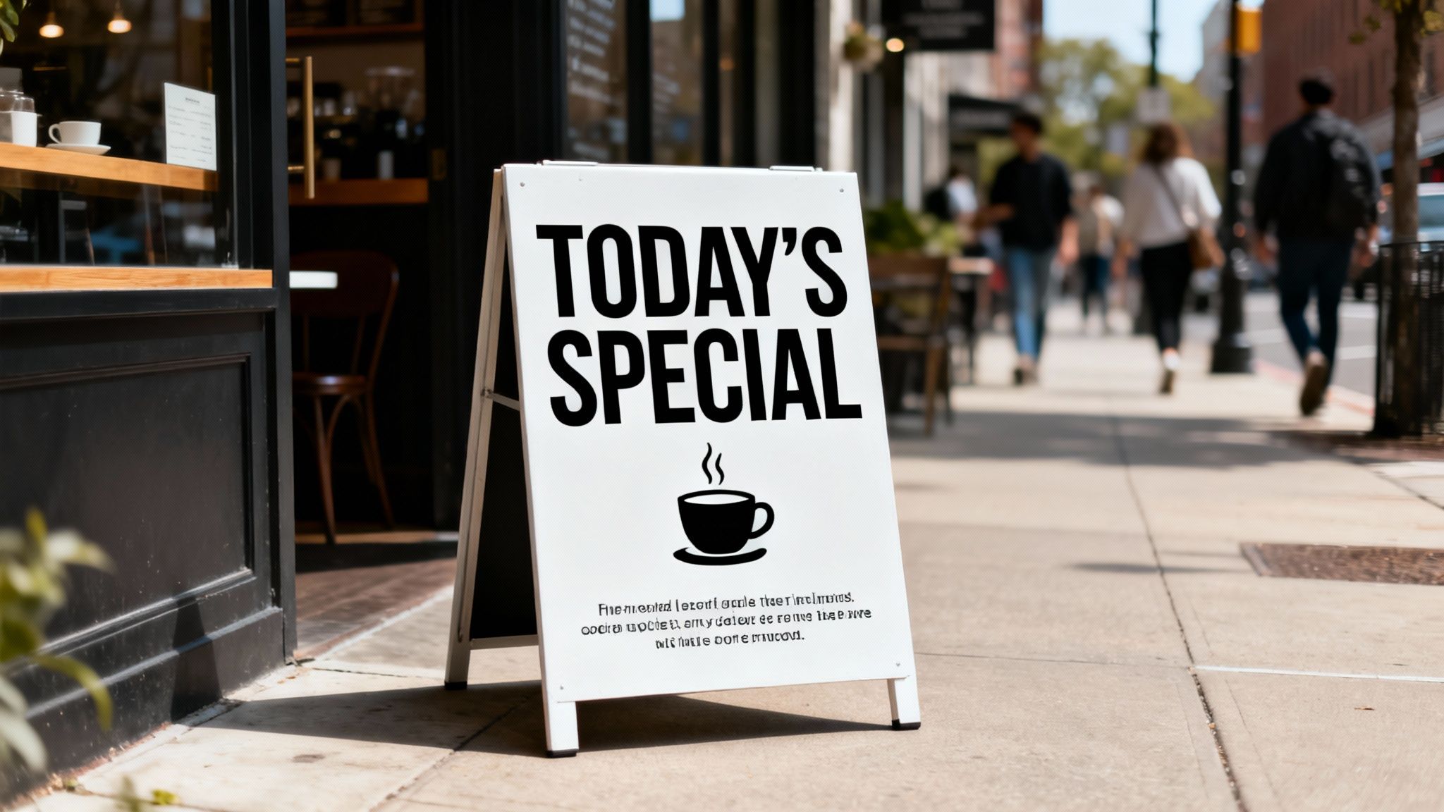
- The Daily Special: It's a classic for a reason. A "Soup of the Day" or a "4-6 pm Happy Hour" creates a real sense of urgency. It’s here today, gone tomorrow.
- Witty Quotes & Humour: Something like, "Our coffee is a hug in a mug. A very, very hot hug." A bit of humour lowers people's guard and makes your brand feel approachable.
- Loyalty Programme Promos: Use the sign to get people on board. "Your 7th coffee is on us! Ask inside for a card."
Your sandwich board is your business’s personality on a platter. It’s the perfect opportunity to show people what you’re all about before they even step through the door.
Service Providers and Real Estate Agents
Move away from food and retail, and you'll see sandwich boards playing a more functional, but no less important, role. For a real estate agent, these signs are an absolute must for pulling traffic and getting maximum eyeballs during a crucial open home.
Think about it: an agent can use a series of matching signs to create a clear breadcrumb trail for potential buyers. Simple directional arrows and consistent branding not only guide visitors but also build a professional presence across the whole neighbourhood. It cements their reputation as the local expert.
- Open Home Directionals: Clean, simple signs with a bold arrow and the open home address. This is non-negotiable for guiding traffic.
- Event & Workshop Promotion: A local yoga studio could advertise a new beginner's workshop, or an accountant might promote a tax seminar for small businesses.
- Highlighting a Key Feature: For a property, a sign might scream "Open Home Today – Epic Sea Views!" to spark curiosity and focus on a unique selling point.
By using these real-world examples as a starting point, you can start building a strategy that turns your sandwich board from a static object into a hard-working, profitable part of your marketing.
Maintaining Your Sign for Lasting Impact
A scuffed, faded, or dirty sign does more than just look a bit shabby; it can actively hurt your brand’s image. Think of your sandwich board as a handshake with every potential customer who walks past. Keeping it in top shape is a non-negotiable part of making a great first impression and getting the most out of your investment.
The good news is, this doesn't have to be a major chore. A few simple, regular habits can make a huge difference, extending your sign's lifespan and ensuring it stays a sharp, appealing asset for your business. It’s all about showing you care about the details.
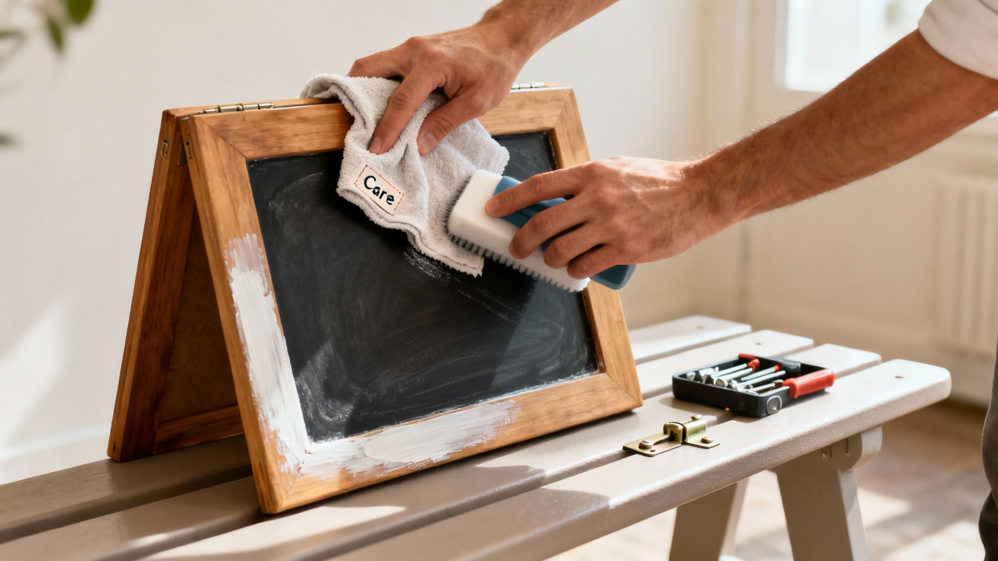
Routine Cleaning and Care
How you clean your sign comes down to what it's made of. The golden rule is to always start gentle, because harsh chemicals or abrasive scrubbers can easily ruin the finish and fade your message.
- Chalkboards: To avoid that frustrating "ghosting" effect where old messages linger, just wipe the board with a damp cloth and let it dry completely. For a deeper clean, a mix of water and a tiny bit of vinegar often does the trick, but always test it on a small, hidden corner first.
- Printed Inserts (Corflute/PVC): All you need here is a soft cloth and some mild, soapy water. Steer clear of any solvent-based cleaners – they can strip the ink and destroy the protective UV coating.
- Wooden Frames: A quick wipe with a damp cloth will usually do. If the finish is starting to look a bit tired, a fresh coat of weatherproof varnish once a year will keep it protected from the New Zealand weather.
A clean sign is a trustworthy sign. Taking just five minutes at the end of the day to wipe down your board ensures it’s always ready to represent your business at its best.
Simple Storage and Repair Tips
Being smart about storage is your best defence against unnecessary wear and tear. While most signs are built to be weather-resistant, they aren't bulletproof. The single best thing you can do to make your sign last is to bring it inside overnight and during bad weather like heavy rain or strong winds.
Catching small issues early can save you from bigger headaches down the track. Keep an eye out for loose hinges and tighten any wobbly screws. If you spot a chip in a painted frame, a quick touch-up with matching paint will seal it off and stop moisture from creeping in and causing real damage.
Common Questions About Sandwich Board Signage
Diving into the world of sandwich boards can bring up a few questions. From navigating council rules to figuring out the costs, getting straight answers is key to making a smart investment for your business. Let's tackle some of the most common queries we hear from Kiwi business owners.
Do I Need a Permit for My Sign in NZ?
This is the big one, and the short answer is: it depends on your local council. Most councils across New Zealand have specific rules about signs on the footpath. While you might not need a formal permit for a single A-frame, you absolutely must follow their placement guidelines.
Some city centres and main streets have much stricter policies, and you might need to register your sign or pay a small fee. The best first step is to visit your local council’s website and search for their "Signage Bylaw" or "Footpath Management Policy". Checking first saves you from potential fines and keeps the footpath safe for everyone.
What Is the Most Weather-Resistant Board?
For New Zealand’s four-seasons-in-one-day weather, you can't go past heavy-duty plastic or metal A-frames. I always recommend looking for models with a hollow base that you can fill with water or sand. That extra weight is a game-changer for keeping your sign upright when a southerly blows through.
To get the most life out of your sign, make sure the graphics are printed on a durable material like Aluminium Composite Material (ACM) or correflute with UV-cured inks. These are built to stand up to the harsh Kiwi sun and will resist fading far longer than a simple painted wooden sign or a paper insert.
How Much Should I Expect to Pay?
The price tag on a sandwich board really comes down to the material, size, and how much custom printing you need. Here's a rough guide:
- Entry-Level: A basic, lightweight correflute A-frame will set you back around $80 to $120. These are great for short-term promotions.
- Mid-Range: A classic wooden chalkboard sign usually sits in the $150 to $250 price bracket. Perfect for cafes and bars that change their specials daily.
- Premium Quality: For a sturdy, custom-printed plastic or metal frame designed to last for years, you’re looking at $250 to $400+.
Think of it less as a cost and more as a long-term investment in your street-front advertising. It's working for you every single day.
Ready to create a sign that stops people in their tracks and brings your brand’s story to the street? At SONI DESIGN, we specialise in crafting high-quality, eye-catching signage that makes your vision come alive. Let's design something extraordinary together at https://www.sonidesign.co.nz.
Leave a Comment
Stay home & get your daily
needs from our shop
Start You'r Daily Shopping with Nest Mart