
Your cart is currently empty.
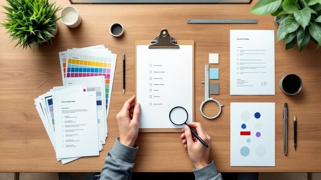
In the world of professional printing, the difference between an acceptable result and an exceptional one lies in the details. A single oversight in colour, alignment, or finishing can compromise an entire project, leading to costly reprints and damaging your brand's reputation. This is where a rigorous printing quality control checklist becomes an indispensable tool for any business. It’s not simply about catching errors; it’s a systematic framework for guaranteeing that every brochure, business card, and poster meets the highest standard of excellence.
Implementing these checks is a core component of a wider strategy. To ensure every printed piece meets the highest standards, it's essential to implement robust measures, similar to broader principles of document quality control. This comprehensive guide provides a step-by-step checklist to transform your creative vision into a tangible, flawless reality. We will explore the critical checkpoints required to ensure perfection from the initial file prep through to the final finished product. By following this process, you can confidently deliver print work that consistently impresses clients and reinforces your commitment to quality. Let's delve into the essential stages of a successful print run.
1. Colour Accuracy and Consistency
First on any comprehensive printing quality control checklist is colour accuracy. This crucial step ensures that the colours in your final printed product perfectly match the intended design, maintaining brand integrity and visual appeal. It involves a systematic approach to managing colour from the digital screen to the physical print, preventing costly and disappointing mismatches.
Effective colour management relies on standardised systems and calibrated equipment to produce predictable and repeatable results. Think of global brands like Coca-Cola or McDonald's; their signature red and gold are instantly recognisable because they are meticulously controlled across every single piece of marketing material, from a billboard in Auckland to a flyer in Wellington. This level of consistency builds brand trust and is achievable for any business that prioritises colour management.
Implementing Colour Control
Achieving consistent colour is not about guesswork; it is a technical process. The goal is to create a closed-loop system where all devices (monitors, proofers, and presses) are synchronised to a common colour standard.
- Device Calibration: Regularly calibrate your monitors using a colorimeter. This ensures that what you see on screen is a true representation of the final colour. Printers and presses must also be calibrated for specific paper types and ink sets.
- ICC Profiles: Use International Colour Consortium (ICC) profiles. These files act as translators, defining how a specific device reproduces colour. Applying the correct ICC profile for your chosen paper and press is essential for accurate output.
- Controlled Lighting: Evaluate proofs and final prints under standardised lighting conditions (like a D50 light booth). Colour can appear drastically different under office fluorescent lights versus natural daylight.
Key Insight: The human eye is subjective, but a spectrophotometer is not. Using measurement tools to define acceptable colour variation with a Delta E value removes ambiguity and provides a concrete, data-driven benchmark for approval.
Putting It Into Practice
For businesses in marketing, design, or retail, where brand perception is paramount, stringent colour control is non-negotiable. It should be implemented before any major print run. For instance, a real estate agency printing property brochures must ensure the lush green of a lawn or the deep blue of a swimming pool is vibrant and accurate to attract potential buyers. Similarly, a restaurant’s menu must present food photography with appetising, true-to-life colours.
The following summary box highlights the core metrics for maintaining strict colour accuracy.
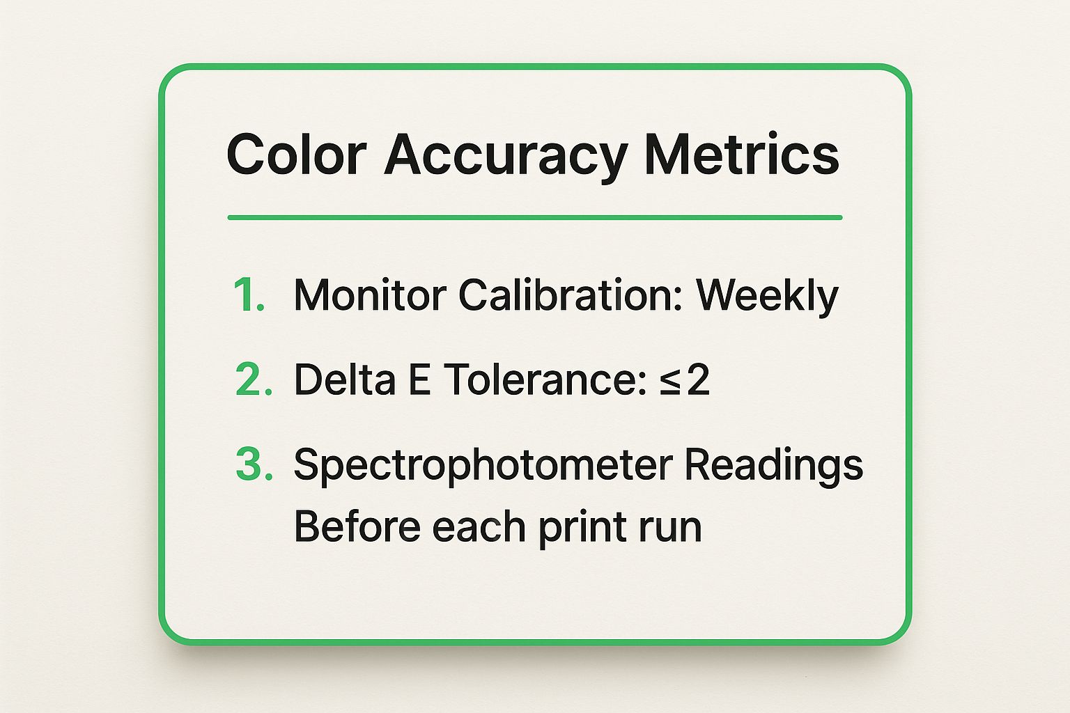
These metrics provide a clear, actionable framework for ensuring your colours remain consistent from the first print to the last. By embedding these checks into your workflow, you guarantee that your brand’s visual identity is protected and professionally represented.
2. Registration and Alignment
Following colour, the next critical point in any printing quality control checklist is registration and alignment. This technical step ensures that all separate colour layers (typically cyan, magenta, yellow, and black) and other graphic elements are printed in the correct position relative to each other. When registration is perfect, the result is a crisp, sharp image; when it's off, you see blurry text, colour fringing around images, and a generally unprofessional finish.
Precise alignment is fundamental to professional printing, a standard championed by press manufacturers like Heidelberg and Komori. Think of a high-end fashion magazine where a model's portrait must be perfectly sharp, or product packaging where die-cut lines must align exactly with the printed branding. Even a slight misalignment can compromise the entire print run, turning a high-impact design into a low-quality product.
Implementing Registration Control
Achieving perfect alignment involves meticulous setup and continuous monitoring. Modern printing presses have automated systems, but manual checks are still vital for catching subtle drifts before they become major problems.
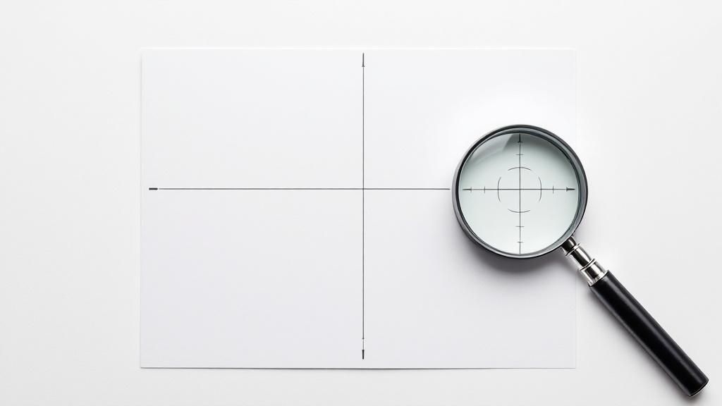
- Use Registration Marks: Ensure your print files include registration marks (small crosshairs or targets) outside the trim area on every colour separation. These marks are the printer's guide for lining up the plates perfectly.
- Check Across the Sheet: Don't just check one area. Examine alignment at multiple points across the printed sheet, including the centre and all four corners, as registration can vary.
- Maintain Machine Tension: Proper paper feed tension and press settings are crucial. Inconsistent tension can cause the paper to stretch or shift slightly as it moves through the press, leading to misalignment.
- Monitor Throughout the Run: Registration should be checked at the start of the print run and then periodically throughout. This ensures that mechanical vibrations or other factors don't cause the alignment to drift over time.
Key Insight: While a single misaligned print might seem minor, the cumulative effect across thousands of copies can destroy brand credibility. Perfect registration is a non-negotiable mark of a high-quality, professional print job.
Putting It Into Practice
Precise registration is essential for any project where clarity and detail are important. For a law firm printing official documents or an architectural firm presenting detailed blueprints, any blurriness can undermine the material's authority and professionalism. Likewise, a retail business producing catalogues must ensure product images are sharp and clear to drive sales.
The video below offers a visual demonstration of how press operators check and adjust registration to achieve perfect alignment.
By making registration checks a mandatory part of your quality control process, you ensure that every detail of your design is rendered with the precision it deserves, safeguarding the quality and impact of your final printed materials.
3. Ink Coverage and Density
Following colour accuracy, the next critical element in any printing quality control checklist is managing ink coverage and density. This technical step ensures the correct amount of ink is applied to the paper to achieve the intended saturation and detail without causing printing issues like smudging or excessive drying times. It’s about striking a perfect balance to produce crisp text and vibrant, rich images.
Proper ink density control is fundamental for consistency across a print run. Imagine a high-end magazine where photographs on page 10 are noticeably lighter or less saturated than identical brand colours on page 50. This inconsistency detracts from the professional look and feel. Organisations like FOGRA and popularised by instrument makers such as Techkon have set standards that allow printers to measure and control ink application precisely, ensuring every single copy meets the same high standard.
Implementing Ink Density Control
Achieving optimal ink coverage is a science of measurement and adjustment. The primary goal is to maintain a consistent ink film thickness on the paper, which directly impacts the visual result. This is monitored using a densitometer to measure Solid Ink Density (SID).
- Establish SID Targets: Before printing, define specific SID values for each ink colour (Cyan, Magenta, Yellow, Black) based on the chosen paper stock. Coated and uncoated papers absorb ink differently and require unique targets.
- Regular Monitoring: During the print run, measure ink density at regular intervals, typically every 250 to 500 impressions. This allows for early detection and correction of any variations.
- Automate Adjustments: Modern printing presses often feature automatic ink key adjustment systems. These systems use scanners to measure density across the sheet and automatically adjust ink flow to maintain the established targets.
- Document Settings: For repeat jobs, meticulously document the optimal density settings, paper type, and press conditions. This creates a reliable baseline for future runs, guaranteeing consistent results every time.
Key Insight: Ink density is not just about colour; it directly affects dot gain, the phenomenon where halftone dots print larger than intended. Controlling density is therefore crucial for maintaining fine details, clear text, and accurate tonal transitions in images.
Putting It Into Practice
Precise ink control is essential in any project where visual quality is paramount. For instance, in packaging printing, consistent and vibrant brand colours are vital for shelf appeal and brand recognition. A consumer goods company cannot afford for its signature blue to look washed out on one box and oversaturated on another. Likewise, in high-quality book printing, controlling black ink density ensures text is sharp and highly legible without bleeding, providing a comfortable reading experience.
By implementing these checks, you move from subjective visual assessment to objective, data-driven quality control. This systematic approach ensures that ink application remains stable and predictable, protecting the integrity and quality of the final printed product from start to finish.
4. Paper Quality and Substrate Inspection
Beyond ink and imagery, the physical foundation of any print job is the paper or substrate itself. Paper quality and substrate inspection is a critical part of any printing quality control checklist, ensuring the chosen material is flawless and suitable for the project. This step involves a detailed examination of the printing surface for consistency, defects, and characteristics that directly influence the final output’s look, feel, and durability.
The substrate dictates how ink is absorbed, how colours appear, and the overall tactile experience of the finished product. For example, a high-end art book requires a paper with a smooth, uniform surface to reproduce fine details, while business cards printed on a textured, heavy stock convey a sense of premium quality. Ignoring this check can lead to issues like mottling, poor ink adhesion, or physical defects that compromise the entire print run, wasting both time and resources.
Implementing Substrate Control
Ensuring your paper meets the required standard involves more than just a quick visual check. It is a methodical process of verification and proper handling from delivery to the press. The goal is to catch any potential issues before they impact production.
- Inspect on Arrival: Check paper consignments as soon as they are delivered. Look for damaged packaging, signs of moisture, or obvious defects. Compare the delivery dockets against your order to confirm the correct weight, finish, and stock type has been supplied.
- Climate-Controlled Storage: Paper is highly susceptible to environmental changes. Store it in a climate-controlled area with stable humidity and temperature to prevent warping, curling, or changes in moisture content that can cause press jams and inconsistent ink absorption.
- Sample Sheet Testing: Before committing to a full production run, always perform a test print on a few sample sheets from the actual batch you plan to use. This confirms compatibility with the inks and press setup, and reveals any hidden surface imperfections.
Key Insight: The specified paper weight (GSM) and the actual paper weight can sometimes differ between batches. Using a calibrated paper scale to verify a sample provides an objective measure of consistency, ensuring the final product has the intended heft and feel.
Putting It Into Practice
This inspection is vital for any project where the material itself is part of the brand message. For a luxury retail brand creating premium packaging, the substrate must be free from any blemishes to reflect the quality of the product inside. Similarly, a cafe printing menus on recycled, uncoated stock needs to ensure the paper’s texture is consistent and enhances its eco-friendly aesthetic, rather than detracting from it with flaws.
By formalising your substrate inspection process, you guarantee that the foundation of your print job is as perfect as the design printed on it. This proactive check prevents costly reprints and ensures the final piece meets both your and your customers’ expectations.
5. Text and Image Sharpness
Beyond colour, the sharpness and clarity of your text and images are fundamental to a professional-quality print job. This element of a printing quality control checklist involves evaluating printed elements to ensure they are crisp, clear, and free from any blur, ghosting, or misregistration. Sharp details convey precision and high standards, directly impacting readability and the overall visual impact of your material.
Unsharp text or blurry images can render your message ineffective and make your brand appear careless. Consider a medical textbook with detailed anatomical diagrams or a high-end fashion magazine; in both cases, absolute clarity is non-negotiable. Achieving this level of definition requires careful attention to file preparation, screen technology, and press settings, ensuring every line and pixel is rendered perfectly.
Implementing Sharpness Control
Ensuring sharp output is a technical process that starts long before the ink hits the paper. It's about translating high-resolution digital assets into equally high-definition physical prints, maintaining clarity from the original file to the final product.
- Verify Image Resolution: Before printing, ensure all images are at a minimum resolution of 300 dots per inch (DPI) at their final print size. Low-resolution images are a primary cause of blurriness.
- Use Appropriate Screening: The screen ruling, measured in lines per inch (LPI), determines the detail level. A fine LPI is suitable for glossy paper viewed up close (e.g., in a fashion catalogue), while a coarser LPI might be necessary for newsprint to avoid ink bleed.
- Check for Registration: Examine prints for perfect registration, where each colour plate aligns precisely. Misregistration causes colour fringes and a noticeable loss of sharpness, especially in small text or detailed line art.
Key Insight: Sharpness isn't just about resolution. Factors like dot gain (how much an ink dot spreads on paper), substrate absorbency, and press calibration all play a critical role. A holistic check is essential for consistently crisp results.
Putting It Into Practice
This check is crucial for any material where fine details are essential for function or perception. For instance, a company printing a technical manual must ensure that small-print instructions and complex schematics are perfectly legible to avoid user error. Similarly, a real estate brochure relies on sharp, high-definition photos to make properties look appealing and professional.
By systematically inspecting for sharpness at multiple points across the print sheet, you can catch and correct issues early. This guarantees that whether it’s a tiny legal disclaimer or an intricate product photograph, every element is presented with the clarity it deserves, reinforcing your brand’s commitment to quality.
6. Finishing and Binding Quality
The final step in any comprehensive printing quality control checklist is a meticulous review of finishing and binding. This crucial stage transforms flat printed sheets into a functional, professional product. It covers all post-press operations, including cutting, folding, binding, and the application of special finishes, ensuring the end product is not only visually appealing but also durable and correctly assembled.
Effective finishing transforms a simple print job into a high-value item. Consider a luxury property brochure with a sleek matte laminate and a perfectly aligned saddle-stitch, or a perfect-bound annual report for a financial services firm that must withstand frequent handling. The quality of these final touches, popularised by industry leaders like Heidelberg and Horizon, directly reflects on the brand's perceived value and attention to detail.
Implementing Finishing and Binding Control
Ensuring quality at this final stage requires a series of physical checks against the project's original specifications. Precision is paramount, as even minor errors in cutting or folding can render an entire print run unusable.
- Verify Dimensions and Folds: Use a ruler and the original proof to check that final trimmed dimensions are exact. For folded items like brochures or menus, ensure all folds are crisp, precisely aligned, and in the correct sequence.
- Test Binding Strength: For saddle-stitched, perfect-bound, or wire-bound documents, physically test the integrity of the binding. Pages should not detach with a gentle but firm pull, and the spine must be securely glued and squared.
- Inspect Finishes: Check any special coatings, like spot UV or laminates, for uniform application. Look for bubbling, peeling, or misalignment, as these defects can undermine the product's professional appearance.
Key Insight: The final finishing and binding stage is where a product gains its tactile and structural character. A flawless finish builds user confidence and enhances the perceived quality, while a poor finish can instantly devalue even the most perfectly printed design.
Putting It Into Practice
This quality check is non-negotiable for any product that requires assembly or has a tactile finish. For instance, a hospitality business creating menus needs to ensure the lamination is flawless to protect against spills and frequent use. Similarly, an event manager producing conference programmes must guarantee the saddle-stitching is robust enough to last the duration of the event.
By systematically inspecting these finishing elements, you ensure the final product delivered to your client or customer is structurally sound, accurately constructed, and professionally presented, meeting every expectation set in the initial brief.
7. Final Inspection and Packaging
The last line of defence in any printing quality control checklist is the final inspection and packaging stage. This critical checkpoint ensures the finished product not only meets the client's specifications but is also prepared for safe transit and delivery. It is a comprehensive review that verifies quantity, checks for final defects, and confirms that every piece is protected against damage.
Effective final inspection is a systematic process, not a rushed final glance. It's the culmination of all previous quality steps, guaranteeing that the effort invested in colour accuracy and registration translates into a perfect final product. For high-value items, like a limited-edition art print run, this stage includes verifying edition numbers and ensuring archival-quality packaging. For large corporate orders, it involves batch-checking brochures to confirm consistency before bundling them for distribution.
Implementing Final Inspection and Packaging
A structured approach to this final review prevents defective products from ever reaching the client, protecting your reputation and avoiding costly reprints. The goal is to standardise the process so it is repeatable and reliable for every job.
- Create Standardised Checklists: Develop a detailed inspection checklist for different job types. This should cover quantity, dimensions, colour, finishing, and any specific client requirements.
- Use Appropriate Lighting: Conduct inspections in a well-lit area, preferably under controlled lighting conditions, to easily spot subtle defects like scuffs, smudges, or inconsistencies.
- Secure and Protect: Package materials appropriately for their end-use and transit method. Use shrink-wrapping to prevent moisture damage, sturdy boxes to avoid crushing, and padding to stop movement and corner damage.
- Document Everything: Keep detailed records of the final inspection results. This data is invaluable for quality management, process improvement, and accountability, forming a key part of ISO 9001 compliance.
Key Insight: The way a product is packaged is the first physical impression a client has of the completed job. Professional, secure packaging communicates a commitment to quality that extends beyond the print itself.
Putting It Into Practice
This final quality gate is non-negotiable for any business that relies on delivering professional-grade printed materials. A marketing agency sending out a campaign must be confident that every single mailer is flawless. Similarly, a business preparing product boxes must ensure they are structurally sound and visually perfect before they are filled and shipped to retailers. Leveraging the right online proofing tools earlier in the workflow can significantly reduce the number of errors that reach this final stage, but it never replaces the need for a physical check.
By formalising this last step, you ensure that the quality you worked so hard to achieve during production is preserved all the way into the client's hands, reinforcing their confidence in your services.
7-Point Printing Quality Checklist Comparison
| Aspect | Color Accuracy and Consistency | Registration and Alignment | Ink Coverage and Density | Paper Quality and Substrate Inspection | Text and Image Sharpness | Finishing and Binding Quality | Final Inspection and Packaging |
|---|---|---|---|---|---|---|---|
| Implementation Complexity 🔄 | High - requires precise calibration and color management systems | High - precision equipment & skilled operators needed | Medium - frequent monitoring and adjustments | Medium - detailed inspection needed | Medium - resolution and screening optimization | High - multiple finishing processes and inspections | Medium - thorough visual and quantity checks |
| Resource Requirements ⚡ | Expensive color measurement devices & software | Specialized registration tools and monitoring systems | Densitometers and ink control systems | Moisture meters, smoothness & porosity testers | High-res imaging and magnification tools | Binding machines, coating equipment, skilled operators | Inspection area, lighting, packaging materials |
| Expected Outcomes 📊 | Consistent, brand-accurate colors across prints | Sharp, correctly aligned prints without blurring or ghosting | Uniform ink density with optimal color saturation | Defect-free, consistent substrates for quality printing | Crisp, clear text and images ensuring readability | Professional finish with durable binding and coatings | Defect-free, properly packaged products ready for shipment |
| Ideal Use Cases 💡 | Brand-sensitive packaging, marketing materials, corporate identity | Multi-color printing, packaging with die cuts, newspapers & mags | Magazines, packaging with vibrant colors, books | High-end art books, specialty substrates, quality-sensitive jobs | Technical manuals, high-res photos, small detailed text | Books, luxury packaging, magazines | Final quality assurance before shipping |
| Key Advantages ⭐ | Ensures brand trust and reduces costly reprints | Prevents misalignment defects and waste | Optimizes ink use, reduces defects like blocking | Prevents print defects, ensures substrate suitability | Enhances readability and visual impact | Improves product appearance, prevents binding & finishing faults | Guards against shipping damage, confirms order accuracy |
Elevate Your Print Projects with a Commitment to Quality
Navigating the complexities of print production can seem daunting, but as we've detailed, a systematic approach transforms it into a manageable and rewarding process. This comprehensive printing quality control checklist isn't just a list of tasks to tick off; it's a powerful framework for achieving consistent, professional, and visually stunning results every single time. By embracing this structured methodology, you move from hoping for a good outcome to engineering one.
The journey from a digital file to a tangible printed piece is filled with critical checkpoints. We've explored the seven pillars of print quality, from the foundational prepress stages to the final moments before dispatch. Mastering each one ensures your final product is not just acceptable, but exceptional.
Key Takeaways for Flawless Execution
Let's recap the core principles that will elevate your print game:
- Colour is Communication: Precise colour accuracy and consistency aren’t just technical details; they are fundamental to your brand's identity and the emotional impact of your design. Using calibrated monitors and physical proofs is non-negotiable for getting this right.
- Precision Defines Professionalism: Misaligned plates or sloppy registration can instantly cheapen an otherwise beautiful design. Paying close attention to trim marks, bleed, and alignment is what separates amateur work from professional-grade production.
- Finishing is the Final Word: The quality of the binding, cutting, and folding makes the first physical impression. A perfectly printed piece can be let down by poor finishing, so this final stage deserves as much scrutiny as the first.
Implementing this checklist demystifies the printing process. It empowers you, your team, and your print provider with a shared language and a clear set of standards. This proactive approach minimises costly errors, prevents frustrating reprints, and eliminates delays, ultimately saving you time and money. More importantly, it builds a reputation for reliability and excellence.
The true value of a meticulous printing quality control checklist lies in its ability to consistently translate your creative vision into a physical product that you can be proud of. It’s a commitment to your brand, a sign of respect for your audience, and the definitive mark of a true professional. By integrating these checks into your workflow, you ensure every project, from a simple flyer to a complex catalogue, meets the highest standard of quality and achieves its intended purpose with flawless impact.
At SONI DESIGN, this rigorous attention to detail isn't just a process; it's our promise. We live and breathe quality control, embedding this checklist into every project to ensure your vision is realised perfectly. Partner with a team that is as committed to your project's success as you are by visiting SONI DESIGN to start your next print masterpiece.
Leave a Comment
Stay home & get your daily
needs from our shop
Start You'r Daily Shopping with Nest Mart