
Your cart is currently empty.

Before you can even think about hitting 'print', you've got to get your tools sorted. Creating a truly stunning canvas print hinges on three key things: your printer, the ink you use, and the canvas itself. Getting this trifecta right from the get-go saves you a world of headaches and wasted materials down the line. It's the foundation for turning a digital file into a piece of art that looks exactly how you pictured it.
Choosing Your Canvas Printing Gear
Diving into canvas printing means making a considered investment in your equipment. These choices will directly shape the lifespan, colour accuracy, and overall punch of your prints. I always tell people to think of their gear less like tools and more like partners in the creative process.
For a lot of folks in New Zealand, this is more than just a hobby. There's a real opportunity to build a profitable business around canvas printing, thanks to the constant demand for custom wall art—everything from family portraits to bespoke office décor. It’s a surprisingly scalable industry; you can start relatively small and grow from there. To get a feel for the business side, it's worth reading up on the potential of a canvas printing business and how to get started on customcanvas.co.nz.
Selecting the Right Printer and Inks
At the heart of any professional setup is, of course, the printer. If you're serious about printing on canvas, a large-format inkjet printer is completely non-negotiable. Stick with the big names like Epson, Canon, or HP, and look for models specifically built for fine art or "giclée" printing.
There are a couple of specs you really need to pay attention to. The print width is a big one; a 24-inch model is a fantastic starting point that gives you plenty of flexibility. The other is resolution, measured in DPI (dots per inch). A higher DPI, like 2880 x 1440, means you can reproduce incredibly fine details and beautifully smooth colour transitions.
Now, let's talk ink. This decision is, in many ways, even more important than the printer itself. You'll be choosing between dye-based and pigment-based inks, and for canvas, there’s a clear winner.
Pigment-based inks are the undisputed champion for archival-quality canvas prints. They're made of microscopic solid particles suspended in a liquid. Instead of soaking in, they sit right on top of the canvas fibres. This gives them incredible lightfastness and water resistance, meaning your prints will fight off fading for a century or more.
Dye-based inks, on the other hand, are made of colourants dissolved in liquid. While they can look incredibly vibrant at first, they soak into the canvas and are notoriously vulnerable to fading from UV light and damage from moisture.
To make the choice crystal clear, here’s a quick rundown of how they stack up.
Printer Ink Comparison for Canvas
This table breaks down the essential differences between pigment and dye-based inks, helping you see why one is the professional standard for canvas work.
| Feature | Pigment-Based Inks | Dye-Based Inks |
|---|---|---|
| Longevity | Archival quality; can last 100+ years | Fades within a few years |
| Water Resistance | Excellent; smudges are much less of an issue | Poor; highly susceptible to moisture damage |
| Colour Gamut | Good, with exceptionally deep, rich blacks | Excellent, known for incredibly vibrant, punchy colours |
| Best For | Fine art, photography, and any archival-quality prints | Quick photo prints for albums, temporary displays |
Ultimately, for any print you want to sell or hang on a wall for years to come, pigment ink is the only way to go.
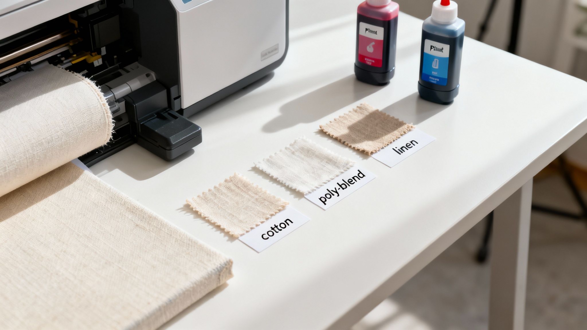
Choosing Your Canvas Material
The final piece of your equipment puzzle is the canvas itself. Trust me, not all canvas is created equal. The material blend directly impacts the final texture, its long-term durability, and how it absorbs colour.
You’ll generally come across three main types:
- 100% Cotton Canvas: This is the traditional choice, and for good reason. It has a beautiful, classic texture that artists love, and it’s great at absorbing ink to produce warm, rich tones.
- Polyester-Cotton Blends: A hugely popular modern option that really offers the best of both worlds. The polyester adds strength and a brighter white base for colours to pop, while the cotton keeps that authentic canvas feel.
- 100% Polyester Canvas: This synthetic option provides a very smooth, consistent surface. Its main advantage is dimensional stability, meaning it’s far less likely to sag over time, making it a go-to for high-volume commercial printing.
Don’t forget about the finish, either. A gloss or satin finish will make your colours more vibrant and boost contrast, which can be great for photography. A matte finish, however, gives you that classic, non-reflective fine-art look that's perfect for hanging in brightly lit rooms. My best advice? Get your hands on some sample packs from different suppliers. There’s no substitute for seeing and feeling the material before you commit to buying a whole roll.
Getting Your Digital Files Ready for Canvas
The journey from a digital image to a stunning physical print starts long before a single drop of ink hits the canvas. Honestly, getting your digital file right is probably the most critical part of the whole process. It dictates the final quality, the colour accuracy, and the sharpness of your art.
Think of it like this: if you don't get the foundations right, the whole house will have problems. Any mistakes you make at this digital stage will absolutely show up in the finished print.
Proper file prep is all about making sure the vibrant image you see on your screen translates faithfully to the textured surface of canvas. This isn't just about hitting "save." It’s about understanding resolution, getting a handle on colour management, and making a few key adjustments for the unique way canvas behaves.
Nailing the Resolution and Dimensions
First things first: resolution isn't negotiable. If you want to print on canvas, you need a high-resolution file. Anything less, and you're heading straight for a blurry, pixelated mess.
The gold standard in the industry is 300 DPI (dots per inch) at the final print size. So, if you're planning a 16x20 inch print, your digital file needs to be 4800 x 6000 pixels. Simple as that.
Sure, for massive prints that will be viewed from across a room, you might get away with a lower DPI, maybe 150 at a push. But for anything that people will see up close, stick to 300 DPI. It's the difference between a crisp, professional print and something that just looks a bit soft and amateurish.
Mastering Colour Management
I can't stress this enough: what you see on your monitor is not what your printer will produce by default. This is where a proper colour-managed workflow saves the day. It’s a system that keeps your colours consistent all the way from the screen to the final print.
It all begins with calibrating your monitor. You'll need a hardware tool for this, like a SpyderX or a Calibrite i1Display. This step is non-negotiable because it ensures your screen is actually showing you accurate colours, giving you a reliable starting point.
Next, you need the right ICC profile. This little file is a map that tells your computer how your specific combination of printer, ink, and canvas reproduces colour. Printer and canvas manufacturers provide these profiles, and using the correct one is absolutely vital for getting accurate colour on canvas.
A pro tip I always share is to use soft proofing in your editing software like Adobe Photoshop or Lightroom. This feature simulates how your image will look when printed with a specific ICC profile. It lets you see any potential issues and make targeted tweaks to brightness, contrast, and saturation before you waste any of that expensive ink and canvas.
Prepping for the Gallery Wrap
One of the most popular ways to finish a canvas is the gallery wrap, where the image folds around the wooden stretcher bars. It gives you a beautiful, clean, frameless look, but it does require some careful prep work to make sure you don't lose key parts of your image over the sides.
You'll need to add extra image area—often called a "bleed"—around your main subject. For a standard 1.5-inch deep frame, I'd recommend adding at least 2 inches of extra image on all four sides to be safe.
Here are a few techniques I use to create that wrap-around border:
- Content-Aware Fill: This is a lifesaver in Photoshop. You just extend the canvas size and let the Content-Aware Fill tool intelligently generate new pixels that seamlessly match the edges of your image. It works brilliantly for photos with organic, non-repeating backgrounds like landscapes, skies, or abstract patterns.
- Mirrored Edges: Another go-to method is to simply mirror the outer 1.5-2 inches of your image. This creates a continuous effect around the sides without you having to crop into your original composition.
- Solid Colour Border: For a cleaner, more modern look, you can just add a solid border. Black or white is classic, but picking a complementary colour from the image itself can look really sharp.
And one last thing: don't forget to sharpen your image specifically for canvas. The texture of the material has a natural softening effect, so a final, targeted sharpening pass is the secret to making the details pop.
Bringing Your Canvas Print to Life
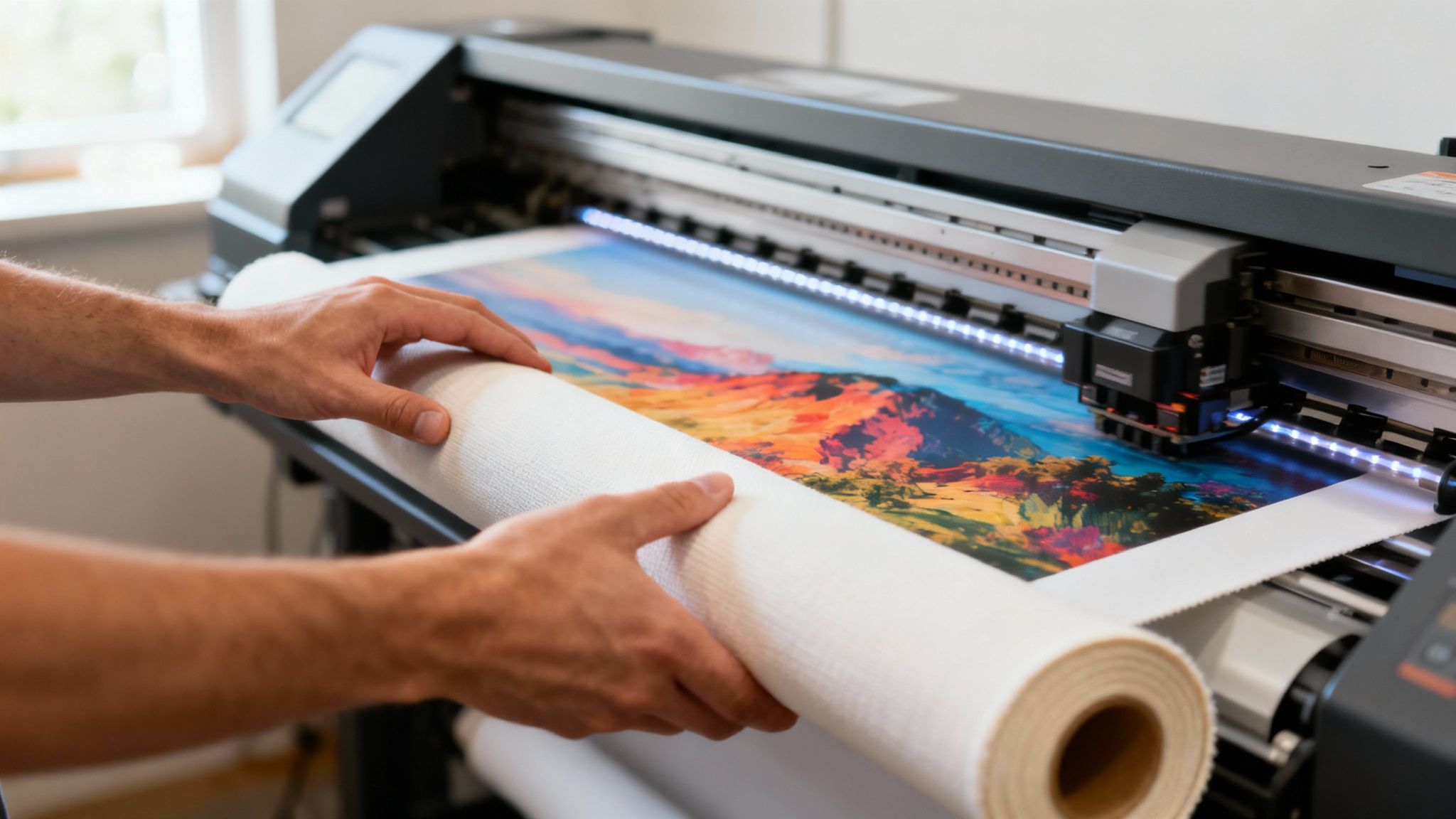
This is where all that careful prep work pays off. Your file is dialled in, the canvas is chosen, and it’s finally time to put ink to material. It can feel like you just need to hit 'Print', but a few deliberate steps right here will save you from wasting expensive canvas and ink.
The first potential stumble is loading the canvas itself. Whether you’re working with single sheets or a heavy roll, getting it to feed straight is everything. A crooked start almost guarantees a skewed, unusable print. I always take that extra minute to line up the leading edge perfectly with the printer’s guides, engaging the media levers slowly and evenly. It's a small thing that prevents big headaches.
Nailing the Printer Settings
With the canvas loaded, your attention turns to the printer driver on your computer. This is the control centre where you translate your digital file into physical commands for the machine. Never, ever just trust the default settings—they’re almost never optimised for the unique texture and absorbency of artist canvas.
I have a non-negotiable checklist for these settings on every single print job:
-
Media Type: This is priority number one. Your printer's menu should have a specific "Canvas" profile. If for some reason it doesn't, "Heavyweight Matte Paper" or a "Fine Art Paper" setting is usually the next best thing. Choosing the right media type tells the printer exactly how much ink to use and how high the print head should sit above the surface.
-
Print Quality: Crank it up to the highest setting available. Yes, it will slow the printing down significantly, but this is how you achieve maximum detail and smooth, beautiful colour gradients. For fine art reproduction, it's a trade-off you should always make.
-
Colour Management: Make sure this is handled by your editing software (like Photoshop), not the printer. This forces the printer to obey the ICC profile you used for soft-proofing, which is the key to getting predictable, accurate colours.
Getting these details right is more important than ever. While some parts of the Kiwi printing industry are facing challenges, the global demand for canvas is booming. The canvas roll market is projected to hit USD 1483.6 million by 2035, thanks to a huge appetite for fine art and custom interior décor. You can read more about the canvas roll market growth on futuremarketinsights.com.
The Critical Drying Phase
Once the printer finishes its last pass, the golden rule is: don't touch it. Pigment inks need time to cure and properly bond with the canvas fibres. They sit on the surface at first, and handling a print too early is the fastest way to leave a permanent smudge or fingerprint.
I have a strict personal rule: every canvas print gets a full 24 hours to dry in a clean, dust-free space before I even think about varnishing or stretching it. Think of this patience as the final step in quality control—it protects all the hard work you’ve already invested.
Finishing and Protecting Your Print
Once your print is bone dry—and I mean completely, give it at least 24 hours—it's time for the final, crucial step: sealing the deal. This isn't just an optional extra; it's what turns a fragile print into a lasting piece of art. A good varnish is your best defence against dust, moisture, and the dreaded fade from UV light.
Honestly, skipping this step is just asking for trouble. Unprotected inks can scuff with the slightest touch, and even the best archival inks will eventually lose their punch without a protective topcoat. Think of it as insurance for all your hard work. It also has the brilliant side effect of making the whole image 'pop'.
Choosing the Right Varnish
You've got two main ways to apply a varnish: with a high-density foam roller or out of a spray can. I've done it both ways countless times, and each has its pros and cons.
- Roll-On Varnish: This is my go-to method for most jobs. You get a much thicker, more substantial coat, which means better protection. It's also easier to get a perfectly even layer across the entire surface.
- Spray-On Varnish: A spray can is fantastic for highly textured canvases. The fine mist gets into all the little nooks and crannies that a roller might skim over. It takes a bit of practice to get a smooth coat without drips, so a light touch is key.
No matter which you choose, make sure you're in a clean, well-ventilated space. Dust is your enemy here. I always apply a minimum of two thin coats. Let the first one dry completely, then apply the second coat at a 90-degree angle to the first. This cross-hatch pattern guarantees you haven’t missed a spot.
Here's a pro tip: The varnish does more than just protect. It actually deepens the blacks and enriches the colour saturation, especially on a matte canvas. The difference is night and day.
Selecting the Perfect Sheen
The final piece of the puzzle is the sheen. This choice dramatically changes the final look and feel of the print, so think about the artwork itself and where it's going to hang.
You're generally choosing between matte, satin, or gloss. Here’s how I think about them:
| Finish Type | Visual Effect | Best For |
|---|---|---|
| Matte | Zero reflection. This gives a beautiful, soft, fine-art feel. | Prints that will be hung in a bright room with direct light. |
| Satin | A subtle, low-lustre finish. It boosts colour without creating harsh glare. | The perfect all-rounder for both photos and art reproductions. |
| Gloss | Very reflective and vibrant. It makes colours leap off the canvas. | High-impact photos with deep blacks and intense colours. |
When it comes to varnishing or even framing, knowing how different coatings work is a game-changer. For more on that side of things, you might find these expert tips for achieving a perfect finish really helpful for getting that professional edge.
In the end, the right finish doesn't just complete the process of printing onto canvas—it ensures your creation will look just as incredible years from now as it did the moment it came off the printer.
Stretching and Framing Your Canvas
Once your print is varnished and fully cured, it's time for the final, hands-on step: transforming that flat piece of fabric into a stunning piece of art ready for the wall. This is where you give your print structure and presence. Honestly, the stretching and framing process is what really separates a decent print from a truly gallery-worthy piece.
Stretching a canvas, particularly for a gallery wrap, requires a bit of patience and the right gear. A classic rookie mistake is getting the tension wrong, which leads to a saggy canvas down the track. My go-to toolkit is pretty simple but essential: a good pair of canvas pliers to get a solid grip and a quality staple gun. An electric one is a lifesaver for your hands if you're doing a few of these.
Achieving the Perfect Stretch
The aim here is a drum-tight surface, but without warping the image. I always begin by putting one staple right in the middle of one of the stretcher bars. Then, I grab my canvas pliers, pull the opposite side taut—not so hard that you distort things—and pop a staple directly across from the first one. I'll do the same for the other two sides, so I end up with a plus-sign pattern of staples holding the canvas in place.
That initial tension is your base. From there, you just work your way out from those centre staples toward the corners, always alternating between opposite sides. This method is the secret to getting that pressure spread evenly across the canvas, ensuring it stays tight and looks professional for years.
The part that trips most people up is getting those sharp, neat corners. I've found the best way to think about it is like wrapping a present. When you get to a corner, fold the canvas over into a clean 45-degree angle and secure it with a staple. A tidy fold is a dead giveaway of a professional job.
Choosing the Right Frame
While a gallery wrap can look incredible all on its own, adding a frame can provide that final, polished touch. The key is to pick a style that enhances the artwork, not one that overpowers it.
- Classic Frames: For traditional art reproductions or family portraits, you can't go wrong with classic wooden or ornate frames. They add a real sense of timelessness.
- Float Frames: These are my personal favourite for modern art and photography. The canvas sits inside the frame with a small gap, making it look like it's "floating." It’s a very sleek, contemporary look that adds a lot of depth without covering up any of the image itself.
Interestingly, the demand for personalised canvas art here in New Zealand is still going strong. While the wider printing industry has actually seen a decline of -3.4% per year in business numbers between 2019 and 2024, this custom canvas niche is booming. As of 2025, there are 775 printing businesses operating in the country, which just goes to show that specialised services are bucking the general trend. You can read more about these printing business trends in New Zealand on ibisworld.com.
This infographic gives a great overview of the finishing stages that come before you even pick up a staple gun.
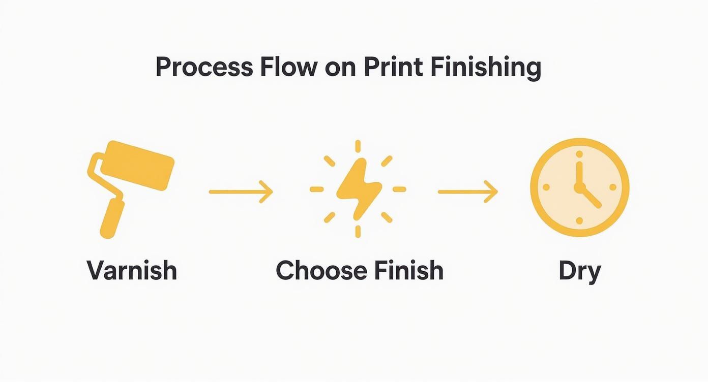
As you can see, applying varnish, choosing the right finish, and letting it dry properly are all crucial steps you need to nail before you even think about framing. By getting these final details of printing onto canvas right, you'll be able to confidently turn your digital files into physical art that's built to last and ready to impress.
Common Questions About Printing on Canvas
Even with a solid workflow, a few questions always seem to pop up when you're printing on canvas. Getting these sorted from the get-go can save you a world of headaches and help you sidestep some common pitfalls.
I find the biggest worry for most people is image resolution. They're convinced their photo just isn’t "good enough" for a large print. While a bigger, better file is always ideal, the gold standard is 300 DPI (dots per inch) at the final print size. Stick to that, and you'll get sharp, clear images that look great even up close. For a massive piece that's going to hang on a distant wall, you might get away with 150 DPI, but you're definitely making a compromise on quality.
Another thing I'm often asked is about longevity. How long will a canvas print really last compared to a standard photo print?
The lifespan is dramatically different, and it all comes down to the quality of the materials. A top-notch canvas print using archival pigment inks and a protective UV varnish can easily last over 100 years without any noticeable fading. Your standard photo paper print, especially one made with dye-based inks, could start to fade in less than a decade.
Key Factors for Print Success
To get those really fantastic results, a few key areas need your full attention. These are the little details that separate a decent print from a truly professional one.
- Can You Print Any Photo? Technically, yes, you can print anything. But the quality of the original file is everything. A low-resolution photo snapped on your phone will look pixelated and blurry when it's blown up on canvas. Always, always start with the largest, highest-quality file you can get your hands on.
- Why Do My Colours Look Dull? Nine times out of ten, this is a colour management issue. If your monitor isn't calibrated and you haven't used the correct ICC profile for your specific canvas and printer combination, what you see on screen simply won't match the final print. Soft-proofing is your best friend here—it lets you preview and fix these issues before you waste a drop of ink.
Turning Your Prints into a Business
If you're a professional looking to sell your work, turning canvas printing into a viable business means getting your head around online marketing. You'll need to learn effective online store SEO strategies to make sure your beautiful prints actually find the right customers. Getting your work seen is every bit as important as the printing process itself.
At the end of the day, successful printing onto canvas is a mix of good technical prep work and using quality materials. By understanding these common issues, you're in a much better position to create prints that not only look fantastic but are also built to last.
At SONI DESIGN, we pour our passion into every project, turning your vision into vibrant reality. Let's create something extraordinary together. https://www.sonidesign.co.nz
Leave a Comment
Stay home & get your daily
needs from our shop
Start You'r Daily Shopping with Nest Mart