
Your cart is currently empty.

Your business card is far more than just a slip of paper; it’s a strategic investment in that critical first impression. It’s about taking your brand’s identity and making it real—something a potential client can touch and feel, creating a tangible connection that digital methods just can't replicate.
Why Business Cards Are Still a Networking Powerhouse

In an era of LinkedIn requests and digital everything, handing someone a physical business card feels almost like a rebellious act. But that's exactly why it works. A physical exchange creates a mental and emotional anchor that a simple screen tap can't match. It’s a deliberate, personal gesture that immediately signals you’re professional and prepared.
Picture this: you're at a bustling networking event in Auckland. After a great chat with a potential client, you exchange details. The other person fumbles to send a contact request on their phone, which will likely get lost in a sea of notifications. You, on the other hand, hand over a beautifully crafted card with a unique texture. That tactile experience makes the interaction stick, ensuring you’re the one they remember long after the event wraps up.
The Psychology of a Tangible Exchange
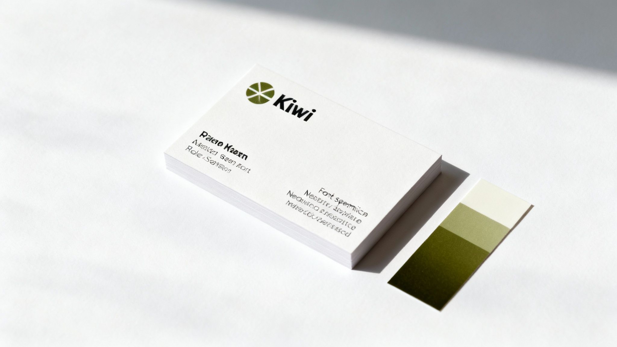
A printed business card engages multiple senses. The satisfying weight of the cardstock, the smooth feel of a matte finish, or the visual pop of a spot UV gloss—all these details speak volumes about your quality and attention to detail before a single word is even read. This physical interaction reinforces the value of the connection you’ve just made.
A business card is more than just contact information; it's a piece of your brand's story that someone can hold in their hand. It serves as a physical reminder of a real-world conversation, giving you an edge in a crowded market.
This tangible quality makes your brand feel more legitimate and established. It subtly communicates that you’ve invested in your business, which goes a long way in building trust with potential clients and partners.
A Powerful Marketing Tool in Disguise
While its main job is to share contact details, a well-designed card is really a micro-marketing tool. It can instantly convey your brand's personality, whether that's sleek and modern for a tech startup or classic and trustworthy for a legal firm in Christchurch. It’s a fantastic opportunity to put your brand identity on display in a concise, impactful format.
Even with the rise of digital tools, the business card remains a crucial part of the professional toolkit here in New Zealand. Believe it or not, research shows that for every 2,000 cards handed out, a business can see a sales increase of about 2.5%. While global printing volumes took a hit after the pandemic, the fact that business cards have remained popular highlights just how effective they are in building lasting professional relationships. You can explore more about these trends and their impact on modern networking.
Think of it as a bridge. It often prompts the person to take the next step, whether that’s visiting your website, checking out your portfolio, or sending that all-important follow-up email. A business card doesn't compete with digital tools; it complements them, providing a personal starting point for what often becomes a digital relationship.
Crafting a Design That Commands Attention
A great business card does more than just list your contact details; it tells a story and guides the eye where you want it to go. It’s a careful dance between clarity and creativity, all designed to make a great first impression in a split second. The aim isn't just to dump information but to create a visual path that leads someone effortlessly to the most important stuff.
It all starts with a clear visual hierarchy. Think of it as organising the information on your card from most to least important. Not every detail carries the same weight, and your design needs to reflect that. Your name and company logo are usually the stars of the show, so they should grab the most attention.
You can create this hierarchy using different font sizes, weights (like bold vs. regular), colours, and placement. For example, your name might be in a slightly larger or bolder font than your phone number, instantly telling the viewer who you are. The goal is to make the card scannable so someone can get the gist in just a few seconds.
The Power of Negative Space
One of the most under-appreciated tools in design is negative space—the empty areas around your text and logo. A cluttered card is just visual noise. It’s hard to read and, frankly, looks unprofessional. Letting your key elements breathe by embracing white space is a game-changer.
This breathing room makes your logo pop, your name stand out, and your contact details far easier to read. Often, a minimalist approach comes across as more confident and modern. Imagine a Wellington-based tech startup using a clean, spacious layout with just a logo and a QR code on one side—it instantly projects a sleek, forward-thinking image.
Choosing Your Essential Information
Figuring out what to include is just as crucial as the design itself. A common mistake is trying to cram too much onto such a small space, which completely undermines its purpose. Every single piece of information should have a reason for being there.
So, what are the absolute must-haves for most business cards?
- Your Name and Job Title: It establishes who you are and your role.
- Company Name and Logo: These are your primary brand identifiers.
- Phone Number: A direct line of contact is still vital in many industries.
- Email Address: The standard for professional digital communication.
- Website URL: This is your digital front door, leading people to your portfolio or services.
Your business card isn't an encyclopaedia of your professional life. It's a key that unlocks the door to a deeper conversation. Only include information that helps start that conversation, not end it with overwhelming detail.
Think hard about what you can leave out. Do you really need a physical address if your business is entirely online? Are multiple social media handles necessary, or is it better to send them to your most active one? A tradesperson in Tauranga will find a mobile number absolutely critical, whereas a graphic designer in Dunedin might prioritise a link to their online portfolio above all else.
Creating Balance and Contrast
A well-balanced design just feels right—it's stable and looks professionally put together. This doesn't mean you have to make everything perfectly symmetrical. In fact, asymmetrical balance can create a much more dynamic and interesting layout. You could place a visually "heavy" element like a large logo on one side and balance it with several smaller elements, like your contact details, on the other.
Contrast is what makes your card readable. This goes for both colour and fonts. A light-coloured font on a light background is a recipe for disaster. You need high contrast, like classic black text on a white background or crisp white text on a dark blue one, to make sure your details are clear at a glance.
Pairing different but complementary fonts can also add real character. You might use a bold, clean sans-serif font for your name and headings, and a classic, readable serif font for the contact info. The trick is to stick to two, or at most three, fonts to keep things looking cohesive. When you're ready for printing business cards, remember that a design prioritising readability and flow will always win over one that's just decorative. It’s the perfect marriage of form and function.
Choosing Paper and Finishes That Feel Premium
The look of your business card is only half the story. The real test comes the moment you hand it to someone. That’s when their sense of touch takes over, forming an instant, subconscious opinion about your brand's quality. A flimsy card feels cheap, almost like an afterthought. A substantial, textured card, on the other hand, immediately signals professionalism and a genuine care for the details.
When you're printing business cards, the paper stock and the finish you choose are just as important as your logo or font. These elements all work together, creating a full sensory experience that helps your card—and you—stick in someone's memory long after the initial handshake.
Understanding Paper Weight and Why It Matters
Paper weight, measured in Grams per Square Metre (GSM), is probably the single biggest factor in how your card feels. A higher GSM number means a thicker, heavier, and more durable card. Picture the difference between a high-quality photo print and a standard memo from the office printer—that immediate sense of quality is what you're aiming for.
- 250-300 GSM: This is the lighter end of cardstock. It's certainly cost-effective, but it can feel a bit flimsy and is more prone to bending and creasing. It’s often considered the entry-level choice.
- 350-400 GSM: Now we’re talking. For most professionals here in New Zealand, this is the sweet spot. A card in this range feels sturdy and professional without being excessively thick. It has a satisfying heft that just feels right.
- 400+ GSM: This is premium territory. These ultra-thick cards, sometimes called "luxe" cards, are incredibly rigid and make a powerful first impression. They’re perfect for luxury brands or anyone who wants to project an image of undeniable quality.
Getting your head around paper weight is fundamental, and this comprehensive paper weight guide is a great resource to explore the nitty-gritty. Think about it this way: for a builder or a real estate agent whose card might get knocked around in a wallet or on a work site, investing in a durable 400 GSM stock is just smart business.
Finishes That Define Your Brand Voice
The finish, or coating, that’s applied to your card does more than just protect the ink; it completely changes the card's look and feel. Every finish has its own personality, and picking the right one is a great way to subtly reinforce your brand’s identity.
Below is a practical comparison to help you decide which finish aligns best with the story you want your card to tell.
A Practical Comparison of Business Card Finishes
A breakdown of common printing finishes, their unique effects, and the best use cases to help you select the perfect one for your brand's personality.
| Finish Type | Visual and Tactile Feel | Ideal For These Brands | Key Considerations |
|---|---|---|---|
| Gloss | Shiny, reflective, and slick. Makes colours look incredibly vibrant. | Photographers, artists, tech startups—any brand with bold, colourful imagery. | The high shine can catch fingerprints and make it difficult to write on with a standard pen. |
| Matte | Smooth, non-reflective, and sophisticated. Feels modern and understated. | Consultants, writers, designers, professional services. Great for text-heavy cards. | Colours can appear slightly more muted than on a gloss finish. Laminated matte is very durable. |
| Uncoated | Natural, slightly porous texture. Feels organic, authentic, and classic. | Eco-conscious brands, artisans, cafes, anyone wanting a rustic or minimalist vibe. | Easiest surface to write on, but colours can look less saturated as ink soaks into the paper. |
| Soft Touch | Velvety, suede-like texture. A unique feel that people notice immediately. | Luxury brands, high-end creatives, or anyone wanting to add a tactile "wow" factor. | This is a premium finish, so expect it to cost a bit more. It feels incredibly refined. |
Choosing the right finish is all about matching the card’s personality to your brand's.
The finish on your business card is a non-verbal cue. A high-gloss finish shouts "vibrant and bold," while a soft-touch matte finish whispers "elegant and refined." Choose the one that speaks your brand's language.
Special Finishes to Make a Lasting Impression
If you really want your business card to be a conversation starter, you can step it up with a special finish. These techniques add tactile and visual elements that standard printing just can’t replicate, instantly setting your card apart from the rest of the pile.
One of the most popular choices is spot UV. This is where a high-gloss varnish is applied to specific parts of your card—like your logo or a graphic pattern—while the rest of the card stays matte. The contrast creates a subtle, eye-catching effect that practically begs to be touched.
For a touch of pure elegance, you can’t beat foiling. This process involves stamping metallic foil (gold, silver, and copper are common) onto the card, adding a luxurious shimmer to your name or logo. It’s a go-to for high-end retail brands, consultants, and anyone wanting to signal prestige.
Finally, die-cutting lets you break free from the standard rectangle. You can get your cards cut into a custom shape that reflects your brand—imagine a camera shape for a photographer or a leaf for a landscaper. It’s a bold move, but it’s one that guarantees your card won't be easily forgotten.
Preparing Your Artwork for Flawless Printing
You’ve got the design locked in and the perfect paper picked out. Now for the final hurdle: getting your artwork file ready for the printer. This is where the technical stuff comes in, and even small mistakes here can cause big, expensive problems—think logos getting chopped off or fuzzy, pixelated images.
Getting your file "print-ready" isn't as scary as it sounds, but it does mean paying close attention to a few details. Think of it like giving a builder a detailed blueprint instead of a rough sketch. The more precise your file is, the better your business card will turn out. Nailing this step ensures what you see on your screen is exactly what you get in your hand.
Getting to Grips with Bleed, Trim, and Safe Zones
Picture a massive guillotine slicing through a huge stack of printed card stock. It’s incredibly accurate, but there’s always a tiny, hair-like margin for mechanical shift. This is precisely why "bleed," "trim," and "safe zones" are so critical for protecting your design.
- Trim Line: This is the actual edge of your finished business card. For a standard NZ card, that’s typically 90mm x 55mm. It’s where the blade will cut.
- Safe Zone (or Safety Margin): Think of this as an invisible border, usually about 3mm inside the trim line. All your vital information—your name, logo, phone number—must stay inside this zone. This guarantees nothing gets accidentally clipped during the final trim.
- Bleed Area: This is a 3mm margin that extends beyond the trim line on all four sides. If any colours, photos, or graphic elements in your design are meant to go right to the very edge, you have to extend them all the way out to fill this bleed area. It’s the only way to prevent ugly white slivers from showing up if the cut is a fraction of a millimetre off.
The safe zone is the "safe house" for your most important info. The bleed area is your "insurance policy" for a clean, professional edge-to-edge finish. Simple as that.
Why CMYK Is a Must-Have (and RGB Is a No-Go)
The colours on your computer screen are made with light, using a mix of Red, Green, and Blue (RGB). That's great for digital displays, but it's not how printing works.
Professional printing presses use ink, creating colours by mixing Cyan, Magenta, Yellow, and Black (Key), which is known as CMYK. This is a non-negotiable difference. If you supply a file in RGB, the printer's software will convert it to CMYK, and the colours can shift—sometimes dramatically. That vibrant, electric blue on your screen might end up looking like a dull, flat navy in print.
To avoid any nasty surprises, always set your design software’s colour mode to CMYK right from the start.
This process flow helps visualise the key decisions in bringing your card to life, from the foundational paper choice to the final special touches.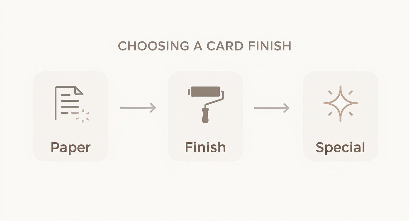
As the visual guide shows, selecting the right paper stock is the foundation, followed by a finish that complements your brand, and finally, any special elements that make it stand out.
Don't Get Caught Out by Resolution and Fonts
Two final checks will save you from the most common printing headaches: image resolution and font handling. Getting these right is what separates a crisp, professional-looking card from one that just looks cheap.
Any images or logos in your design need to be at a resolution of 300 Dots Per Inch (DPI). This is the industry standard for high-quality print. Images you grab from a website are usually only 72 DPI, which looks perfectly fine on a screen but will come out blurry and pixelated on paper. Always, always use high-resolution source files.
The printing industry in New Zealand is a fascinating space. While it feels huge, there are currently around 775 printing businesses operating across the country. That number has been declining by about 1.9% a year recently, which likely reflects consolidation as more media goes digital. Still, the sector is dominated by small-to-medium businesses, so you’ll find plenty of specialist printers who can help. If you're interested, you can discover more insights about the NZ printing industry.
Finally, you have to manage your fonts properly. If you send a design file to a printer and they don't have the exact fonts you used, their computer will automatically substitute them with something else—and completely ruin your layout. The fix is simple: outline your fonts (sometimes called "convert to curves"). This command, found in most design software, turns your text into fixed vector shapes. Now it doesn't matter who opens the file; it will look exactly as you intended.
Finding the Right Printer in New Zealand
Alright, you’ve got your print-ready artwork sorted. Now comes the crucial part: finding the right people to bring it to life. In New Zealand, you’re basically looking at two main options—your friendly neighbourhood print shop or one of the big online printing services. Each has its own strengths, and the best fit for you really boils down to what you value most.
Going with a local printer in a place like Wellington or Christchurch means you get a much more personal touch. You can literally walk in, have a chat about what you're after, and—this is a big one—actually touch and feel the different paper samples. There’s no substitute for feeling the difference between a standard 350 GSM matte card and a premium 400 GSM soft-touch finish.
On the other hand, online printers often have the edge on price and sheer convenience, particularly for straightforward jobs. Their whole process is automated, which means they can offer really competitive pricing and quick turnarounds. If you need a big batch of standard cards and you need them yesterday, online is often the way to go.
Local Print Shops vs Online Services
Choosing between local and online isn't just a matter of cost. It's a trade-off between personalised service, speed, and your ability to check the quality with your own hands. A local printer might need a bit more time, but being able to talk directly with the person handling your job can save you from expensive mistakes, especially if you’re getting into custom finishes like foil stamping or die-cutting.
Here’s a quick rundown of what to consider:
- Turnaround Time: Online services are generally quicker for standard runs. But if you're in a real pinch, a local printer might be able to squeeze in a small rush job for you.
- Personalised Service: Nothing really beats talking to an expert face-to-face. A local printer can give you advice that’s genuinely tailored to your design.
- Physical Proofs: Being able to see and hold a physical sample before committing to the full print run is a huge plus for local shops.
- Cost: For large, simple orders, the economies of scale mean online printers are usually cheaper.
No matter who you're considering, ask them this one simple question: "Can I see and feel samples of this exact cardstock and finish?" A picture on a website just can't capture the real-world feel that makes a great business card stand out.
A Hybrid Strategy for Modern Networking
While a physical card delivers that initial 'wow' factor, many savvy Kiwi businesses are now taking a hybrid approach. It's all about pairing a beautifully printed card with a digital equivalent. This gives you the memorable impact of the physical handover, with the added convenience of digital sharing for follow-ups.
The digital business card scene is growing fast, which shows a real shift in how we network. Globally, this market was recently valued at around USD 215 million and is expected to grow massively. The big drivers are things we all use daily—smartphones, QR codes, and NFC tech that make sharing your details instantaneous. If you're curious, you can read the full research about the digital card market and see where it's headed.
This hybrid model truly offers the best of both worlds. You can hand over a stunning printed card in a key meeting, and for a quick coffee catch-up or an email follow-up, a simple tap or scan of your digital card is incredibly efficient. It just means you’re ready to make a great connection, no matter the situation.
Got a Few Last-Minute Questions?
You’ve nailed the design, your files are ready, but a few nagging questions are holding you back from hitting that ‘order’ button. That’s completely normal. Making choices about printing can feel pretty permanent, so let's clear up the common queries that pop up right at the end.
Getting these final details sorted will give you the confidence to place your order without any second-guessing.
How Many Cards Do I Actually Need?
This is the classic dilemma: you want to be cost-effective, but you don't want to get stuck with a mountain of outdated cards. There's no magic number, but we can get pretty close by thinking about how you'll use them.
For most small business owners or professionals here in New Zealand, a run of 250 to 500 cards is a solid starting point. This gets you a better price-per-card without the risk of major waste if your details change next year.
Think about your specific role:
- Sales or Network-Heavy Roles: If you're always at trade shows, conferences, or client meetings, start with 500 or even 1,000 cards. You'll go through them faster than you think.
- Consultants or Freelancers: A smaller run of 250 is often a smart move. It gives you the flexibility to tweak your services or branding more often without binning old stock.
- Mainly Internal Roles: If you only hand out a card occasionally, the printer's minimum order of 100 or 250 will be more than enough.
The goal is to order enough cards to last you for the next 12-18 months. Too few and you risk getting caught short, but too many and they could become obsolete before you use them.
Should I Print on Both Sides?
Absolutely! In fact, I almost always recommend it. A double-sided card instantly doubles your real estate, letting you keep the front clean and impactful while tucking extra details onto the back.
This is the key to avoiding a cluttered design. Your front side should be reserved for the essentials: your name, company, logo, and primary contact info. The back then becomes the perfect home for secondary information like your social media handles, a list of services, a QR code, or even a short brand mission statement. It just makes for a more professional and complete-feeling card.
Digital vs. Offset Printing: What's the Difference?
When you’re looking at print options, you'll likely come across these two terms. Understanding the basic differences between digital and offset printing is key to getting the quality and price you want.
- Digital Printing: Think of this as a super-advanced version of a desktop printer. It’s ideal for smaller runs (usually anything under 1,000 cards) because there’s very little setup involved. This means it’s faster and more affordable for the quantities most people need.
- Offset Printing: This is the traditional method using custom plates and wet ink. The setup is more involved and costly upfront, but for massive print runs, the price per card drops significantly. It also offers exceptional colour consistency, which is crucial for huge orders.
Honestly, for most business card orders between 100 and 1,000, digital printing is the perfect sweet spot, giving you fantastic quality, quick turnaround, and a great price.
Help! I Found a Typo After I Approved the Proof!
This is the one that makes your stomach drop. Once you sign off on that final proof, the responsibility for any errors—typos included—is usually on you. Printers move incredibly fast, and your job is often queued up for the press almost immediately.
If you spot a mistake, call your printer right away. Don't email, call. If you catch it before they've started printing, you might be able to stop the job and send a new file. If the presses are already running, though, you'll almost certainly have to pay for a full reprint.
This is why triple-checking your proof is non-negotiable. Read every name, number, and email address out loud—it’s the most critical final step.
Ready to bring your vision to life with a card that truly represents your brand? At SONI DESIGN, we specialise in crafting high-quality prints that make a lasting impression. Let’s create something extraordinary together.
Explore our custom printing services at https://www.sonidesign.co.nz.
Leave a Comment
Stay home & get your daily
needs from our shop
Start You'r Daily Shopping with Nest Mart