
Your cart is currently empty.

So, you're ready to print posters in NZ but feeling a bit lost on where to begin? It’s a common feeling. Turning a brilliant idea on your screen into a physical poster that truly pops involves a few more steps than just clicking a 'print' button.
This guide is your complete roadmap. Think of it as having an expert printer looking over your shoulder, helping you navigate every decision to get a professional result, every single time.
Your Starting Point for Poster Printing in New Zealand
Even with screens everywhere, a well-designed, professionally printed poster has a unique power. It can stop someone in their tracks at a busy café, get the word out about a local gig, or turn a plain wall into a piece of art. The trick is getting the details right.
This guide will walk you through all the important stuff, from choosing the right paper to setting up your file correctly, so you can avoid those expensive and frustrating mistakes.
Despite what you might hear, the printing industry in New Zealand is still a major player. It’s a $1.4 billion market, and a big chunk of that comes from advertising materials like posters. While some areas of print have faded, industries like retail, events, and tourism still lean heavily on posters for powerful, localised advertising. You can check out more stats on the NZ printing market over at ibisworld.com.
What This Guide Covers
We’ve designed this to be a practical, no-fluff playbook for getting your printing done right. We’ll tackle the most common questions and hurdles, offering clear, straightforward advice. Our mission is to take the mystery out of the process, giving you the confidence to get it done perfectly.
Here’s a quick look at what’s coming up:
- Paper Stocks and Finishes: We'll explore why the paper you choose can either elevate your design or let it fall flat.
- File Preparation: Get the lowdown on the non-negotiables: resolution, colour modes, and bleed for print-ready artwork.
- Sizes and Print Methods: Find the ideal dimensions for your project and figure out the most cost-effective way to print it.
- Common Mistakes to Avoid: Learn from others' experiences and sidestep the frequent slip-ups that cost time and money.
By the time you're done reading, you won’t just know how to order a poster. You'll understand why certain choices make a huge difference to the final product. You'll be able to talk to any printer with confidence and bring your vision to life exactly how you see it in your head. Let's dive in.
Choosing the Right Foundation: Paper Stocks and Finishes
The leap from a design on your screen to a poster in your hands starts with one critical choice: the paper. This isn't just a background detail; it's the first thing people will see and feel. The right paper stock and finish can take a decent design and make it exceptional, giving it a tangible quality that a digital file simply can’t match.
Think of it like choosing the right canvas for a painting. A cheap, flimsy canvas won’t do justice to the artist's work. In the same way, the wrong paper can make brilliant colours look flat, feel cheap in hand, or catch a nasty glare, completely undermining all your design effort. Let's walk through the options so you can pick the perfect foundation for your project.
Understanding Paper Weight (GSM)
When you start looking at options to print posters, you’ll constantly run into the term GSM. It stands for Grams per Square Metre, but don't let the technical name throw you. It’s just a straightforward way to measure how thick and sturdy a piece of paper is.
To get a feel for it, here’s how GSM relates to paper you already know:
- Standard office paper: That flimsy stuff in the printer is about 80gsm.
- A decent flyer: This usually feels a bit more substantial, sitting in the 130-170gsm range.
- A quality business card: This feels stiff and premium, often 300gsm or more.
For most posters here in NZ, the sweet spot is somewhere between 170gsm and 250gsm. A 170gsm stock is a fantastic all-rounder, giving you a quality feel without breaking the bank—perfect for event promos. If you're printing an art piece or something you want to last, jumping up to 200gsm or 250gsm will give it that extra durability and a more luxurious finish.
The Bottom Line: A higher GSM means a heavier, thicker, and more durable poster. Just think about where your poster will end up. A notice for an indoor community board doesn't need the same heavy-duty stock as an art print destined for a frame.
How Different Finishes Change Everything
Once you’ve settled on the weight, you need to think about the finish. This is the coating applied to the paper that dictates how it looks and feels, how it plays with light, and the overall vibe it gives off.
Gloss Finish
A gloss finish is shiny, smooth, and makes colours absolutely pop. Its highly reflective surface bounces light back, which really cranks up the vibrancy and saturation of your images. This makes it a go-to for photo-heavy posters or anything that needs to scream for attention from across the room. The only catch? That same reflectiveness can cause a serious glare under direct lighting, which isn't ideal for every situation.
Matte Finish
Matte is the total opposite. It has a flat, non-reflective surface that soaks up light instead of bouncing it back. This lends a more subtle, sophisticated, and often artistic feel to a poster. Because there’s no glare, it’s the top choice for art prints, gallery pieces, or posters with lots of text that need to be legible from any angle. It has a lovely, natural texture you can feel.
Satin (or Silk) Finish
Can't decide between the two? Meet satin, your new best friend. Often called silk, this finish is the perfect middle ground. It has a beautiful, low-sheen lustre that enhances colour without the mirror-like reflection of a full gloss. It’s the best of both worlds: a professional look, minimal glare, and rich colours. Honestly, if you're ever unsure, satin is an incredibly reliable and safe bet for almost any poster project.
Choosing the right combination of paper weight and finish is about matching the physical product to your design's intent. To make it even easier, here's a quick reference table to help you decide.
Poster Paper Stock and Finish Comparison
| Paper Type / Finish | Best For | Feel & Appearance | Pros | Cons |
|---|---|---|---|---|
| 170gsm Gloss | Photo-heavy posters, event promotions, high-impact visuals. | Shiny, smooth, and highly reflective. | Makes colours incredibly vibrant and saturated. | Can create significant glare under direct light. |
| 200gsm Matte | Art prints, gallery displays, text-heavy designs, sophisticated looks. | Flat, non-reflective, natural texture. | No glare, excellent readability, feels high-end. | Colours can appear slightly less punchy than on gloss. |
| 250gsm Satin | Versatile all-rounder; corporate displays, decorative prints, premium promos. | Subtle low-sheen, smooth feel. A perfect in-between. | Reduces glare while keeping colours rich and deep. | Can be slightly more expensive than standard options. |
This table should give you a solid starting point. Remember, the best choice always comes down to what you want your final poster to say and where it will be seen.
Getting Your File Ready for a Perfect Print
This is where the magic happens—or doesn't. Getting your digital file right is the single most important thing you can do to make sure the poster you get back looks just as good as it does on your screen. It’s all about translating your creative vision into a language the printer’s machinery can understand.
Think of it like giving a builder a blueprint for a house. If the plans are blurry, use the wrong scale, or are missing key measurements, you won't get the house you dreamed of. It's the same with printing; a poorly prepared file is a recipe for disappointment.
Let's break down the three pillars of a print-ready file, turning those technical terms into simple, practical steps.
Resolution: It's All in the Dots
First up is resolution. You'll see this measured in DPI, which stands for Dots Per Inch. Imagine your design as a mosaic made from thousands of tiny coloured tiles. DPI is simply how many of those little tiles (or dots of ink) the printer will squeeze into a one-inch square.
For something you see on a website or social media, 72 DPI is fine because screens create images by emitting light. But printing is a different game entirely. We're physically putting ink on paper, so we need a much higher density of dots to create a sharp, professional-looking image.
So, what's the magic number? For poster printing, it's 300 DPI.
- Below 300 DPI: Your images will almost certainly look pixelated or blurry. The printer has to stretch fewer dots over the same area, which creates that blocky, low-quality effect nobody wants.
- At 300 DPI: This is the gold standard in the print industry. It guarantees your text is crisp and your images are packed with detail.
- Above 300 DPI: You can go higher, but for most posters, you won't see a noticeable difference in quality. You'll just end up with a massive file that's a pain to upload and process.
Key Takeaway: Always start your design project with the canvas set to 300 DPI. You can't just add resolution to a low-quality image later on—it’s like trying to un-blur a fuzzy photo. It simply doesn't work.
Colour Modes: Speaking the Printer’s Language (RGB vs CMYK)
Ever printed a photo at home and been baffled when the vibrant colours on your screen came out looking a bit dull and flat? That’s almost always because of a clash between colour modes. Your monitor and a commercial printer speak two completely different colour languages.
RGB (Red, Green, Blue) is the language of screens. It's an "additive" colour model, meaning it starts with a black screen and adds different combinations of red, green, and blue light to create millions of bright, vivid colours.
CMYK (Cyan, Magenta, Yellow, Key/Black) is the language of ink. This is a "subtractive" model. It starts with a white surface (your paper) and adds layers of ink to subtract brightness, creating colours. The range of colours you can make with CMYK ink is naturally smaller and less intense than the RGB spectrum.
If you send an RGB file to be printed, the software has to make its best guess at converting those bright screen colours into the CMYK spectrum. This conversion often leads to a disappointing, muted result. Properly preparing your digital assets is key to ensuring your posters look their best. For some great insights into photo optimisation, have a look at these tips for preparing your digital files.
Bleed: Your Safety Margin for a Flawless Edge
The final pillar of a perfect print file is something called bleed. This simply means extending your poster’s background colour or image slightly beyond the final trim line.
Think back to colouring books. To avoid leaving any annoying white gaps along the edges of a shape, you’d probably colour a little bit over the lines. That’s exactly what bleed is for professional printing.
Printing presses trim huge stacks of paper at high speed, and tiny mechanical shifts—sometimes less than a millimetre—are unavoidable. If your design stops precisely at the edge, even the slightest movement during cutting can leave a thin, unprofessional-looking white sliver along one side.
To prevent this, we add a bleed area. Here in NZ, the standard for most poster printing is a 3mm bleed on all four sides. This means if you want an A2 poster, you actually make your design canvas 3mm larger on every side. When the poster is trimmed down to its final size, your artwork will run perfectly to the very edge. No white gaps, just a clean, professional finish.
This flowchart can help you navigate the choices for your poster, from paper thickness to its ultimate use.
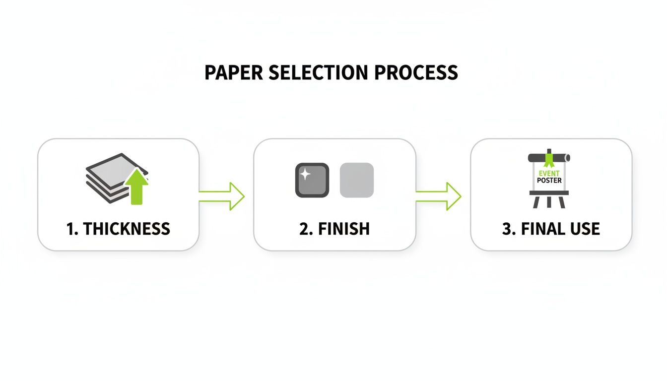
This visual guide shows how thinking about the paper's weight, its finish, and how the poster will be used all contribute to a better final product.
Your Final File Export Checklist
Before you hit send, run through this quick checklist. It doesn't matter if you're a pro using Adobe Illustrator or working in a tool like Canva; these settings are what count.
- File Format: Always export your file as a Press Quality PDF. This is the universal format that printers love because it locks in all your fonts, images, and settings into one tidy, reliable package.
- Colour Mode: Make sure your document is set to CMYK. If you've been designing in RGB, now is the time to convert it. This gives you a much more accurate preview of how the colours will look when printed.
- Resolution: Do a final check to ensure every image and graphic element in your design is at least 300 DPI.
- Bleed & Crop Marks: Confirm you’ve included a 3mm bleed on all sides and that you’ve ticked the box to include crop marks in your export settings. These marks are little lines that show the printer exactly where to trim the paper.
Once you get a handle on these three things—resolution, colour mode, and bleed—you take the guesswork out of printing. You’re no longer just hoping for a good result; you’re setting your project up for a guaranteed great one.
A Guide to Poster Sizes and Print Methods in NZ
Picking the right size and printing method for your poster is a bit like choosing the right tool for a job. You wouldn't use a tiny screwdriver for a massive bolt, right? The same logic applies here. A small A4 flyer won't cut it for a huge storefront display, and the most affordable way to print one poster becomes incredibly expensive when you need a thousand.
Getting these two things right—size and method—is the first step to making sure your project looks great and stays on budget. Let’s walk through the standard "A" sizes we use here in New Zealand and break down the two main printing methods, digital and offset, so you can make the right call.
Understanding Standard Poster Sizes
In New Zealand, we stick to the international "A" paper sizing system, which is refreshingly logical. Each size is simply half of the one before it. An A4 is half an A3, an A3 is half an A2, and so it goes. This makes scaling your designs up or down a breeze and helps printers keep waste to a minimum.
Here’s a quick rundown of the common poster sizes and what they’re best for:
- A4 (210 x 297 mm): This is your everyday printer paper. It's perfect for notices on a community board, flyers to hand out at an event, or a small print you might frame for your desk.
- A3 (297 x 420 mm): At double the size of A4, this is where you start getting into proper poster territory. Think cafe window displays, small event announcements, or detailed infographics that need a bit more room to breathe.
- A2 (420 x 594 mm): A very popular choice for event posters, in-store promotions, and art prints. It’s big enough to grab attention from across the room but not so large that it's overwhelming. A really versatile option.
- A1 (594 x 841 mm): Now we're getting into high-impact territory. A1 posters are brilliant for trade show displays, large-scale retail advertising, and band promotions. They really command attention in busy environments.
- A0 (841 x 1189 mm): As the biggest standard size, an A0 is a massive one square metre of paper. You save this one for when you need to make a huge statement—think outdoor advertising, large architectural plans, or major campaign launches.
Digital vs. Offset Printing: What’s the Difference?
Once you’ve settled on a size, the next big question is how to print it. For pretty much any poster job, you’ll be choosing between two methods: digital or offset. A good way to think about them is like choosing a vehicle. One is a nimble runabout, perfect for quick trips, while the other is a massive haulage truck, built for heavy, long-distance jobs.
Digital Printing is the runabout. It works a lot like a high-end office printer, taking your digital file and printing it directly onto the paper. The setup is minimal, which is its biggest advantage.
- Best for: Small quantities (from a single poster up to about 250-500), jobs with a tight deadline, and projects that need personalisation (like printing a different name on each one).
- Pros: Very fast turnaround, cost-effective for small runs, and allows for variable data.
- Cons: The price per poster doesn't drop much as you print more, so it gets expensive for larger volumes.
Offset Printing is the heavy-duty truck. This is a more traditional method where your design is etched onto custom metal plates. Ink is transferred from these plates to a rubber blanket, which then rolls the ink onto the paper.
The setup for offset printing is a much bigger deal—it involves creating the plates and calibrating the press. But once it's up and running, it can churn out thousands of identical copies at an incredible speed and a very low cost per unit.
This is the method used for mass-produced items like magazines and newspapers. It’s all about scale.
- Best for: Large print runs (usually 500+ copies), projects where perfect colour consistency is essential, and jobs where the lowest price-per-poster is the main goal.
- Pros: Extremely low cost per unit on large orders, with fantastic colour accuracy and print quality.
- Cons: The high initial setup cost makes it completely uneconomical for small runs, and the whole process takes longer.
When looking for print posters NZ services, it helps to know where the printers are. The industry is quite concentrated, with Auckland having 510 print businesses—great for nationwide campaigns. Canterbury and Wellington are next, with 111 and 105 businesses, respectively. You can dive deeper into these numbers with NZ's printing industry distribution data on Figure.nz.
Avoiding Common—and Costly—Printing Mistakes
We’ve all been there. You spend ages getting your design just right, send it off to print, and what comes back is… not what you expected. Even the most stunning design can be derailed by a few simple technical slip-ups, leading to disappointing results, expensive reprints, and a lot of frustration.
Think of this section as your pre-flight checklist. Learning from the most common pitfalls is the secret to getting a perfect print run every time. Let's walk through the three big culprits I see most often: blurry images, rogue fonts, and colours that just don't pop.
The Blurry Image Catastrophe
This is probably the most heartbreaking mistake in the book. You find a fantastic image online, pop it into your A2 poster layout, and it looks great on your screen. But when the printed posters arrive, the image is a fuzzy, pixelated mess.
The cause? Almost always low resolution. As we touched on earlier, images for the web are typically saved at 72 DPI (Dots Per Inch), which is perfectly fine for a glowing monitor. Print is a different beast entirely and demands a much higher resolution of 300 DPI to look sharp and professional. Stretching a small, low-res image to fill a large poster is like blowing up a passport photo to the size of a billboard—the detail just isn't there to begin with.
- What Went Wrong: The source image simply didn't have enough pixels for the physical size it was being printed at.
- The Simple Fix: Always, always start with high-resolution images. Before you even place an image, check its properties to make sure it’s 300 DPI at the size you need. If you're using a stock photo site, download the largest version available. You can always scale it down, but you can’t scale it up without losing quality.
The Dreaded Font Disaster
Here’s another classic issue. You’ve picked the perfect font to capture the mood of your poster, but the final print comes back with a generic substitute like Arial or Times New Roman. This happens when the font you used isn’t embedded in the print file you sent over. If the printer's computer doesn't have that exact font installed, its software makes an executive decision and swaps it for something it does have.
This can completely wreck your layout. All your careful kerning, line spacing, and the entire feel of the design can be thrown out the window. A design that was meant to be sleek and modern can suddenly look clumsy and dated, all because the typography got lost in translation.
The sure-fire way to prevent this is to convert your text to outlines (or "curves" in some software) before you export the final PDF. This little step effectively turns your letters into vector shapes, locking them in place forever. The text is no longer editable, but it guarantees your typography will print exactly as you intended, on any computer in the world.
The CMYK Colour Mismatch
Ever had your vibrant on-screen colours come back from the printer looking dull and a bit lifeless? You've just experienced the classic RGB vs. CMYK mix-up. Your screen creates colour by mixing light (Red, Green, Blue), while a printer uses ink to absorb light (Cyan, Magenta, Yellow, Black). The range of colours you can create with ink is naturally smaller than the brilliant spectrum a backlit screen can produce.
When you design in RGB mode, you're often working with colours that are physically impossible to replicate on paper. As soon as that file hits the print queue, it gets converted to CMYK, and those bright, luminous colours are automatically shifted to their nearest, often duller, printable equivalent.
Given the pressures facing the local printing industry here in New Zealand, avoiding reprints for colour issues is a win-win. Economic shifts have made it a tough market, so getting files right the first time helps keep costs down for everyone. For a deeper dive, there's an interesting report on A/NZ printer market trends on therecycler.com that sheds more light on this.
- What Went Wrong: The design file was created in RGB colour mode, which is built for screens, not ink on paper.
- The Simple Fix: Set up your design document in CMYK from the very beginning. This way, you’re working within the printable colour range from the start, and what you see on your screen will be a much more accurate preview of the final poster. No nasty surprises.
Placing Your Order with a New Zealand Printer
You’ve sorted your paper stocks and perfected your print file—now for the exciting part. Placing your order with a local Kiwi printer is where all your hard work pays off and your design comes to life. Clear communication here is the key to a smooth run from screen to paper.
It all starts with getting a quote. To get a price that’s on the money, you’ll need to give your printer a solid brief. Think of it like giving a builder your house plans; the more detail you provide upfront, the more accurate the final cost will be.
Submitting a Clear Quote Request
When you get in touch, have all your details ready to go. This simple step saves a lot of back-and-forth emails and makes sure the price you get is the price you'll actually pay.
Make sure your request includes these four essentials:
- Quantity: Just how many posters are you after?
- Finished Size: The exact final dimensions (e.g., A2 or 420mm x 594mm).
- Paper Stock: The specific weight and finish (e.g., 200gsm satin).
- Artwork Status: A quick note to say your print-ready PDF is good to go.
With these details, the printer will send back a quote. Once you give it the nod, they'll ask you to send through your artwork, usually via their website or email. This is the moment to pause and double-check you're attaching the final, high-resolution version.
When choosing a local printer, it helps to know how good businesses make themselves easy to find. Many printers ensure they’re visible online, and learning how a business can add itself to Google can offer some good clues for spotting well-established local companies.
The Importance of the Proofing Process
Before your job hits the press, you'll receive a digital proof. Don't just skim it—this is a hugely important checkpoint. The proof is your final preview, showing exactly how the poster will look once printed, complete with trim marks and bleed.
Crucial Tip: Treat the proof as your last line of defence against errors. Scour it for typos, check that images are where they should be, and make sure every single detail is perfect. When you approve the proof, you're officially signing off on the job.
Once you give your approval, your poster joins the production queue. This is the point of no return; any changes after this will almost certainly mean extra costs and delays.
Turnaround for digital posters in NZ is generally pretty quick, often between 1-3 working days, though this can vary with the printer’s schedule. Offset jobs will naturally take a bit longer. Most printers will offer courier delivery across New Zealand or let you pop in and pick up your order if you're local. A clear brief and a careful proof check are your best tools for a fantastic, stress-free result.
Your Poster Printing Questions, Answered
You’ve got your design sorted and you're almost ready to go, but a few questions might still be swirling around. That's completely normal. Let's tackle some of the most common queries we get from people looking to print posters NZ wide, so you can order with total confidence.
Think of this as the final check-in before your design hits the press.
What's the Smartest Poster Size for My Budget in NZ?
Hands down, sticking to the standard 'A' sizes like A3, A2, and A1 is your most wallet-friendly move. Printers plan their runs by fitting as many jobs as possible onto massive sheets of paper, a bit like a game of Tetris. Standard sizes are designed to fit perfectly with virtually no wasted paper, and those savings get passed on to you.
If you only need a handful of posters, A3 often hits the sweet spot for value. But if you’re doing a big promotional run, the cost per poster for A1 or A2 drops significantly, making them incredibly economical.
Can I Really Just Print One Poster?
You sure can. Thanks to modern digital printing, ordering a single, stunning poster is not only possible but also surprisingly affordable. Unlike the old-school offset methods that required a huge setup, digital printers are ready to go almost instantly, which makes them perfect for one-offs, art prints, or even just a test-run of your design.
Just make sure you find a local NZ printer that offers large-format digital printing.
A quick tip on colour: always set up your file in a CMYK colour profile, not RGB. If getting a specific brand colour exactly right is non-negotiable, ask your printer for a 'hard copy' proof. It’s a single printed sample on your chosen paper, so you see precisely how it will look before committing to the full run.
I Keep Seeing "GSM." What Does It Actually Mean?
GSM simply stands for 'Grams per Square Metre'. It’s the standard measure for paper weight and thickness. The higher the GSM number, the heavier and more substantial the paper feels.
To give you some context, your average office paper is about 80gsm. For a poster that feels professional and is built to last, you’ll want to be in the 150gsm to 250gsm range.
Ready to see your vision come to life in vibrant, high-quality print? The team at SONI DESIGN is here to guide you through it, making sure you get a flawless result every time. Start your poster printing project with us today!
Leave a Comment
Stay home & get your daily
needs from our shop
Start You'r Daily Shopping with Nest Mart