
Your cart is currently empty.

A great business card starts long before you open up design software. It begins with a clear idea of what you want to say and who you are. This initial planning is the foundation for making a card that not only shares your contact details but genuinely makes a memorable first impression.
Why Your Business Card Still Matters
In a world of LinkedIn requests and email signatures, it's easy to think the humble business card is a relic. But nothing could be further from the truth. A physical card creates a tangible connection that digital methods just can't replicate. It's a personal touchpoint, a physical reminder of a real conversation.
Think of it as your brand's handshake. A flimsy, poorly designed card sends a message of carelessness. On the other hand, a high-quality, thoughtfully designed card screams professionalism and confidence. While it's true that some studies show 88% of business cards are thrown out within a week, that statistic is really about forgettable cards. Your goal is to be in that other 12%—the ones people keep.
Defining Your Card's Core Message
Before you get lost in paper stocks and fancy finishes, take a moment to ask one simple question: What is the single most important message this card needs to communicate about my business? Your answer to this will steer every other decision you make.
Think about your brand's personality:
- Innovative and modern? A clean, minimalist design with a surprising element like Spot UV or even a unique shape could be perfect.
- Trustworthy and established? You can't go wrong with a classic layout on thick, premium cardstock using timeless typography.
- Creative and bold? This is your chance to play with vibrant colours, custom die-cut shapes, or shimmering foil accents that grab attention.
For example, a freelance photographer might use one side of their card to showcase a stunning, high-gloss image—instantly proving their talent. A financial advisor, however, would likely choose an elegant, understated design on a heavy matte stock to convey stability and trust.
Your business card isn’t just a networking tool; it's a miniature billboard for your brand. Its job is to start a conversation and be memorable enough for that conversation to continue later. Make every square millimetre count.
Aligning With Your Overall Brand Identity
Your business card can't be a lone wolf. It needs to feel like part of a family, fitting in perfectly with your website, social media, and any other marketing you're doing. This consistency is what builds brand recognition and reinforces a professional, polished image.
When you're thinking about your cards, consider how they fit into your wider marketing efforts. They can be a key part of comprehensive print marketing services that give your brand a powerful physical presence. If your website has a specific colour palette and font, those exact elements need to appear on your card. This is the kind of thoughtful alignment that turns a simple piece of card into a strategic marketing tool.
Nailing the Design and Print File Setup
You've figured out your message and what you want your card to say about you. Great! Now comes the part where many fantastic ideas fall over: turning that vision into a print-ready file. This isn't about being a design genius; it's about a few technical details that make the difference between a professional card and a disappointing one. Get this right, and what you see on your screen is exactly what you'll get in your hands.
The whole process really boils down to three core pillars: your message, your brand, and then, finally, the design that brings it all together.
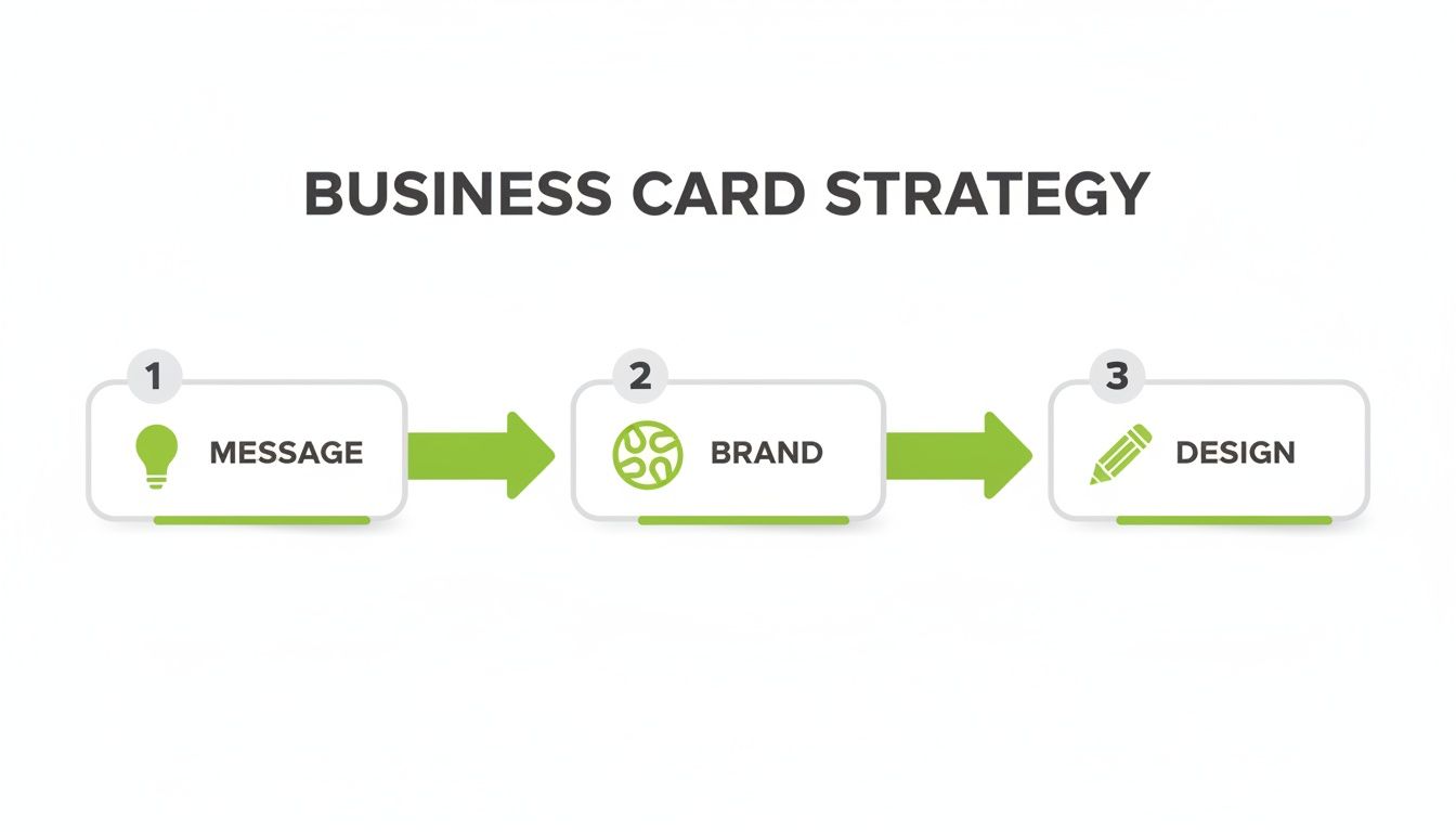
As you can see, design is the final execution. It’s built on the solid foundation of a clear message and consistent branding. Without those first two pieces, even the slickest design won't truly connect.
Understanding Bleed, Trim, and the Safe Area
Here’s a little insight into the printing process. Your business card isn’t printed by itself. It’s printed on a massive sheet with dozens of others, which is then sliced into individual cards by a powerful cutting machine called a guillotine. While these machines are incredibly precise, they can have tiny mechanical shifts—we're talking less than a millimetre. That's where bleed, trim, and the safe area become your best friends.
-
Trim Line: This is the finish line—the exact final dimensions of your business card. In New Zealand, the standard size is 90mm x 55mm. It's the line where the guillotine blade is supposed to land.
-
Bleed Area: To avoid an ugly, thin white sliver along the edge if the cut is a fraction of a millimetre off, you need to extend your background colour or any edge-to-edge images beyond the trim line. Kiwi printers almost always ask for a 3mm bleed on all sides. This means your final artwork for a 90x55mm card should actually be 96mm x 61mm.
-
Safe Area: Just as the bleed protects the outside edges, the safe area is all about protecting what's inside. Think of it as an internal buffer, usually 3-5mm inside the trim line. All your crucial info—your name, logo, and contact details—must live inside this zone. This guarantees nothing important gets accidentally trimmed off.
I like to explain it like framing a picture. The trim is the edge of the photo, the bleed is the bit of the image that gets tucked behind the frame, and the safe area is where you keep the main subject, well away from the edges.
The All-Important Difference: RGB vs. CMYK
One of the most common letdowns I see is when someone’s vibrant, beautiful design comes back from the printer looking dull and flat. The culprit? Almost always, it's the colour mode.
Your computer screen, camera, and phone create colour by mixing Red, Green, and Blue (RGB) light. It's an additive process—add them all together, and you get white light. It's perfect for screens.
Commercial printing presses, on the other hand, use a totally different method. They physically mix inks: Cyan, Magenta, Yellow, and Key (Black), or CMYK. This is a subtractive process, where the inks absorb light.
The range of colours an RGB screen can show is far wider than what CMYK inks can physically reproduce. Screens can create bright, luminous tones that simply don't exist in the world of ink on paper. Designing in RGB and then converting to CMYK at the end is a recipe for a nasty surprise.
To avoid this colour shift, you must set your design file to CMYK mode from the very beginning. If you're using professional software like Adobe Illustrator or Affinity Designer, it’s a simple setting when you create your document. For a real estate agent whose entire brand is built on a specific shade of blue, getting this right is absolutely non-negotiable.
Getting Your Resolution and File Format Spot-On
Finally, the sharpness and clarity of your finished card comes down to one thing: resolution. For anything destined for print, the industry standard is 300 Dots Per Inch (DPI). If you use a lower resolution, like the 72 DPI used for web images, you'll end up with a blurry, pixelated card that looks unprofessional.
When you're ready to save your file, your printer will have a strong preference for the format.
The Best File Formats for Print:
- PDF (Press Quality): This is the gold standard, no question. It locks in your fonts, images, and graphics into one self-contained file, ensuring nothing moves or changes when the printer opens it.
- EPS (Encapsulated PostScript): A fantastic choice for vector designs (like most logos), because it can be scaled up or down infinitely without losing a drop of quality.
- TIFF (Tagged Image File Format): If your card includes a high-quality photograph, TIFF is ideal. It uses lossless compression, meaning it keeps all the original image data intact.
Try to avoid sending JPEGs unless your printer specifically asks for one, as their compression method can degrade the quality. Taking a moment to master these technical steps ensures your investment in printing business cards pays off with a flawless result you're proud to hand out.
Choosing Paper and Finishes That Feel Right
Your design is locked in and the file is technically perfect. Now for the fun part—the decision that separates a good business card from a truly great one: the physical materials themselves.
The way a card feels in someone's hand, from its weight and texture to its finish, sends a powerful, unspoken message about your brand's quality and attention to detail.
This tactile experience is a massive advantage over purely digital networking. When you hand over a card, you’re giving someone a physical piece of your brand. Making it feel substantial and memorable ensures it stands out in a wallet and doesn’t get immediately discarded.
It All Starts With Paper Weight (GSM)
The very first thing anyone notices is the card's sturdiness. This comes down to the paper weight, measured in GSM (Grams per Square Metre). Simply put, a higher GSM number means thicker, heavier, and more durable paper.
A flimsy, thin card just feels cheap and disposable. If you want your business card to convey permanence and professionalism, a heavier stock isn't just nice to have—it's essential.
Here’s a quick rundown of what those numbers actually mean:
- 250-300 GSM: This is the absolute minimum you should consider. Honestly, it feels a bit flimsy and is prone to bending and dog-ears almost immediately.
- 350-400 GSM: This is the sweet spot and the most popular choice for a reason. It has a substantial, premium feel without being overly rigid. It feels like a proper business card.
- 450+ GSM: Now we're in luxury territory. These ultra-thick cards (sometimes called duplexed or triplexed) make a serious statement. They are incredibly durable and have a real presence.
For a local builder or a law firm wanting to project strength and reliability, investing in a 400 GSM or heavier stock is a small detail that makes a huge impact.
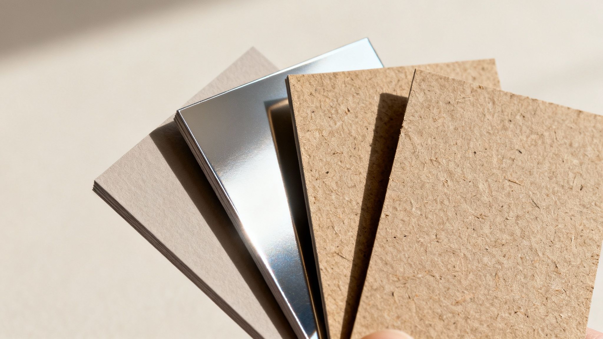
Coated vs. Uncoated: A Tale of Two Textures
Beyond just weight, the paper's surface treatment—or lack of it—defines its whole look and feel. Your two main camps are coated and uncoated, and this choice dramatically alters how your colours and design come across.
Coated stocks have a sealant applied to the surface, creating a smooth, less porous finish. Ink sits right on top, which means you get sharper details and more vibrant, punchy colours. These come in either gloss or matte varieties.
Uncoated stocks, on the other hand, have a more natural, textured feel. The paper is porous, so it soaks up more ink. This can make colours appear slightly softer or more muted, which can be a beautiful effect for elegant, rustic, or earthy brands. It's also the only real choice if you need to write on your cards.
Think of it this way: a coated stock is like a freshly polished floor—sleek, reflective, and showing off every detail. An uncoated stock is more like a natural hardwood floor, with a warm, organic character that absorbs light.
Finding Your Perfect Finish
The final layer is the finish, or laminate, which is applied after printing. This not only protects the card from scuffs and moisture but also adds that final tactile quality.
Matte Laminate A matte finish gives you a smooth, non-reflective surface that feels sophisticated and modern. It’s fantastic for designs with a lot of text, as it cuts down on glare and improves readability. A marketing agency or a high-end café might choose matte for an understated, elegant impression.
Gloss Laminate Gloss is the complete opposite: it's highly reflective and shiny. This finish makes colours pop and gives your card a vibrant, high-energy look. It’s a brilliant choice for photographers or any business using bold imagery, as it makes photos look incredibly rich and deep.
To make this a bit easier, here’s a quick guide to help you pick the right combination for your brand.
Paper Stock and Finish Selection Guide
| Material/Finish | Best For | Feel & Appearance | Considerations |
|---|---|---|---|
| Matte Coated | Professional services, minimalist designs, text-heavy cards. | Smooth, non-reflective, and modern. Subtle and sophisticated. | Can show fingerprints on dark colours. |
| Gloss Coated | Photographers, artists, vibrant and colourful brands. | Shiny, reflective, and high-impact. Makes colours pop. | Prone to glare, which can make text hard to read. |
| Uncoated | Eco-conscious brands, rustic businesses, appointment cards. | Natural, slightly textured, and organic. Muted colour palette. | Colours will be less vibrant than on coated stock. Easy to write on. |
| Recycled Kraft | Artisans, cafes, brands with a strong eco-friendly message. | Raw, earthy, and distinctly textured. | Best for simple, dark ink designs. Full-colour photos won't work well. |
Choosing the right materials ensures your brand’s physical assets are not just seen, but felt. The choice of paper and finish significantly influences the perceived quality of a business card, creating a tactile experience that leaves a lasting impression. Similar material considerations are vital for other tangible promotional items, such as physical loyalty stamp cards, where durability and feel are crucial for repeated customer interaction.
Adding Special Touches That Make an Impact
A well-designed business card on quality paper is a solid start. But what about a card that engages more than just sight? One with a unique texture, a flash of light, or an unexpected shape is the one people remember long after the handshake. These special finishes are how you turn a standard bit of marketing into a memorable experience.
These aren't just cosmetic upgrades; they’re strategic investments. A special finish can subtly communicate your brand’s personality, whether that's luxury, innovation, or creativity. When you decide to print business cards with these extra touches, you're deciding to make a far more powerful first impression.
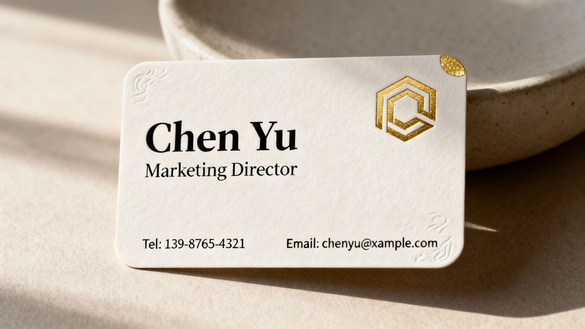
Using Spot UV to Create Subtle Contrast
One of the most popular and effective finishes I've seen is Spot UV, also called Spot Gloss. It involves applying a high-gloss, clear coating to specific areas of your card, leaving the rest with a matte finish. The result is a striking contrast that catches the light beautifully.
Imagine a tech startup with a sleek, minimalist card. The card itself has a smooth matte laminate, but their logo is done in Spot UV. As you tilt the card, the logo subtly gleams, drawing the eye without shouting. It’s a touch that whispers "modern and sophisticated."
Spot UV is brilliant for adding a layer of discovery to your card. It rewards the person holding it with a detail they might not see at first glance, making the interaction more engaging and memorable.
This technique is perfect for:
- Making a logo or company name pop.
- Highlighting a specific pattern or graphic element.
- Adding a tactile texture to an otherwise simple design.
Adding Elegance with Foil Stamping
For a touch of pure luxury, nothing beats foil stamping. This process uses heat and pressure to apply a thin layer of metallic foil to the paper. While gold and silver are timeless classics, you can now get foil in a huge range of colours, including rose gold, copper, blue, and even stunning holographic finishes.
Think of a high-end jeweller or a luxury real estate agent. A business card with their name stamped in shimmering gold foil on thick, dark cardstock instantly communicates value and exclusivity. It feels premium because it is premium. The slightly indented quality of the foil adds a depth that standard ink just can't replicate.
Creating Texture with Embossing and Debossing
If you want your card to have a truly three-dimensional feel, embossing and debossing are the way to go. These techniques reshape the paper itself to create a raised or recessed effect.
- Embossing pushes your design up from the back of the card, creating a raised surface. It’s fantastic for giving a logo or monogram a tactile, "touchable" quality.
- Debossing is the opposite; it presses your design into the card, creating an indented impression. This can give a sophisticated, letterpress-style feel.
For an artisan bakery, an embossed logo of a wheat stalk on a rustic, uncoated cardstock would perfectly complement their hands-on, handcrafted identity. The physical texture reinforces the brand message in a way visuals alone cannot.
Modernising with Die-Cutting and Rounded Corners
Who says a business card has to be a rectangle? Die-cutting allows you to cut your card into virtually any custom shape you can imagine, opening up a world of creative possibilities. A photographer's card could be shaped like a camera, or a coffee shop's card could be shaped like a coffee cup. It's a guaranteed conversation starter.
While a fully custom shape is a bold move, a much simpler yet effective option is adding rounded corners. This small change softens the card's appearance, giving it a more modern, friendly, and approachable feel. It’s a popular choice for creative agencies, tech companies, and personal brands that want to appear less corporate and more human.
Finalising Your Print and Getting the Proof Right
You've done the hard work. The design is locked in, the file is technically perfect, and you’ve landed on a paper stock that feels just right. Now for the final step: turning that digital file into a stack of business cards you can’t wait to hand out. This is where all your careful planning comes together, and it's your last chance to make sure your vision comes to life exactly as you imagined.
Choosing the Right Print Partner
Finding a printer you can trust is a game-changer. While big online printers might seem convenient, there's a lot to be said for partnering with a local Kiwi print shop. A local expert can give you real advice, let you feel the different paper samples, and help you spot a potential problem before it turns into an expensive mistake.
It's a specialised field. In 2025, New Zealand’s printing industry is home to exactly 767 businesses. While that number is down from previous years, it points to a core group of dedicated specialists. Considering there are 617,330 total enterprises in NZ, these printers are busy, often focusing on high-value, quick-turnaround jobs like premium business cards. You can get a better sense of the current state of NZ's printing industry on IBISWorld.com.
When you're chatting with a potential printer, here are a few good questions to ask:
- What file format do you prefer? (Most will say a press-quality PDF).
- Can you show me some real-life examples of cards with finishes like foil or Spot UV?
- What’s your proofing process like? Do you offer a hard-copy proof?
How they answer will tell you a lot about their expertise and how much they care about the details.
The Make-or-Break Importance of Proofing
Whatever you do, don't skip the proofing stage. A proof is the final preview your printer sends for approval before they hit 'print' on the full run. This is your absolute last chance to catch a typo, a weird colour shift, or a layout mistake. Honestly, rushing this step is one of the most common—and costly—blunders people make.
You'll typically come across two kinds of proofs.
Digital Proofs (Soft Proofs) This is just a PDF showing how your design is set up. It’s great for a final check of the basics:
- Text and spelling: Seriously, read it out loud. You'll be surprised what you catch.
- Placement of your logo and contact info.
- Confirming the bleed and safe zones are all correct.
Just remember, you can't rely on a digital proof for colour. The light from your RGB screen will always look different from CMYK ink on paper.
Hard-Copy Proofs (Press Proofs) For a little extra cost, many printers will run a single, physical copy of your card for you. This is the gold standard. It lets you see and feel the real deal—the exact paper, the true colours, and the finish. If your brand relies on a very specific shade of green, a hard-copy proof isn't just nice to have; it's essential.
Think of approving a proof as signing a contract. Once you give the okay, you’re confirming everything is perfect and taking ownership of the result. Triple-check every single detail before you say yes.
How Many to Order and When You'll Get Them
Finally, you need to decide on a quantity. It’s tempting to order a massive run to get that per-card price down, but it pays to think strategically.
If it’s a brand-new design or your contact details might change, start small with a run of 100 or 250 cards. This way, you’re not stuck with a huge box of outdated cards. For established businesses with a solid design, ordering 500 or 1,000 cards usually offers the best bang for your buck.
Be sure to ask about turnaround times upfront. A standard digital print job might only take 3-5 business days. But if you’ve added special finishes like foil stamping, expect it to take longer because of the extra steps involved. Planning for this will ensure your cards are in your hands right when you need them.
Your Top Business Card Printing Questions, Answered
Stepping into the world of professional printing can feel a bit like learning a new language. You'll hear terms like 'bleed', 'GSM', and 'colour modes' thrown around, and it's easy to feel overwhelmed. I get it. To help clear things up, here are some straightforward answers to the questions we hear all the time, so you can order your next set of business cards with total confidence.
What’s the Standard Business Card Size in New Zealand?
In New Zealand, the go-to standard is 90mm x 55mm. This isn't just a random number; it's become the norm for a very practical reason—it slips perfectly into almost any wallet or cardholder. This makes it super convenient for people to actually keep your card.
While you can definitely get creative with custom die-cut shapes, sticking to the classic 90mm x 55mm is almost always your most budget-friendly and straightforward path. Before you jump into designing, it's always a good idea to double-check the exact specs with your chosen printer, just to be on the safe side.
How Much Bleed Do I Actually Need?
Okay, this one is a biggie. For pretty much any printer in New Zealand, you'll need to add a 3mm bleed to all four sides of your design. Think of bleed as a safety net for your background colour or image, extending it past the final trim line of the card.
Here’s how it works in practice: for a standard 90mm x 55mm card, the file you send to the printer needs to be 96mm x 61mm. That extra 3mm on each edge is your buffer. Printing presses and guillotines are incredibly precise, but tiny shifts can happen. This bleed ensures that even if the cut is off by a fraction of a millimetre, your background still goes right to the edge, and you don't get any awful-looking white slivers.
Your bleed is your insurance against an imperfect cut. At the same time, remember to keep all your vital text and logos inside a "safe area," typically another 3-5mm inside the final trim line. This guarantees nothing important gets accidentally chopped off.
What’s the Real Difference Between a Matte and Gloss Finish?
Choosing between matte and gloss really comes down to the personality of your brand and how you expect people to use your card. They create completely different first impressions, both visually and to the touch.
A gloss finish has a shiny, reflective coating that makes colours pop. It looks vibrant, saturated, and offers a bit of protection against moisture or scuffs. This makes it a fantastic choice for designs heavy on photography or bold graphics. The main drawback? It’s a magnet for fingerprints and you can't really write on it with a normal pen.
On the other hand, a matte finish has a smooth, non-reflective surface that feels sophisticated and modern. It’s the clear winner for minimalist designs or cards with a lot of text, as there's no glare to get in the way of reading. Most importantly, it's the only practical option if you or your clients might want to jot down a quick note on the card.
Think of it like this:
- Gloss: High-energy, bold, and attention-grabbing.
- Matte: Understated, elegant, and professional.
Can I Print a Small Test Batch of Cards First?
Yes, and honestly, you absolutely should if you have any doubts. Thanks to modern digital printing, ordering a small run of business cards is both easy and affordable. Most print shops are more than happy to print batches as small as 50 or 100 cards.
This is a really smart move in a few different situations:
- Testing a new design: See how the colours and layout actually look and feel in your hand before you commit to a big order.
- New or updated details: If you've just launched your business or changed your phone number, a small run is perfect.
- Budget constraints: It lets you get professionally printed cards without a major upfront investment.
Sure, the cost-per-card is a bit higher on smaller orders, but the peace of mind it buys you is priceless. It helps you avoid the costly mistake of getting stuck with a thousand cards that have a typo or a colour you just don't love. When you print business cards for the first time, a small test run is your best friend.
At SONI DESIGN, we specialise in bringing your vision to life with vibrant, high-quality printing that makes a lasting impression. From initial design to the final finish, we pour our hearts into every project to ensure it tells your unique story. Let’s create something extraordinary together. https://www.sonidesign.co.nz
Leave a Comment
Stay home & get your daily
needs from our shop
Start You'r Daily Shopping with Nest Mart