
Your cart is currently empty.
When it comes to designing a great presentation folder, it’s tempting to jump straight into the fun stuff like colours and logos. But hold on. A truly effective folder—one that actually works for you—starts with a bit of groundwork. Think of it less as a piece of printed card and more as a strategic business tool.
Building Your Folder's Strategic Foundation
Before you even think about firing up your design software, you need a solid plan. A folder without a clear purpose is just that—a folder. But one with a clear strategy? That’s a powerful piece of communication that can steer conversations, build trust, and reinforce what your brand is all about.
So, the first question to ask is: what’s its job? The answer to this will shape every single decision you make from here on out.
- High-Stakes Sales Pitch: If you're handing over a major proposal or a contract, this folder needs to scream quality and confidence. Its whole vibe should be about professionalism and trustworthiness.
- Trade Show Handout: In a crowded event hall, your folder has about two seconds to make an impact. It needs to be eye-catching and memorable enough to not end up in the nearest bin, but also designed with cost-effectiveness in mind for wider distribution.
- New Client Onboarding: This folder is essentially a welcome kit. It should feel organised, helpful, and reassuring—a tangible reflection of the supportive experience you're promising your new client.
Know Your Audience
Once you've nailed down the what, it's time to focus on the who. Who are you handing this folder to? Your approach for a corporate law firm in Auckland will be worlds away from what you’d create for a creative start-up in Wellington.
Let’s take a real-world example. Imagine a real estate agent who specialises in helping first-home buyers. Their folder should feel friendly, approachable, and full of useful info. A clean layout with clear, welcoming fonts would be perfect. Now, contrast that with an agent selling multi-million dollar luxury properties. Their folder needs to convey exclusivity and premium quality, probably using a heavier paper stock and sophisticated finishes like embossing.
Your presentation folder is often the very first tangible thing a potential client will hold from your brand. Every design choice has to instantly connect with them, reflecting your values and meeting their expectations.
Aligning Design with Business Goals
Every element on your folder, from the paper it’s printed on to the finish you choose, should be a conscious decision that backs up your business goals. For instance, if a core part of your brand is being eco-friendly, choosing a 100% recycled paper stock isn’t just a nice touch—it’s a powerful statement that proves you walk the talk.
This kind of strategic thinking is catching on fast here in New Zealand. Businesses are realising that quality, customised print materials are a fantastic way to engage with clients. We’re seeing more and more evidence that the physical, tactile nature of a well-designed folder helps people organise and remember key information, especially during important meetings. You can dive deeper into these ideas in the NZ Marketing Insights & Trends report.
By laying this strategic foundation—defining the purpose, getting to know your audience, and linking every design choice to a goal—you're making sure your presentation folder design is more than just a paper holder. It becomes a hard-working asset that continues to make a great impression long after you’ve left the room.
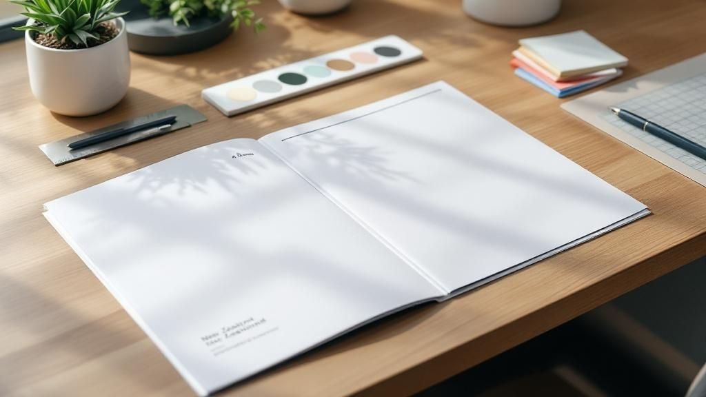
Bringing Your Brand to Life in Print
A great presentation folder does so much more than just hold documents—it tells your brand’s story. For many potential clients, it’s the first physical thing from your company they’ll ever hold. That first touchpoint is critical.
So, how do you make it count? You have to move beyond just slapping your logo on the cover. The real goal is to weave your brand’s identity into the very fabric of the folder, turning it from a simple carrier into a compelling, tactile experience.
Think about the feeling your brand evokes. Is it modern and energetic, or more traditional and trustworthy? Every choice—from the colours and fonts to the very words on the page—needs to work in harmony to create that feeling instantly. Your brand guidelines are your best friend here.
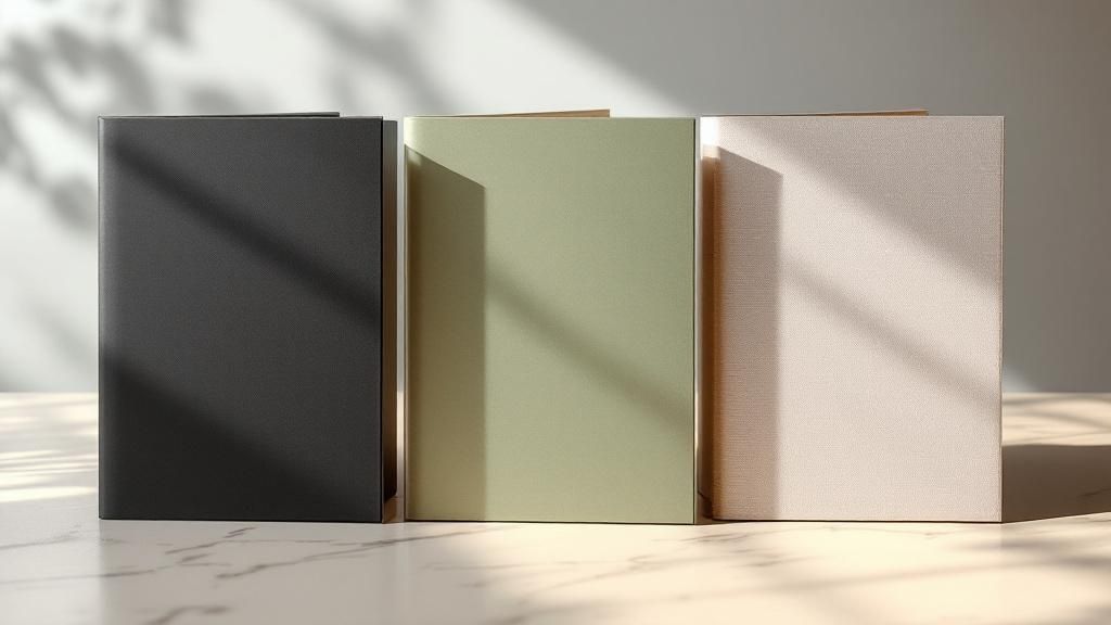
Setting the Tone with Colour and Typography
Your colour palette is one of the most powerful tools you have. Colours carry emotion and can set a mood in a fraction of a second. A financial advisory firm, for instance, might lean on deep blues and greys to communicate stability and professionalism. On the flip side, a creative agency might go for bright, bold hues to signal energy and innovation.
Your folder design is a direct extension of this palette.
- Primary Colours: Use your main brand colours for the big stuff—like the background or dominant graphic elements—to create instant recognition.
- Secondary Colours: These are perfect for accents. Think inside pockets, call-to-action boxes, or highlighting contact details.
- Neutral Tones: Don't underestimate the power of white, grey, or black space. It's essential for preventing a cluttered look and guiding the viewer’s eye right where you want it to go.
Typography plays a similar role, speaking volumes about your brand’s personality. A clean, sans-serif font like Montserrat can feel modern and forward-thinking. A classic serif font like Garamond, however, can lend an air of tradition and authority. Just make sure whatever you choose is easy to read and fits the professional image you're aiming for.
Key Takeaway: Consistency is everything. The colours and fonts on your folder must match what people see on your website, business cards, and every other piece of marketing material. That’s how you build brand recognition and trust.
More Than Just a Logo
Your logo might be the star of the show, but it shouldn't be a solo act. Your folder has valuable real estate, so use it to reinforce your brand's core message. Adding a short, punchy tagline or a concise mission statement can instantly tell someone what you’re all about.
For example, imagine a construction company that specialises in sustainable building. They could feature a tagline like, "Building a Greener Tomorrow, Today." Placed discreetly on the back cover or an inside pocket, it reinforces their niche and provides context that their logo alone can't. This simple addition transforms the folder from a container into a conversation starter. Exploring options like vibrant Full Color Presentation Folders can make your branding elements truly pop.
Picture a high-end interior design studio. Their folder might have their logo elegantly embossed on the front. Inside, instead of a loud, busy design, they could use a single, stunning photo of their best work on one pocket and their mission statement tastefully printed on the other. This thoughtful approach turns a simple folder into a portfolio piece, communicating expertise before the client even peeks at the documents inside. Every choice tells your story.
Mastering the Structural and Layout Design
This is where the rubber meets the road. A great-looking folder is one thing, but if it doesn't function properly, it's failed. We're moving beyond the visuals and into the technical craft of folder design, where structure and layout are everything. It’s about making sure every single element has a purpose and a place.
The absolute heart of this process is the dieline. Think of it as the architectural blueprint for your folder. It’s a flat, 2D template that tells your printer exactly where to cut, crease, and fold the paper to bring your folder to life.
Honestly, using a dieline isn't optional. It's the only way to map out the precise location of pockets, business card slits, and every folded edge. Trying to design without one is like building a house without plans—you’re setting yourself up for a disaster. Your printer will almost always provide you with a standard dieline, and that becomes the foundational canvas for your artwork.
Choosing the Right Pocket Configuration
Pockets are arguably the most functional part of your folder, so their style needs to match what you're trying to achieve. You've got a few common options, and each one suits a different scenario.
-
Single Pocket: With a pocket on the right-hand side, this is your go-to for streamlined presentations. It’s perfect when you’re delivering a single contract or a concise info pack and want to guide the reader through the material in a set order.
-
Double Pockets: This is the most popular and versatile choice for a reason. Two pockets let you organise different types of material. For instance, you could put signed documents on one side and leave the other empty for your client's notes or additional paperwork.
-
Vertical Pockets: A stylish, modern alternative where the pockets run up the side instead of along the bottom. They look great but are better for holding fewer, sturdier documents like postcards. Thinner A4 sheets can sag a bit, which doesn't look as professional.
Think about a real estate agent. Double pockets are a no-brainer. They can pop the property brochure and floor plans on one side, with the offer documents and their business card neatly tucked into the other. This simple organisation makes a world of difference for a potential buyer trying to process a lot of information.
In New Zealand, the professional design sector is a serious economic player, accounting for around 94,200 full-time jobs. That’s about 4.4% of the country's total employment. It's this community of skilled designers and print specialists that drives the thinking behind functional design, ensuring even something as practical as a folder pocket is well-considered. You can get a deeper look into this via the valuable insights provided by DesignCo.
Guiding the Eye with Layout and Hierarchy
Once your folder’s structure is sorted, the layout of your visual elements dictates how someone will read and understand the information. A successful presentation folder design uses fundamental layout principles to create a clear visual path for the eye to follow.
First up is visual hierarchy. This is simply the art of arranging things to show what's most important. Your logo and company name should grab the most attention. Secondary information, like a tagline or website, comes next. Contact details are crucial, but they can be smaller and placed discreetly on the back or inside a pocket.
Next, find your balance. This doesn't mean perfect symmetry. In fact, asymmetrical balance—where a large element on one side is balanced by several smaller ones on the other—can often create a more dynamic and engaging design.
Finally, make friends with negative space (or white space). It’s the empty area around your text and images. Overcrowding a folder makes it look chaotic and unprofessional. Giving your design room to breathe makes it feel clean, organised, and confident, allowing your key messages to really shine.
Imagine a folder for a financial services firm. The layout needs to project order and trust. The logo would be prominent on the front, but not overpowering. Inside, the design might use clean lines and a subtle colour scheme to separate sections, reinforcing that sense of reliability before the client has even read a word.
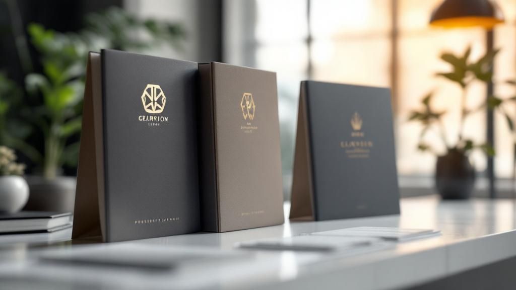
Choosing Materials and Finishes That Make an Impact
Your design might be what catches their eye, but the feel of the folder in their hands is what clinches the impression of quality. This is where the right paper and finishing touches can turn a perfectly good presentation folder into something exceptional, leaving a lasting memory of your professionalism and meticulous attention to detail.
Think about it from your own experience. A flimsy folder feels temporary, almost disposable. But a thick, substantial folder with a subtle texture? That feels important. It signals that what’s inside—and by extension, your brand—is valuable. This tactile experience is a quiet but powerful part of how you communicate your brand’s worth.
Getting to Grips with Paper Stock
The weight and quality of paper are typically measured in GSM (Grams per Square Metre). It’s simple: a higher GSM means a heavier, thicker, and more durable paper stock.
- Standard office paper is usually around 80-100 GSM. This is far too flimsy for a folder that needs to make a professional statement.
- A good starting point is anything in the 250-300 GSM range. This gives you a solid, professional feel without being excessively rigid or expensive.
- For a truly premium or luxury feel, look at stocks of 350 GSM and above. These communicate serious quality and durability, making them ideal for high-value proposals or luxury brand kits.
Beyond the weight, think about the paper’s texture. A smooth, coated stock will make your colours pop with vibrancy. On the other hand, an uncoated or textured stock, like a linen finish, can add a layer of sophistication and a pleasant tactile quality, hinting at craftsmanship and tradition.
Adding a Touch of Class with Print Finishes
This is where you can really make your folder stand out from the pack. Speciality print finishes aren't just decorative flourishes; they are strategic tools you can use to draw attention to the most important parts of your design, like your logo or tagline.
Imagine a real estate agent finalising a major property sale. A folder with a subtle, gold foil logo instantly adds a sense of prestige and celebration, reinforcing the importance of the moment. Or picture a tech startup using a Spot UV finish to create a sleek, glossy circuit board pattern over a matte black folder—a clever nod to their industry.
The trick is to use these finishes with purpose, not just for the sake of adding bling.
Expert Tip: In my experience, less is almost always more. A single, beautifully executed finish, like an emboss on your logo, will have far more impact than a folder overloaded with foil, gloss, and die-cuts. Focus on one or two techniques that genuinely reflect your brand’s personality.
Comparing Your Finishing Options
Choosing the right finish comes down to your budget, your brand, and the message you want to send. Each option offers a unique effect. The table below breaks down the most common choices to help you decide which will work best for your presentation folder design.
Choosing the Right Print Finish for Your Folder
This table compares common print finishing options, detailing their visual effect, typical cost, and best use case to help you select the right finish for your brand.
| Finishing Technique | Visual & Tactile Effect | Best Use Case | Relative Cost |
|---|---|---|---|
| Embossing/Debossing | Creates a raised (emboss) or indented (deboss) 3D effect. Adds a touch of classic elegance and texture. | Highlighting logos or key text for a subtle, sophisticated feel. Perfect for law firms or financial services. | Moderate |
| Foil Stamping | Applies a metallic or pigmented foil to the surface. Looks premium, reflective, and eye-catching. | Making a brand name or logo pop with a luxurious feel. Great for high-end retail or event folders. | Moderate to High |
| Spot UV Varnish | A high-gloss coating applied to specific areas ("spots") of the design. Creates a contrast in textures. | Highlighting a photo, pattern, or logo against a matte background for a modern, sleek look. | Moderate |
| Lamination (Matte/Gloss) | A thin protective film applied to the entire folder. Gloss is shiny and vibrant; matte is non-reflective and smooth. | Protecting the folder from wear and tear while setting a definitive tone (bold vs. understated). | Low |
Making the right choice here really elevates the final product. It shows you’ve thought about the entire experience, not just the visual design.
Ultimately, the materials and finishes you choose are the final layer in your brand’s story. They're what transform your folder from a simple carrier for documents into a memorable piece of communication that speaks volumes about your commitment to quality.
Preparing Flawless Files for Your Printer
https://www.youtube.com/embed/6fagftDm4yk
Even the most incredible presentation folder design can fall flat because of simple technical mistakes during file setup. A brilliant concept deserves a flawless execution, and that means handing off a print-ready file your printer can use without a single headache. Think of this final step as your last quality control checkpoint. It's what ensures the folder you hold in your hands looks exactly like the one you perfected on screen.
Taking a bit of extra time here will save you from the massive frustration and expense of reprints. One of the most common—and costly—mistakes I see is a major colour shift. What looked vibrant and perfect on your backlit monitor can appear dull or just plain wrong on paper. This almost always happens when designs are accidentally created in RGB (Red, Green, Blue), the colour space for screens, instead of CMYK (Cyan, Magenta, Yellow, Black), the four-colour standard for professional printing. My advice? Set your design software to CMYK right from the start.
Your Essential Pre-Flight Checklist
Before you hit 'Export' on that final file, run through this quick technical review. These are the non-negotiables every professional printer needs to see for a clean, crisp result.
-
Set Your Bleed: Any design elements, especially backgrounds and images that are meant to go right to the edge, must extend beyond the final trim line. This extra margin is called a bleed, and it’s usually about 3mm to 5mm. It’s your safety net, ensuring that when the huge stacks of folders are trimmed to size, there are no unsightly white slivers left on the edges.
-
Include Trim and Fold Marks: These are tiny, hair-thin lines that sit outside your actual design. They show the printer precisely where to cut the folder (trim marks) and where to create the creases for the pockets (fold marks). Most design software can add these for you automatically when you export your PDF.
-
Convert Fonts to Outlines: This is a big one. To completely avoid any font substitution issues on the printer’s end, you need to convert all your text to outlines (or "curves" in some software). This clever step essentially turns your lettering into a vector shape, locking it in place. It guarantees your typography looks exactly as you intended, even if the printer doesn't have your specific font installed.
Image Quality and File Management
Nothing screams "amateur" faster than a blurry, pixelated image on an otherwise professional-looking folder. Any photos or raster graphics in your design absolutely must have a resolution of at least 300 DPI (Dots Per Inch) at the final printed size. Anything less will compromise the entire design.
Also, it's best practice to embed all your images directly into the file rather than just linking to them. This bundles everything up neatly into one self-contained package, so there's no chance of missing assets.
A professional presentation folder is a key asset for countless businesses. This is especially true in New Zealand's booming arts and creative sector, where the number of businesses more than doubled from 17,774 to 35,955 between 2002 and 2022. For these creative firms, a perfectly executed folder is essential for showcasing their work. You can explore more about this growth in the Infometrics Arts and Creative Sector Profile.
Once your files are technically perfect, you'll face the final hurdle: getting that massive file over to your printer. Email providers have strict attachment size limits, so knowing how to efficiently share large print-ready files with a dedicated file-sharing service is crucial.
The universally accepted format for submission is a high-quality, print-ready PDF. This format is fantastic because it preserves all your fonts, images, colours, and layout details in a single, reliable file. By running through this checklist, you’re not just sending a design; you’re ensuring your vision is brought to life perfectly.
Got Questions About Folder Design? We've Got Answers
As you start getting into the nitty-gritty of your presentation folder design, you're bound to have questions. That's perfectly normal. In fact, it’s a good sign—it means you’re thinking about the details that separate a decent folder from a truly great one.
To help you feel confident moving forward, we’ve answered some of the most common questions we hear from our clients every day.
What’s the Standard Folder Size in New Zealand?
This is probably the first question everyone asks, and for good reason—it’s the foundation of your entire layout. The go-to standard for virtually all professional presentation folders in New Zealand is a size built to hold A4 documents (210mm x 297mm).
To make sure your papers fit neatly without getting creased or bent, the folder itself needs to be slightly larger. A typical closed folder will measure about 220mm x 310mm. That little bit of extra space is crucial for keeping everything looking sharp and professional.
While A4 is the undisputed king for business proposals, reports, and welcome packs, you aren't locked into it. If you’re putting together a kit with A5 flyers or smaller brochures, a custom A5 folder could work beautifully. But honestly, unless you have a very specific reason to go smaller, sticking with an A4-based design is always the safest and most versatile choice.
How Much Should I Budget for Folder Design and Printing?
Ah, the classic "how long is a piece of string?" question. The reality is that the cost can swing wildly depending on what you're after. I find it helps to break the budget down into two separate buckets: the design work and the physical printing.
-
Professional Design: Here in New Zealand, you could work with a freelance graphic designer for a few hundred dollars to get a solid, professional layout. If you’re looking for a deeper dive with a full-service agency that includes brand strategy and concept work, you could be looking at several thousand dollars.
-
Printing & Finishing: This is where the price can really change. The final quote from a printer will hinge on your specs. The biggest factors are quantity (the cost-per-folder drops dramatically on bigger orders), the paper stock you select, and any special finishes like foil stamping or embossing.
You might spend a few hundred dollars on a small batch of basic, digitally printed folders. At the other end of the scale, a large offset run with premium paper and a couple of fancy finishes will be a more significant investment. The only way to know for sure is to get detailed quotes from a few printers once your design is locked in.
What's a Dieline, Anyway? A folder's dieline is its master blueprint. It’s a precise digital template that shows the printer exactly where to cut, fold, and crease the flat sheet of card to build your folder. Without one, getting pockets, panels, and business card slits to line up correctly is just guesswork. It's a non-negotiable tool for a professional result.
Should I Choose a Gloss or Matte Finish?
This choice isn't really about right or wrong; it's about matching the folder's feel to your brand's personality. The finish you pick sets an immediate tone before your client even looks inside.
A gloss laminate is shiny, reflective, and makes colours pop. It’s also tough and does a great job of resisting scuffs and moisture. This finish is perfect for brands wanting to project energy, vibrancy, and a modern, bold feel.
On the other hand, a matte laminate gives you a non-reflective, elegant finish with a smooth, almost velvety feel. It whispers quality and luxury. While it can be more prone to showing fingerprints, it’s the ideal choice for high-end, minimalist, or classic brands that communicate through quiet confidence.
Think about your brand's voice. Is it loud and proud, or more refined and reserved? Your answer will point you straight to the perfect finish for your presentation folder design.
At SONI DESIGN, we live and breathe this stuff. We pour our hearts into every project because we know a presentation folder is more than just paper—it's a story, a first impression, and a tangible connection to your clients. From vibrant prints to elegant finishes, we’ll work with you to bring your vision to life. Let’s create something extraordinary together at https://www.sonidesign.co.nz.
Leave a Comment
Stay home & get your daily
needs from our shop
Start You'r Daily Shopping with Nest Mart