
Your cart is currently empty.

Hotel signage guidelines are essentially the rulebook for creating a clear, safe, and welcoming environment for every guest. These aren't just about aesthetics; they cover everything from legal requirements and accessibility to making sure your brand shines through. Think of them as a blueprint for transforming signs from simple wall art into indispensable tools that make a guest's stay smooth and your hotel run more efficiently.
Why Great Signage Is Your Hotel's Silent Concierge
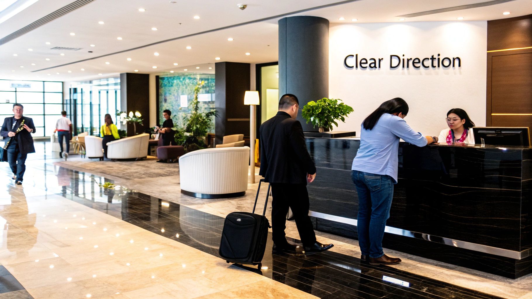
It’s best to think of your hotel's signage as a silent concierge. It works tirelessly around the clock, guiding, informing, and reassuring every single person who walks through your doors. From the second a guest arrives, this silent assistant starts shaping their impression of your property and the quality of their stay.
But truly effective signage is so much more than just pointing the way to the lift or the pool. It’s a sophisticated system that has to expertly balance three critical jobs at once.
The Three Pillars of Hotel Signage
Any truly solid signage strategy is built on three core pillars. Each one has a specific job to do, but they all work together to create a seamless experience for your guests.
-
Intuitive Wayfinding: This is all about logic. It’s about leaving a trail of breadcrumbs for your guests to follow. By placing clear signs at key decision points—think lobby junctions, corridor intersections, and outside lifts—you guide people effortlessly. It removes the frustration of feeling lost and makes even the largest property feel manageable and intuitive.
-
Legal and Safety Compliance: Let's be clear: adhering to regulations like the NZ Building Code is non-negotiable. This pillar covers all the essential signs for fire exits, emergency procedures, and accessible routes. Getting this right isn't just about avoiding fines; it’s about demonstrating a fundamental commitment to the safety of every guest and staff member.
-
Powerful Branding: Every sign, from the grand entrance to the small room number plaque, is a chance to tell your brand's story. The colours, fonts, and materials you choose should echo your hotel's unique personality. Are you a modern, chic city hotel or a rustic, cosy lodge? Consistent branding builds a powerful sense of quality, place, and trust.
When these three pillars align, they do more than just give directions. They build an atmosphere of confidence and care.
The table below breaks down these essential elements, showing how they transform basic signs into a strategic asset for your hotel.
Core Components of Effective Hotel Signage
| Component | Core Objective | Impact on Guest Experience |
|---|---|---|
| Wayfinding | To provide clear, intuitive directional guidance. | Reduces stress and confusion, empowers guests to explore independently. |
| Compliance | To meet all legal and safety standards (e.g., ADA, fire codes). | Creates a secure environment, showing care for guest well-being. |
| Branding | To reinforce the hotel's identity and aesthetic. | Builds brand recognition and creates a cohesive, memorable atmosphere. |
| Information | To communicate key details (e.g., opening hours, amenities). | Informs guests and reduces repetitive questions for staff. |
| Identification | To clearly label rooms, floors, and specific areas. | Ensures guests can easily locate their room and other facilities. |
Ultimately, a guest who feels confident and can find their own way feels respected from the moment they step inside.
A well-designed signage system directly impacts guest satisfaction scores and online reviews. When guests feel at ease and can navigate independently, their perception of service quality improves significantly, even without interacting with staff.
This proves that investing in a great signage plan isn't just another operational cost—it's a direct investment in your hotel's reputation. After all, a confused guest is a stressed guest, and that frustration can quickly appear in a negative review.
On the other hand, the guest who finds their room with ease feels looked after. This silent concierge sets a positive, welcoming tone for the entire stay and even boosts your operational efficiency by freeing up the front desk from answering the same questions over and over.
Decoding Compliance and Accessibility Standards
Navigating the legal requirements for hotel signage can feel like wading through a sea of technical jargon. But when you boil it down, compliance is really about two things: guest safety and trust. It’s the framework that ensures your property is not just welcoming in spirit, but genuinely safe and accessible for every single person who walks through your doors.
Instead of seeing compliance as a bureaucratic box-ticking exercise, think of it as your guide to creating an inclusive and legally sound environment. It turns dense legal code into practical, actionable steps. This is especially true for the most critical signs in your hotel—those for fires, exits, and accessible routes—where the rules for placement and design are very specific.
The Bedrock of Safety: NZ Building Code
Here in New Zealand, our primary rulebook is the NZ Building Code Clause F8, which sets the standards for signs in buildings. It’s the foundation for ensuring clarity and safety for everyone, from guests to staff.
The nuts and bolts are laid out in the Acceptable Solution F8/AS1, which specifies the types of signs you absolutely must have. These include:
- Safety Signs: General warnings and instructions to prevent injuries.
- Exit Signs: To clearly mark emergency escape routes.
- Fire-Related Signs: Showing the location of extinguishers, alarms, and hoses.
- Hazard Signs: Warning of potential dangers like a wet floor or low clearance.
- Accessibility Signs: Guiding people with disabilities to accessible routes and facilities.
This code also gets into the nitty-gritty of how signs should look. They can be in English, Māori, or both, and must include features like Braille. It also sets clear standards for height and visibility. For example, photoluminescent signs need their minimum height dimensions increased by 30% and must be visible from up to 24 metres away. Getting familiar with these details is non-negotiable for keeping everyone safe.
Making Signage Legible for Everyone
Meeting the building code is one thing, but true compliance lives in the small details that make a sign genuinely readable. Accessibility isn't just about ramps; it’s about making sure information can be easily understood by people with different levels of vision. This is where font, size, and contrast become your most important tools.
This infographic breaks down the simple but crucial principles of creating legible text.
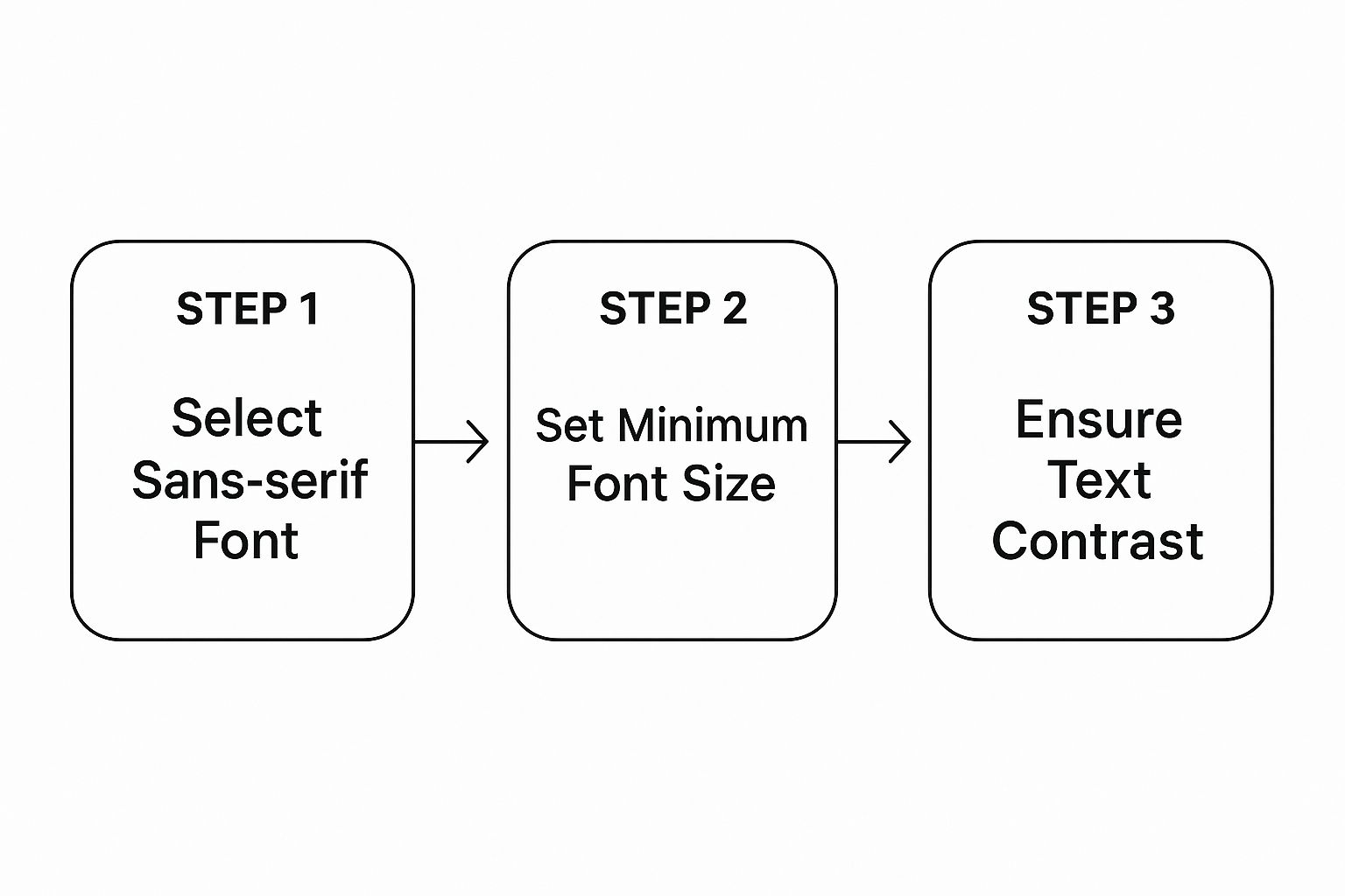
The takeaway here is straightforward: start with a clean, simple font, make it large enough to be read from a distance, and place it on a high-contrast background. These three steps are the cornerstone of signage that works for all your guests.
Key Accessibility Features to Implement
To make your hotel genuinely welcoming, you need to build specific accessibility features into your signage from the ground up. These elements are often required by law, but they also send a powerful message that you care for all your guests.
-
Tactile and Braille Signs: Room numbers, lift buttons, and signs for key facilities should always feature raised text and Braille. This gives guests with visual impairments the independence and dignity to navigate your space on their own.
-
High-Contrast Colours: For guests with low vision, the contrast between text and its background is everything. You can't go wrong with classic combinations like white-on-black or black-on-white. Steer clear of pairing colours with similar tones, like light grey text on a white background.
-
Logical Placement: Consistency is key. Accessibility signs need to be placed in the same spot every time. For instance, room identification signs should always be on the wall on the latch side of the door, at a standard height, so guests know exactly where to find them by sight or touch.
By putting accessibility first, you’re not just ticking a compliance box—you’re actively expanding your market. A hotel with a reputation for being truly accessible becomes the go-to choice for travellers with disabilities, along with their families and friends.
Making sure guests can find their way out safely in an emergency is absolutely paramount. For a deeper dive into this critical area, it’s worth reviewing these fire exit safety compliance tips for businesses. Ultimately, compliance and accessibility are two sides of the same coin; both are about creating a space that feels safe, predictable, and respectful for everyone.
Designing a Stress-Free Guest Journey
Great wayfinding is all about making navigation feel invisible. A guest shouldn't ever have to stop, scratch their head, and wonder where to go next. The right path should just feel obvious. This is where we get into the psychology of how people move through a space, building a system that answers their questions before they even think to ask them.
Think of your hotel as a story. The lobby is the opening chapter, the corridors are the unfolding plot, and the guest's room is the satisfying conclusion. Your signage is the narrator, guiding them smoothly from one point to the next. Without clear narration, the story falls apart, leaving your guest confused and frustrated.
The Three Signage Superheroes
To build this seamless experience, you need to deploy three key types of signs. Each one has a specific job, but they all work together as a team to make sure a guest never feels lost. Getting these roles right is the first step toward creating a logical, intuitive flow.
-
Identification Signs: These are the most direct. They simply state, "You are here." Think room numbers, signs for the "Fitness Centre," or the plaque that reads "Reception." Their only job is to confirm a location.
-
Directional Signs: These are your navigators. They tell guests how to get from point A to point B, using clear language and arrows. Signs pointing toward "Lifts," "Conference Rooms," or "Guest Parking" fall into this category.
-
Informational Signs: This group provides essential context and rules. A sign detailing pool opening hours or a menu displayed outside your restaurant are perfect examples. They manage guest expectations and answer common questions on the spot.
When these three types work in harmony, they create a silent, helpful conversation with your guests. A guest sees a directional sign for the lifts, follows the arrow, and is immediately met with an identification sign confirming they've arrived at the lift lobby. It’s a simple but incredibly reassuring process.
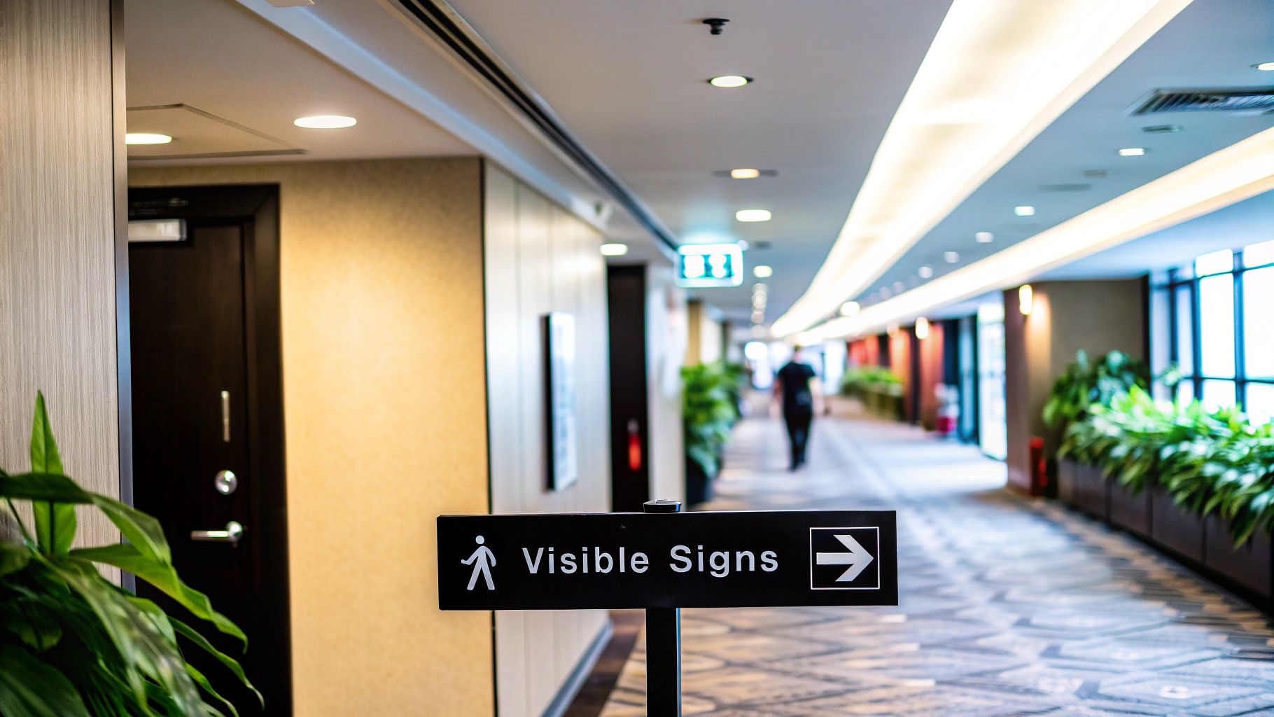
Placing Signs at Critical Decision Points
Knowing what signs to use is only half the battle. Where you put them is just as crucial. The secret is to place them at critical decision points—literally any spot where a guest has to make a choice about which way to turn.
Put yourself in the shoes of a first-time visitor. Walk through your own hotel and take note of every single time you hesitate or feel a flicker of doubt. Those are your signage hotspots.
-
Lobby and Entrance Areas: The second a guest walks in, they need immediate orientation. A clear directory or directional signs pointing to reception, lifts, and restaurants are non-negotiable.
-
Lift Lobbies: When a lift door opens on a new floor, a guest's first thought is, "Which way to my room?" A sign showing room number ranges (e.g., "Rooms 201-215 ←") is essential.
-
Corridor Intersections: Any time a hallway splits, turns, or meets another, you need a sign. Without one, guests are forced to guess, which often leads to them turning the wrong way and feeling frustrated.
A well-placed sign prevents a moment of confusion from turning into a negative memory of the stay. It's a proactive form of customer service that shows you've anticipated your guests' needs.
This forward-thinking approach dramatically cuts down on the number of times guests need to ask staff for directions. This frees up your team to focus on more meaningful, high-value interactions that truly enhance the guest experience.
Creating a Clear Visual Hierarchy
Once your signs are in all the right places, they need to speak the same visual language. A consistent visual hierarchy means guests can understand your entire signage system at a glance, almost subconsciously. This boils down to using consistent colours, fonts, and icons across your entire property.
Think of it like traffic lights—everyone instantly understands what red, yellow, and green mean. Your system should be just as intuitive. A guest should know, just by the look of a sign, whether it's giving a direction, identifying a room, or providing information. To add another layer of convenience, consider interactive elements. Learning how to design effective QR codes can significantly improve their usefulness, linking guests directly to digital menus, spa booking pages, or local area guides.
For example, you could decide that all directional signs will have a blue background, while all identification signs will have a grey one. This simple rule, when applied everywhere, makes your whole wayfinding system feel natural and easy to follow. The end goal is to transform a potentially confusing building into a space that guests can navigate with complete confidence.
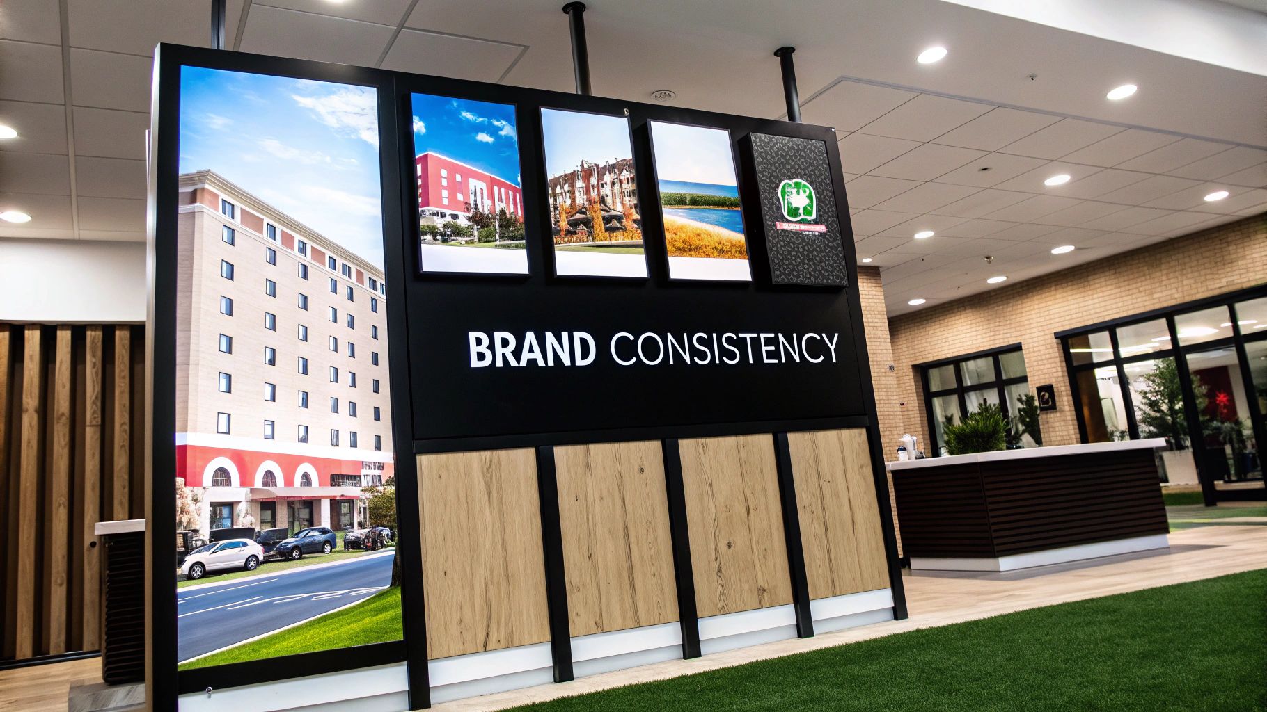
Turning Signage Into a Powerful Brand Statement
Your hotel’s signs are so much more than just a way to point people to the lift or the pool. They are a constant, visible part of your guest's experience. Every sign, from the large one out front that welcomes them to the tiny room number on their door, is a chance to reinforce who you are as a brand.
This is where you bring your brand's personality to life in the physical space. By making sure your material choices, fonts, and colour scheme all match your hotel’s unique character, you create an experience that feels complete and immersive. The aim is for every sign to look like it truly belongs.
Weaving Your Brand Story Into Every Sign
Think of your brand identity as the main plot of a story. Your signage is how you tell that story throughout the building. A rustic mountain lodge will tell a very different story from a sleek city hotel, and its signs should absolutely reflect that.
-
For a Rustic Lodge: You might choose materials like engraved wood, weathered steel, or natural stone. These options give off a sense of warmth, nature, and authenticity—perfect for a cosy, back-to-the-land brand.
-
For a Modern City Hotel: Clean, minimalist materials are the way to go. Think brushed aluminium, polished brass, or backlit acrylic. These choices shout sophistication, efficiency, and a sharp, contemporary style.
The right material doesn't just look good; it feels right. It makes your brand something guests can almost touch, creating a subconscious connection that builds trust and quietly communicates your value.
To get this right, it helps to understand the bigger picture of how great brands set themselves apart. Looking at powerful brand positioning examples can spark some fantastic ideas for making every little detail support a strong, cohesive identity.
Consistency: The Secret to Building Trust
Imagine checking into a hotel where the lobby sign is ultra-modern, but the hallway signs look like they’re from the 1980s, and your room number is just a flimsy plastic sticker. It’s jarring. This kind of inconsistency creates a feeling of chaos and can make the whole operation feel a bit cheap.
Consistency across all your signage is what communicates professionalism and genuine care. This means sticking to the same family of fonts, the same colour palette, and a consistent style of icons across the entire property.
When your branding feels the same from the moment a guest books online to the physical signs they follow to their room, you create a seamless journey. That cohesion is reassuring. It tells them they're in capable hands and that you've thought about every detail.
This attention to detail is more important than ever. Here in New Zealand, quality assurance programmes are a huge driver of guest expectations. Take Qualmark, our official tourism quality assurance organisation. It saw a 23% jump in businesses earning gold status by meeting high standards, which include things like clear signage and cultural thoughtfulness. This shows that guests are demanding better experiences, making clear, on-brand hotel signage a cornerstone of service excellence.
At the end of the day, investing in high-quality, on-brand signage is really an investment in your reputation. It elevates the entire guest experience, speaks to your value, and turns a simple sign into a silent ambassador for your brand.
Choosing Materials That Last and Impress
The material you choose for your hotel signs does far more than just hold the text. It’s a silent communicator of your brand’s quality, and it dictates how long your signs will last and how much upkeep they’ll need. Getting it right is a careful balancing act between durability, your budget, and the specific aesthetic you want to create for your guests.
Think of it like choosing furniture for your lobby. You wouldn't put a delicate fabric sofa out in the rain, would you? The same logic applies here. A sign facing the coastal elements needs to be much tougher than one nestled in a quiet interior corridor. Following these hotel signage guidelines will help you make a smart, lasting investment.
Matching Materials to Your Environment
First things first: where is the sign going to live? A sign's location is the single biggest factor in determining which materials will work. Busy, high-traffic areas demand tough materials that can handle scuffs and frequent cleaning, while your outdoor signs must be able to stand up to sun, rain, and fluctuating temperatures.
This distinction is about more than just looks; it's about protecting your budget and your brand. Choosing the wrong material can lead to faded, cracked, or warped signs in just a few years. That means spending more money on replacements and, worse, damaging your hotel’s carefully crafted image.
The right material choice is a form of proactive maintenance. By selecting durable, location-appropriate options from the start, you protect your brand image and prevent the recurring costs of frequent repairs and replacements.
A Practical Guide to Common Signage Materials
To help you decide, let's walk through some of the most popular materials we see in the hotel industry. Each one has its own strengths, making it ideal for specific jobs—whether you’re aiming for a luxurious feel, a rustic vibe, or a budget-friendly and durable solution. The trick is to align the material’s properties with your brand and what you need the sign to do.
Below is a quick comparison table to help guide your decision-making process.
Hotel Signage Material Comparison
| Material | Best For | Pros | Cons |
|---|---|---|---|
| Acrylic | Modern interiors, illuminated signs, and room numbers. | Versatile, lightweight, and has a clean, polished look. Excellent for backlighting and comes in many colours. | Can scratch more easily than metal and may fade over time with direct, prolonged sun exposure. |
| Aluminium | Both interior and exterior signs, directional wayfinding. | Durable, rustproof, and lightweight. Offers a sleek, professional finish and is very cost-effective for its longevity. | Can dent under significant impact and may lack the premium feel of heavier metals like brass. |
| Brass | High-end branding, main entrance signs, historic properties. | Creates a classic, luxurious, and prestigious appearance. Extremely durable and develops a unique patina over time. | Requires regular polishing to maintain its shine and is one of the more expensive material options. |
| Wood | Rustic lodges, boutique hotels, spas, and eco-resorts. | Offers a warm, natural, and inviting aesthetic. Can be engraved or carved for a unique, custom look. | Needs sealing and regular maintenance for outdoor use. Can be susceptible to moisture and insects if not treated. |
| Digital | Lobbies, event spaces, and high-traffic informational hubs. | Dynamic and instantly updatable. Boasts a high recall rate—studies show digital signage has an 83% recall rate among viewers. | Higher initial cost and requires power and potential software subscriptions. Content needs to be managed. |
Ultimately, the best material is the one that ticks all your boxes: it fits the location, reflects your brand's personality, and works within your budget. Considering these factors early on ensures your signage will not only look fantastic on day one but for many years to come.
Of course! Here is the rewritten section, designed to sound like an experienced human expert sharing practical advice.
Your Hotel Signage Questions, Answered
Even the most thorough plan hits a few practical hurdles. It's only natural. When it comes to putting your signage strategy into action, certain questions pop up time and time again. Let’s tackle some of the most common queries we hear from hoteliers, so you can refine your approach, stay compliant, and keep your guest experience seamless.
How Often Should I Be Auditing My Signage?
Think of a full-scale signage audit like a major health check-up. You’ll want to do a deep dive every 3-5 years, or whenever you're doing a significant refurbishment. This ensures your entire system is still doing its job, looks fresh, and lines up with any changes to local codes.
That said, don't wait five years to spot a problem. A quick, informal once-over should be part of your annual maintenance schedule. Keep an eye out for faded colours, peeling edges, or any physical damage. And of course, if you ever change your hotel's layout or the NZ Building Code is updated, those specific signs need immediate attention.
What are the Most Common Signage Mistakes Hoteliers Make?
Over the years, we've seen a few recurring tripwires that can turn a helpful sign system into a frustrating maze for guests. Steer clear of these, and you'll be well ahead of the game.
- Sign Overload: The temptation is to put a sign everywhere, but this just creates visual noise. Too many signs in one place overwhelm guests, making it impossible to find the one piece of information they actually need.
- Mismatched Branding: A mix-and-match collection of fonts, colours, and materials looks unprofessional. It sends a confusing message and dilutes the strong brand identity you've worked so hard to build.
- Bad Timing and Placement: This is a big one. Placing a sign after a guest needs to make a turn is a classic mistake. The sign needs to be visible before the decision point, not around the corner.
- Forgetting the Upkeep: A dusty, damaged, or flickering sign doesn't just look bad; it screams that you don't sweat the small stuff. That single broken sign can cast a shadow over a guest's entire perception of your hotel.
- Ignoring Accessibility: Overlooking high-contrast text, tactile features, and Braille isn't just a compliance headache—it's actively excluding guests with vision impairments and telling them they aren't welcome.
The best hotel signage isn't about how many signs you have, but about placing the right signs in the right places. The goal is clarity, not quantity. One perfectly positioned directional sign is infinitely more valuable than five confusing ones clustered in a hallway.
Should I Bring in a Professional for My Signage?
For small, non-essential updates—like a temporary sign for an event—handling it in-house is perfectly fine. But for anything more substantial, especially a full-scale wayfinding system or anything involving compliance, calling in a professional is a very smart move.
Why? Because navigating the NZ Building Code and accessibility standards like NZS 4121:2001 is complex. A signage expert can conduct a proper site audit, pinpointing the weak spots in your guest journey you might not even see. They’ll design a cohesive system that feels like a natural extension of your brand and ensure every sign is installed correctly for visibility and legal peace of mind. Think of it less as a cost and more as an investment in your guests' safety and your hotel's reputation.
At SONI DESIGN, we believe great signage does more than just point the way—it tells your story. From eye-catching digital prints to elegant directional signs, we work with you to create solutions that guide your guests and elevate your brand. Let's create something extraordinary that reflects your unique vision!
Article created using Outrank
Leave a Comment
Stay home & get your daily
needs from our shop
Start You'r Daily Shopping with Nest Mart