
Your cart is currently empty.

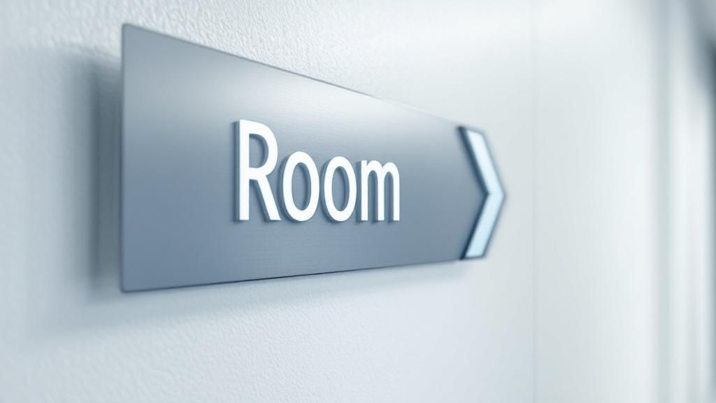
Navigating a hospital can be a stressful experience, but it doesn't have to be. Hospital signage guidelines are the essential standards that make sure these complex buildings are safe, efficient, and welcoming for everyone. Think of them less as simple directions and more as the backbone of patient safety, operational flow, and a positive visitor experience. Good signage does more than just point the way; it actively reduces stress and helps prevent missed appointments.
Why Clear Hospital Signage Is a Critical Priority
Imagine trying to find your way through a sprawling, unfamiliar hospital when you're already worried about a loved one or a health concern. That feeling of being lost and overwhelmed is something far too many people experience. This is where clear, intuitive signage steps in to act as a calm and steady guide. It transforms a confusing maze into a manageable space.
In many ways, a hospital's wayfinding system is like its central nervous system. It communicates vital information constantly, ensuring everyone—from patients and visitors to staff and delivery personnel—gets where they need to go, safely and on time.
This isn't just a matter of convenience; it’s a cornerstone of patient-centred care. When a visitor can easily find the cardiology wing or a patient can locate the radiology department without having to ask for help, it removes a huge layer of stress. This small detail has a massive ripple effect. Staff are freed up from constantly giving directions and can focus on what they do best: providing care.
The Impact on Safety and Efficiency
Confusing or inadequate signage can cause more than just frustration. It can lead to genuine problems like delayed care, missed appointments, and crowded, congested corridors. During an emergency, the ability to instantly spot the route to the Emergency Department or a critical care unit is absolutely vital. Well-planned hospital signage directly tackles these issues by creating a predictable and logical environment.
An effective wayfinding system does more than point the way; it builds trust. Each sign that confirms a visitor is on the right path reinforces their confidence and reduces their cognitive load, allowing them to focus on their health or the well-being of a loved one.
The fundamental importance of effective signage extends to all healthcare facilities, from major hospitals to smaller specialty centres. For a great real-world example, you can see how these principles are applied in the design of facilities like an NHS dental clinic.
Setting the Standard in New Zealand
While there isn't specific national data on digital signage adoption in Aotearoa, Te Whatu Ora (Health New Zealand) provides robust guidance for health facility design. These guidelines place a high priority on clear, accessible, and culturally considerate signage as a key tool for reducing patient stress.
The focus is squarely on creating a supportive atmosphere through excellent navigation. It’s a recognition that finding your way easily is a vital part of modern healthcare design. You can explore these standards in more detail in the official NZ Health Facility Design Guidance Note.
Before we dive deeper, let's summarise the foundational concepts that make a hospital's wayfinding system truly effective. These pillars work together to create an environment that is not just easy to navigate, but also safe and reassuring for everyone.
The Pillars of Effective Hospital Signage
| Pillar | Core Objective | Impact on Patients and Staff |
|---|---|---|
| Accessibility | Ensure everyone, regardless of ability, can read and understand the signs. | Reduces barriers for people with disabilities, older adults, and those with low literacy, promoting equity. |
| Consistency | Use a uniform system of colours, fonts, symbols, and terminology throughout the facility. | Creates a predictable environment, reduces confusion, and makes navigation feel intuitive. |
| Clarity | Provide clear, concise information at key decision points. | Prevents visitors from feeling lost, minimises stress, and avoids a "cognitive overload" of information. |
| Safety | Clearly mark emergency exits, hazards, and essential services. | Ensures rapid response during emergencies and prevents accidents, protecting both patients and staff. |
Ultimately, these pillars aren't just abstract design principles. They are the practical building blocks for creating a healthcare facility that feels human-centred and supportive from the moment someone walks through the door.
Navigating Regulatory and Accessibility Requirements
Getting to grips with the rules for hospital signage can feel like a mammoth task. But these regulations aren't there to make life difficult. Instead, think of them as a blueprint for creating a space that’s truly safe, welcoming, and easy to navigate for every single person who comes through your doors. Following these hospital signage guidelines is the first step toward creating a truly empathetic and effective wayfinding system.
These requirements are the architectural plans for communication. Just as a building needs a solid foundation to stand strong, a signage system needs to be built on proven accessibility standards to actually work for people. Let's break down the essential rules that govern hospital signage in New Zealand, reframing them as powerful tools for better design.
The Foundation of Universal Design
At the heart of all these regulations is a simple, powerful idea: universal design. This is the principle that spaces should be built from the ground up to be accessible to everyone, no matter their age, ability, or background.
When it comes to signage, this means designing for the full spectrum of human experience. You’re not just creating signs for a healthy adult with perfect vision; you're also thinking about a senior with low vision, a child, someone in a wheelchair, or a visitor who is blind. This approach means your wayfinding system just works for the widest possible audience, without needing special, one-off fixes. It’s about building equity right into the hospital’s physical environment.
At its heart, a great signage system is an exercise in empathy. It anticipates the needs of every visitor and provides information in a way that is clear, dignified, and supportive, removing barriers before they are ever encountered.
By embedding these principles into your project from day one, you’ll naturally sidestep common compliance headaches. More importantly, you'll create a place where every visitor feels seen and supported on their journey.
Key Accessibility Requirements in Practice
So, how do you put universal design into action? Hospital signage guidelines give us a clear set of practical rules. These aren't just arbitrary specs; they're based on extensive research into how people with different abilities see and interact with the world around them.
-
High-Contrast Colours: The text and symbols on a sign have to pop against their background. A strong contrast ratio, typically 70% or higher, is absolutely vital for people with low vision. Think bold white text on a deep blue background, not light grey on an off-white wall.
-
Minimum Font Sizes: The text simply has to be big enough to read from a practical distance. The required character height changes depending on how far away someone will be viewing it, ensuring critical information like room numbers and department names is always legible.
-
Tactile and Braille Elements: For anyone who is blind or has significant vision loss, tactile signs are non-negotiable. These signs feature raised lettering and corresponding Grade 2 Braille, allowing information to be read by touch.
-
Mounting Height and Location: Consistency is king. Signs must be installed at a predictable height so people know where to look or feel for them. This standard ensures signs are within the line of sight for most people, including wheelchair users, and are correctly positioned for tactile reading.
These practical rules are the building blocks of an accessible wayfinding system that serves everyone equally.
Navigating Specific Signage Regulations
Beyond general accessibility, hospitals also need to follow specific rules for certain areas and situations, especially when it comes to patient rights and safety hazards.
For example, a clear sign must be posted to warn people when medical oxygen is in use or being stored. Likewise, other health and safety warnings have specific requirements to protect both patients and staff from hidden dangers. In Aotearoa, the Health and Disability Commissioner (Code of Health and Disability Services Consumers' Rights) Regulations 1996 outlines patient rights, and signage plays a key role in making sure this information is visible and understood.
These types of signs often come with prescribed wording, symbols, and placement rules, like being readable from a set distance (e.g., five feet). They form a critical layer of the regulatory landscape. Ignoring these specific hospital signage guidelines can lead to serious compliance issues and, more importantly, put people’s safety and rights at risk.
The Psychology of Effective Wayfinding Systems

Great wayfinding is so much more than just putting signs on walls. It's really the art and science of guiding people through a space so intuitively that they barely have to think about it. A truly effective system anticipates what someone needs to know and answers their questions before they even have a chance to feel lost.
Let's dig into the psychological principles that can transform a confusing building into a reassuring and easy-to-navigate environment.
Think about a visitor's journey through a hospital. It's a bit like walking down an unfamiliar path at dusk. Each sign should be a well-placed lamp, not just showing the next few steps but also confirming they're on the right track. This constant reassurance builds confidence and dramatically reduces anxiety. The ultimate goal is to make getting around feel so effortless that visitors can focus on what's truly important—their health or the loved one they're there to support.
Reducing Cognitive Load for Stressed Visitors
Hospitals are, by their very nature, stressful places. And stress has a huge impact on our ability to think clearly and process information. When we're anxious, our cognitive load—basically, the amount of brainpower needed to do something—is already maxed out. A confusing wayfinding system just piles on more stress, making it nearly impossible to decipher complex maps or remember a string of directions.
The secret to great hospital signage is to intentionally reduce this cognitive load. You do this by creating a crystal-clear and logical hierarchy for your information.
- Colour-Coding: This is a classic for a reason. Assigning a specific colour to a whole wing or department (like blue for Maternity or green for Cardiology) creates a powerful visual shortcut. The brain processes a colour far quicker than it can read a word.
- Distinct Symbols and Icons: Using universally understood symbols for things like toilets, lifts, or the cafe gives people instant recognition. It cuts right through any language or literacy barriers.
- Progressive Disclosure: This is crucial. Instead of bombarding visitors with every single destination the moment they walk in, you reveal information in stages. At the main entrance, they just need to know which floor or wing to head for. Once they get there, they can find the next sign pointing them to the specific clinic or room.
This structured, step-by-step approach simplifies the decisions people have to make at every turn, making the entire journey feel logical and much less daunting.
The Power of Co-design and Real-World Feedback
The most successful wayfinding systems are never designed in a vacuum. They are developed through co-design, a process that brings the very people who will use the space every day—patients, their families, and staff—to the design table. These are the people with the real-world insights, and they can spot the navigational hurdles that designers and architects might easily miss from their blueprints.
A signage system is only successful if it solves real problems for real people. Engaging directly with hospital users uncovers the "unspoken" navigational challenges—the confusingly numbered corridors, the hidden entrances, and the routes that feel unsafe or counterintuitive.
A fantastic New Zealand example of this was the signage project at Taupō Hospital. The project team knew that poor navigation was a major source of stress, so they partnered directly with patients and whānau. They ran surveys, interviewed staff, and even had consumer representatives walk the patient journey to see the problems firsthand. This co-design approach led to tangible improvements in the visitor experience because the feedback directly shaped the final design. You can learn more about how they did it by reading the full case study on the Lakes DHB project.
By weaving these psychological principles into the design and committing to a co-design process, a hospital can create a wayfinding system that does far more than just direct foot traffic. It becomes a vital part of the healing environment itself, communicating care, competence, and empathy from the very first step a visitor takes inside.
Selecting the Right Materials and Design Elements
Choosing the right materials and design elements for your hospital signs is a lot like an architect selecting the perfect materials for a new building. The physical sign itself is just as important as the information it displays. It has to be tough enough for a high-traffic environment, completely safe for patients, and a seamless extension of your hospital's wayfinding strategy and brand.
This is a balancing act between practicality and aesthetics. A sign in a busy main corridor needs to handle bumps from trolleys and frequent, rigorous cleaning. On the other hand, a sign in a sensitive clinical area might need special anti-microbial properties above all else. These decisions have a direct impact on the longevity, safety, and overall success of your wayfinding system.
Choosing Durable and Safe Materials
The materials you choose have to stand up to the unique pressures of a healthcare setting. Longevity is a big one, because replacing signs is expensive and disruptive. But when it comes to hospitals, safety and cleanability are absolutely non-negotiable.
Here’s a look at some of the most common materials and where they fit best:
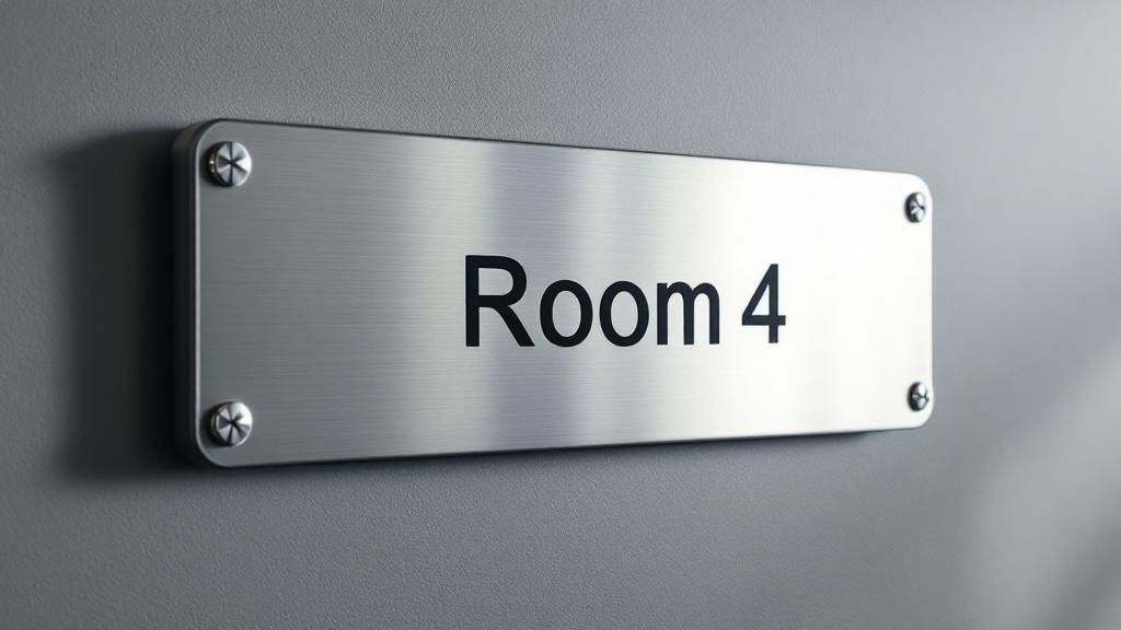
- Acrylic: A versatile and popular choice, acrylic is strong, easy to clean, and can be customised with subsurface printing. This protects the text and graphics from wear and tear, making it perfect for interior signs like room numbers and departmental directories.
- Aluminium: If you're after a more premium, robust feel, aluminium is a fantastic option. It's incredibly durable, so it's a great fit for busy corridors and even exterior signage. It also comes in various finishes to match your hospital's interior design.
- Anti-Microbial Surfaces: In clinical areas, infection control is everything. Specialised materials with anti-microbial coatings or inherent properties are vital for reducing the spread of germs. You'll want these for signs in patient rooms, treatment areas, and around surgical suites.
To help you weigh your options, this table breaks down the pros and cons of common signage materials.
Comparing Common Hospital Signage Materials
| Material | Key Advantages | Best Use Cases | Important Considerations |
|---|---|---|---|
| Acrylic | Versatile, easy to clean, modern look, subsurface printing protects graphics. | Room identifiers, directional signs, directories, donor walls. | Can scratch if not properly cared for; lower impact resistance than polycarbonate. |
| Aluminium | Highly durable, premium finish, lightweight, excellent for interior and exterior use. | Main directories, exterior building signs, high-traffic corridors. | Higher initial cost; can dent under significant impact. |
| PVC Foam Board | Lightweight, cost-effective, easy to fabricate. | Temporary signage, informational posters, low-traffic areas. | Not as durable as other options; can be damaged by harsh cleaning chemicals. |
| Anti-Microbial Laminates | Actively inhibit microbe growth, easy to clean, can be applied to other substrates. | Touch-points, patient rooms, nurses' stations, surgical areas. | Can add to the cost; requires verification of anti-microbial effectiveness. |
Ultimately, the best material isn't just about what looks good on day one. It's about what continues to do its job safely and clearly on day one thousand.
Weaving in Brand and Visual Language
Beyond the physical materials, elements like typography, colour, and icons create a visual language that guides your visitors. This is where your hospital's brand identity truly meets the practical demands of wayfinding. A consistent visual system doesn't just look good; it makes the entire facility feel more cohesive, professional, and trustworthy.
This image highlights a few key compliance metrics that must be baked into any design from the start.
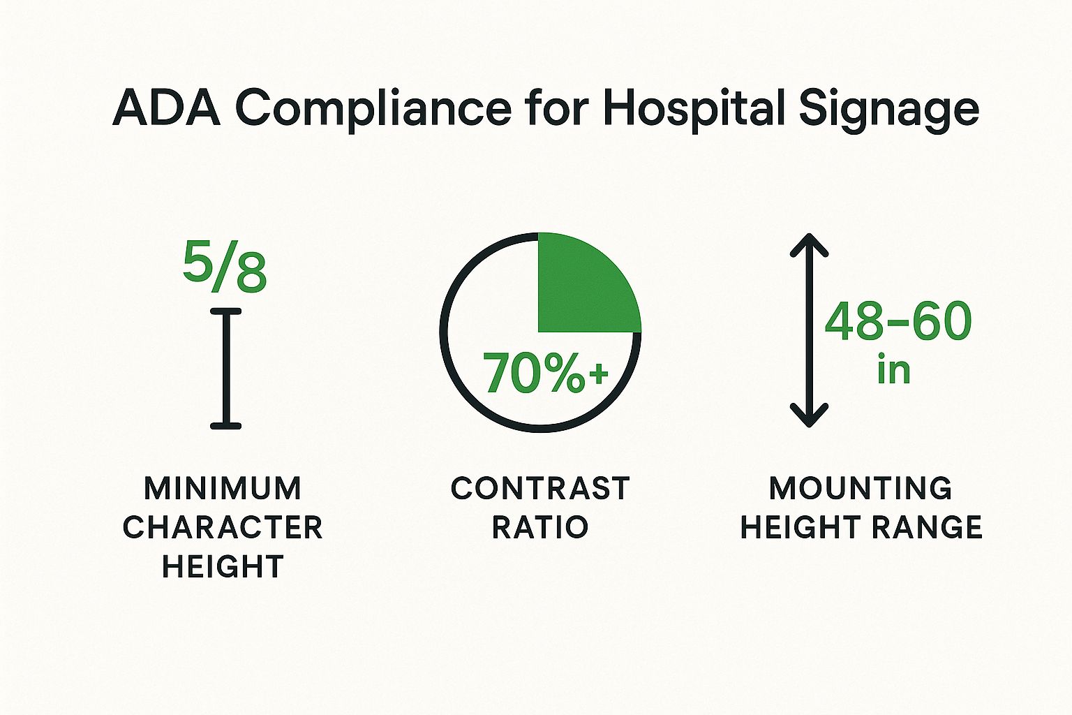
These visual data points show how specific, measurable standards for height, contrast, and size are the foundation of truly accessible sign design.
While keeping hospital-specific needs in mind, it's also helpful to look at broader design principles. Reviewing examples of comprehensive brand guidelines can give you great ideas for creating a more robust and consistent visual system across your entire facility.
The Role of Typography and Iconography
The fonts and symbols you use have a massive impact on readability, especially for visitors who are stressed, in a hurry, or have vision impairments.
-
Typography: Always go for a clean, sans-serif typeface known for its excellent legibility. Think Helvetica or Frutiger. Steer clear of decorative or overly complex fonts that are hard to read from a distance. Using font weights consistently—like bold for headers and regular for other text—creates a clear visual hierarchy that people can understand at a glance.
-
Iconography: Simple, universally understood icons are a powerful tool. They can cut through language barriers and are processed much faster than words. Using a consistent set of icons for key facilities like toilets, lifts, and information desks gives visitors helpful visual shortcuts to navigate the space more easily.
In the end, every single design choice—from the texture of a sign to the curve of a letter—shapes how effective your hospital wayfinding is. By carefully selecting each element, you create a signage system that isn't just compliant and durable, but one that communicates care, clarity, and competence to every person who walks through your doors.
Integrating Digital Signage and Technology
While your permanent, static signs form the reliable backbone of a hospital's wayfinding system, today's technology offers some incredible tools to elevate the entire visitor experience. The key isn't to replace every physical sign with a screen. Instead, it’s all about smart integration, creating a hybrid system where digital and static elements work together seamlessly.
Think of it this way: the fixed signs get you to the right wing, but a digital screen tells you the real-time wait for your clinic. It’s this combination that creates a fluid, stress-free journey. Technology helps solve complex communication problems that static signs just can’t, turning a good wayfinding system into a truly great one.
Making Information Dynamic and Responsive
The single biggest advantage of digital signage is its ability to change in an instant. Hospitals are anything but static; clinics run late, rooms get reassigned, and urgent health advice needs to be shared immediately. Digital displays are built for this kind of environment.
This real-time capability turns signs from simple pointers into active communication hubs. They can broadcast urgent public health alerts, show current wait times for the emergency department, or even guide people to an alternative entrance during renovations. That kind of responsiveness is a game-changer for managing the flow of people and improving operational efficiency.
By blending the reliability of static signs with the adaptability of digital displays, a hospital creates a wayfinding ecosystem that is both stable and intelligent. It gives visitors the consistency they need, while also providing the up-to-the-minute information that makes their journey smoother.
This dynamic approach is now a central part of modern hospital signage guidelines, helping facilities manage people and information far more effectively.
Personalising the Patient Journey
Beyond just broadcasting messages, technology opens the door to a much more personalised navigation experience. This is where tools like interactive kiosks and mobile integration come into play, offering tailored directions that a static sign simply can't.
-
Interactive Kiosks: When placed at key decision points like main entrances or lift lobbies, these allow visitors to search for a specific doctor or department and get turn-by-turn directions right there on the screen.
-
Mobile App Integration: A hospital app can take this a step further. It can send directions straight to a visitor's phone, complete with that familiar "blue dot" navigation we all use in our cars.
-
QR Code Implementation: QR codes are a fantastic way to bridge the physical and digital worlds. A simple code on a static sign can let a visitor scan for more detailed information, access a directory, or even watch a video about a clinic. If you're looking for ideas, an ultimate guide to using QR codes can provide a solid foundation for their use in a healthcare setting.
This level of personalisation respects each person’s unique journey, massively reducing the need for them to stop and ask for help. It empowers them with the exact information they need, right when they need it, building confidence and easing the anxiety that so often comes with navigating a large, complex hospital.
A Practical Implementation Checklist
Turning solid signage theory into a successful on-the-ground project comes down to a clear, step-by-step plan. This checklist is your roadmap for getting a new or upgraded wayfinding system off the ground, making sure it’s effective, compliant, and genuinely helpful. Think of it less like a rigid set of rules and more like a dependable framework for a complex but vital job.
The first step is always discovery. Before you can map out the future, you have to understand the present. That means walking the floors and seeing your facility through the eyes of a stressed, first-time visitor.
Phase 1: Initial Audit and Team Formation
Start by doing a full audit of every sign you currently have. Walk every corridor, pop into every department, and take notes on everything you see. Document any signs that are broken, out-of-date, confusing, or don't meet today's standards.
Next, you need to build your project team. This isn’t a one-person job. A strong team should bring together different perspectives from across your facility, including:
- Facility Managers: They know the building's bones, its quirks, and what it takes to maintain things.
- Clinical Leaders: They can speak to patient flow, which departments are busiest, and where people get lost most often.
- Marketing or Communications Staff: They will ensure every sign looks and feels like it belongs to your hospital's brand.
- Patient Advocates or Volunteers: These are your secret weapon. They offer priceless, real-world feedback from the user’s point of view.
Getting this group together from the start is the key to making sure every angle is covered.
The success of a signage project is directly tied to how well you plan at the beginning. A detailed audit and a diverse team will save you from expensive mistakes down the road and ensure the final system actually solves real-world problems.
Phase 2: Design and Vendor Selection
With your audit done and your team assembled, it's time to create a comprehensive design brief. This is the document that will guide the entire project. It needs to lay out your goals, budget, brand guidelines, and all the technical must-haves, especially accessibility requirements.
From there, you can start the search for a qualified signage vendor. Don't just pick anyone. Look for a partner with proven experience in healthcare—they’ll already know the unique challenges, like infection control, durability needs, and the complex web of regulations. Always ask to see their work in other hospitals and talk to their references. Choosing the right partner is probably the single most important decision you'll make.
Phase 3: Installation and Post-Launch Review
A smooth installation is all about careful planning. You want to cause as little disruption as possible. Work with your vendor to create a phased rollout, tackling one area or floor at a time. It’s often best to schedule this work during quieter, off-peak hours to minimise the impact on patients and staff.
Finally, remember that the project isn't over just because the signs are on the wall. A wayfinding system needs to live and breathe with your facility. Set up a schedule for post-launch evaluation and ongoing maintenance. A few months after the rollout, actively gather feedback from staff and patients to see if any confusing spots remain. A good maintenance plan protects your investment and keeps your wayfinding system working perfectly for years to come.
Of course! Here is the rewritten section with a more natural, human-expert tone, following all the specified guidelines.
Common Questions About Hospital Signage
Even with the best planning, putting together a hospital's signage system always brings up a few tricky questions. Facility managers, designers, and administrators often run into the same practical hurdles.
This section is here to give you straightforward answers to the questions we hear most often. Think of it as your go-to guide for those finer details that make all the difference in creating a truly effective and compliant wayfinding system.
How Often Should Hospital Signage Be Audited?
As a rule of thumb, a full-scale audit of your entire signage system should happen at least every 3 to 5 years. This isn't just a quick walk-around; it's a deep dive to make sure everything is still compliant, in good shape, and actually matches your hospital's current layout.
But let's be realistic—hospitals are constantly changing. You'll also need to do an audit whenever there's a major shift, like a department moving, a new service launching, or even a brand refresh. On top of that, it’s smart to do a quick, informal check every year. This helps you catch any scuffs, outdated info, or general wear and tear before a small issue becomes a big headache for your patients.
What Is the Most Important Accessibility Factor?
This is a tough one because every accessibility feature plays a part. But if I had to pick just one, it would be high colour contrast between the text and its background. It has an enormous impact on readability, especially for people with low vision, age-related sight loss, or even certain cognitive conditions.
You can have the most beautiful sign in the world, but if people can’t easily read it, it’s failed at its one job. Strong contrast is non-negotiable.
Sticking to a contrast ratio of at least 70%, as the accessibility standards recommend, is the best way to make sure your signs are clear and legible for absolutely everyone who walks through your doors.
How Can We Best Incorporate Cultural Inclusivity?
In Aotearoa New Zealand, weaving Te Reo Māori and other cultural elements into your signage is about so much more than a simple translation. To get it right, you need to move beyond ticking a box and embrace genuine partnership. This means co-designing with local iwi, cultural advisors, and community leaders.
When you work together from the start, you ensure the language, symbols, and stories you use are authentic and respectful. It’s how you create a space that doesn't just feel welcoming, but truly reflects and honours the cultural fabric of the community you serve.
Are Digital Signs a Replacement for Static Signs?
Definitely not. It's best to think of them as partners working together. Static signs are the permanent, reliable backbone of your wayfinding system—the big overhead signs for each wing, the fixed numbers on every door. They provide a constant, predictable foundation that people can count on.
Digital signs, on the other hand, bring the flexibility. They’re perfect for dynamic, real-time information that static signs just can’t handle, like clinic wait times, temporary detours, or urgent public health messages. The best systems use both: the dependability of static signs combined with the responsiveness of digital ones. It’s this blend that creates a seamless and helpful visitor experience.
At SONI DESIGN, we believe great signage is a mix of art, science, and a whole lot of empathy. Whether we're crafting clear directional signs or producing vibrant prints that tell your story, we're passionate about making your vision for a safer, easier-to-navigate facility a reality. Let's create something extraordinary together that shows your commitment to care. You can explore our design and signage solutions at https://www.sonidesign.co.nz.
Leave a Comment
Stay home & get your daily
needs from our shop
Start You'r Daily Shopping with Nest Mart