
Your cart is currently empty.
Picture this: a potential customer is strolling down the street, completely oblivious to that amazing new coffee blend or special two-for-one deal you’ve got waiting inside. This is where a great footpath sign comes in. For so many New Zealand businesses, it's like a friendly handshake, turning a casual passerby into a genuinely interested customer.
Why Your Business Needs a Footpath Sign
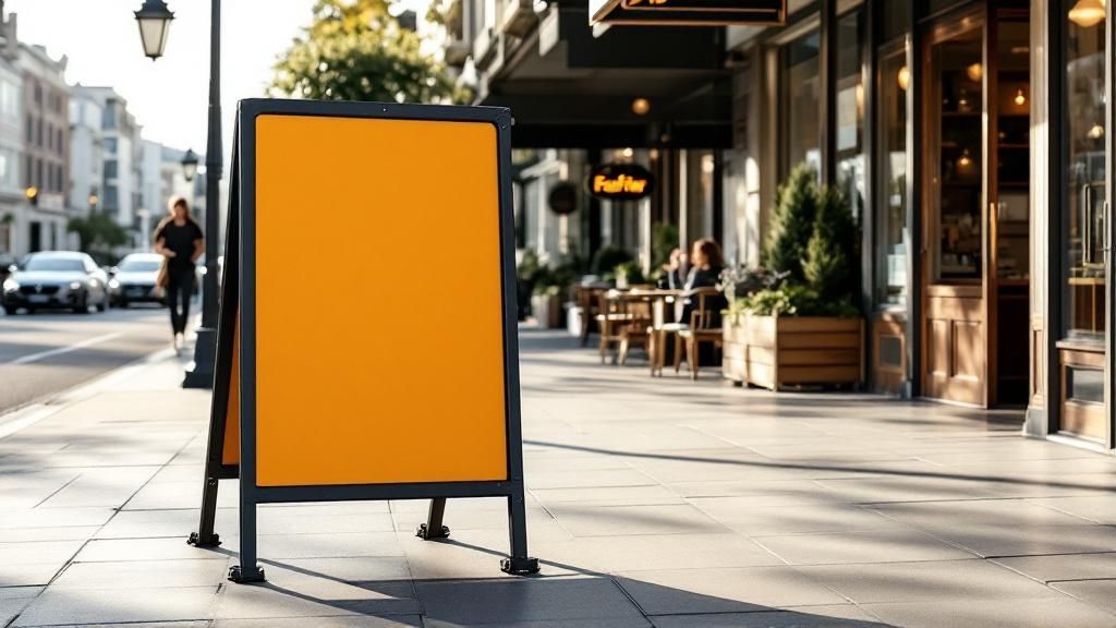
Think of your footpath sign—often called an A-frame or sandwich board—as your silent salesperson. It’s out there on the pavement, day in and day out, tirelessly broadcasting your brand’s personality and current offers to everyone who wanders past.
For local Kiwi businesses, whether it's a bustling café in Auckland or a quaint boutique shop in Queenstown, these signs are one of the most direct and budget-friendly ways to capture foot traffic. A good sign isn't just a slab of plastic or wood; it's a strategic blend of key ingredients working together to make a brilliant first impression.
The Anatomy of an Effective Sign
The very best footpath signs nail a balance between three crucial components:
- Eye-Catching Design: You’ve only got a few seconds to grab someone's attention. That means using bold, clear fonts, high-contrast colours, and a message that’s short, punchy, and to the point.
- Weather-Proof Materials: Let's be honest, New Zealand's weather can be all over the place. A durable sign, maybe with a sturdy metal frame or a water-fillable base, is a smart investment that will stand up to wind, rain, and sun.
- Council Compliance: This is the big one that often gets overlooked. Following your local council’s rules on size, placement, and display times is absolutely non-negotiable.
A beautifully designed sign that flouts local bylaws can quickly turn from an asset into a liability, landing you with fines or orders for removal. Getting compliance right ensures your sign is helping, not hindering, your business.
Understanding just how vital signs are for business success really drives home why a footpath sign is such a smart move. You can learn more about the critical importance of signage in commerce to get the full picture.
By getting these three things right—design, materials, and rules—you can transform your footpath sign from a simple ad into a valuable, compliant, and customer-generating machine.
How Early Road Safety Shaped Today's Signage Rules
 To really understand why we have such specific rules for footpath signs, it helps to take a trip back in time. Picture the streets of early 20th-century New Zealand—often chaotic, bustling places with a mix of carts, early motorcars, and people on foot. There were no national traffic laws like we have now, so keeping people safe was more about common sense than official rules.
In those early days, warnings were pretty basic. A shop owner might just nail a hand-painted sign to a post, or a road crew could simply chalk a warning on a board. There was no consistency. What you saw in one town was completely different from the next, creating a confusing and sometimes dangerous jumble of alerts. This was the reality of our growing towns and cities.
The Era of Human Warning Signs
As machinery got bigger and faster, so did the risks. The arrival of massive steam-powered road rollers, for example, introduced a whole new level of danger for pedestrians and horse-drawn traffic. With no official signs to rely on, people had to come up with other ways to keep everyone safe.
This is where the "flagman" came in—a worker whose entire job was to be a living, breathing warning sign. Think about this: in Wellington, back in 1887, someone had to walk at least 20 metres ahead of a noisy steam roller waving a red flag just to let people know it was coming. It’s a fascinating piece of history, and you can see how these early practices evolved in New Zealand's history of temporary traffic management.
This total reliance on a person to do the job of a sign shows just how informal safety was back then. It was a practical, if clunky, solution for a time when formal regulations for footpath signs in NZ were still a long way off.
The Shift Toward Standardisation
As our towns blossomed into cities and cars became more common, it was obvious the old, informal system couldn't cope. A makeshift sign in Christchurch might mean something completely different from one in Auckland, which was a recipe for confusion and accidents.
This inconsistency was the real catalyst for change. The journey from a flagman on the street to the detailed bylaws we follow today tells us something incredibly important about why these rules exist.
Regulations aren't just red tape designed to make life difficult. They are the direct descendants of that flagman—a modern, consistent system built from over a century of learning how to keep our public spaces safe and accessible for everyone.
Knowing this history gives today’s rules a whole new meaning. Every detail, from the size and placement of your A-frame sign to its design, is part of a long tradition of looking out for each other on our shared footpaths.
Meeting Council Rules for Footpath Signs
Navigating your local council's bylaws for footpath signs can feel a bit like wading through red tape. But once you understand the "why" behind the rules, it all starts to make sense. At their core, these regulations are all about keeping our footpaths safe and accessible for everyone.
Think of the pavement outside your shop as a shared public space. It’s a thoroughfare for parents with prams, people using wheelchairs or mobility scooters, and folks who are visually impaired. The council's job is to ensure your sign doesn't accidentally become an obstacle, turning a potential customer's journey into a frustrating or dangerous one.
Key Rules You Must Follow
While the specifics can vary slightly between cities like Auckland, Wellington, and Christchurch, the fundamental principles are pretty consistent across the country. They’re all designed to strike a balance between letting you advertise and keeping the public way clear.
Here’s a breakdown of what you'll almost always need to consider:
- Size and Dimensions: Councils will have strict limits on the maximum height and width of your sign. A sign that's too big isn't just an eyesore; it can block sightlines for drivers pulling out of a driveway and for pedestrians trying to see what's ahead.
- Placement and Clearance: This is a big one. You'll need to leave a mandatory clear channel for people to walk through. This is often around 1.8 metres wide and means placing your sign a certain distance from both the kerb and your building line.
- Permitted Hours: You can't just leave your sign out 24/7. Most councils require you to display it only during your business's opening hours. Bringing it in at night stops it from becoming a trip hazard in the dark or getting blown into traffic during a southerly gale.
To make this easier to digest, here’s a quick summary of the common rules you'll encounter. Remember, this is a general guide—you should always check your specific local council's website for the most up-to-date and accurate bylaws for your area.
Common NZ Council Footpath Sign Rules at a Glance
A summary of typical regulations business owners encounter across major New Zealand city councils. Always check with your specific local council for current bylaws.
| Regulation Area | Common Requirement | Reasoning (Public Safety & Accessibility) |
|---|---|---|
| Clear Footpath Width | Maintain at least 1.8m of clear space. | Guarantees enough room for wheelchairs, mobility scooters, and prams to pass without obstruction. |
| Sign Placement | Keep it directly outside your business premises. | Prevents random street clutter and avoids confusing pedestrians about which business the sign belongs to. |
| Display Times | Only during your business's operating hours. | Reduces trip hazards after dark and stops signs from being damaged or becoming dangerous projectiles in bad weather. |
| Stability and Condition | Must be stable, sturdy, and in good repair. | Prevents signs from tipping over in a gust of wind or from a slight knock, which can cause injury or block the path. |
Nailing these details means you can place your footpath signs in NZ with complete confidence, knowing you're a considerate member of the local business community.
Visualising Compliant Dimensions
Sometimes, a picture is worth a thousand words of council-speak. This image perfectly illustrates the common placement rules councils have in place.
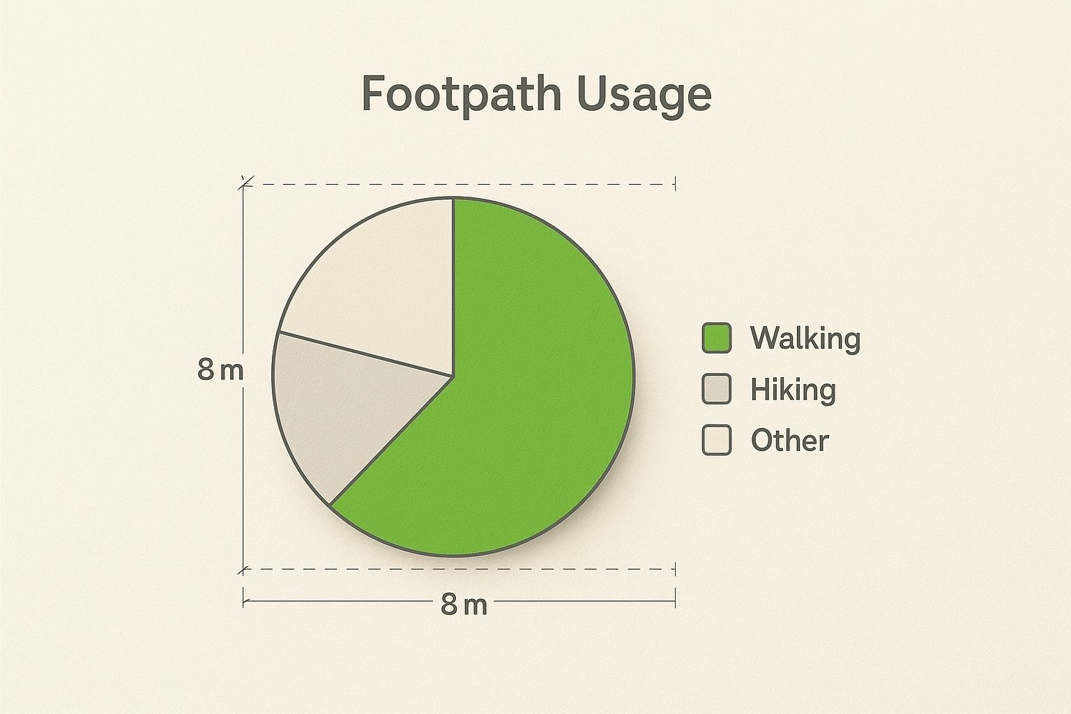
As you can see, it’s all about finding that sweet spot. The goal is to make your sign visible enough to catch the eye while leaving more than enough room for people to move freely and safely. By respecting these dimensions, you ensure your sign helps your business without getting in anyone’s way.
Designing a Sign That Stops People in Their Tracks
You’ve got about three seconds. That’s the tiny window of opportunity you have to catch the eye of someone walking past your business. In that fleeting moment, your footpath sign needs to do some heavy lifting to turn a casual glance into genuine interest. A great sign isn't just about pretty aesthetics; it's a careful mix of the right materials, smart colour choices, and a message that stops people cold.
Your first decision is what your sign is actually made of. This is your main defence against New Zealand’s famously four-seasons-in-a-day weather. A classic wooden A-frame might perfectly capture your rustic café vibe, but if your business is in a wind tunnel like Wellington, you'll need something tougher. A sturdy metal frame or a hollow base you can fill with sand or water will give you the stability you need. The goal is to choose a sign that looks the part but, more importantly, stays put.
Readability is Everything
Once you’ve sorted the frame, the real design work begins. The absolute golden rule here is clarity over clutter. Your message has to be so straightforward that someone can absorb it without even breaking their stride.
This is where high-contrast design principles are your best friend.
- Bold Colours: Forget subtle pastels. You need combinations that shout from across the street. Think classic black on yellow, crisp white on a deep blue, or any vibrant colour set against a clean white background. These pairings create instant visual punch.
- Clear, Simple Fonts: That elegant, swirly script might look lovely up close, but from the other side of the pavement, it’s just a messy blur. Stick with clean, sans-serif fonts like Helvetica, Arial, or Open Sans. They’re built for legibility at a glance.
- Keep it Short & Sweet: It’s tempting to list every single thing you offer, but resist! A powerful sign zeroes in on one compelling offer. A good rule of thumb is to stick to a maximum of 5-7 words. Is it a "Coffee & Muffin Deal"? A "50% Off Winter Sale"? Or a simple "We're Open"? Be direct and to the point.
The Power of Simplicity: Before and After
Let's imagine a sign for a local bakery. The first draft might read: "Artisan Breads, Sourdough, Pastries, Croissants, Gluten-Free Options, and Freshly Brewed Coffee Available All Day." It’s certainly informative, but it’s also a visual overload.
A much punchier version would be a bold, simple sign saying: "Freshly Baked Sourdough. Grab a Loaf!" It’s specific, it’s actionable, and it’s incredibly easy to process in just a few seconds. That one small tweak transforms the sign from a passive menu into an active invitation.
Many of the modern footpath signs in NZ are now made with Aluminium Composite Material (ACM) panels. These are fantastic because their smooth surface often doubles as a whiteboard for dry-erase markers. This gives you amazing flexibility to advertise daily specials or update information without the cost and hassle of a whole new print run.
By focusing on a clear visual hierarchy—a bold headline, readable text, and a simple call to action—you create a sign that does more than just sit on the footpath. It actively works to bring customers through your door.
The Unseen Traffic Controllers on Our Footpaths
Think about your last walk or drive through town. Beyond the shop windows and your own A-frame sign, there's a whole other language being spoken—the language of official pedestrian signs. These aren't about advertising a flat white; they're the silent guardians of our public spaces, and there's a real science behind why they work and why council rules for business signs are so firm. Grasping this helps you see where your business fits into the bigger picture of a safe, shared community.
It all boils down to a simple concept: our brains can only handle so much information at once. Official signs, like the ones for a pedestrian crossing or a school zone, are designed for instant recognition. They need to cut through all the other visual noise to deliver a critical safety message. Your marketing sign is competing for that exact same slice of attention.
Why Safety Gets Top Priority
There’s a very good reason the rules around your footpath signs nz are so strict. It’s to stop your clever marketing message from accidentally drowning out a life-saving one. Picture this: a driver is squinting to read your daily special. In that split second, they could easily miss the official sign warning them that children are crossing the road just ahead.
This is the exact scenario that council bylaws are designed to prevent. By keeping business signage within specific limits for size, placement, and design, they make sure the visual hierarchy on our streets always puts safety at the very top.
At its heart, the principle is straightforward: a person's ability to see and react to an official safety sign must never be compromised. This ensures your business can thrive as part of the community without unintentionally creating a hazard.
A fascinating study on hazard warnings revealed that certain signs, like the iconic symbol for a children's crossing, were linked to an estimated 41.2% drop in related crashes here in New Zealand. But here's the catch: the same report points out that a driver might only notice between 2% and 20% of single warning signs they pass. This shows just how critical it is for those signals to be completely clear and unobstructed. You can dig into the full research on hazard sign effectiveness on NZ roads.
That data really highlights the fine line between getting noticed and becoming a dangerous distraction.
Your Sign's Part in a Bigger System
At the end of the day, your footpath sign is a guest in a shared public space—one that has been carefully organised for everyone's safety. When you follow the rules, you’re doing more than just dodging a fine; you're playing your part in a system designed to protect people.
Your responsibility as a business owner is to make sure your sign works in harmony with its surroundings. It needs to draw in customers without ever getting in the way of the crucial visual cues that keep our footpaths and roads safe for everyone, from young kids to our elderly.
Crafting a Uniquely New Zealand Sign System

The system of signs dotting New Zealand's streets didn't just happen overnight. For a long time, our road warnings were a bit of a mishmash, with many ideas borrowed straight from the American system. But as our country carved out its own identity, it became obvious we needed something built for our own unique roads and conditions.
So, a deliberate move was made to create a system that was truly ours. It was a conscious decision to step away from international templates that never quite fit and, instead, build something that put the safety of Kiwis front and centre. This wasn't just shuffling papers; it was a fundamental shift in how we approach public safety.
The Turning Point for Signage
The real turning point came in the mid-20th century with the introduction of some key regulations. This push was cemented by the Traffic Sign Notice of 1966, a landmark document that officially standardised many of the signs we now take for granted. This wasn't just a new rulebook; it was the birth of a clear, national sign language designed specifically for New Zealanders.
This notice introduced or refined crucial instructions for drivers and pedestrians. For the first time, essential signs like 'Give Way', 'Pedestrian Crossing Ahead', and specific commands for turning traffic became uniform across the country, creating a unified approach to safety. You can dive deeper into the history of this unique New Zealand road sign system to see how it all unfolded.
This standardisation was a game-changer. It ensured that a 'Give Way' sign meant the exact same thing in Invercargill as it did in Kaitaia, eliminating confusion and making our roads and footpaths far safer.
Lasting Impact on Public Spaces
This history matters a great deal for business owners today. The strict rules governing commercial footpath signs in NZ are a direct descendant of this legacy of safety and clarity. Understanding that today’s regulations are built on a foundation of carefully developed national standards helps explain why compliance is so non-negotiable.
It shows that the rules aren't just arbitrary red tape. They are the result of a long journey toward creating a safer, more intuitive environment for everyone who shares our public spaces.
Your Top Footpath Sign Questions, Answered
If you're thinking about using a footpath sign for your business in New Zealand, you're not alone. It's one of the best ways to grab attention, but it's natural to have a few questions about the rules and how to get the most bang for your buck. Let's walk through some of the most common queries we hear.
The big one, right off the bat, is about permits. Do you actually need one? The short answer is, it’s a classic "it depends" situation. Every local council has its own set of rules. Some might require you to apply for a permit, which could involve paperwork and a fee, while others simply have a standard set of bylaws that everyone needs to follow. The only way to know for sure is to check with your local council directly. A quick visit to their website or a phone call will give you the definitive answer for your area.
How Do I Choose the Right Sign for My Spot?
This question comes up a lot, especially from businesses in notoriously windy places like Wellington or any of our beautiful coastal towns. When you're dealing with gusty conditions, your number one priority has to be stability. A flimsy sign isn't just ineffective; it's a genuine safety risk.
For breezy locations, you'll want to look for signs with some serious staying power:
- Heavy-Duty Metal A-Frames: Their sheer weight makes them tough for the wind to bully.
- Water-Fillable Bases: These clever designs have a hollow base you can fill with water or sand, creating a solid anchor that keeps your sign exactly where you put it.
It's easy to get drawn in by a sign's good looks, but in windy spots, that can be a real mistake. Choosing a sturdy, weighted sign isn't just about protecting your investment—it's about keeping people safe by ensuring your sign doesn't end up in the street or tripping up a passerby.
How Can My Sign Get Noticed Without Being an Eyesore?
Finally, how do you design a sign that packs a punch without overwhelming people with information? The key is to embrace the “three-second rule.” Think about it: that’s all the time you have to catch someone's eye as they walk past.
If they can't figure out what you're offering in about three seconds, you've lost them. Keep your message tight—aim for a maximum of 5 to 7 words. Use colours that pop, like classic black on yellow or white on a dark blue, and have one crystal-clear call-to-action. When it comes to footpath signs, simplicity is your superpower.
Ready to create a sign that stops traffic for all the right reasons? At SONI DESIGN, we specialise in crafting eye-catching, durable footpath signs that tell your story. Let's bring your vision to life.
Leave a Comment
Stay home & get your daily
needs from our shop
Start You'r Daily Shopping with Nest Mart