
Your cart is currently empty.

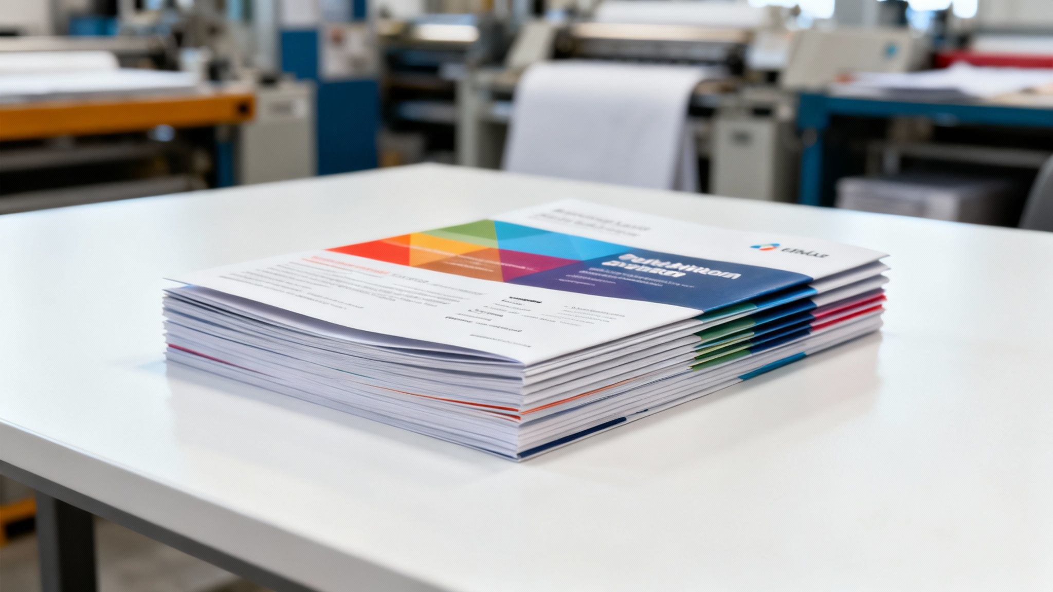
When you need marketing materials that truly pop—think brochures, flyers, or reports that make an impact—standard office printing just doesn't cut it. Professional colour copy and print services are the answer, delivering the kind of vibrant colours, sharp detail, and polished finish that reflects the quality of your brand.
What Is Professional Colour Copy and Print
It’s a bit like the difference between a home-cooked meal and a chef-prepared dish. Both get the job done, but the professional version uses specialised equipment, premium ingredients, and expert techniques to reach a level of quality and consistency that’s simply out of reach at home. Professional colour printing works on the very same principle.
This isn't just about hitting 'print' on a bigger machine. It’s a specialised service that gives you access to commercial-grade technology and, just as importantly, the expertise that comes with it. We’re talking about a deep understanding of colour theory, paper science, and all the finishing processes needed to turn your digital file into a tangible, impressive piece of communication.
Why Quality Matters More Than Ever
In a world saturated with digital content, a physical print piece has to work that much harder to grab someone's attention. A brochure with faded colours or a business card printed on flimsy paper can instantly send the wrong message about your brand. High-quality printing ensures every piece you hand out is a perfect reflection of your standards.
The real advantages come down to a few key things:
- Superior Colour Accuracy: Professional machines are meticulously calibrated to produce consistent, vibrant colours that match your brand guidelines perfectly, every single time.
- Wider Material Selection: You get access to a huge range of paper weights, unique textures, and special finishes that add a tactile, memorable quality to your materials.
- Advanced Finishing Options: Go beyond simple printing with services like binding, laminating, and custom die-cutting for a truly professional and durable final product.
- Expert Guidance: Print specialists can offer advice on everything from preparing your files to choosing the right paper, helping you get the best possible result.
Achieving this level of output is what separates the pros from the rest. For a deeper look into what goes into it, this guide on understanding professional print quality is a great resource.
While digital media is everywhere, the tangible nature of a well-executed print piece creates a memorable and lasting connection with your audience. That's what makes professional printing such a vital marketing tool.
The New Zealand printing industry has certainly evolved with digitisation, but high-quality advertising materials like brochures and flyers remain essential. Even with market shifts, the sector still represents an estimated NZD 1.4 billion market. This highlights just how important impactful print media continues to be for businesses all across the country.
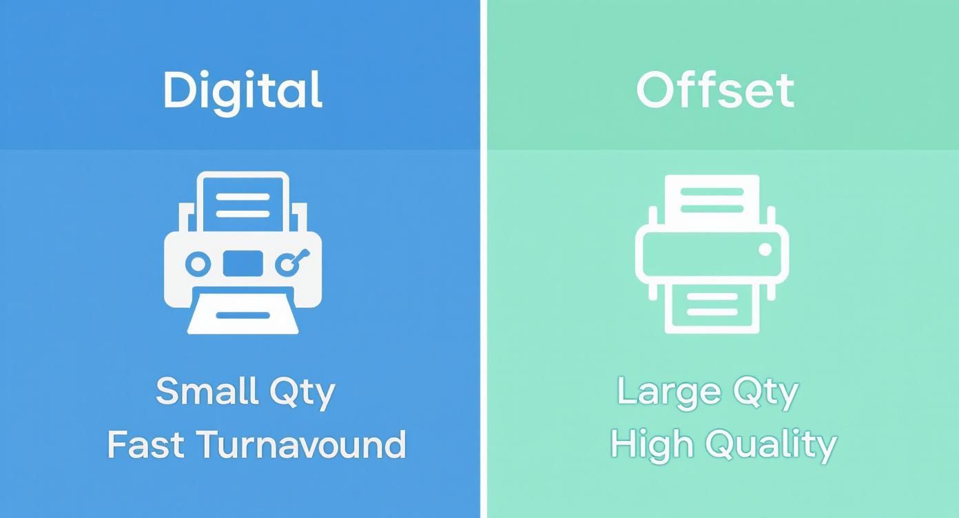
Choosing Between Digital and Offset Printing
When you’re ready to get your project professionally printed, you'll find yourself at a crossroads: digital or offset printing? It’s a bit like choosing between a high-end kitchen blender and a full-scale industrial bakery oven. The blender (digital) is perfect for whipping up a quick, customised smoothie right when you want it. The oven (offset) is built for mass production, churning out thousands of identical loaves with perfect consistency and at a low per-unit cost.
Each method has its place, and the best choice really comes down to what you’re trying to achieve. Getting a handle on understanding the differences between offset vs. digital printing is the first step to making sure you get the quality, speed, and price that fits your project.
When to Choose Digital Printing
Digital printing is all about speed, flexibility, and being cost-effective for smaller jobs. It works by printing your design directly from a digital file, completely skipping the time-consuming process of creating printing plates. This minimal setup makes it the champion for projects with tight deadlines or when you only need a handful of copies.
Think about going digital for things like:
- Short Runs: It's perfect for anything from a single copy up to around 500, like flyers for a local event or handouts for a conference.
- Variable Data: If you need to personalise each print, say with a different name or address for a direct mail campaign, digital is the only way to go.
- Quick Turnarounds: When you need your prints in a day or two, digital is your best friend.
- Proofing: It’s a fantastic way to get a single, accurate sample of your project before you commit to a massive print run.
The real magic of digital printing is its agility. It allows for on-demand production, which cuts down on waste and makes it easy to test out a few different designs without a huge financial commitment.
When to Choose Offset Printing
For large-volume projects, offset printing is the undisputed king. When you need the absolute lowest cost per item, this is the way to go. It’s a more traditional method that uses metal plates to transfer ink onto rubber blankets and then onto the paper. The initial setup takes longer and costs more, but once the presses are rolling, the price per piece plummets as the quantity goes up.
Offset is the clear winner for:
- High-Volume Jobs: It's essential for quantities of 1,000 or more, like nationwide brochure distributions or magazine runs.
- Unmatched Colour Consistency: It delivers incredibly precise and consistent colour, which is critical for protecting your brand's integrity across a large campaign.
- Specialty Inks: Offset presses easily handle custom Pantone colours and metallic inks that many digital printers just can't replicate.
To help you decide at a glance, here's a quick breakdown of how the two methods stack up.
Digital vs Offset Printing: A Quick Comparison
This table highlights the key differences between digital and offset printing to help you choose the right method for your project.
| Feature | Digital Printing | Offset Printing |
|---|---|---|
| Best For | Short to medium runs (1-500 copies) | Large volume runs (1,000+ copies) |
| Turnaround Time | Fast (hours to a couple of days) | Slower (several days due to plate setup) |
| Cost | Low setup cost, higher cost per piece | High setup cost, very low cost per piece on large runs |
| Colour Quality | Very good, but can have slight variations between runs | Exceptional colour accuracy and consistency (Pantone colours) |
| Personalisation | Excellent; ideal for variable data on each print | Not possible; every print is identical |
| Paper Options | Good range, but some limitations on special stocks | Almost unlimited; works with a vast range of papers/finishes |
Ultimately, the right choice depends on balancing your project's volume, budget, and timeline.
Here in New Zealand, the trend is definitely leaning towards digital, especially for jobs that require a personal touch. This shift is part of a bigger global picture. For example, the label printing market is projected to grow to USD 3.3 billion by 2025, largely driven by the demand for vibrant, custom branding that digital makes possible. This growth really shows how modern businesses are turning to digital solutions for high-quality, flexible colour printing that meets their needs.
How to Prepare Your Files for Flawless Printing
A perfect print job begins long before any ink hits the paper. Think of your digital file as the blueprint for a building – if the measurements are off, even the best builder can't produce the right result. Getting your files ready for a professional colour copy and print service is the single most important step you can take to get the vibrant, crisp results you’re picturing.
Nailing this setup stage saves you a world of hassle. No more back-and-forth emails, surprise costs, or disappointing outcomes. It means you can send your designs off to your NZ print provider with total confidence.
Master the Colour Mode: CMYK vs. RGB
One of the most common stumbling blocks people run into is the colour mode. Your computer screen, phone, and TV all create colour by mixing Red, Green, and Blue light. This is called the RGB colour space, and it’s brilliant for anything viewed on a screen.
But commercial printers don't use light; they use ink.
Professional print machines build up colour by mixing four specific inks: Cyan, Magenta, Yellow, and Black. This system is known as CMYK.
The range of colours (or 'gamut') that can be created with light is much, much wider than what can be reproduced with ink. This means bright, electric colours designed in RGB can look flat, dull, or just different when printed. To avoid this nasty surprise, always set your design software’s colour mode to CMYK right from the start. You'll get a far more accurate preview of the final printed piece.
Why Resolution and Bleed Are Non-Negotiable
Ever seen a printed photo that looked fuzzy, blocky, or pixelated? That’s almost always a resolution problem. For print, your images need a much higher density of information than they do for a website. The industry standard is 300 Dots Per Inch (DPI). Anything less, and you risk your images looking soft and unprofessional.
Just as critical is adding a bleed. This is a small extra margin—usually 3mm—of your background colour or image that extends beyond the final trim line of your document. Because it's impossible to trim thousands of sheets with microscopic precision, the bleed acts as a safety zone. It guarantees your design goes right to the very edge, preventing any ugly white slivers from appearing after trimming.
This handy decision tree shows how your project size and deadline can help you choose between digital and offset printing, which we touched on earlier.
The main thing to remember is that smaller, urgent jobs are a perfect match for digital printing, while offset is the way to go for large, high-quality runs where cost-per-item is key.
Exporting a Print-Ready PDF
Once your masterpiece is complete, you need to save it in a way the printer can use. The gold standard, universally accepted format is a high-quality PDF. When you export from design tools like Adobe InDesign, Illustrator, or even Canva, hunt for a preset called "Print Quality" or "Press Quality."
Choosing this setting usually takes care of three vital things for you:
- Embeds Your Fonts: This packages your chosen font files directly into the PDF. It means the printer doesn't need to have the same fonts installed on their machine to see your text correctly.
- Includes Bleed and Crop Marks: It keeps that crucial bleed area we talked about and adds tiny lines (crop marks) that show the printer exactly where to trim the final piece.
- Maintains High Resolution: It stops the software from squashing your images and graphics down to a lower quality, ensuring everything stays sharp and clear.
Picking the Perfect Paper and Finishes
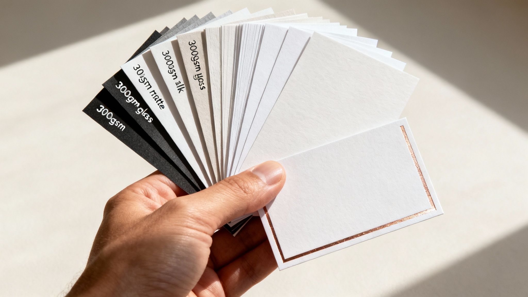
It’s easy to get caught up in the digital design, but the moment your project comes off the printer, the paper and finish take over. This is where your colour copy and print job goes from being something people just see to something they can actually feel and experience.
Think of it like this: a brilliant design on flimsy paper feels a bit like a let-down, doesn't it? The right paper stock adds substance and texture, giving your message a sense of quality that a screen just can’t replicate. A heavy, textured card feels important, while a sleek, glossy paper suggests vibrancy and energy. It's a crucial choice that makes your marketing materials feel as good as they look.
Getting to Grips with Paper Weights and Coatings
In the print world, paper weight is measured in grams per square metre (gsm). It's a simple concept: the higher the gsm, the thicker and more substantial the paper feels. This single choice can completely change the perception of your final product.
To make this a bit clearer, here's a breakdown of common paper weights and what they're typically used for.
Common Paper Weights and Their Uses
| Paper Weight (GSM) | Common Uses | Feel & Durability |
|---|---|---|
| 90-120 gsm | Internal memos, letterheads, basic flyers | Standard office paper feel. Flexible and lightweight. |
| 130-170 gsm | Quality flyers, brochures, event posters | A noticeable step up. More substance, less 'floppy'. |
| 200-300 gsm | Booklet covers, premium brochures, presentation folders | Feels substantial and durable, almost like a thin card. |
| 350-400 gsm | Business cards, postcards, invitations, loyalty cards | The heavyweight choice. Rigid, luxurious, and built to last. |
Once you've picked a weight, the next decision is the coating, which dramatically affects how your colours look. A gloss finish is shiny and reflective, making bright colours and photos really pop. On the other hand, a matte finish is non-reflective and smooth, offering a more understated, sophisticated look that’s fantastic for text-heavy designs.
Adding Those Unforgettable Final Touches
Special finishes are what take a print job from good to great. They add visual flair and a tactile quality that invites people to touch and engage with what you’ve created.
A special finish isn't just a fancy add-on; it's a strategic move. It can draw the eye to your logo, add durability, or create a sensory experience that reinforces your brand’s commitment to quality.
Here are a few popular options that can really elevate your project:
- Lamination: This involves applying a thin protective film over the print. Available in gloss or matte, it's a lifesaver for items that get handled a lot, like menus or business cards, protecting them from spills and wear.
- Foiling: Using heat and pressure, a metallic foil (think gold, silver, or even holographic) is stamped onto specific parts of your design. It’s an instant way to add a touch of luxury that catches the light and people's attention.
- Embossing & Debossing: Want to add some texture? Embossing creates a raised, 3D pattern on the paper, while debossing creates a pressed-in, indented effect. Both add a touch of class that people simply can't resist running their fingers over.
Ensuring Accurate Colour in Your Print Job
Have you ever signed off on a design that looked perfect on your monitor, only to feel that pang of disappointment when the printed version arrived looking… different? It’s a classic and frustrating problem, but it’s not the printer’s fault. The real issue is that screens and printers speak two completely different languages when it comes to colour.
Think of it this way: your screen creates colour by adding light, using a combination of Red, Green, and Blue (RGB) pixels. It’s an additive process. Printers, on the other hand, create colour by putting ink on paper, which subtracts light. They use a mix of Cyan, Magenta, Yellow, and Black (CMYK) ink.
Because these two systems are fundamentally different, some of the super-bright, vibrant colours you can see on a backlit screen just don’t have a direct equivalent in the world of ink on paper. That electric blue on your monitor might come out looking a little more subdued. It's not an error; it's simply a translation between two distinct colour worlds. Understanding this is the first step to getting the results you want from any colour copy and print job.
Achieving Consistent Brand Colours
So, how do you make sure your company's specific shade of green looks exactly the same on your business cards, brochures, and banners? You can't leave it to chance. The solution is to use a standardised colour system to provide a precise target.
The industry gold standard for this is the Pantone Matching System (PMS). Think of it as a universal recipe book for colour. Each Pantone colour has a unique code that corresponds to a very specific ink formula. When you give a PMS code to your NZ print provider, they aren't just trying to match a colour by eye—they're mixing the ink to that exact, predefined recipe. This is absolutely vital for maintaining brand consistency.
Providing a Pantone code removes all guesswork. It tells the printer, "Don't try to approximate this colour with CMYK; mix this exact ink formula." This is the professional standard for ensuring colour accuracy.
The Power of a Printed Proof
Even when you’ve got your files set up perfectly and specified your Pantone colours, there's one final step you should never skip for an important project: getting a printed proof. A digital PDF proof is essential for spotting typos and checking the layout, but it still can't show you precisely how the colours will appear on the physical paper stock.
A physical proof (or hard copy proof) is a test run, printed on the same machine and the same paper that will be used for your final job. It’s your golden opportunity to:
- Verify Colour Accuracy: See with your own eyes how your colours translate to paper.
- Check Paper and Finish: Feel the texture and weight of the paper and see how a gloss or matte finish impacts the design.
- Catch Issues Early: If something isn't right, you can make adjustments before committing to the full print run, saving a lot of time and money.
It's your last, best chance to sign off on the project with complete confidence, knowing the final result will be exactly what you had in mind.
Breaking Down Print Costs to Get the Best Value
Figuring out a print quote can seem a bit like solving a puzzle, but the final price for your colour copy and print job really boils down to a handful of key factors. Once you get a handle on these, you can make smart decisions that get you the best bang for your buck without compromising on the final look.
The biggest single thing that affects your price is almost always quantity. Think of it like baking a batch of biscuits; the initial setup—getting the ingredients out, mixing the dough, preheating the oven—is the same whether you bake one biscuit or a hundred. Offset printing works the same way. There's a significant setup cost at the beginning, but that cost gets spread across every single item you print.
This is why printing 5,000 brochures often gives you a much, much lower cost for each individual brochure than if you were to print only 500.
The Key Ingredients of Your Print Quote
Aside from how many you're printing, a few other choices really shape the final price. Each one adds its own kind of value, so it’s all about deciding where your budget will make the most impact.
- Paper Stock: This is a big one. Heavier, textured, or specialty papers will naturally cost more than your standard, everyday options. For example, a thick 350gsm card stock is going to be pricier than a lighter 150gsm flyer paper.
- Printing Method: As we've touched on, offset printing has those higher setup costs but becomes incredibly cost-effective for big runs. On the flip side, digital printing is your go-to for smaller quantities and when you need things done quickly.
- Special Finishes: This is where you can add some real magic. Things like metallic foiling, embossing (raised lettering), or custom die-cutting will add to the cost, but they can also make your project unforgettable.
The best value isn't just about finding the cheapest price. It's about getting the most impact for your investment. Sometimes, spending that little bit extra on a premium paper or a special finish is what makes your material stand out and actually work.
It's clear that high-quality colour printing isn't going anywhere. Globally, the demand is stronger than ever, particularly with the rise of printers that can do it all—copy, scan, and print. This market is projected to jump from USD 34.1 billion in 2025 to a massive USD 63.5 billion by 2035.
Here in New Zealand, that trend holds true. There's a constant need for sharp, professional print for everything from marketing to day-to-day business communications, which makes smart print budgeting a must for Kiwi businesses. You can dive deeper into this topic by reading the full market report on the growth of multifunctional printers from futuremarketinsights.com.
Common Colour Printing Questions Answered
Stepping into the world of professional printing can feel a bit like learning a new language. You want the perfect result, but sometimes the terminology can be confusing. Let's clear up a few of the most common questions so you can approach your next colour copy and print project with total confidence.
What Is the Difference Between Colour Copying and Colour Printing?
You'll often hear people use these terms as if they're the same thing, but there's a subtle and important difference. At its core, colour printing means creating a new print from a digital source file—think a PDF or an image file. This is the gold standard for quality because you're starting with the original, crisp data.
Colour copying, on the other hand, traditionally means duplicating a physical document that already exists. You place a flyer on the glass, and it makes a copy.
These days, the line has blurred a bit, as modern print shops will often scan your physical document first, creating a digital file before printing. But for the sharpest, cleanest results, you should always start with the original digital file whenever you can. It makes a world of difference.
How Can I Ensure My Brand Colours Print Accurately?
This is a big one. Your brand colours are your identity, and getting them wrong is not an option. The single most reliable way to nail your colours is to use the Pantone Matching System (PMS). Think of PMS codes as a universal recipe for ink—providing your printer with these codes removes any guesswork and ensures consistency every single time.
If you're designing in CMYK, make sure your software's colour mode is set to CMYK right from the start. Converting from RGB later can cause unexpected colour shifts.
For any project where precise colour is non-negotiable—like your logo on a business card—always ask for a physical proof. It lets you see and approve the final colour on your chosen paper stock before you commit to the full print run.
What Is 'Bleed' and Why Do I Need It in My Design?
Ever seen a business card with a frustratingly thin white sliver along one edge? That’s what happens when a design has no bleed.
Bleed is a small safety margin, usually 3mm, that you add to your design, extending your background or images beyond the final trim line. Professional printers don't print on single sheets; they print on large sheets and then trim them down in stacks. A tiny, microscopic shift in the cutting blade is inevitable.
That bleed area ensures that even if the trim is a fraction of a millimetre off, your colour or image still goes right to the very edge of the page, giving you a clean, professional finish. No white slivers, guaranteed.
Ready to bring your vision to life with vibrant, high-quality printing? The team at SONI DESIGN is here to help with all your design and printing needs. Let’s create something extraordinary together!
Leave a Comment
Stay home & get your daily
needs from our shop
Start You'r Daily Shopping with Nest Mart