
Your cart is currently empty.
Colour management is essentially a translation system for colour. It’s the process we use to control and standardise colour as it moves from one device to another, ensuring the final print matches what you saw on your screen. Think of it as a universal translator, making sure the vibrant red you perfect on your monitor doesn't end up as a dull maroon on paper.
Why Your Colours Look Different in Print
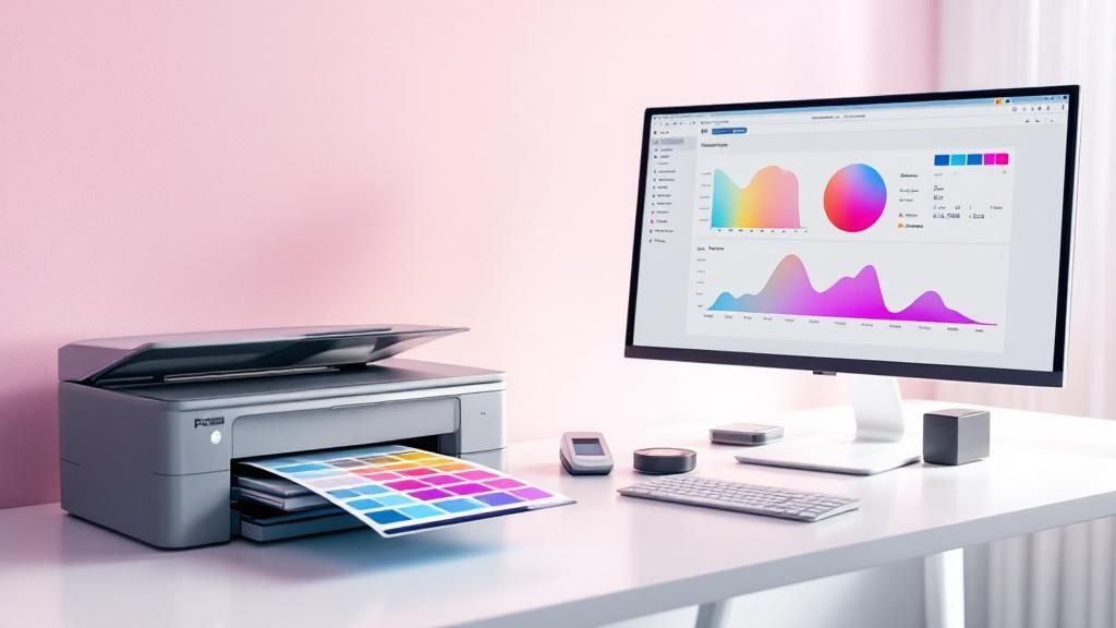
We’ve all been there. You spend hours getting the colours in your design just right, only for the printed version to arrive looking completely off. That brilliant blue has become a muted navy, and the lively greens look muddy and flat. It's a frustratingly common problem for anyone working with design and print.
The root of the issue is simple: every single device—your monitor, camera, scanner, and printer—sees and reproduces colour differently. Colour isn't an absolute value; it's entirely relative to the device displaying it.
A good analogy is translating a phrase between languages. The English saying "I feel blue" conveys sadness. A literal, word-for-word translation into another language might just describe the colour itself, completely missing the emotional context. In the same way, each device "speaks" its own distinct colour language.
Colour management acts as the expert translator. It establishes a common reference language to ensure the original meaning—the precise shade you chose—is communicated accurately from your digital design to the final printed piece.
Without this system in place, you’re basically just guessing and hoping for the best, leaving the final look of your project entirely to chance.
The Problem of Different Colour Languages
Your monitor creates colour by emitting light through tiny Red, Green, and Blue (RGB) pixels. This is called an additive colour model, where mixing all the colours at full brightness creates pure white light. It's perfectly suited for glowing digital screens.
Printers, on the other hand, work in the complete opposite way. They apply layers of Cyan, Magenta, Yellow, and Black (CMYK) ink onto paper, which absorb light. This is a subtractive colour model—the more ink you lay down, the darker the colour gets until you eventually reach black.
This fundamental difference is why a straight conversion from your screen to the printer so often goes wrong. Your monitor can produce a huge spectrum of bright, luminous colours that a CMYK printer physically can't replicate with ink on paper.
Why This Matters for Your Business
Getting colour wrong isn't just a minor creative headache; it can have real, tangible impacts on your business. For any brand, colour is a cornerstone of its identity. Think about "Coca-Cola Red" or "Cadbury Purple"—those specific shades must be exact, every single time, across all marketing materials.
Here in New Zealand, the printing sector has increasingly embraced managed workflows to boost efficiency. In fact, solid industry analysis shows that implementing proper colour management can slash costly reprints by as much as 30%.
The need for accuracy becomes especially clear when you’re creating physical products. For instance, if you're producing personalized photo gifts like custom mugs or photo blankets, getting the colours right is non-negotiable for a quality result.
Ultimately, getting a handle on colour management in your printing workflow delivers some serious benefits:
- Predictability: You can be confident that the colour you approve on screen is the colour you’ll get in your hands.
- Brand Consistency: It guarantees your brand colours remain uniform across every flyer, brochure, and business card.
- Cost Savings: It drastically reduces waste and prevents expensive, time-consuming reprints.
- Professionalism: It delivers the polished, accurate results that clients and customers expect.
The Three Pillars of a Colour-Managed Workflow
To get consistent colour from what you see on your screen to the final printed product, you need a solid workflow. It all comes down to three key pillars that work in tandem: Calibration, Profiling, and Conversion. If you can get your head around how these three work together, you've pretty much mastered the fundamentals of print colour management.
I like to think of it like an orchestra getting ready for a big show. Before they can play a single note in harmony, every instrument has to be perfectly tuned. That first, essential step? That's Calibration.
Pillar 1: Calibration
Calibration is all about getting a device—like your monitor or printer—to a known, stable, and repeatable state. It’s not about describing how the device sees colour just yet; it's about making sure it’s operating at its best and, most importantly, consistently.
When you're calibrating a monitor, you're essentially setting a few key parameters:
- White Point: This dials in the "whiteness" of your screen. For general work, you'll often aim for a standard like D65 (which mimics daylight), but for print proofing, D50 is the industry go-to.
- Gamma: This controls the contrast and brightness curve between pure black and pure white.
- Luminance: This is simply the screen's overall brightness, which you'll want to set to a level that's comfortable for your working environment.
By calibrating, you're tuning your monitor to a standard reference. It's the only way to ensure that what you see today looks exactly the same tomorrow, giving you a trustworthy foundation for every colour decision you make.
Pillar 2: Profiling
Okay, so your instrument is tuned (calibrated). Now you need to understand its unique sound. A violin and a trumpet can both hit a perfect 'A', but they sound completely different, right? That unique character is what profiling captures.
An ICC profile is a small data file that acts like a digital fingerprint for a specific device. It meticulously describes that device's colour gamut—the entire range of colours it can possibly show or reproduce.
The process involves measuring how that device handles a standard set of colours. The resulting profile then tells your computer's colour management system exactly how that specific monitor, scanner, or printer-and-paper combination "sees" and renders colour.
The Bottom Line: Calibration gets a device into a consistent state. Profiling describes how that device behaves in that state. You simply cannot have an accurate profile without a proper calibration first.
In New Zealand, the printing industry leans heavily on these global standards. We use International Color Consortium (ICC) profiles extensively to keep colour accurate across all the different machines and paper types we work with. For a deeper dive into these standards, the X-Rite blog is a fantastic resource.
This diagram shows how these different device profiles work together in a typical workflow.
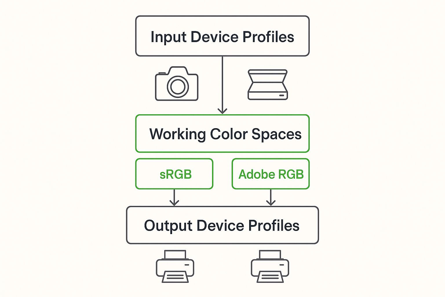
As you can see, colours from an input (like a camera) are mapped into a working space, then converted for an output device like a printer, using profiles every step of the way.
Pillar 3: Conversion
Now for the magic. With every instrument tuned and its unique voice accounted for, the conductor can finally lead the orchestra. This act of translation and direction is handled by the Color Management Module (CMM), often called the colour engine.
Conversion is the active process of translating colour data from one device's colour space to another, using their ICC profiles as the map. When you send an image from your monitor (which uses a large RGB gamut) to your printer (which has a smaller CMYK gamut), the CMM intelligently maps the colours across.
It makes smart decisions about what to do with "out-of-gamut" colours—those vibrant hues your screen can show but your printer physically can't mix with ink. This translation ensures the look and feel of your image is kept as true as possible.
To make the right choices during conversion, it really helps to know the main colour spaces you'll be dealing with.
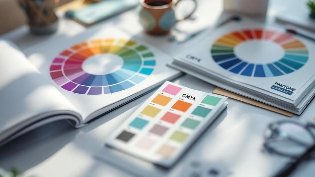
Comparing Key Colour Spaces for Print Design
Each colour space has its own strengths and is designed for a specific purpose. This table breaks down the most common ones you'll encounter.
| Color Space | Gamut Size | Primary Use Case | Best For |
|---|---|---|---|
| sRGB | Small | Web, Digital Displays, Phones | Website images, social media graphics, general digital use. |
| Adobe RGB | Medium | Digital Photography, Design | Preparing high-quality photos intended for print production. |
| Coated FOGRA39 | Small | Offset Printing (Europe) | Commercial printing on coated paper stocks (common in NZ). |
| GRACoL | Small | Offset Printing (N. America) | High-quality commercial print jobs, primarily in North America. |
Choosing the right space from the start is half the battle. Use sRGB for anything staying on a screen, but switch to a larger space like Adobe RGB when you know the final destination is a printed page, before converting to the appropriate CMYK profile for the press.
Your Practical Screen-to-Print Workflow
Knowing the theory is great, but getting consistent, professional results comes down to putting it all into practice. Let’s walk through a clear, step-by-step workflow that takes the guesswork out of any print project. Think of it as your pre-flight checklist, ensuring a smooth journey from digital design to the final printed piece.
Each step here logically follows the one before it, building a chain of trust between what you see on your screen and what comes off the press. By following this sequence, you’ll systematically eliminate the frustrating colour shifts that waste time, money, and materials.
Step 1: Calibrate Your Monitor
Your monitor is your window to the digital world, but an uncalibrated screen is like looking through a tinted window—it completely skews your perception of colour. Calibration is the absolute, non-negotiable first step. It establishes a reliable and consistent reference point for all your visual work.
The gold standard is to use a hardware calibrator, like a colorimeter or spectrophotometer. These little devices physically measure the light your screen emits and work with software to automatically build a custom ICC profile just for your monitor. It's the most accurate way to go.
No hardware? You can still make a huge difference. Both Windows and macOS have built-in visual calibration tools that walk you through adjusting brightness, contrast, and gamma. It might not be as precise as a dedicated device, but it’s a massive leap forward from doing nothing at all.
Step 2: Configure Your Software Settings
Once your monitor is showing you true colours, the next job is to get your design software on the same page. In programmes like Adobe Photoshop, Illustrator, or InDesign, you'll manage this in the Colour Settings panel.
This is where you define your working spaces. For any project heading to print, a common best practice is to set your RGB working space to Adobe RGB (1998). It has a wider gamut than the standard sRGB, meaning it can capture more of the vibrant colours that modern printers are capable of reproducing.
You'll also want to set a default CMYK working space. A widely used standard in New Zealand and Europe is Coated FOGRA39, which is perfect for printing on coated paper stocks. Getting this set up synchronises your entire creative suite, ensuring colours stay consistent when you move files between applications.
A crucial part of the screen-to-print workflow involves meticulous image preparation; mastering effective product photo editing techniques ensures your source files are optimised for the best possible print translation before you even begin the layout process.
Step 3: Use Soft-Proofing for Simulation
This is the magic step where it all comes together. Soft-proofing is a brilliant feature in your design software that lets you simulate, right there on your calibrated screen, how your design will actually look when printed on a specific printer using a specific paper.
Here’s the process in a nutshell:
-
Enable Soft-Proofing: In your design app (for example, in Photoshop head to
View > Proof Setup > Custom), you can switch on the proofing view. - Select the Profile: Choose the specific ICC profile for the exact printer and paper stock you'll be using. Your print provider should be able to send you this file.
- Analyse the Preview: Your screen will instantly adjust the image to simulate the final print. You'll likely see some of your brightest, most saturated colours become a little duller—that’s the CMM showing you which colours are "out of gamut" for that printer.
This preview gives you the power to make vital colour adjustments before a single drop of ink hits the paper. You can then selectively tweak those out-of-gamut colours or adjust tones to compensate for the shift, making sure the final print looks exactly how you envisioned it.
Step 4: Export With the Correct Profile
Happy with your soft-proof? The last piece of the puzzle is exporting your file correctly for your print provider. When you save as a PDF or TIFF, you have to ensure the correct ICC profile is either embedded in the file or the colours are converted to the destination profile.
- Embedding the Profile: This tucks the profile data right inside the file itself, telling the printer’s system exactly how to interpret your colours.
- Converting to Profile: This option actually changes the RGB or CMYK colour values in your file to match the printer's colour space.
Before you export, always double-check with your print partner for their specific file requirements. Following their guidelines is the final, critical link in the chain, guaranteeing predictable and successful colour on every print job.
Advanced Techniques for Professional Results
Once you've got a solid workflow locked down, it's time to dig into the details that separate a good print from a truly exceptional one. These advanced techniques give you the ultimate say over your colour, empowering you to confidently take on high-stakes work like fine art reproduction, luxury packaging, or nailing a specific brand colour.
Mastering these concepts shifts colour management from a damage-control exercise to a proactive strategy. You’ll start to see problems before they happen, troubleshoot tricky issues with ease, and deliver work with a level of precision that builds client trust and sets you apart as a professional.
The Critical Role of Viewing Conditions
It’s easy to forget, but one of the most critical parts of professional colour management happens away from the screen. The light in your room has a massive impact on how you see colour, both on your monitor and on a printed proof. Our eyes are amazing at adapting, but this also means they can be easily fooled by the light around us.
This is why professional print environments rely on standardised viewing conditions. Think of a dedicated viewing booth or a room with walls painted a neutral grey, lit by a specific, colour-corrected light source.
- D50 Lighting: This is the gold standard for print. It’s a calibrated light source that mimics natural daylight at a 5000K colour temperature. This creates a neutral, consistent environment for comparing what’s on your screen to what’s on the paper.
- Ambient Light Control: This means no colourful walls reflecting onto your work, no sunlight streaming in from a window, and no mixing different types of light bulbs in your workspace.
By controlling your viewing environment, you eliminate a huge variable from the equation. It guarantees that when you hold a physical print next to your monitor for a soft proof, you're making a true apples-to-apples comparison.
Understanding Rendering Intents
When you move an image from a large colour space (like Adobe RGB) to a smaller printer gamut (like a CMYK profile), some colours simply won't fit. Rendering Intents are the different strategies your software can use to handle these "out-of-gamut" colours. Choosing the right one is absolutely vital.
A rendering intent is essentially a set of rules for how to remap colours from one device's gamut to another. It answers the question: "When a colour doesn't fit, what should I do with it?"
You'll find four main intents, but for printing, you'll almost always be choosing between these two:
- Perceptual: This intent prioritises the overall visual feel of an image. It gently shifts all the colours—even those already in-gamut—to fit them neatly inside the destination space. It’s perfect for photographs because it keeps the relationships between colours looking natural and pleasing.
- Relative Colorimetric: This intent is all about accuracy for the colours that do fit. It maps in-gamut colours perfectly and only "clips" the out-of-gamut colours, snapping them to the nearest reproducible hue. This is usually the best choice for logos and vector graphics where matching a specific brand colour is non-negotiable.
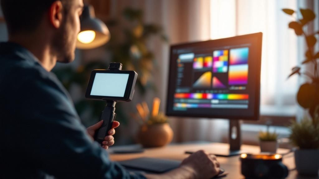
Creating Custom Profiles with a Spectrophotometer
While the generic ICC profiles provided by manufacturers are a great starting point, the pinnacle of precision is creating your own. This is where a spectrophotometer comes in—a high-end piece of hardware that measures colour with incredible accuracy. It lets you build completely custom ICC profiles for your exact combination of printer, ink, and paper.
This step is crucial because even two printers of the same model can have slight differences. Furthermore, many professional printers in New Zealand follow the 'four Cs of colour management'—Consistency, Calibration, Characterisation, and Communication—to achieve predictable results. Creating custom profiles (Characterisation) is a cornerstone of this approach, as devices naturally drift over time and need recalibrating every few months to stay on target. You can find more professional insights on this framework at X-Rite's colour management blog.
Common Colour Management Mistakes to Avoid
Even with the best intentions, it's surprisingly easy for small mistakes to throw your entire colour management in printing workflow off course. These common trip-ups are often the real culprits behind frustratingly inconsistent results.
Think of this as your pre-flight checklist. By being aware of these frequent pitfalls, you can build a much more reliable process. Getting it right the first time doesn't just improve your final prints—it saves a huge amount of time, money, and stress.
Designing in the Wrong Colour Space
This is probably the most common mistake in the book. It’s incredibly easy to start a new project in sRGB, which is the default for most design software, without realising it’s built for screens, not for ink on paper.
When you send an RGB file to a CMYK printer without a deliberate, careful conversion, you force the printer’s software to make a blind guess. This almost always leads to a visible loss of vibrancy. Those bright, glowing colours you loved on screen simply cannot be reproduced with CMYK inks, and the result is often a dull, disappointing print.
- The Problem: The bright, punchy colours on your screen look flat and muted when printed.
- The Solution: For print jobs, always start your design in a wider working space like Adobe RGB (1998) if you're dealing with photos. Then, for the final step, convert your file to the specific CMYK profile supplied by your print provider.
Trusting an Uncalibrated Screen
Making critical colour decisions on an uncalibrated monitor is like trying to mix paint in the dark—you're just guessing. You simply cannot trust what you're seeing. A monitor's colours drift over time, and the out-of-the-box factory settings are never accurate enough for serious print work.
Without that calibrated, neutral reference point, every colour adjustment you make is based on flawed data. What looks like the perfect brand blue on your screen might be a completely different shade in reality.
A study of print professionals revealed that inconsistent colour from uncalibrated monitors was one of the top three causes of rejected print jobs. This single oversight can directly lead to costly reprints and client dissatisfaction.
Calibrating your monitor at least once a month gives you a stable visual foundation. It ensures the colours you see are the colours you get, making your soft proofs and edits genuinely meaningful.
Forgetting to Embed ICC Profiles
Creating a brilliant design is only half the battle. If you forget to embed the correct ICC profile when you export your final file, you're essentially sending it to the printer without any instructions on how its colours should be interpreted.
This forces the print shop's system to guess which "colour language" your file is speaking. It will likely apply a generic, default profile, which can cause unexpected and unwanted shifts in colour and tone across your entire design.
Mismatching Profiles to Paper Stock
Not all paper is the same. A glossy, coated paper reflects light and holds ink completely differently from a porous, uncoated paper. Every unique combination of printer, ink, and paper has its own distinct colour gamut and needs a specific ICC profile to match.
Using a "Coated" profile for a job that will be printed on "Uncoated" paper is a recipe for a muddy mess. The profile is telling the printer to lay down far more ink than the absorbent, uncoated paper can handle, resulting in oversaturated, blurry images.
To get this right:
- Always ask your print partner for the exact ICC profile for the paper stock you've chosen.
- Use that specific profile when you're soft-proofing your design on screen.
- Make sure you export the final, print-ready file using that same destination profile.
This straightforward step is absolutely crucial for successful colour management in printing. It's the key to making sure your creative vision is translated accurately onto the final physical product.
Your Colour Management Questions, Answered
Even with a great system in place, questions always come up. This section tackles the most common queries we hear about colour management in printing, giving you practical answers to solve problems and build your confidence.
Think of these as the hands-on details that can make or break your project. Nailing them is how you turn theory into consistently fantastic results.
How Often Should I Calibrate My Monitor?
For any professional creative work, you should be calibrating your monitor at least once a month. The components inside your screen, like the backlights and phosphors that create the image, change and fade over time. This slow degradation causes your colours to drift.
It’s a bit like tuning a guitar before a concert. Regular calibration keeps your screen a reliable and stable reference, ensuring the creative decisions you make are based on accurate colour. This isn’t just a nice-to-have; it’s the foundation of any solid colour management workflow.
Can I Manage Colour Without Buying Expensive Gear?
Yes, absolutely. While high-end hardware like a spectrophotometer gives you the ultimate level of precision, you can make enormous improvements using just software. These methods are much more budget-friendly and still represent a huge leap forward in quality.
A great starting point is your computer’s built-in calibration tool—both Windows and macOS have one. Even more importantly, always download and use the correct ICC profiles from your printer and paper suppliers.
Using the right ICC profile for your specific paper and turning on soft-proofing in your design software will get you 90% of the way to accurate colour. It’s the single most effective step you can take without investing in new equipment.
What's the Difference Between an ICC Profile and a Colour Space?
This is a really common point of confusion, but a simple analogy helps clear it up.
-
A colour space (like sRGB or Adobe RGB) is like a universal language. Think of it as standard, textbook English—it contains a massive, defined dictionary of colours that everyone agrees on.
-
An ICC profile is like a specific person's accent or dialect. It describes how one particular device—your monitor, or your printer—actually speaks that language. It accounts for all the unique quirks, strengths, and limitations of that individual piece of equipment.
So, the colour space is the big, theoretical standard, while the ICC profile describes the real-world performance of your gear.
What's the Number One Cause of Colour Mismatches in Printing?
The most frequent culprit, by a long shot, is a mismatched workflow. This usually happens when a design created in an RGB colour space (meant for glowing screens) is sent straight to a CMYK printer without a proper, managed conversion.
When there's no ICC profile to act as a translator between these two very different colour models, the printer is left to guess how to interpret the RGB data. This guesswork almost always leads to a noticeable loss of vibrancy and brightness, resulting in prints that look dull, muddy, and just plain wrong. This is exactly the problem that a proper colour management workflow is designed to prevent.
At SONI DESIGN, we live and breathe colour. We know that getting it right is essential for bringing your brand’s vision to life. From eye-catching signage to perfectly matched brochures, our team blends technical skill with a creative passion to make sure every project looks exactly how you imagined it. Let's create something brilliant together—explore our print and design services today.
Leave a Comment
Stay home & get your daily
needs from our shop
Start You'r Daily Shopping with Nest Mart