
Your cart is currently empty.
Even with all our digital tools, a physical business card is still one of the most effective marketing tools a Kiwi professional can have. It’s more than just a slip of paper with your contact details; it’s a tangible piece of your brand, creating a real connection that a digital contact just can't match.
Why a Business Card Still Matters in New Zealand

In a world drowning in digital noise, a business card is a solid, physical anchor for your brand. It's a real piece of your professional identity that won’t get lost in a cluttered inbox or buried in a social media feed. Think of it as the perfect follow-up, a physical reminder of an actual conversation.
The simple act of exchanging cards is also a powerful professional ritual. That moment of connection is personal and direct, creating a memory that a quick email or a LinkedIn request just can't replicate. It shows you’re prepared, professional, and you value the connection you've just made.
The Psychology of a Quality Card
The feel of a card in someone's hand says a lot about your business before a single word is even read. A flimsy, cheap-feeling card can subconsciously signal a lack of care or detail. On the other hand, a high-quality, thoughtfully designed card from a good NZ printer immediately screams professionalism and quality. It’s a silent nod to your high standards.
This guide is your complete roadmap for getting business cards printing NZ right. We'll walk you through everything you need to create a card that not only shares your information but also opens doors and starts real conversations.
We’re going to cover:
- Strategic Design: How to lay out your information for the biggest impact.
- Material Choices: Understanding different paper stocks and why it makes a huge difference.
- Standout Finishes: Using special touches to create a card that people actually remember.
- The Ordering Process: A step-by-step guide to make sure you get a perfect print run, every time.
A great business card isn’t just a piece of paper; it’s a handshake you leave behind. It’s the first chapter of your brand’s story, designed to make someone want to read the rest.
Let's get started on turning your idea into a powerful networking tool that truly represents you and your business.
Designing a Card That Truly Represents Your Brand
Think of your business card as more than just a slip of paper with your contact details. It's a handshake in physical form. It’s a tiny, powerful billboard for your brand, communicating your style, professionalism, and personality before you’ve said another word.
Getting the design right is everything. It’s not about trying to become a graphic designer overnight, but about understanding a few key ideas that separate a great card from a forgettable one. With a bit of thought, you can create something that not only looks sharp but actively works for your business.
Establishing a Clear Visual Hierarchy
When you hand someone your card, where do their eyes go first? A well-designed card guides them effortlessly. This is called visual hierarchy, and it’s the secret to a layout that’s both clean and effective.
Your name and your brand’s logo should be the stars of the show—make them the most prominent things on the card. Next up should be your job title or a quick one-liner explaining what you do. Finally, your contact details like your phone number, email, and website can be smaller. They’re important, but they’re supporting actors.
- Primary Info: Your Name & Company Logo (Largest)
- Secondary Info: Your Title or Tagline (Medium)
- Tertiary Info: Contact Details (Smallest)
By playing with size, boldness, and placement, you create a natural flow that stops the card from looking like a cluttered mess.
Choosing Colours and Fonts with Purpose
Colour speaks a language all its own. The shades you pick for your card will trigger feelings and ideas long before anyone reads a single word. A palette of deep blues and greys feels stable and trustworthy, perfect for a financial consultant. On the other hand, a burst of bright orange and yellow screams energy and creativity, which would be ideal for a marketing agency.
Your colour palette should be a direct reflection of your brand identity. Keeping colours consistent across your website, social media, and printed materials is how you build powerful, instant brand recognition.
Fonts are just as important; they’re the voice of your brand.
- Serif Fonts (like Times New Roman): These tend to feel traditional, dependable, and authoritative.
- Sans-Serif Fonts (like Arial or Helvetica): These come across as modern, clean, and approachable.
- Script Fonts: These can add a personal, handcrafted touch or a hint of elegance.
Stick to one or two fonts that match your brand’s vibe and, most importantly, are dead easy to read, even when they’re small. If you're looking for inspiration on how design choices affect perception, checking out some innovative identity card designs can be a great starting point, as they share many of the same core principles.
Preparing Your File for Perfect Printing
Okay, you’ve got a killer design. The last hurdle is the technical setup. This part is absolutely crucial for anyone seeking quality business cards printing NZ, as it’s what ensures the design on your screen translates perfectly to paper. The two big concepts you need to know are bleed and the safe zone.
Think of bleed like this: if you’re colouring a picture and want the colour to go right to the very edge, you’d colour a little bit over the lines, right? That way, when you cut it out, there’s no annoying white gap. Bleed is the exact same principle. Your background colour or image should extend about 3mm past the final card size on every side. This gives the printer a margin of error, so even if the cutting blade is off by a hair, you won't get any slivers of white on the edge.
The safe zone is the opposite. It’s an internal buffer area where you keep all your important stuff—logos, names, and contact details. By keeping everything at least 3-5mm inside the final trim line, you guarantee that nothing crucial gets accidentally sliced off during production. Nailing these technical details is what separates an amateur-looking card from a professional, flawless one.
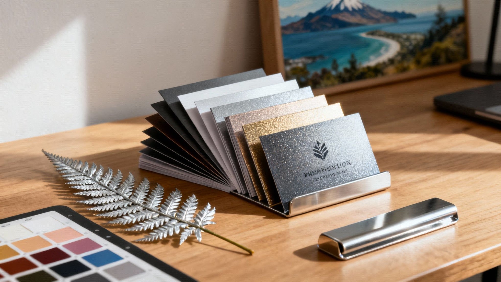
Choosing the Right Paper Stock and Material
Long before someone even reads your business card, they feel it. The weight of the card in their hand, the texture under their thumb—it all sends an immediate, subconscious message about your brand. Choosing the right paper isn't just a tiny detail; it's the foundation of your card's story and a hallmark of quality business card printing in NZ.
Think of it like a handshake. A flimsy, thin card is like a weak, forgettable handshake. But a thick, substantial card? That feels confident, professional, and memorable. This tactile experience is your first chance to communicate quality before a single word is read.
Understanding Paper Weight (GSM)
The secret to a sturdy, impressive card lies in its GSM, which stands for Grams per Square Metre. It’s simply a measure of paper density. The higher the GSM, the thicker and more durable your card will feel. For context, standard office printer paper is about 80 GSM – way too flimsy for a business card that needs to last.
For business cards, you need to be looking at a much heavier weight:
- 300–350 GSM: This is the sweet spot and the industry standard for a great quality business card. It’s got enough heft to feel professional and sturdy, making it a reliable and budget-friendly choice for most Kiwi businesses.
- 400+ GSM: Now you're in premium territory. Cards at 400 GSM or higher feel seriously substantial. They have a noticeable weight and rigidity that screams luxury and permanence. They’ll resist bending and creasing, keeping your brand looking sharp long after you've handed them out.
The right paper weight sets the stage. A card with a higher GSM doesn’t just feel better—it subconsciously tells the recipient that you invest in quality, which reflects directly on your business.
This diagram breaks down the essential ingredients for a great business card, from the core info to the technical details that pull it all together.
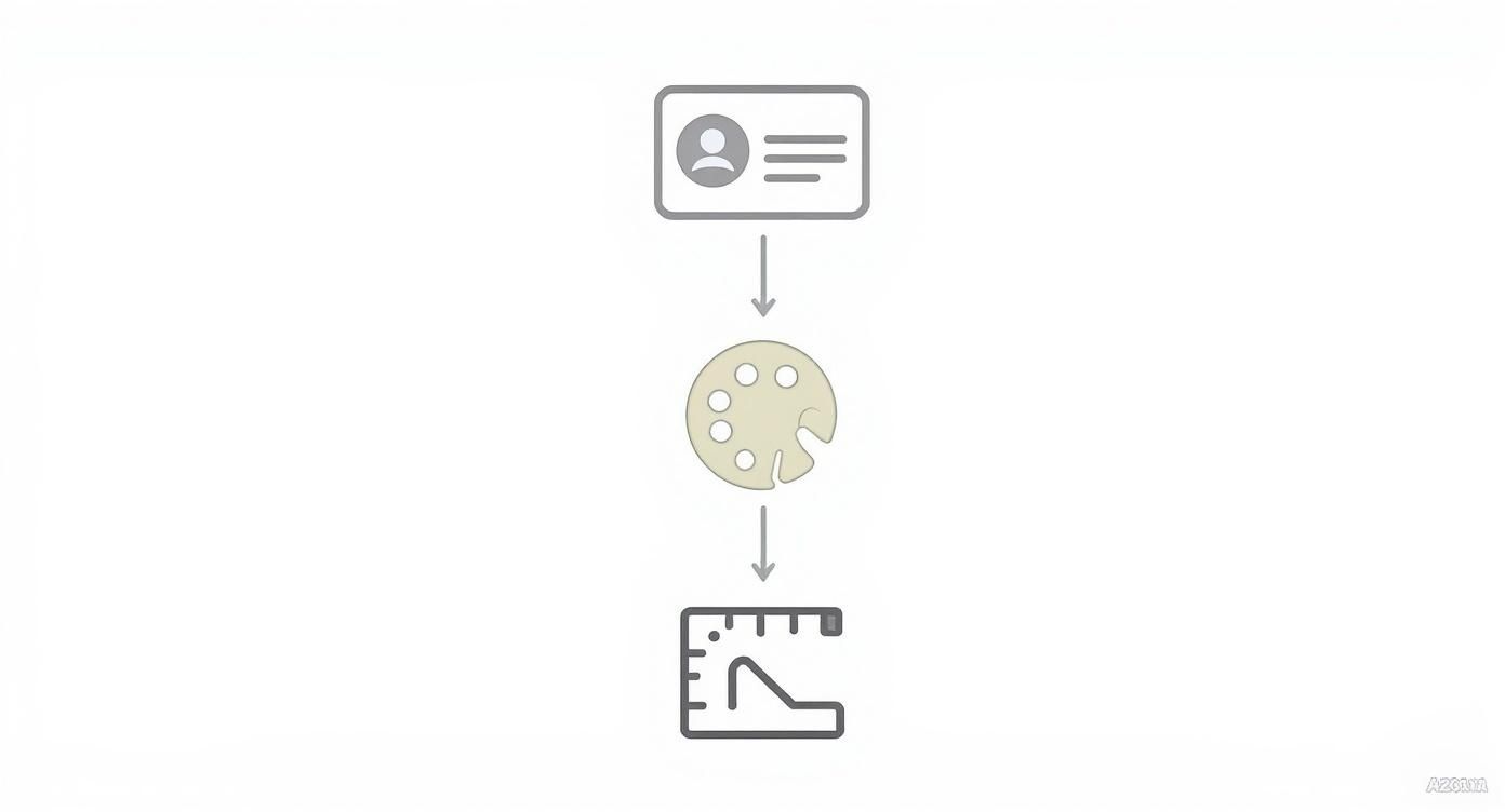
As you can see, getting the foundational information right is just as crucial as the visual appeal and the final technical setup. They all work together.
Selecting the Perfect Stock Type
Beyond sheer weight, the paper's finish plays a huge role in how your design comes across. Each stock has its own personality, and picking the right one can really make your brand sing.
To help you decide, I've put together a quick comparison of the most common paper stocks you'll come across.
Common Business Card Paper Stocks Comparison
| Paper Weight (GSM) | Common Type | Feel & Impression | Best For |
|---|---|---|---|
| 300-350 | Uncoated | Natural, porous, slightly textured. Easy to write on. | Eco-conscious or artisanal brands with a minimalist, down-to-earth vibe. |
| 350 | Matte Coated | Smooth, non-reflective, sophisticated. Resists smudges. | Corporate professionals, creative agencies—almost anyone wanting a modern, elegant look. |
| 350-400+ | Gloss Coated | Shiny, reflective, slick. Makes colours pop. | Photographers, designers, or any brand wanting a vibrant, high-impact feel. |
| 400+ | Recycled | Often has a subtle, earthy fleck. Feels authentic. | Businesses wanting to highlight their commitment to sustainability. |
| 400+ | Textured (Linen, Felt) | Tactile and unique. Creates a memorable physical sensation. | Luxury brands, boutiques, or anyone wanting to stand out with a classic or rustic feel. |
Choosing between these comes down to the message you want to send. Do you want to look sleek and modern, or organic and approachable?
A Closer Look at the Main Finishes
Uncoated Stock
This is paper in its natural state—no coating, just a porous, organic-feeling surface. It’s a dream to write on and is perfect for brands that want to come across as authentic, artisanal, or eco-friendly. Think minimalist designs and earthy colour palettes.
Matte Coated Stock
A matte stock has a smooth coating that kills glare and stops fingerprints in their tracks. It gives colours a slightly muted, sophisticated look and makes text incredibly crisp and easy to read. It's a fantastic all-rounder, working for everyone from corporate lawyers to graphic designers.
Gloss Coated Stock
If you want your colours to leap off the card, gloss is your friend. The shiny, reflective coating makes images and bold colours look incredibly vibrant and sharp. It’s a great choice for photo-heavy designs or brands bursting with energy. Just a heads-up, it can be tricky to write on.
Embracing Eco-Friendly and Textured Options
With sustainability being such a big focus for businesses here in New Zealand, many printers now offer amazing eco-friendly stocks. Recycled paper is a hugely popular option, often featuring a subtle, natural fleck that adds character while showing you care about the planet.
Textured stocks like linen, felt, or even a hammered finish are also becoming more common. These materials are all about creating a memorable tactile experience that goes beyond the visual. A linen finish can feel timeless and classic, while a more robust texture might feel rustic and strong. In a sea of smooth cards, a unique texture is a powerful way to make sure yours is the one they remember.
Using Special Finishes to Make Your Card Stand Out
So, you've nailed the design and picked the perfect paper stock. The next step is where the real magic happens. Special finishes are what take a business card from just another rectangle of paper to something genuinely memorable.
These are the little details people notice—the tactile and visual extras that make them stop, look closer, and even say, "Ooh, that's nice." It’s the difference between a standard car and one with all the bells and whistles; they both get you there, but the experience is on another level entirely.
Finishes add texture, depth, and a touch of class, making sure your card doesn't just get glanced at but actually felt and remembered. For anyone looking into business cards printing NZ, getting your head around these options is crucial for creating a powerful first impression.
Lamination for Feel and Durability
Think of lamination as the final protective seal on your card. It's a thin layer applied after printing that not only shields the card from scuffs and spills but also completely changes how it feels in someone's hand.
There are three popular choices, and each one sets a very different tone:
- Matte Lamination: This gives you a smooth, non-shiny finish for a modern, understated look. It's brilliant for readability and doesn’t show up fingerprints, making it a solid all-rounder for almost any professional.
- Gloss Lamination: For a high-shine finish that makes colours pop, gloss is the way to go. It’s eye-catching and gives off a slick, energetic vibe—perfect for brands that want to look bold and dynamic.
- Soft-Touch Lamination: Often described as feeling like velvet or suede, this is a seriously premium option. It has a unique, luxurious texture that’s an instant conversation starter and sends a clear message of quality and attention to detail.
Adding Targeted Shine with Spot UV
Imagine running your finger over a matte-finished card, but your logo has a stunning, wet-look shine that catches the light. That's the power of Spot UV. It's a high-gloss varnish applied to specific parts of your design, creating a beautiful contrast between the flat surface and the shiny bits.
This technique is fantastic for highlighting what matters most. You can apply it to your logo, your name, or even a subtle background pattern. It adds a layer of visual interest that makes people tilt the card and engage with it, making it far more likely to stick in their memory.
A great Spot UV finish isn't just about shine; it creates a tactile map on your card, guiding the recipient's fingers and eyes to the most important parts of your brand.
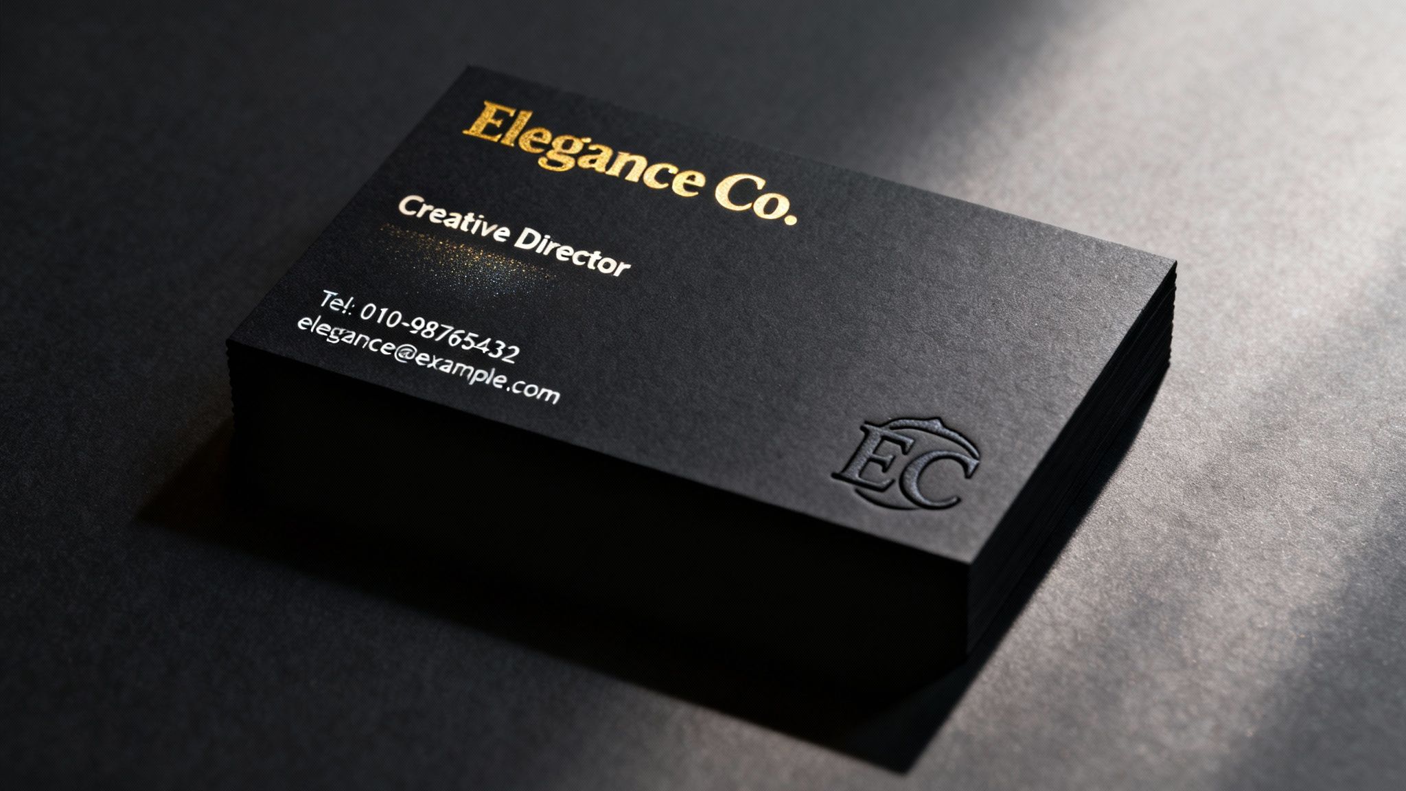
Conveying Luxury with Foiling
When you want your card to scream prestige and quality, nothing beats metallic foiling. This process uses heat and pressure to apply a thin layer of foil—usually gold, silver, or copper—to your design. The result is a brilliant, reflective metallic finish that looks and feels incredibly upmarket.
Foiling makes a statement. It’s a favourite among luxury brands, high-end consultants, and creative professionals who want their card to feel like an exclusive invitation. You don't need much; even just a foiled logo or name can instantly elevate the perceived value of your business. There are even modern options like holographic foils, which create a captivating, futuristic shimmer.
Creating Depth with Embossing and Debossing
While most finishes are visual, embossing and debossing are all about touch. These techniques physically change the surface of the paper to create a stunning three-dimensional effect.
- Embossing: This process pushes part of your design up from the back, creating a raised surface. Running your thumb over an embossed logo is a really distinct tactile experience that feels classic and refined.
- Debossing: The opposite of embossing, this technique presses a design element into the card, creating a recessed impression. It produces a subtle, sophisticated effect that communicates craftsmanship and quiet confidence.
Both methods add a level of physical craft that a flat design simply can't match. They tell the person holding the card that you've invested in quality, turning it from a simple piece of information into a small work of art.
Finding the Best Local Printer in New Zealand
Alright, your design is locked in and looking sharp. Now for the exciting part: bringing it to life. Choosing a printer for your business cards here in NZ isn't just about chasing the lowest price. It’s about finding a local partner who gets what you're trying to achieve and can deliver something you'll be proud to hand out.
Knowing a little about the printing world will help you ask the right questions and find the perfect match for your project.
You'll mainly come across two methods: digital and offset. Think of digital printing like a super-powered office printer. It’s quick, has very little setup time, and is brilliant for smaller runs – say, anything under 500 cards. If you're a startup or just need a batch in a hurry, digital is your best friend.
Then you have offset printing. This is the traditional, old-school method using printing plates and a much more involved setup. It takes a bit longer and costs more upfront, but once the press is running, the cost per card plummets. This makes it the only real choice for large orders. The quality is often considered the gold standard, too, delivering incredibly crisp details and spot-on colour.
Vetting Your Local NZ Printer
So, with your design file ready and a basic grasp of printing, how do you pick the right local printer? It pays to do a little digging. A good printer is more than just a supplier; they're a valuable partner for your business, and finding the right one can save you a world of headaches.
You're looking for someone who is open, helpful, and genuinely proud of what they produce. A great local printer won't just take your order; they'll guide you, offering advice on paper stocks or finishes that could take your card from good to unforgettable.
A Practical Checklist for Choosing a Printer
To make sure you end up with a reliable partner for your business card printing in New Zealand, here's a simple checklist to run through. These steps will give you a real sense of their quality, service, and dependability.
-
Request Physical Samples
This one is a deal-breaker. You can't feel a 400 GSM card stock or a soft-touch laminate through a computer screen. Always ask for a sample pack. Getting your hands on their actual work is the single best way to judge the craftsmanship you can expect for your own cards. -
Check Their Online Reviews and Portfolio
What are other Kiwi businesses saying? Jump onto Google and check out their reviews. You'll quickly get a feel for their reputation on things like quality, speed, and customer service. A solid portfolio that shows off a wide range of business card styles is another great sign they know what they're doing. -
Understand Their Proofing Process
A 'proof' is your final sneak peek before the entire batch gets printed. Any professional printer will always send you a digital proof to sign off on. This is your last line of defence against a rogue typo or a logo that's slightly off-centre. If your brand colours need to be perfect, it's worth asking if they can provide a physical proof, even if it costs a little extra.
The proofing stage is your ultimate safety net. A printer who takes this step seriously is a printer who cares about getting the final product right, protecting both their reputation and your investment.
-
Value Local Support and Communication
Can you actually get a human on the phone? Choosing a local, NZ-based printer means you can have a real conversation with someone who understands the market here. Being able to easily discuss your files or get some expert advice on the best finish for your design is priceless.
Your Step-by-Step Guide to Ordering Business Cards
Alright, your design is locked in and looking sharp. Now for the exciting part: turning that digital file into a stack of high-quality business cards you can actually hold. If you've never done it before, the printing process can seem a bit intimidating, but it's really just a series of simple steps.
Let's break it down so you know exactly what to expect when you work with a local Kiwi printer. We'll get that design off your screen and into your hand, without any fuss.
Step 1: Finalise and Prepare Your Artwork
Before you even start talking to printers, your design file needs a final technical once-over. This is probably the most crucial step of the whole process because it prevents those frustrating (and often costly) printing mistakes. A professional printer needs a file set up in a very specific way to get the job done right.
Here’s your quick pre-flight checklist:
- Colour Mode: Your design must be in CMYK (Cyan, Magenta, Yellow, Black). Screens display colours in RGB, but commercial printers use CMYK. If you send an RGB file, the printed colours will look disappointingly different.
- File Format: A print-ready PDF is the gold standard. This format essentially locks everything in place—your fonts, your images, your layout—so nothing gets shifted or substituted on the printer’s end.
- Resolution: Make sure any images or logos are at least 300 DPI (dots per inch). Anything less will come out looking fuzzy and pixelated.
- Bleed and Safe Zones: Don't forget to add a 3mm bleed around all edges. This is the extra margin that gets trimmed off, ensuring your background colour goes right to the edge. Also, keep all your important text and logos inside the "safe zone" so they don't get accidentally chopped.
Step 2: Request Quotes and Provide Details
With your artwork prepped, it's time to get in touch with some local NZ printers. To get an accurate quote, you need to be crystal clear about what you want. Being vague is the fastest way to get an incorrect price or cause delays down the line.
When you ask for a quote, be sure to include:
- Quantity: How many cards are you after? (250, 500, or 1000 are common starting points).
- Paper Stock: Be specific. Mention both the weight and the finish (e.g., "400 GSM Matte Coated").
- Size: The standard Kiwi business card is 90mm x 55mm. If you're after something different, make sure you say so.
- Special Finishes: Clearly state if you want anything extra like Spot UV, foiling, or embossing.
- Timeline: If you're on a tight deadline, let them know upfront.
Step 3: The Critical Proofing Stage
Once you've accepted a quote, the printer will send back a digital 'proof'. This is your last line of defence—your final chance to catch any mistakes before hundreds of cards are printed. Do not rush this step.
Think of the proof as the final sign-off. A tiny typo that slips past you now becomes a very permanent—and very public—mistake.
Go over every single detail with a fine-tooth comb. Check for spelling mistakes, wrong phone numbers, or anything that just doesn’t look right. Better yet, get a colleague to cast a fresh pair of eyes over it. When you approve that proof, you’re giving the final green light, confirming everything is 100% correct.
Step 4: Approve and Await Delivery
After you give your final approval, your job heads to the print queue. The printer will give you an estimated turnaround time, which can vary depending on what you've ordered. Simple digital prints are usually pretty quick, but offset jobs or cards with special finishes will naturally take a bit longer.
When the courier drops off that box of brand-new business cards, take a moment to check them over. Make sure the colour, stock, and finishes are exactly what you asked for. After following a careful process and choosing a good local printer, you'll have a quality card you can be genuinely proud to hand out.
Got Questions About Printing Business Cards in NZ? We've Got Answers
Stepping into the world of business card printing can feel like a minefield of new terms and choices. To help you get it right the first time, here are the answers to the questions we hear most often from Kiwi businesses.
What's the Go-To Business Card Size in NZ?
In New Zealand, the standard, tried-and-true business card size is 90mm x 55mm.
There's a simple reason everyone sticks to this dimension: it fits perfectly in a wallet or a standard cardholder. While you can always go for a custom size to make a statement, you can't go wrong with the standard. It’s practical, professional, and ensures your card doesn't get left behind.
How Long Will It Take to Get My Cards?
Printing time really comes down to the method used and how fancy you get with the finishes. Here’s a quick breakdown of what to expect:
- Digital Printing: This is your speedy option, perfect for smaller batches. You're typically looking at a turnaround of 2-4 business days.
- Offset Printing: For bigger print runs, this is the most economical choice. Because it's a more involved process, it usually takes about 5-7 business days.
Remember, adding special touches like foil stamping or embossing will add a day or two to the timeline. It’s always best to check with your printer when you place the order so there are no surprises.
A quick but crucial tip on colour: Your computer screen uses RGB (Red, Green, Blue) to display colours, but professional printers use CMYK (Cyan, Magenta, Yellow, Black). To avoid any nasty surprises, make sure your final design file is saved in the CMYK colour mode. This ensures the colours you see on paper match what you approved on screen.
Can I Actually Write on a Laminated Card?
It really depends on the finish you choose. Trying to jot a note on a high-gloss card with a ballpoint pen is pretty much impossible—the ink will just bead up and smudge.
Matte or soft-touch laminates are a bit more forgiving, but you'll probably still need a permanent marker to write clearly. If you know you'll be adding appointment times or personal notes to your cards, your best bet is to go with an uncoated paper stock. It's designed to be written on.
Ready to create a business card that genuinely reflects your brand's quality and character? SONI DESIGN is here to guide you through the process and print something you'll be proud to hand out. Let's start creating at https://www.sonidesign.co.nz.
Leave a Comment
Stay home & get your daily
needs from our shop
Start You'r Daily Shopping with Nest Mart