
Your cart is currently empty.

Before you even think about design, the first real decision you make is about the physical card itself. The size, the paper, the way it feels in someone's hand—this is your brand's first handshake. It’s a tangible piece of your business, so getting these foundational elements right is absolutely crucial for making a real connection.
Choosing a Business Card That Feels Right
Picking the right combination of size and paper stock sets the entire stage. Sure, a standard 90mm x 55mm card on 350gsm matte paper is a solid, professional choice that you can't go wrong with. But if you want to make a truly memorable impression, exploring unique sizes or textured stocks can make all the difference.
Finding the Perfect Size and Orientation
Here in New Zealand, the standard business card size is 90mm x 55mm. It’s familiar, it fits perfectly into a wallet, and it’s instantly recognisable as professional. For industries like finance or law where trust and dependability are paramount, this is the go-to option.
But standing out often means breaking the mould. A different shape can be a powerful statement.
- Square Cards (e.g., 55mm x 55mm): These have a modern, creative energy that’s perfect for designers, artists, or tech startups. The unusual shape is hard to forget and gives a unique canvas for a bold logo.
- Mini or "Slim" Cards (e.g., 90mm x 40mm): If you're going for a sleek, minimalist vibe, these are fantastic. They communicate elegance and precision, forcing your design to be concise and impactful.
- Vertical Orientation: Sometimes, all it takes is flipping the standard layout on its head. A vertical card feels fresh and dynamic, working especially well for designs that have a natural top-to-bottom flow or a portrait-style logo.
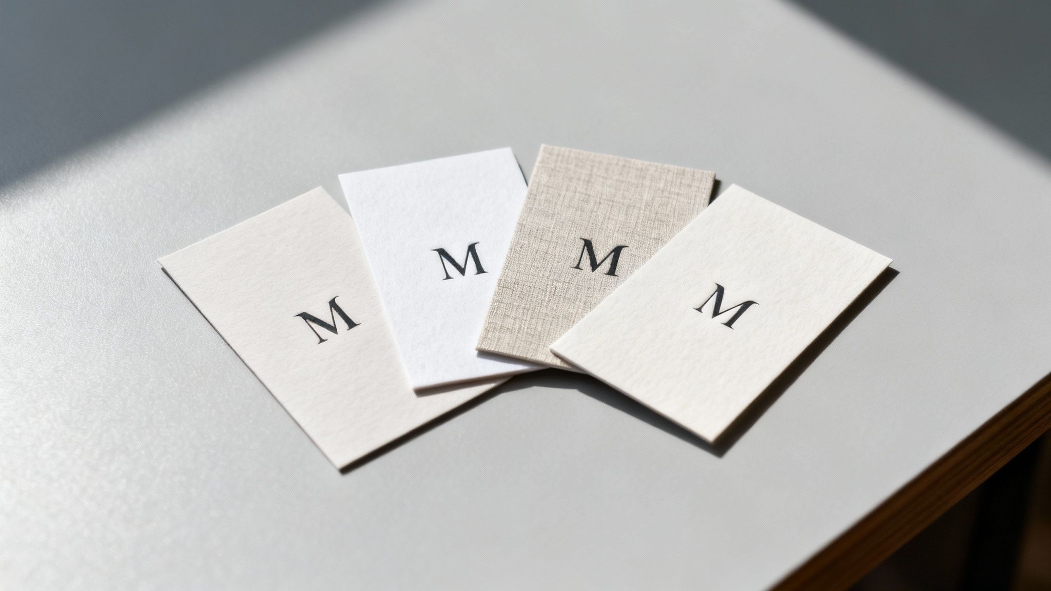
Selecting Paper Stock for a Tactile Impression
The weight and texture of your card speak volumes about your brand’s quality before a single word is read. Paperweight is measured in GSM (Grams per Square Metre)—the higher the GSM, the thicker and more substantial the card will feel.
A typical business card sits around 300-350gsm. Anything lighter can feel a bit flimsy, which might inadvertently cheapen your brand's image. I always recommend aiming for 400gsm or higher for that premium, sturdy feel that conveys confidence. A real estate agent, for example, could use a heavy 400gsm uncoated stock to project a feeling of trust and rock-solid reliability.
Beyond the weight, the finish is just as important.
- Matte: This gives you a smooth, non-reflective surface that looks clean and contemporary. It's fantastic for minimalist designs and has the added bonus of being easy to write on.
- Gloss: A shiny, vibrant finish is your best bet if you want colours to really pop. It’s an excellent choice for photographers or creative agencies looking to show off vivid imagery.
- Uncoated: For an organic, authentic touch, an uncoated stock with its natural, textured feel is ideal. It works beautifully for eco-conscious brands or anyone aiming for an artisanal, handcrafted feel.
The tactile experience of a business card leaves a surprisingly strong psychological impression. A thick, textured card simply feels more important and is far less likely to be tossed aside, reinforcing your brand’s value in the recipient's mind.
It's also worth remembering that local printing is a big deal. New Zealand's printing sector supports a huge ecosystem of 617,330 enterprises, with 775 dedicated printing businesses across the country. This strong local market means there are plenty of specialised providers ready to help small and medium businesses get it right.
Ultimately, your business card is a direct extension of you. Think about how its design and feel contribute to building your personal brand and making that first meeting count. Your card shouldn’t just look good; it needs to feel right, perfectly aligning with the story you want to tell.
Using Special Finishes to Stand Out
Once you’ve nailed down the right size and paper, it’s time for the fun part: adding personality. Special finishes are the little details that take a simple piece of cardstock and turn it into a memorable experience. Think of them as the difference between a standard introduction and a real conversation starter.
These tactile and visual enhancements are what people actually notice and remember long after a meeting. For anyone in competitive fields like real estate, marketing, or creative services, these final touches aren't just decorative—they’re a strategic move. A well-chosen finish can make your logo pop, add a touch of luxury, or simply make your card more interesting to hold. This is where the real craftsmanship in business card printing shines.
Adding a Tactile Dimension with Spot UV and Embossing
One of the most powerful ways to make an impact is through texture. Spot UV is a fantastic technique where a high-gloss varnish is applied to specific areas of your card, creating a stunning contrast against a matte background. Picture your logo catching the light with a subtle shine, or a specific pattern feeling silky-smooth to the touch. It’s a clever way to draw the eye exactly where you want it.
Embossing, on the other hand, physically raises a design from the paper, creating a three-dimensional effect you can feel. This adds a sophisticated, tangible quality that just feels premium. It’s perfect for giving a monogram, logo, or even just your name a bit of gravitas, conveying a sense of quality and establishment.
- When to use Spot UV: It’s ideal for highlighting logos or patterns on matte or soft-touch laminated cards. The contrast creates a really modern, high-impact feel.
- When to use Embossing: This works best on thicker paper stocks—at least 350gsm—to create a noticeable raised texture without weakening the card. It projects classic elegance.
Creating a Luxurious Feel with Foil Stamping
For a touch of pure luxury, nothing really beats foil stamping. This process uses heat and pressure to apply a thin layer of metallic foil to the paper. While gold and silver are timeless choices, don't forget that foils come in a huge range of colours, including rose gold, copper, and even eye-catching holographic finishes.
Foil is incredibly versatile. You could use a fine, foil-stamped border to frame your card with understated elegance, or go bold with a fully foiled logo that makes a confident statement. It immediately signals a high-end brand, making it a popular choice for luxury retailers, consultants, and anyone wanting to project an image of premium quality.
Here's something to think about: a business card with a special finish is far more likely to be kept. Research suggests that 72% of people judge a company based on the quality of its business card, and a unique tactile element like foil or embossing makes it feel too valuable to just toss away.
Below is a quick comparison to help you figure out which special finish might be the right fit for your business.
Choosing the Right Special Finish for Your Business
A comparison of popular business card finishes to help you decide which one best suits your brand identity and industry needs.
| Finish Type | Best For | Industry Example | Considerations |
|---|---|---|---|
| Spot UV | Creating a high-contrast, modern feel by highlighting specific elements like logos or patterns. | A graphic design studio using it to make their logo pop on a matte black card. | Works best on matte or soft-touch finishes to maximise contrast. Avoid using it on very fine text. |
| Embossing | Adding a classic, sophisticated texture that feels premium and established. | A law firm embossing its crest or a high-end furniture maker embossing its name. | Requires thicker card stock (350gsm+) to look its best. Can affect the back of the card slightly. |
| Foil Stamping | Communicating luxury, elegance, and high value. Perfect for making a bold, memorable statement. | A boutique jeweller using rose gold foil for their logo and contact details. | Can be more expensive than other finishes. A huge range of foil colours is available beyond just gold and silver. |
| Die-Cutting | Making a truly unforgettable impression with a custom shape that reflects your brand's personality. | A coffee shop with cards shaped like a coffee cup or a pet groomer with a paw-print-shaped card. | The design needs to be clever and practical. Complex shapes may increase costs and production time. |
Ultimately, the right finish depends on the story you want your brand to tell. Each option offers a unique way to make your first impression count.
Standing Out with Unique Die-Cut Shapes
Why stick to a rectangle? Die-cutting lets you cut your business cards into almost any custom shape you can dream up. This is your chance to get really creative and directly link your card’s form to your business. A coffee shop could have a card shaped like a coffee bean, or a photographer might opt for a shape that mimics a camera lens.
This level of personalisation makes a powerful first impression because it’s so unexpected. A uniquely shaped card isn’t just a piece of contact info; it’s an unforgettable brand artefact. It shows you’ve put thought and creativity into every single detail of your business.
This drive for unique products is really reshaping the printing industry. The New Zealand print-on-demand market, now valued at USD 120 million, is expanding fast, driven by e-commerce demands for one-of-a-kind stationery. And as hybrid cards with QR codes now see 36% usage, blending tactile finishes with digital links is becoming a seriously powerful networking strategy. If you're interested in this space, you can discover more insights about the New Zealand print-on-demand market.
How to Prepare Your Artwork for Flawless Printing
Even the most incredible business card design can fall flat if the digital file isn't set up correctly for the printing press. You’ve put in the creative work, so let's make sure the final product is just as brilliant. Getting a few technical details right is the crucial last step that bridges the gap between your screen and the card in your hand.
Think of it this way: prepping your file correctly is non-negotiable for professional results. It’s how you prevent common but costly mistakes like weird colour shifts, blurry text, or your contact details getting chopped off. You don't need to be a design guru, but you do need to know the basic rules of the road for business cards printing.
Understanding Bleed, Trim, and Safe Zones
If there's one area that trips people up, it's the margins. The bleed, trim line, and safe zone aren't just arbitrary suggestions from printers; they're essential for getting that clean, professional, edge-to-edge finish on every card.
- The Trim Line: This is simple—it's the final cut edge of your business card. For a standard NZ card, that’s the 90mm x 55mm border where the guillotine does its work.
- The Bleed Area: This is a 3mm buffer zone that extends beyond the trim line on all sides. If you have a background colour or an image that touches the edge of the card, it absolutely must extend all the way out to fill this bleed area. This gives the cutting machine a tiny bit of wiggle room, ensuring you never end up with an ugly white sliver along the border if the cut is a fraction of a millimetre off.
- The Safe Zone: This is an internal margin, also usually 3mm, set inside the trim line. Keep all your mission-critical info—your name, logo, and phone number—tucked safely inside this zone. Anything outside of it is in the danger zone and risks getting sliced off.
Here's a good analogy: Think of it like using painter's tape. The safe zone is the part of the wall you've taped off to protect. The bleed is where you paint slightly over the tape's edge to guarantee a perfectly crisp line when you peel it off. The trim line is that final, perfect edge.
Ignoring these zones is the fastest way to an amateur-looking result. Always turn on the guides in your design software so you can see exactly where these lines are.
This diagram breaks down how to set up separate artwork layers for special finishes. It’s key for ensuring elements like Spot UV or Foil align perfectly with your main design during the printing process.
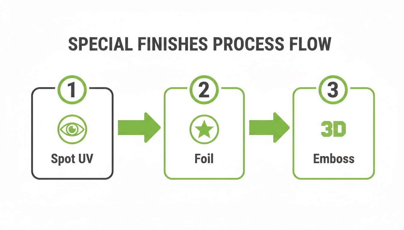
As you can see, each special finish needs its own dedicated layer. This isn't just a suggestion—it's how printers ensure every detail is applied with precision.
Setting the Correct Colour Mode
One of the most common technical hiccups we see is a colour mode mismatch. What you see on your screen is made of light (RGB), but what comes off a press is made of ink (CMYK). They are completely different systems, and if you don't account for this, your colours will not turn out as you expect.
RGB (Red, Green, Blue) is for digital screens. It’s an "additive" model that can create super bright, vibrant colours that physically can't be replicated with ink on paper.
CMYK (Cyan, Magenta, Yellow, Key/Black) is the standard for professional printing. It’s a "subtractive" model. If you design in RGB, that vibrant electric blue on your monitor will likely print as a much duller, muted navy.
The fix is simple: always set your design file’s colour mode to CMYK from the very beginning. This gives you a far more accurate preview of how the final colours will actually look on paper.
Ensuring High Resolution for Sharp Details
The final piece of the pre-press puzzle is resolution. This determines how sharp and clear your printed card will be. We measure this in DPI, or Dots Per Inch.
For any professional print job, the gold standard is 300 DPI.
Don't be tempted to grab your logo from your website. Images online are almost always 72 DPI—perfect for fast-loading screens, but guaranteed to look fuzzy and pixelated when printed. You can't just "upscale" a low-res image and hope for the best; the quality has to be there from the start.
Here’s a quick quality check: before you export your file, zoom in to 100%. Do the text and images look crisp? If so, you’re good to go. If anything looks blurry or blocky, you need to find a higher-resolution version. This one step will ensure every detail, from the finest print to the sharpest edge of your logo, comes out perfectly.
From File to Finish: Ordering Your Business Cards
You’ve nailed the design and prepped your files for printing. Nice one. Now for the final leg of the journey: placing the order. This part might seem like a simple box-ticking exercise, but a few smart decisions here can save you time, money, and a lot of headaches down the track.
Let's walk through the last few checkpoints to get those digital files transformed into a stack of high-quality, professional cards you can be proud of.
How Many Cards Do You Really Need?
This is usually the first question you'll be asked, and the answer has a huge impact on your budget. The way printing works, there are fixed setup costs, so the more cards you print at once, the cheaper each individual card becomes. It's all about economy of scale.
Ordering a small run of 100 cards makes sense if you’re just trying out a new design or if your contact details change frequently. But if your info is locked in, jumping up to 500 or 1,000 cards can slash your cost-per-card by more than 50%. My advice? Think about how many networking events, client meetings, or trade shows you have on the horizon for the next six to twelve months. It’s almost always better to order a few more than you think you'll need.
Don’t Skip the Proof—Ever
Before your job hits the big press, you’ll get a proof. This is your absolute last chance to catch any errors. I can't stress this enough: do not skip this step. There are a couple of different proofs you might encounter.
- Digital Proof (PDF): This is the standard. You’ll receive a PDF that shows exactly how your card will be laid out, complete with trim and bleed lines. Use this to triple-check every single letter and number. Is the spelling correct? Is the phone number right? Is anything sitting too close to the edge?
- Physical Proof (Hard Copy): If you've gone for custom colours or fancy finishes like foil stamping, I highly recommend getting a physical proof. It costs a bit more and adds a day or two, but it lets you see the colours under real light and feel the paper stock in your hands. It’s the only way to be 100% certain.
Pro Tip: Always get a second person to look over the proof. After staring at a design for hours, your brain starts to auto-correct things. A fresh set of eyes will spot a tiny typo or a misplaced logo in seconds, saving you the pain and cost of a reprint.
Once you sign off on that proof, you’re telling the printer to go ahead. Any mistakes discovered after that point are on you.
Factoring in Timelines and Delivery
After you've given the green light, your cards are off to production. The time it takes can vary quite a bit, so it pays to plan ahead.
- Standard Printing: For a straightforward card on a common paper stock, you’re typically looking at a 3-5 business day turnaround.
- Special Finishes: Things like Spot UV, embossing, or custom die-cutting involve extra processes and machine setups, which can push the timeline out to 7-10 business days.
Always build these production times into your schedule, especially if you need the cards for a specific event. The last thing you want is to show up empty-handed.
Finally, think about how they’ll get to you. It's worth learning how to find reliable courier services for delivery to ensure your brand new cards arrive safely and on time. A little forward planning on production and shipping means you'll have your cards right when you need them, ready to make that killer first impression.
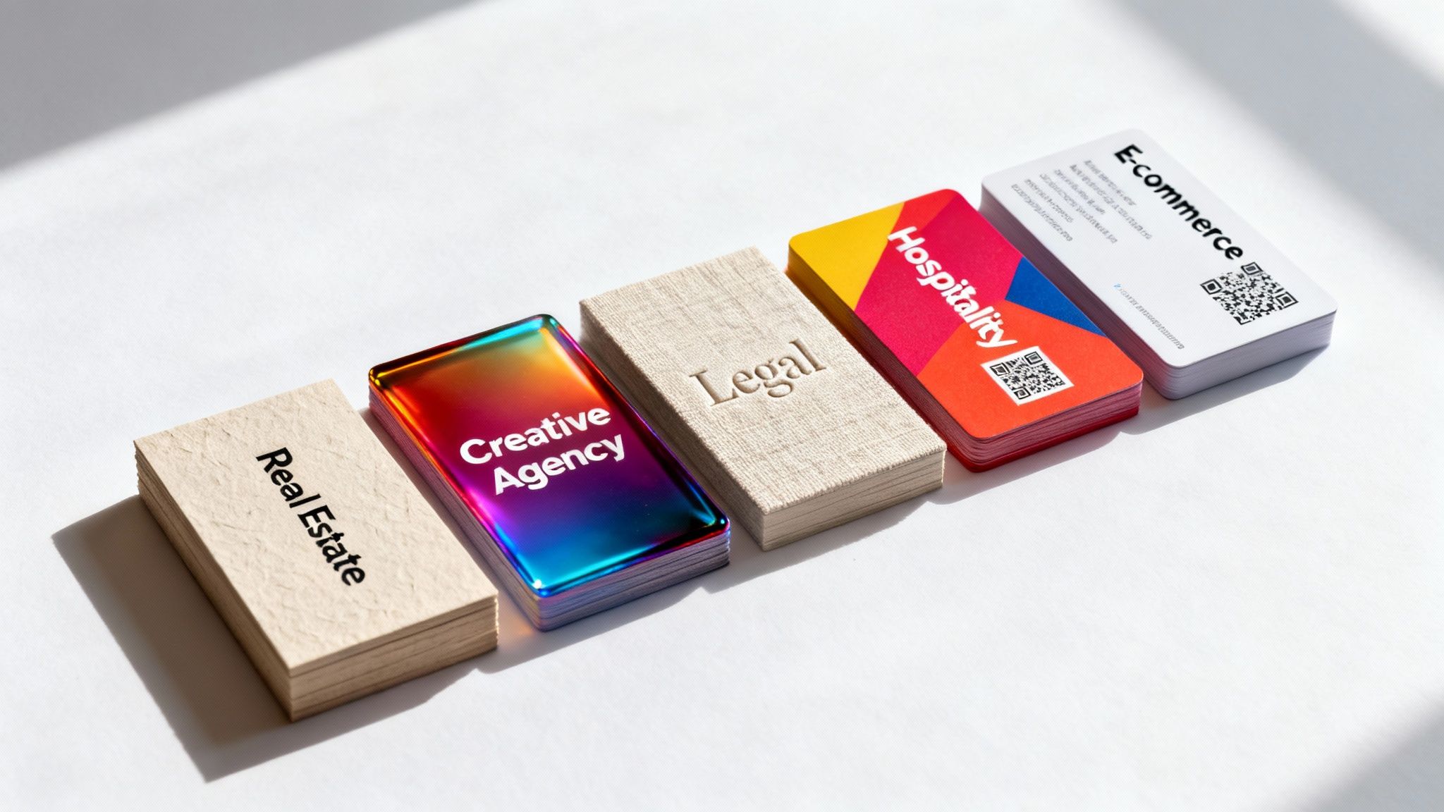
Business Card Ideas for Different Industries
A business card isn't just a piece of paper; it’s your pocket-sized ambassador. The card that wows a creative director probably won't be the same one that builds instant trust with a financial advisor. A one-size-fits-all approach to business cards printing just falls flat.
To create a card that genuinely connects, you need to get inside the heads of your audience. Think about their industry's expectations and values. It’s all about speaking their language through design, texture, and even function.
For Creatives and Tech Startups
If you're in design, marketing, or tech, you live and breathe innovation. Your business card should be a tiny testament to that creativity. This is your chance to break the rules with unconventional shapes, bold colours, and maybe even some unexpected materials.
- Try die-cutting: A card shaped like your logo or a unique icon is instantly unforgettable.
- Go bold with colour: A full-colour flood or brightly painted edges makes a seriously confident statement.
- Integrate a QR code: Send people straight to your online portfolio, GitHub profile, or latest project.
Think about a square card (55mm x 55mm) with a clean, minimalist design on a thick, uncoated stock—it feels modern and self-assured. Or, you could go for a soft-touch laminate with a high-contrast Spot UV finish for that sleek, premium feel that a tech-savvy crowd really appreciates.
For Real Estate and Professional Services
In fields like real estate, law, and finance, your main currency is trust and authority. Your business card needs to feel substantial and dependable, mirroring the quality of your service. Here, subtlety and premium materials are your best assets.
A classic, heavyweight card stock (400gsm or higher) immediately signals quality. Finishes like embossing or foil stamping can add a touch of timeless class without being ostentatious. A lawyer, for instance, might choose a traditional linen paper with their firm’s crest elegantly embossed on it.
A tangible sense of quality goes a long way. A thick, well-crafted card feels important and is less likely to be discarded, subtly reinforcing the value of the professional who handed it out.
A real estate agent could really stand out with a card that has a luxurious soft-touch laminate, perhaps with their name stamped in a subtle silver or gold foil. That combination feels both modern and deeply trustworthy.
For E-commerce and Retail Brands
For e-commerce and retail businesses, a business card is the perfect way to bridge the gap between a physical chat and a digital sale. The goal is to drive action and make your brand stick. Your card should be vibrant, functional, and perfectly in sync with your online storefront.
- Make it useful: Turn it into a loyalty card, a discount coupon, or an appointment reminder.
- Drive online traffic: A prominent QR code linking directly to your online store or social media is a no-brainer.
- Showcase your product: A high-gloss finish can make your product photography pop with life and colour.
Imagine a café owner handing out cards shaped like a coffee cup that also offer 10% off the next purchase. Or an online clothing boutique using a card with a holographic foil finish that perfectly captures the brand's trendy, dynamic vibe.
For Hospitality and Events
The hospitality and events industries are all about creating unforgettable experiences. Your business card should be a little teaser of what you offer. This is the place for bold designs, unique shapes, and textures that grab attention and start a conversation.
A wedding planner might choose a card with elegant script on a pearlescent stock, while a music festival promoter could go for a die-cut shape with eye-popping neon colours. The key is to be distinctive and create a sense of occasion from the get-go.
To give you a clearer picture, I've put together some tailored suggestions based on what I've seen work best for different professions.
Business Card Ideas by Industry
| Industry | Recommended Paper | Suggested Finish | Design Tip |
|---|---|---|---|
| Real Estate Agent | 400gsm or heavier matte | Soft-touch laminate with spot gloss on the logo | Use a high-quality headshot and keep contact info clean and legible. |
| Graphic Designer | Uncoated or textured stock | Die-cut shape or coloured edges | Showcase your design skills. Let the card itself be a mini-portfolio piece. |
| Lawyer / Accountant | Linen or felt-textured card | Embossing or subtle foil stamping (e.g., silver) | Prioritise a traditional, clean layout that conveys professionalism and trust. |
| E-commerce Owner | 350gsm silk with a gloss laminate | QR code linking to the online store | Use vibrant, on-brand colours and product imagery to make it pop. |
| Restaurant / Café | Recycled or kraft paper stock | Can be used as a loyalty card (stampable) | Include your address, hours, and a clear call-to-action, like "Book a Table." |
| IT Consultant | Sleek matte or soft-touch | Spot UV on tech-related icons or QR code to LinkedIn | Keep it modern and minimalist. A clean design suggests efficiency and expertise. |
This is just a starting point, of course. The best business card is one that authentically reflects your brand and resonates with the people you want to connect with.
This focus on tailored, high-quality printing is crucial in New Zealand's competitive market. The local industry has 767 printing businesses, and while the market has seen some consolidation, specialised operations are thriving by creating personalised products for key sectors like real estate, retail, and hospitality. This trend shows just how essential tangible networking tools remain for building trust. If you're interested, you can discover more about the NZ printing industry landscape here. Your card is a direct reflection of this commitment to quality.
Your Business Card Printing Questions, Answered
Getting into the nitty-gritty of business card printing can feel a bit overwhelming, especially when you're after that perfect, professional finish. To help you out, I’ve pulled together answers to the questions we hear most often. Think of this as your cheat sheet for getting your order right the first time, without any headaches.
What’s the Go-To Business Card Size in New Zealand?
Here in New Zealand, the standard business card size is 90mm x 55mm. There's a good reason it's so popular—it's designed to slide perfectly into any wallet or cardholder, which makes it incredibly practical.
While that size is the most common and generally the most cost-effective, don't let it box you in. A unique shape, like a sharp-looking square card or a slim mini-card, can really make your brand stick in someone's mind. We handle both standard and completely custom sizes, so whatever your creative vision is, we can bring it to life.
What on Earth Is a 'Bleed' and Why Do You Keep Mentioning It?
Okay, let's clear this up. A 'bleed' is simply an extra 3mm of your background design that extends past the final trim edge of your card. It's not optional; it's a non-negotiable for professional printing.
Here's why: printing and cutting machines are incredibly precise, but we're talking about micro-millimetres. Tiny shifts can happen during the trimming process. That extra 3mm margin is your safety net. It ensures that if the blade is off by a fraction of a millimetre, you won't get a frustrating, unprofessional-looking white sliver along the edge. A proper bleed is what guarantees your colour or image goes right to the very edge, giving you that sharp, flawless look.
Think of it as an insurance policy for your design. Getting the bleed set up correctly is the single most important technical step to ensure your cards look professionally produced, not like they came off a home printer.
How Can I Make My Cards Feel High-End Without Breaking the Bank?
This is a great question. One of the simplest and most effective tricks is to upgrade your paper stock. Just moving from a standard 300gsm to a thicker 350gsm or even a hefty 400gsm paper makes an instant difference. People can feel the quality and durability the moment they hold it.
Another surprisingly affordable way to add a premium touch is with a laminate. A matte or soft-touch laminate gives the card a smooth, almost velvety texture that feels incredible. These small tweaks make a huge impact on how your brand is perceived, helping it feel more established and high-end.
Are QR Codes on Business Cards Still a Thing?
Absolutely! A QR code is a fantastic, practical tool that bridges the gap between your physical card and your digital world. It's moved way past being a gimmick and is now a genuinely useful feature.
You can link a QR code to just about anything:
- Your company website or a special landing page
- Your professional LinkedIn profile
- An online portfolio or project gallery
- A direct link to a sign-up form or special offer
Just make sure it's big enough to be easily scannable—we recommend at least 15mm x 15mm. It also needs to have enough contrast with the background for a phone camera to read it properly. It’s a smart, modern touch that makes your card work that much harder for you.
Ready to create a business card that truly represents your brand? At SONI DESIGN, we specialise in high-quality business cards printing, helping businesses across New Zealand make a memorable first impression. Explore our printing options and get a quote today!
Leave a Comment
Stay home & get your daily
needs from our shop
Start You'r Daily Shopping with Nest Mart