
Your cart is currently empty.

Even with all our digital tools, a physical business card is still one of the most effective networking tools a Kiwi professional can have. Getting high-quality business card printing in NZ is more than just a way to hand out your contact info. It’s about creating a real, tangible impression that sticks with someone long after you've shaken hands.
Why Your Business Card Still Packs a Punch in NZ

It’s tempting to assume a quick LinkedIn connection has made the printed card obsolete, but that misses the point entirely. A business card is a physical extension of your brand that you literally put into someone's hands. It cuts straight through the digital clutter and forges a genuine connection that a simple follow request can't match.
Picture the last networking event you were at in Auckland or Wellington. The act of exchanging cards is a time-honoured ritual that cements a conversation. It signals that you came prepared and that you respect the other person's time. While digital marketing is key, these traditional tools are a vital part of the bigger picture and complement your strategies to attract clients by giving your brand a solid presence in the real world.
Making That Tangible First Impression Count
A thoughtfully designed card does more than just list your details—it evokes a feeling. The weight of the cardstock, the sharpness of the print, and the polish of the design all send subtle signals about your business’s standards and eye for detail.
A business card is your silent brand ambassador. It keeps the conversation going long after you've left the room, acting as a constant, professional reminder of who you are and what you do.
This physical quality is incredibly powerful for a few key reasons:
- It Builds Credibility: A professionally printed card instantly suggests you're a serious, established business.
- It Prompts a Follow-Up: A card sitting on a desk is a far more effective reminder to get in touch than an email buried in a crowded inbox.
- It's a Direct Connection: It’s simply the fastest, most direct way to exchange details without fumbling with phones or apps. Everyone gets it.
A Strong Presence in a Stable Industry
Despite all the changes in marketing, the need for quality print has held its ground. The printing industry in New Zealand proves this point. As of early 2025, there are 775 businesses operating in the country's printing sector. While that number shows a slight long-term dip, its stability highlights that print—especially for core items like business cards—remains a fundamental need for Kiwi companies.
At the end of the day, a business card is a smart investment in both your personal and company brand. It’s a simple, affordable tool that opens doors, sparks conversations, and helps build the strong relationships that are so crucial for success in New Zealand’s close-knit business community.
Designing a Card That Represents Your Brand
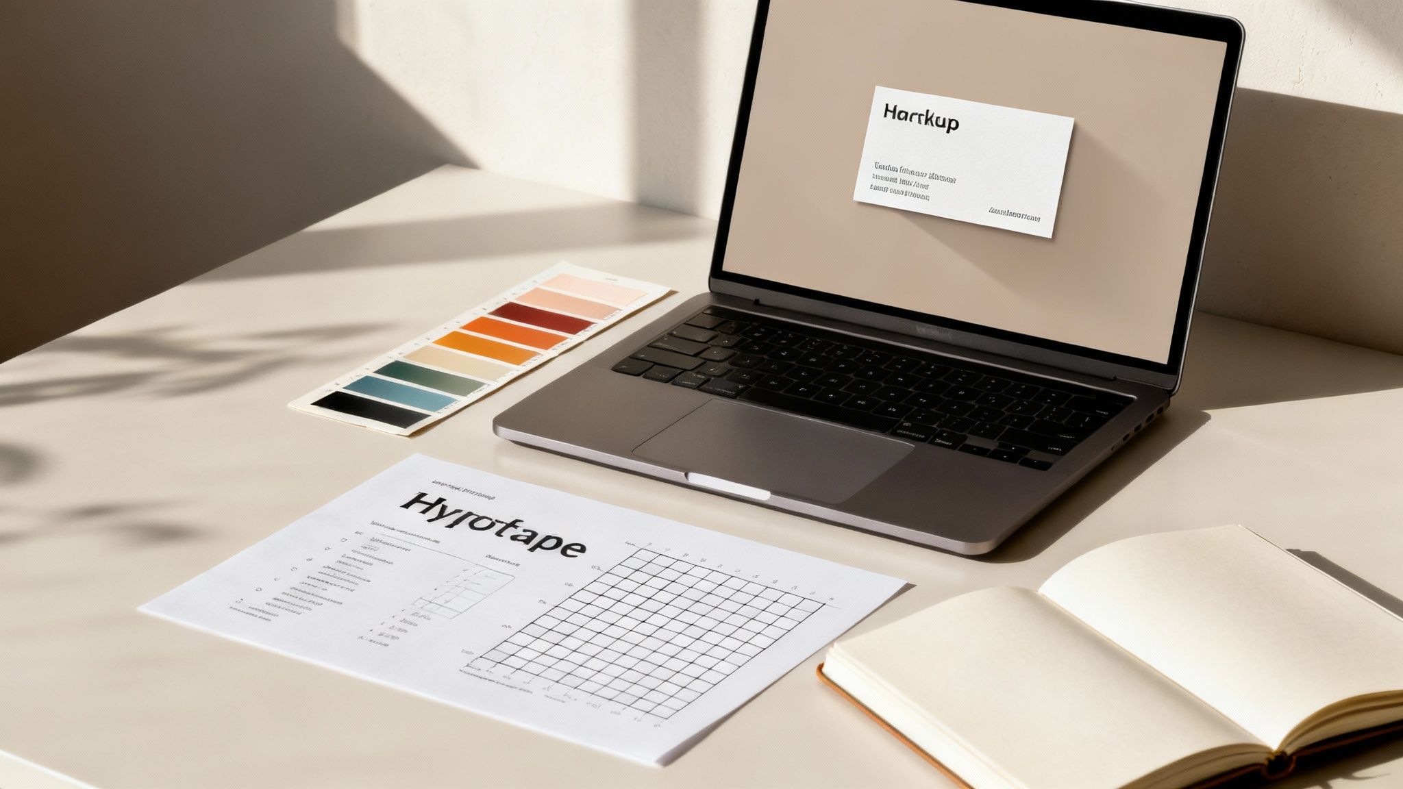 Think of your business card as a tiny, pocket-sized ambassador for your brand. It’s often the very first tangible thing someone takes away from a meeting with you, so its design plays a huge role in shaping their first impression. A great card immediately says you’re professional, you care about quality, and it gives a feel for your brand’s personality before a word is even read.
This is where consistency is absolutely key. The colours, fonts, and logo on your card need to line up perfectly with what people see on your website, your social media, and any other marketing you do. To nail this, it’s a brilliant idea to create brand guidelines. This simple document acts as your rulebook, ensuring everything, including your business card, stays on-brand.
Core Elements Every Card Needs
While it’s tempting to get super creative, there are a few non-negotiable details that every business card must have. If you miss any of these, you risk making it hard for that valuable new contact to actually get in touch, which defeats the whole purpose.
Make sure your design clearly features:
- Your Logo: This is your brand's most recognisable visual. Give it pride of place.
- Your Name and Title: Let people know who you are and what you do.
- Company Name: Obvious but essential for brand recall.
- Contact Information: At a minimum, this means your phone number, email address, and website.
- A QR Code (Optional but Recommended): Especially in 2025, QR codes are making a huge comeback. They're a fantastic, quick way to link someone directly to your portfolio, LinkedIn profile, or online store.
These elements are the foundation. Once you’ve got them sorted, you can start playing with the layout to create something that’s not just functional but also looks fantastic.
A well-organised card respects the recipient's time. By using clean typography and a clear visual hierarchy, you make it effortless for them to find the information they need, reflecting the efficiency and professionalism of your business.
Getting Your File Print-Ready
Creating a stunning design is one thing, but preparing the file correctly for professional business card printing in NZ is what truly brings it to life. This is where I see a lot of simple, avoidable mistakes happen. Getting the technical details right is the difference between a flawless card and a disappointing one.
The three most critical things to get right are your resolution, colour mode, and bleed. Get any of these wrong, and you could end up with blurry logos, weird colour shifts, or unsightly white slivers along the edges of your finished cards.
Resolution and Colour Mode
First up, resolution. For printing, your design file needs to be at least 300 DPI (dots per inch). Anything less will look pixelated and amateurish when printed. This high resolution is what keeps your text and images looking crisp and professional.
Next is colour mode. Your file must be set to CMYK (Cyan, Magenta, Yellow, Key/Black). It’s an easy mistake to design in RGB (Red, Green, Blue), which is the colour mode for screens. But if you send an RGB file to a printer, the colours will be converted, and your vibrant brand colours might come out looking muddy or dull. Always start your design in CMYK.
Understanding Bleed
"Bleed" is a term you'll hear a lot in printing. It’s simply a small, extra margin of your background design that extends beyond the final cut line of the card. Because the trimming process involves a big mechanical guillotine, it’s never 100% pixel-perfect. Adding a bleed ensures that even if the cut is a fraction of a millimetre off, you won't get any ugly white borders.
For a standard 90mm x 55mm business card, you’ll want to add a 3mm bleed on all four sides. This brings your total file dimensions to 96mm x 61mm. Just be sure to keep all your important text and logos well within a "safe area" inside the trim lines so nothing gets accidentally chopped off.
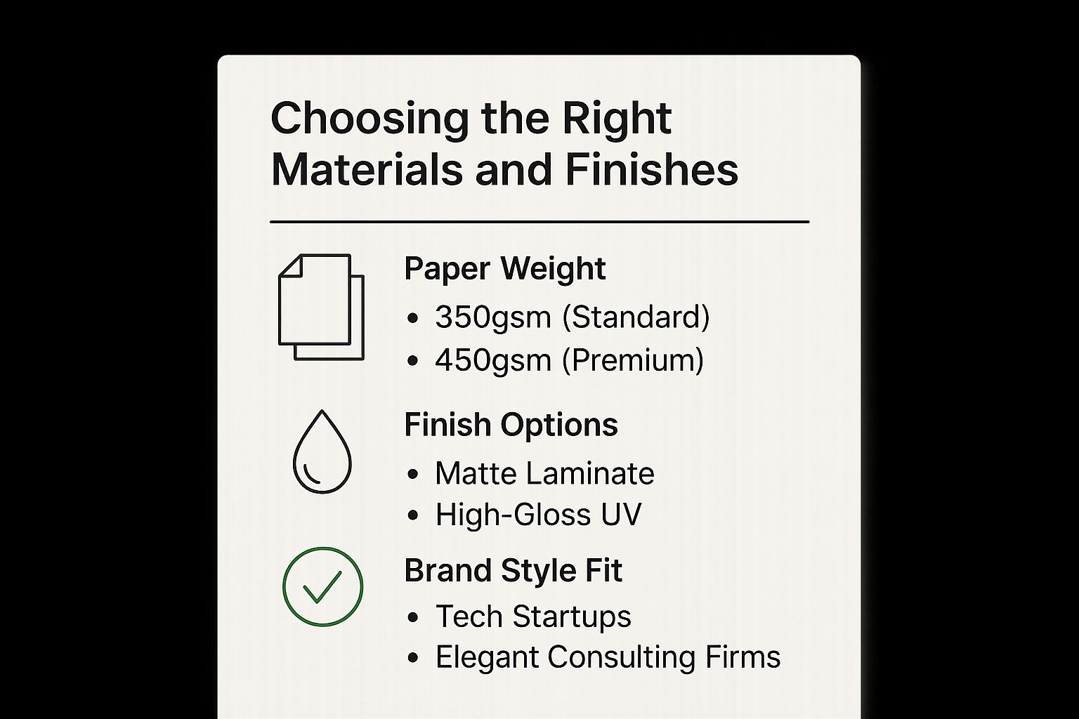
Choosing the Right Materials and Finishes
How a business card feels in someone’s hand says just as much as what’s printed on it. The weight, texture, and finish all build the perception of your brand, making this a critical part of the business card printing in NZ process.
It all starts with the paper stock, measured in GSM (grams per square metre). This isn't just some industry jargon; it’s a direct measure of your card’s thickness and sturdiness. We’ve all been handed a flimsy, lightweight card that felt a bit cheap. On the other hand, a thick, substantial card immediately gives an impression of quality and professionalism. That tactile experience is often the very first thing a new contact will notice.
Understanding Paper Weight and Its Impact
For a solid, professional impression, I always recommend starting with a minimum of 350gsm. This weight has a durable feel without being too chunky, making it a fantastic all-rounder for everyday networking. It’s the industry standard for a good reason—it feels right and stands up to being passed around.
But if you really want to make an impact, moving up to a premium 450gsm stock is a genuine game-changer. This heavier weight has a distinct, luxurious quality that adds a sense of importance to your card. It subtly tells the recipient that you care about quality, right down to the smallest details.
The difference between a standard and premium card stock is something you can literally feel. Handing someone a thick, weighty card creates an immediate, subconscious impression of stability and high value before they’ve even read your name.
Selecting Finishes That Align with Your Brand
Beyond the paper itself, the finish you choose can completely change the character of your business card. Each option offers a different look and feel, so it's worth thinking about which one truly reflects your brand’s personality.
- Matte Laminate: This gives you a smooth, non-reflective surface that looks modern and sophisticated. It’s perfect for clean, minimalist designs and for brands that want to project an understated elegance. A nice bonus is that it resists fingerprints and smudges.
- High-Gloss UV: A high-gloss finish makes colours really pop and gives your card a vibrant, shiny look. This is an excellent choice for brands that use bold colours or photography in their design, like creative agencies or retail businesses.
- Foiling and Embossing: For that ultimate premium touch, you can’t go past special finishes. Foiling adds metallic accents that catch the light beautifully, while embossing creates a raised, three-dimensional texture. These are ideal for luxury brands, high-end consultants, or anyone wanting to signal prestige.
To help you decide, here’s a quick breakdown of how different finishes match up with various brand styles.
Matching Card Finishes to Your Brand Style
| Feature | Best For | Feel & Impression | Typical Use Case |
|---|---|---|---|
| Matte Laminate | Minimalist, modern, and tech-focused brands | Smooth, elegant, and non-reflective. Feels sophisticated and understated. | A Christchurch-based software startup wanting a clean, professional look. |
| High-Gloss UV | Vibrant, creative, and visual-heavy brands | Shiny, slick, and eye-catching. Makes colours look rich and saturated. | A Wellington photographer or a colourful retail brand. |
| Foiling | Luxury, premium, and established brands | High-end, prestigious, and visually striking. Catches the light. | An Auckland law firm or a high-end financial advisor. |
| Embossing | Classic, traditional, and brands wanting a tactile element | Textured, substantial, and classic. Adds a 3D feel to logos or text. | A well-established consultancy or a boutique architectural practice. |
Ultimately, choosing the right combination is about creating a cohesive brand experience. A tech startup might opt for a 450gsm card with a sleek matte laminate to reflect its modern, innovative spirit. In contrast, an established law firm could choose that same 450gsm stock but with gold foiling to communicate tradition, trust, and authority. Your card is a physical touchpoint for your business—make it count.
Placing Your Order with SONI DESIGN
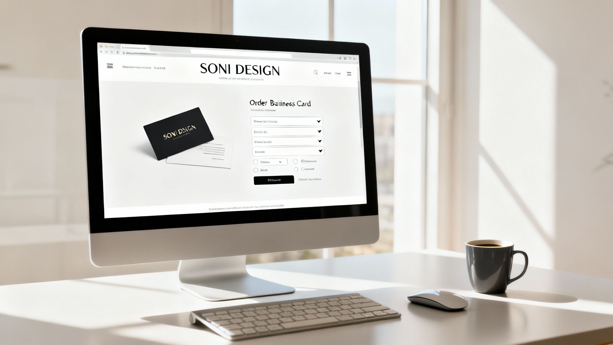
Okay, your design file is prepped and looking sharp. The good news? Ordering your cards is the easiest part. We’ve designed our SONI DESIGN platform to be as straightforward as possible, walking you from file upload to final approval without any guesswork.
This move to easy online systems is happening everywhere. In fact, the global online printing market was valued at around $2.5 billion in 2025, largely thanks to businesses and freelancers across New Zealand needing professional marketing tools without the old-school hassle. If you're interested in the data behind this shift, Data Insights Market offers a deeper dive into the industry.
Getting Started on the Platform
First things first, you’ll need to upload your print-ready PDF. The moment you do, our system runs a quick check for common gremlins like low-resolution images or incorrect colour modes, giving you immediate feedback.
From there, it’s all about locking in the details. This is where you bring your vision to life by choosing:
- Quantity: Need a small test run of 100? Or stocking up with 1000 or more? The choice is yours.
- Paper Stock: Decide on the feel. Will it be our popular 350gsm standard or the heftier premium 450gsm?
- Finishes: This is where the magic happens. Lock in that matte or gloss laminate, or add a touch of foil.
With every option you select, you’ll see the price update instantly. No hidden costs, no surprises at checkout. It's all about helping you find that perfect balance between what you want and what your budget allows.
The All-Important Digital Proof
We never print anything without your final green light. After you've set your specifications, we'll generate a digital proof. Think of this as the final dress rehearsal for your business card, showing exactly how it will look with all the trim lines and safe zones marked out.
Take your time with this step—it’s critical. Pour a coffee and carefully review every detail on the proof. Check for typos, make sure your phone number is correct, and confirm no important logos or text are creeping too close to the edge. This final check is your safety net against a reprint.
Once you give the proof your official "okay," your order moves straight into our production queue.
Turnaround and Delivery Anywhere in NZ
Being a local New Zealand printer means we can get things done quickly. Our standard business card printing in NZ usually takes about 3-5 working days to produce, plus a little extra time for delivery.
We ship right across the country, so it doesn't matter if you're in Auckland, Christchurch, or somewhere a bit more off the beaten track. We’ve fine-tuned our whole process—from the simple online order to the reliable courier—to get your stunning new cards in your hands, completely stress-free.
Common Printing Mistakes and How to Avoid Them
https://www.youtube.com/embed/En610O0sxbE
Even the most brilliant design can get tripped up by small technical mistakes, leading to a print job you’re not happy with. I've seen it happen countless times. Let's walk through the most common pitfalls in business card printing in NZ so you can get it right the first time and avoid the hassle and cost of a reprint.
Getting the Technicals Right
Probably the number one issue we see is artwork that isn't high enough resolution. Your logo looks razor-sharp on your computer screen, but when it’s a low-quality JPEG, it will come out of the printer looking fuzzy and pixelated. The fix? Always, always use high-resolution vector files—think .AI or .EPS—for logos and graphics. That’s how you guarantee they stay crisp.
Another classic mistake is the colour setup. You’re likely designing in RGB because that’s the standard for screens. But for professional printing, the file needs to be in a CMYK colour profile. If you send us an RGB file, it has to be converted, and that process can sometimes make your vibrant brand colours look a bit dull or muddy. It's a nasty surprise when you're expecting bright and bold.
Sidestepping Design and Layout Blunders
Beyond the technical file prep, some common design choices can really let a business card down. The biggest offender? Trying to cram too much information onto it. It’s tempting to include every single detail about your business, but the result is usually a cluttered mess that’s impossible to read.
You need to embrace white space—or negative space, as designers call it. The empty areas around your logo and text are just as important as the content itself. This breathing room makes your card feel more professional and sophisticated, and it helps direct the eye to what really matters.
A design trap I see a lot is using fonts that are either way too small or far too decorative for contact details. While creative typography is a huge trend for 2025, the practical information must be legible at a quick glance. Stick to clean, readable fonts for your name, phone number, and email.
Before you finalise your design, run through this quick checklist:
- Proofread everything. Seriously. Check for typos in names, numbers, and emails. Then get someone else to check it, too.
- Keep it simple. Does every single element on the card have a clear purpose? If not, it’s probably just clutter.
- Add a clear call-to-action. Tell people what to do next. A simple "Visit our website" or "Scan for my portfolio" makes a huge difference.
Nailing the Final File Setup
Getting your file prep right is absolutely crucial for a professional finish. We’ve covered resolution and colour mode, but the third piece of that puzzle—the one people often forget—is the bleed.
Without a proper bleed, which is an extra 3mm of your background colour or image extending past the trim line, you risk getting thin white slivers along the edges of your finished cards. This happens because the guillotine that cuts the cards has a tiny margin of error. That bleed acts as a safety net, ensuring your design goes right to the very edge.
Finally, make sure all your important text and logos are placed well within the "safe area," away from where the card will be trimmed. This prevents anything critical from getting accidentally sliced off. By keeping these common errors in mind, you’re setting yourself up for a smooth process and a final product you’ll be proud to hand out.
Got Questions About Printing Business Cards in NZ? We’ve Got Answers.
When you’re trying to get your business cards just right, it’s natural for a few questions to pop up. We get asked these all the time, so we’ve put together some straightforward answers to help you order with confidence.
What’s the Go-To Business Card Size in New Zealand?
Here in New Zealand, the standard business card size is 90mm x 55mm. While you can definitely get creative with custom sizes, this is by far the most common and budget-friendly option.
It’s the perfect size to slip into a wallet or a standard cardholder, making it super convenient for people to hang onto. A quick pro tip: when you’re setting up your design file, make sure to add a 3mm bleed on all sides. This gives us the room we need for trimming and ensures your design goes right to the edge without any weird white borders.
What on Earth is GSM and Which One Do I Need?
GSM stands for 'Grams per Square Metre'. In simple terms, it's a measure of the paper's weight and thickness. The higher the GSM, the thicker and more substantial your card will feel.
We generally recommend a minimum of 350gsm for a business card that feels professional and not flimsy. If you really want to make an impact, bumping it up to a 400gsm or 450gsm stock gives the card a noticeable sturdiness that just feels more premium and important in someone's hand.
Should I Design in CMYK or RGB?
This one is a biggie: your artwork must be in CMYK (Cyan, Magenta, Yellow, Key/Black). This isn't just a preference; it's a fundamental requirement for professional printing.
RGB (Red, Green, Blue) is the colour system used for digital screens—think your computer monitor or smartphone. If you create your design in RGB, the colours will be converted to CMYK before printing, and that conversion can lead to some pretty dramatic and disappointing colour shifts. To make sure the final printed colour is what you actually intended, always start your design in a CMYK colour profile.
Getting these details right is more important than ever. The commercial printing market here in NZ is on the up, with projections showing an annual growth rate kicking off at 4.03% in 2025. This growth is largely thanks to a vibrant startup scene and a renewed focus on sharp branding. Since things like business cards are a huge slice of that market, Kiwi businesses are realising just how powerful these little pieces of card can be. You can dive deeper into these commercial printing market trends to see where things are headed.
Ready to create a business card that truly stands out? At SONI DESIGN, we pour our passion and expertise into every single project. Let's make something amazing together. Start your order today.
Leave a Comment
Stay home & get your daily
needs from our shop
Start You'r Daily Shopping with Nest Mart