
Your cart is currently empty.
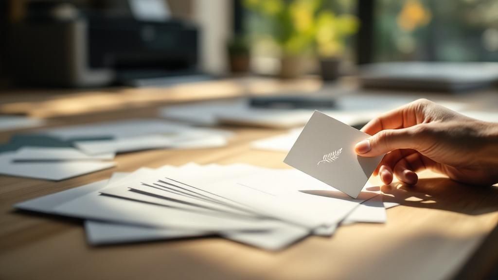
A business card is more than just a piece of paper with your contact details on it; it's a physical handshake, a tangible representation of you and your brand. In a world saturated with digital connections, a professionally printed card offers something different—a personal touch that an email or a LinkedIn request just can't match.
The Power of a Professional First Impression
It’s tempting to think the humble business card is a relic of the past, but its real strength lies in what digital interactions often lack: substance. A thoughtfully designed and well-printed card becomes a physical reminder of a conversation, a solid piece of your brand that someone can hold onto.
Think of it like this: a great business card is the equivalent of a firm, confident handshake. It instantly signals professionalism and a serious attention to detail, turning a simple piece of card into a marketing tool that people actually want to keep.
Why Quality Printing Makes a Difference
The feel of a business card—its weight, its texture, the way a finish catches the light—says a lot about your brand before a single word is even read. This is where tactile marketing really comes into play. A flimsy, cheaply printed card can unintentionally communicate that you might cut corners elsewhere in your business.
On the other hand, a card printed on thick, premium stock with a unique finish creates an immediate and lasting positive association. It suggests quality, builds credibility, and hints at success. This principle holds true everywhere; for instance, sharp visuals are essential in real estate to demonstrate the power of a professional first impression in marketing.
A high-quality business card does more than share your details; it validates your brand’s commitment to excellence and leaves a memorable, physical footprint in a potential client's hand.
Turning Impressions into Opportunities
Making that initial connection count is crucial, especially when you think about how quickly people move on. The statistics are quite telling: globally, a staggering 88% of business cards are thrown out within a week. At the same time, studies show that 72% of people judge a business by the quality of its card.
This is the challenge every business owner faces: how to create a card that not only wows someone at first glance but also avoids ending up in the bin. This is where professional printing comes in. It gives you access to the premium materials, vibrant colours, and unique finishes needed to create something genuinely unforgettable.
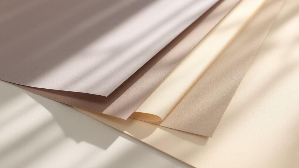
Choosing Your Canvas: Paper Stocks and Materials
The foundation of any great business card isn't the logo or the font—it's the paper it’s printed on. Think of it like an artist selecting a canvas. Your choice of paper stock sets the entire tone for your brand's first physical impression, communicating value long before anyone reads a single word.
You’ll hear the term GSM a lot, which stands for Grams per Square Metre. Don't let the jargon intimidate you; it's just a simple way to measure paper density and weight. A low GSM feels flimsy, like a cheap flyer. A high GSM, on the other hand, feels substantial and premium, like a high-end invitation. It has a real presence in your hand.
Here in New Zealand, a good starting point for a professional business card is around 300-350 GSM. This gives it a solid, quality feel without being too rigid. Once you get up to 400 GSM and beyond, you’re in luxury territory. These cards have a noticeable heft that screams quality and permanence.
The journey from a digital design to a finished card is a big one, and the material you choose is arguably the most critical step.
As you can see, turning a simple idea into a powerful marketing tool really hinges on getting the physical materials right.
The Classic Contenders: Popular Paper Types
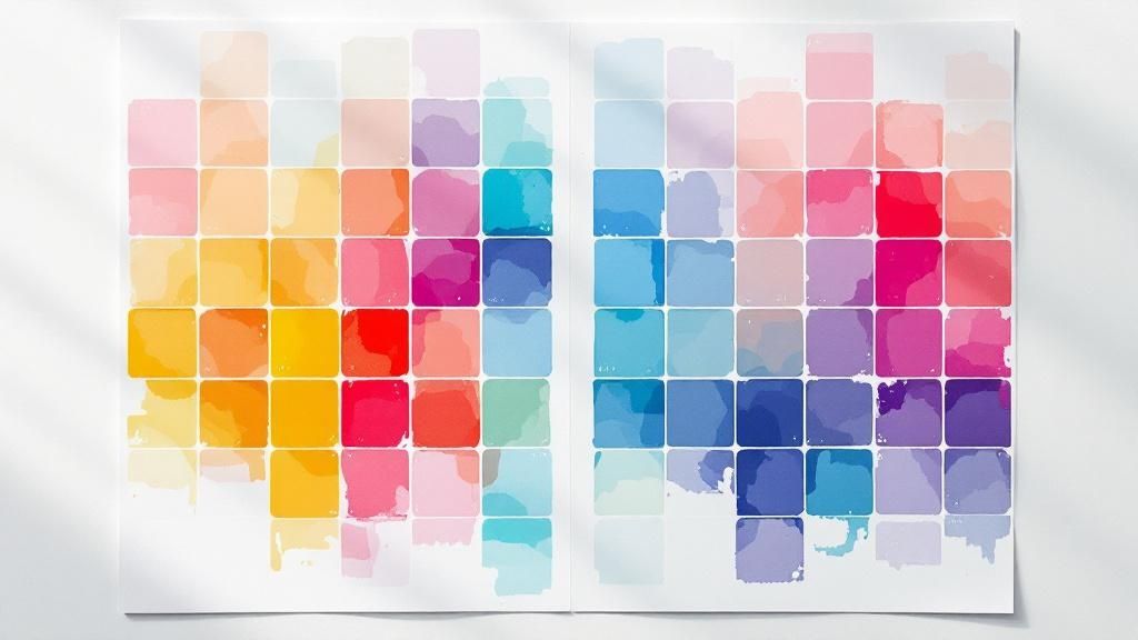
Beyond just the weight, the paper's finish plays a huge role. Each type interacts with light and ink in its own unique way, creating a distinct look and feel that needs to match your brand’s personality.
-
Matte Stock: There's a reason this is such a popular choice. Matte paper has a smooth, non-reflective surface that gives colours a subtle, almost understated elegance. It's perfect for clean, minimalist designs and has a practical bonus—it's a breeze to write on if you need to jot down a quick note for a new contact.
-
Gloss Stock: If you want your colours to absolutely sing, gloss is your go-to. Its shiny, reflective coating makes vibrant logos and images look incredibly sharp and eye-catching. This stock is a natural fit for creative industries like photography or graphic design where making a strong visual impact is everything.
-
Uncoated Stock: With its natural, slightly textured feel, uncoated paper is the most porous of the bunch. It soaks up ink more deeply, which gives colours a softer, more muted look. This is the perfect choice for brands going for an organic, rustic, or eco-friendly vibe.
To help you decide, here’s a quick breakdown of how these common paper stocks stack up against each other. Each one serves a different purpose, so thinking about your brand's message is key to picking the right one.
Paper Stock Comparison for Business Cards
| Paper Stock Type | Typical GSM Range | Look and Feel | Best For |
|---|---|---|---|
| Matte | 300 - 450 GSM | Smooth, non-reflective, elegant, easy to write on. | Corporate, minimalist designs, or when writability is important. |
| Gloss | 300 - 450 GSM | Shiny, vibrant, eye-catching, makes colours pop. | Photographers, designers, and brands with bold, colourful logos. |
| Uncoated | 300 - 600+ GSM | Natural, textured, porous, gives a soft, muted look. | Eco-conscious brands, artisans, rustic or organic aesthetics. |
| Recycled | 300 - 400 GSM | Slightly textured, often with visible fibres, earthy. | Sustainable businesses and brands wanting to convey an ethical message. |
| Linen | 280 - 400 GSM | Woven, crosshatch texture, feels classic and luxurious. | Lawyers, financial advisors, and high-end professional services. |
Choosing the right stock is less about what’s "best" and more about what’s best for you. A slick gloss card might feel out of place for an organic farm, just as an uncoated card might not do justice to a vibrant digital artist's work.
Standout Materials for a Memorable Impression
If you really want to move beyond the traditional, there are some incredible materials that can make your business card truly unforgettable. These options are all about creating a unique tactile experience that gets people talking.
Choosing a unique material isn't just a design choice; it's a strategic move. It makes your card a conversation starter, ensuring it stands out in a stack and is remembered long after the meeting ends.
For instance, recycled paper stocks are an excellent option for businesses that want to wear their commitment to sustainability on their sleeve. They often have a lovely, subtle texture that immediately communicates an earthy, responsible brand identity.
Another fantastic choice is textured linen paper. This stock has a fine, woven pattern that adds a touch of classic sophistication and feels wonderful between your fingers. It’s a superb fit for professionals in fields like law or high-end consulting who want to project an image of timeless elegance.
Thinking Outside the Paper Box
For those who really want to push the boundaries, modern printing offers materials that go way beyond cardstock. These alternatives are designed to make a bold statement and are incredibly durable.
Consider these game-changers:
-
Plastic Cards: Available in clear, frosted, or solid colours, plastic cards are waterproof, tear-proof, and basically indestructible. They're perfect for industries where durability is key—think construction or landscaping—and they offer a very sleek, modern look.
-
Wooden Cards: Want something truly unique and eco-conscious? Laser-engraved wooden cards are hard to beat. Each card has a distinct grain, making every single one a one-of-a-kind piece that immediately conveys craftsmanship and a connection to nature.
-
Metal Cards: This is the pinnacle of luxury and durability. Metal cards are for making the most powerful impression possible. While they're a significant investment, their sheer weight and cool touch leave absolutely no doubt about the premium quality of your brand.
Ultimately, the material you choose is your brand’s first handshake. Whether you opt for a classic matte finish, a textured recycled paper, or an innovative wooden design, make sure it tells the story you want to tell.
Adding Polish with Finishes and Embellishments
So, you’ve picked out the perfect paper stock for your business card. That’s your canvas. Now it’s time for the fun part: adding those final, unforgettable touches that make people take notice. Special finishes and embellishments are what lift a card from a simple piece of information into a miniature work of art.
These details aren't just for show. They’re strategic tools that can guide the eye, create a memorable tactile experience, and subtly broadcast your brand’s commitment to quality. Think of it this way: the paper is the foundation of the house, but the finishes are the landscaping, the fresh coat of paint, and the stylish front door. They’re what make people stop and take a second look. When you use them thoughtfully, these additions can turn a standard design into something really special.
Ultimately, it’s all about creating contrast and texture that draws attention to the most important parts of your card, like your logo or company name.
Creating a Tactile Experience
Some of the most powerful finishes are the ones people can not only see but also feel. Engaging the sense of touch makes your card far more memorable than one that relies on visuals alone.
-
Embossing & Debossing: These are two sides of the same coin, each creating a sophisticated, textured effect. Embossing uses a custom die to press a design up from the back of the card, creating a raised, 3D element on the front. Debossing, on the other hand, presses the design down into the card for a subtle, indented look. Both add a touch of classic elegance and a physical dimension that just begs to be touched.
-
Spot UV: Imagine painting a targeted, ultra-glossy shine onto specific parts of your card—that's Spot UV. It's a fantastic way to make a logo, a graphic, or even a pattern pop against a matte background. The contrast between the dull, smooth paper and the high-gloss shine of the UV coating is visually striking and feels amazing.
-
Raised UV: Taking Spot UV a step further, raised UV (sometimes called 3D UV) adds a clear, glossy layer that is noticeably elevated from the card's surface. It creates a distinct textural experience that’s similar to embossing but with a sleeker, more modern feel.
These tactile elements are becoming a huge trend, and for good reason. They signal a certain level of craftsmanship and attention to detail, which instantly boosts how people perceive your brand.
A special finish isn't just an add-on; it's a sensory hook. By creating a physical texture, you make your business card more engaging and significantly harder to forget.
Adding a Touch of Luxury
Sometimes, a brand just needs a little bit of sparkle to convey a premium, high-end image. This is where metallic and protective finishes come in, adding both glamour and durability to your card.
Foiling is the undisputed champion for adding a touch of metallic luxury. The process involves applying a thin layer of metallic foil—often in gold, silver, or copper, but even holographic colours are an option—to specific areas of your design. The way foil catches the light creates an undeniable sense of prestige and quality. It's perfect for luxury brands, creative professionals, and anyone looking to make a bold statement.
Another crucial layer to consider is lamination. While it’s less of an embellishment and more of a protective layer, it has a massive impact on the final look and feel of your card.
- Matt Lamination: This gives a smooth, velvety texture that softens colours and cuts down on glare. It feels incredibly sophisticated and provides an excellent base for Spot UV.
- Gloss Lamination: For a high-shine, reflective surface that makes colours appear more vibrant and saturated, gloss is the way to go.
- Soft-Touch Lamination: Often described as feeling like suede or velvet, this finish offers a unique, luxurious tactile experience that people won't want to put down.
The key is to choose the right combination of these elements. A busy, colourful design, for example, might be completely overwhelmed by heavy foiling. On the other hand, a minimalist design on a matt-laminated card can be beautifully enhanced with a simple embossed logo. Your goal should always be to apply these finishes strategically, highlighting key information rather than distracting from it.
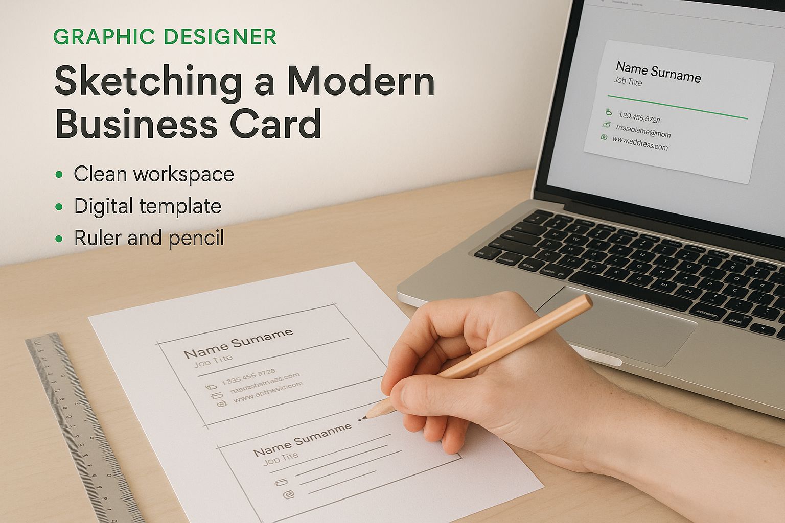
Getting Your Design Files Ready for a Flawless Print Run
Creating a killer business card design is one thing. Making sure it looks just as sharp coming off the press? That’s a whole different ball game. The pre-press stage is where so many avoidable—and costly—mistakes happen. But if you get your files set up correctly from the get-go, you're handing your printer the perfect blueprint for an amazing result.
Think of your design file as the recipe for your business card. If you get a measurement wrong or leave out a key ingredient, the final dish just won't be right. It's the exact same with business card printing; a tiny oversight on your screen can become a glaring problem on the final printed card. A few minutes of prep now can save you a world of time, money, and frustration later.
I know this part can feel a bit technical, but the core ideas are actually quite simple once you understand the why behind them.
Bleed, Trim, and Safe Zones Explained
Ever painted a wall? You probably used masking tape, but you still painted slightly over the tape edge, just in case. That way, when you peel the tape off, you get a perfect, crisp line with no unpainted gaps. That’s pretty much how bleed works in printing.
Here’s a simple breakdown of the three key areas you need to know:
-
Bleed: This is the area of your design that extends past the final cut edge of the card, usually by 3mm on all sides. If you have a background colour or an image that's meant to go right to the edge, it must extend into the bleed area. This gives the printer a small margin of error during trimming, preventing any ugly white slivers from appearing on your finished cards.
-
Trim Line: This is the exact line where the card will be cut to its final size. It’s the finished edge you’ll see and feel.
-
Safe Zone: Think of this as the "no-go" zone for the cutting blade. It’s an inner margin, also typically 3mm from the trim line, where you should keep all your critical information—your logo, name, phone number, and email. Anything outside this zone risks getting chopped off during the final trim.
By getting your bleed and safe zones right, you're basically guaranteeing that the design you fell in love with on screen is the one you'll be handing out. No surprises, no cropped text, just perfect, professional cards.
Speaking the Printer's Language: CMYK vs. RGB
Your computer monitor and a printing press speak two completely different colour languages. Your screen creates colour by mixing light using the RGB (Red, Green, Blue) model. A printing press, on the other hand, creates colour by mixing ink using the CMYK (Cyan, Magenta, Yellow, Black) model.
This isn't just a technical detail; it's absolutely crucial.
If you send an RGB file to a commercial printer, their systems will have to guess how to convert it to CMYK. This often leads to colour shifts—those super-vibrant blues and greens on your screen can end up looking a bit flat or muddy in print. To keep your brand colours consistent and accurate, you must design and save your files in CMYK from the start.
The printing industry here in New Zealand has certainly seen some big changes with the shift to digital. While the number of printing businesses actually declined by an average of 3.4% per year through the late 2010s and early 2020s, the demand for truly high-quality work has only gone up. This makes having professionally prepared files more important than ever. You can read more about the trends shaping New Zealand's printing sector on ibisworld.com.
Your Final File Prep Checklist
Before you hit 'send' on that email to your printer, give your file one last look-over with this checklist. It'll help you catch the most common mistakes that cause delays and reprints.
- Check Image Resolution: Are all your photos and graphics crisp? They need to be at least 300 DPI (dots per inch) at the size they'll be printed. Anything less will look pixelated and unprofessional.
- Outline All Fonts: This is a big one. Convert all your text to "outlines" or "curves." This essentially turns your text into a vector shape, so it doesn't matter if the printer has your specific font installed—it will print perfectly every time.
- Embed Your Images: Make sure any images in your design are embedded directly into the file, not just linked. If they're linked, they can easily go missing when your printer opens the file on their end.
- Save as a Print-Ready PDF: This is the gold standard. A high-quality, print-ready PDF locks in all your formatting, colours, fonts, and images into one reliable package that any professional printer can work with.
Digital vs. Offset: How Your Business Cards Are Actually Made
When it comes to printing your business cards, there are really two main roads you can go down: digital or offset. Getting your head around the difference isn't just for print nerds—it's the key to making sure your cards come out looking exactly how you imagined, without blowing your budget.
Think of it this way. Digital printing is like a super-advanced version of the laser printer in your office. It takes your digital file and prints it straight onto the card stock. It’s quick, direct, and doesn’t need much fuss to get started, which makes it perfect for those smaller, have-to-have-it-now jobs.
Then you have offset printing, the traditional workhorse of the industry. This is a more hands-on process that involves creating custom metal plates of your design. These plates transfer ink to a rubber roller, which then presses the image onto the paper. It's a much bigger setup, but once the press is humming along, it’s an incredibly efficient machine for big print runs.
When to Go Digital
Digital printing is the undisputed king of speed and small batches. If you’re a new business needing just 100 cards for a networking event this Friday, digital is your go-to. It's also fantastic if you want to try out a couple of different designs before committing to a big order. The setup is so minimal that turnaround times are lightning-fast.
The other trick up its sleeve is something called variable data printing. Because the printer creates each card individually, you can easily put a different name, title, or even a unique QR code on every single card. It's a level of customisation that just isn't possible with other methods.
So, what's the catch? While the quality from modern digital presses is fantastic, they sometimes struggle to hit an exact Pantone brand colour with the same pinpoint accuracy as offset. The cost per card is also higher, so it starts to feel a bit pricey once you get into larger quantities.
The Power of Offset
For big jobs where consistency is everything, offset printing is the gold standard. Once you get past the initial cost of making the plates, the price per card drops significantly the more you print. If you're outfitting your entire national sales team with thousands of cards, offset delivers incredible value.
The quality is simply top-notch. Offset printing gives you unmatched colour accuracy and ensures every single card in the run looks identical to the last. It also plays nicely with a wider variety of specialty papers and finishes.
The main drawback is the upfront time and cost. It’s just not built for small runs; the expense of creating those custom plates makes an order of a few hundred cards uneconomical. And forget about variable data—every card printed from a plate is an exact clone.
Choosing between digital and offset isn't about which one is "better." It's about picking the right tool for the job. Your decision should come down to how many cards you need, how fast you need them, and how important perfect colour matching is.
To help you see it all side-by-side, here’s a quick breakdown of how these two methods stack up.
Digital vs Offset Printing At a Glance
This table gives you a direct comparison to help you decide which printing method is the best fit for your business card needs, based on what matters most to you.
| Feature | Digital Printing | Offset Printing |
|---|---|---|
| Best For | Small to medium quantities (under 1000) and urgent jobs. | Large quantities (1000+) where cost-per-card is key. |
| Cost | Lower setup cost, but a higher cost per card. | Higher setup cost, but a much lower cost per card on large runs. |
| Turnaround | Very fast, often available for same-day or next-day service. | Slower due to the plate creation and setup process. |
| Colour Accuracy | Very good, but may have slight variations. Less precise with Pantone colours. | Excellent and consistent. The best option for precise Pantone colour matching. |
| Flexibility | Ideal for variable data printing (e.g., different names on each card). | Not suitable for variable data, as each print is identical. |
Ultimately, knowing the strengths of each method means you can confidently order cards that meet your specific needs for quality, speed, and budget every time.
The Future is Hybrid: Smart Business Cards
Don't let anyone tell you the business card is dead. It’s not dying; it’s getting an upgrade. As our work lives blend more and more with the digital world, that little piece of cardstock is becoming a clever bridge between a handshake and an online connection. For Kiwi businesses, this is a brilliant opportunity to make an impression that’s both tangible and tech-forward.
The most exciting development is the hybrid business card. This isn't about ditching paper for pixels. It’s about embedding smart technology into a beautifully printed card, giving you the classic impact of a physical exchange with the instant convenience of a digital link.
What Makes a Card "Smart"?
Think of a smart business card as a traditional card with a digital superpower tucked inside. Two main technologies are driving this change, and they’re both surprisingly simple to use.
-
QR Codes: Once a bit of a gimmick, QR codes are now everywhere. Printing a unique QR code on your card creates a direct portal to your website, LinkedIn profile, online portfolio, or even a digital contact file (.vcf). One quick scan, and you’re in their phone’s address book. Simple as that.
-
NFC Chips: Near Field Communication (NFC) takes things a step further. A tiny, paper-thin NFC chip is embedded inside the card. When a recipient taps the card on their smartphone, it can instantly open a webpage or prompt them to save your details. No apps, no scanning—just a tap. It’s a bit like a digital handshake.
These little bits of tech turn a static piece of information into an interactive tool, making it far more likely your details will actually get saved and not just lost in a wallet.
Getting the Best of Both Worlds
The real magic of a hybrid card is that it combines the old with the new. You still have that personal moment of handing something tangible to a new contact—an experience a purely digital solution just can't match. At the same time, you save them the hassle of typing in your name and number later on.
A hybrid business card honours the tradition of a personal connection while embracing the smart efficiency of today’s technology. It signals that your brand is both established and innovative.
This evolution is especially relevant here in New Zealand, where we’re all so connected. While specific local data is hard to come by, we know that every 2,000 cards handed out can still generate a 2.5% increase in sales, proving their staying power. And with our digital economy booming, as highlighted by Stats NZ's data on electronic transactions, it makes perfect sense to integrate our physical marketing tools with our digital presence.
So, Why Not Go Fully Digital?
You’ve probably seen the apps that let you share a QR code from your phone screen. They’re convenient, sure, and good for the planet. But they’re missing something important: the tangible impact.
Handing someone a thoughtfully designed, well-crafted object feels more significant and professional than asking them to scan your phone. For New Zealand businesses trying to stand out, the hybrid model offers the perfect middle ground—it keeps the classic value of a physical card while giving a confident nod to the future.
Got Questions About Business Card Printing? We've Got Answers.
Stepping into the world of professional printing can feel a bit overwhelming. There are so many options, and it’s natural to have questions about everything from timing to cost. Let's clear up some of the most common queries so you can order your next batch of business cards with total confidence.
The first thing on everyone's mind is usually the price. How much will this actually cost? The truth is, it varies hugely. A basic run of 250 cards on standard matte paper will be very budget-friendly. On the other hand, if you’re after something special—say, a small batch with gold foil and debossing on a heavy 450 GSM stock—you're making a bigger investment in that all-important first impression.
What's the Standard Business Card Size in NZ?
Here in New Zealand, the go-to size for a business card is 90mm x 55mm. It's the classic for a reason: it slips perfectly into any wallet or cardholder, making it practical and instantly recognisable.
But don't feel boxed in by the standard. If you want to make a statement, a custom size or shape can be a fantastic way to stand out. Think about square cards (maybe 55mm x 55mm) or adding rounded corners for a softer, more modern feel. Just keep in mind that unique shapes might not fit as neatly into someone's wallet.
Another big question is always about timing. How long will it take to get my cards? This really comes down to the complexity of your design and the printing method we use.
A simple, digitally printed job can be turned around in just a few business days. But if you’ve chosen offset printing with special finishes like embossing or a custom die-cut shape, it's a more hands-on process. These jobs take longer, so it's always a good idea to plan ahead.
How Many Cards Should I Actually Order?
This is the classic dilemma, especially if you're just starting out. It can be tempting to order a small test run, but printing is a volume game—the cost per card drops dramatically as the quantity goes up. Most printers will have a minimum order, usually around 100 or 250 cards.
To figure out the right number for you, think about:
- Your networking plans: How many conferences, client meetings, or networking events are on your calendar for the next six months?
- Your team: Are you ordering for just yourself, or for the whole crew?
- Value for money: If your contact details are stable, ordering 500 or 1000 cards via offset printing is often the most cost-effective choice in the long run.
Finally, choosing the right printer is just as crucial as the design itself. I always recommend finding a local New Zealand printer who’s happy to send you paper samples. There’s no substitute for actually feeling the different weights and textures in your hands. It’s the only way to be sure the final product will look and feel exactly how you imagined.
Ready to create a business card that truly represents your brand's quality and vision? The team at SONI DESIGN is here to bring your ideas to life with expert printing and a passion for craftsmanship. https://www.sonidesign.co.nz
Leave a Comment
Stay home & get your daily
needs from our shop
Start You'r Daily Shopping with Nest Mart