
Your cart is currently empty.

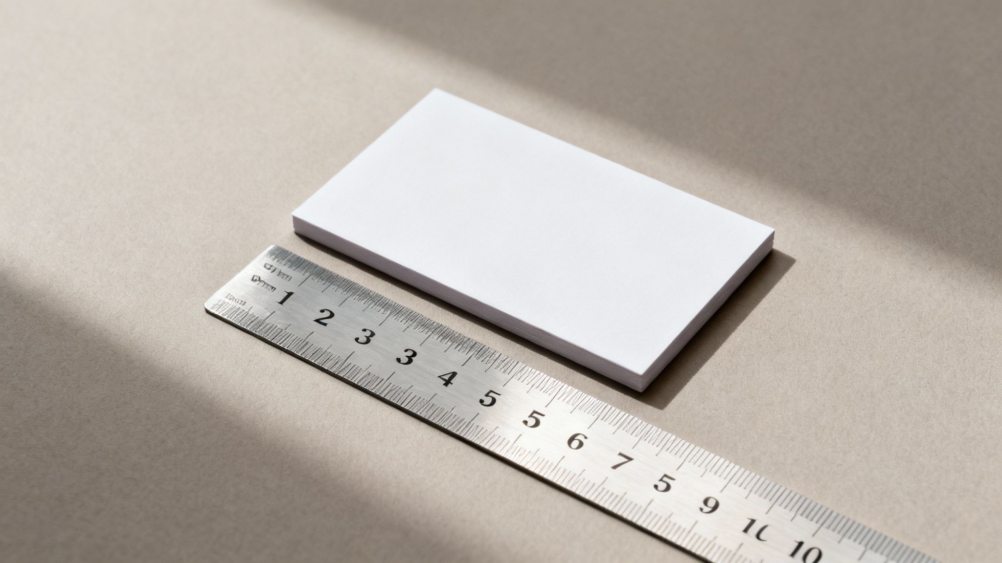
If you’re getting business cards made in New Zealand, the one number you absolutely need to know is 91mm x 55mm. This isn’t just a random measurement; it's the established standard across the country for a very practical reason.
The Standard Business Card Size in New Zealand
Getting the size right is the first, and arguably most important, step in creating a business card that works. It’s the canvas for your design, and in New Zealand, there's a clear expectation for what that canvas should be.
The 91mm by 55mm standard is a deliberate choice. It's the sweet spot between having enough room to clearly present your contact details and logo, while still being compact enough to slip into a wallet or cardholder without a fuss. It’s the universal language of networking here in NZ—everyone expects it, and every wallet is ready for it.
Why This Size Works
This particular size became the gold standard in Aotearoa because it just makes sense. It offers a perfect little billboard for your brand's story without being bulky or awkward. Plus, it plays nicely with the standards used by our closest international partners, especially Australia.
This size mirrors many international norms, which is a nod to our business culture of integrating with nearby economies. You can get a feel for how our size compares to others globally by checking out this guide to international business card standards.
Adhering to the standard 91mm x 55mm size ensures your card is instantly recognisable and easy for contacts to store, making a subtle yet powerful statement about your professionalism and attention to detail.
Sticking to this universal size means your card feels right at home, whether you're at a local networking event in Auckland or a trade show in Sydney. It’s a small detail, but it contributes to a smooth, professional first impression and sets the stage for a great business conversation.
So, Why This Particular Size for New Zealand?
Ever wondered how 91mm x 55mm became the go-to size for business cards all across Aotearoa? It wasn't just a number plucked out of thin air. It's actually a story of practicality and New Zealand's growing presence on the world stage.
For a long time, our business practices—and card sizes—were a bit of a mixed bag, often taking cues from various international standards. As global trade really took off, however, a more unified approach was needed. You might find older Kiwi cards that leaned towards slightly smaller British dimensions, a nod to our historical ties. This evolution towards a single standard is covered well in this broader guide to business card standards.
A Smart Move for Regional Business
The shift to 91mm x 55mm was, at its heart, a really practical decision. This size is the accepted standard right across the Asia-Pacific region, including in Australia—one of our biggest trading partners. Having that consistency just makes business sense.
Think about it: when a Kiwi businessperson hands over a card in Sydney or Singapore, it fits perfectly into the recipient's wallet or cardholder. It’s a small detail, but it speaks volumes about professionalism and a global mindset.
This wasn't just about making things physically fit; it was about slotting into a larger business ecosystem. Adopting this standard was a clear signal of our commitment to seamless international collaboration, making cross-border networking feel natural and effortless.
In the end, this standard dimension is more than just a measurement. It’s a quiet symbol of New Zealand's modern identity: connected, professional, and ready to do business anywhere. Sticking with it is a simple way to show you mean business.
Getting Your File Ready: Bleed and Safe Margins
Right, so you know the final size of a New Zealand business card is 91mm x 55mm. Now it's time to get your design file set up properly. Before you even think about dropping in your logo or contact details, we need to talk about two absolutely critical concepts that every professional printer lives by: bleed and the safe area.
Honestly, getting these right is the secret to avoiding those frustrating printing mishaps. Think of it like this: your finished business card is a photo you want to fit perfectly in a picture frame. The design file you create needs to be a little bit bigger than the frame to make sure everything lines up flawlessly.
Understanding Bleed: Your Printing Safety Net
Bleed is simply the part of your design—usually a background colour or image—that extends past the final trim edge of the card.
Picture a massive guillotine at the print shop, slicing through a huge stack of cards all at once. Even with the best machinery, there can be tiny, microscopic shifts during the cut. If your background stopped precisely at that 91mm x 55mm edge, any slight movement could leave a horrible little white sliver along one side. It just looks unprofessional.
To get around this, printers in New Zealand ask for a 3mm bleed on all four sides. This means the actual document you design needs to be bigger than the card you'll hold in your hand.
Here's how the maths breaks down:
- Document Width: 91mm + 3mm (left bleed) + 3mm (right bleed) = 97mm
- Document Height: 55mm + 3mm (top bleed) + 3mm (bottom bleed) = 61mm
So, when you open up your design software, like Adobe Illustrator or Canva, you need to set your canvas size to 97mm x 61mm. This extra 3mm border is your safety net, guaranteeing your background goes right to the very edge after the trim.
The Safe Area: Keeping Your Details from Getting Chopped
While bleed pushes your background outwards, the safe area (sometimes called a safe margin) is an invisible boundary on the inside. This is the zone where all your vital information—your name, logo, phone number, and email—has to live.
Just as that big cutting blade can shift slightly outwards, it can also shift a tiny bit inwards. By keeping all your crucial content away from that trim line, you ensure nothing important gets accidentally sliced off.
A good rule of thumb is to keep all text and logos at least 3mm to 5mm inside the final 91mm x 55mm trim line. This not only protects your details but also gives the card a much cleaner, more professional, and balanced feel.
Choosing Your Orientation: Landscape or Portrait
Once you've settled on the standard 91mm x 55mm size, your next decision is about orientation. Should you stick with the classic landscape layout, or flip it on its side for a more modern portrait feel? It might seem like a small detail, but it’s one of the first things people notice, and it says a lot about your brand.
The Classic Choice: Landscape
The horizontal, or landscape, layout is the tried-and-true standard for a reason. It’s what most people expect a business card to look like, which immediately gives it a feeling of stability and professionalism.
This format is a great fit for brands that want to project trustworthiness and dependability. Think lawyers, accountants, or established consulting firms. The wider canvas works beautifully for a classic layout—logo on the left, contact details neatly arranged on the right. It’s familiar, easy to read, and gets straight to the point.
The Modern Challenger: Portrait
Flipping your card to a vertical, or portrait, orientation is a simple way to make a bold statement. It instantly sets your card apart from the rest of the stack, signalling that your brand is creative, a bit different, and forward-thinking.
This style is a favourite among designers, photographers, tech startups, and anyone in a creative industry. It’s a fantastic canvas for designs that feature a strong, centred logo or a striking vertical image. If you want your card to be a conversation starter, portrait is the way to go.
Before we weigh the pros and cons, it's crucial to understand how the core printing specs—bleed, trim, and safe area—apply to either choice. This diagram breaks it down perfectly.
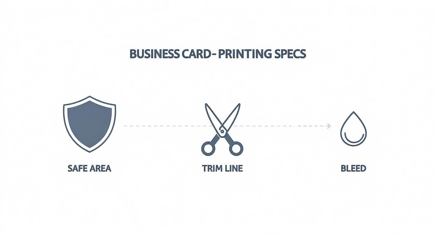
As you can see, the principles are exactly the same whether your design is horizontal or vertical. You still need to account for these zones to get a sharp, professional-looking final product.
Landscape vs Portrait: Which Orientation Is Right for You?
So, how do you choose? There's no right or wrong answer—it all comes down to your brand's personality and the information you need to present. This table breaks down the key differences to help you decide.
| Feature | Landscape (Horizontal) | Portrait (Vertical) |
|---|---|---|
| First Impression | Traditional, stable, professional, and trustworthy. | Modern, creative, unique, and bold. |
| Best For Brands | Corporate, finance, legal, consulting—any industry where tradition and reliability are key. | Creative industries, tech startups, artists, photographers—anyone wanting to stand out from the crowd. |
| Layout Strengths | Works well for longer company names, taglines, and separating a logo from contact information. | Ideal for centred logos, vertical graphics, or designs that guide the eye downwards. |
| Readability | The familiar flow makes it easy for the eye to scan from left to right. | Can feel more like scrolling on a smartphone, which can be intuitive for certain audiences. |
| Wallet Fit | Fits perfectly in standard business card slots in wallets and holders. | Fits just as well, but might be stored on its side depending on the holder's design. |
Ultimately, the best orientation is the one that tells your story at a glance. Think about what you want your card to say about you before a single word is even read. Landscape feels dependable, while portrait feels innovative. Both use the same 91mm x 55mm final dimensions, so the choice is purely a creative one.
Getting Your File Ready for a Flawless Print
Getting that design from your screen to a perfectly printed card is where the real magic happens. A stunning on-screen design is a fantastic start, but to make sure it looks just as good on paper, you need to create a "print-ready" file. It’s a crucial step that helps avoid some common—and costly—printing mistakes.
Think of it like this: your screen uses light to create colours (RGB: Red, Green, Blue), but a commercial printer uses ink (CMYK: Cyan, Magenta, Yellow, Black). If you design in RGB and send that to a printer, the colours will look off, often a bit flat and disappointing. The trick is to start your design in CMYK colour mode right from the get-go.
This little bit of technical know-how is what separates a professional-looking card from an average one, and people absolutely notice the difference. There's a reason over 100 million business cards are printed in New Zealand every year—they work. In fact, 82% of people say they're more likely to do business with someone who gives them a quality card. You can dive deeper into the stats in this print industry report.
Image Quality and File Formats
Next up is resolution. For your logo, photos, or any other graphics to look sharp and clear, they need to have a resolution of at least 300 DPI (dots per inch). Anything lower than that, and you risk your design looking blurry or pixelated, which can instantly make your brand feel less professional.
When it's time to save your masterpiece, the file format you choose really matters. While you might be used to JPGs or PNGs for online stuff, they aren't the best for high-quality printing.
The gold standard for print files is a high-quality PDF (Portable Document Format). A PDF bundles everything—your fonts, images, and layout—into a single, reliable file. It’s the best way to ensure what you see on your screen is exactly what comes off the press.
By taking these few steps—setting CMYK colour, checking for 300 DPI resolution, and exporting as a PDF—you’re giving the printer a perfect blueprint. It's your guarantee for a crisp, vibrant, and professional business card every single time.
Common Design Mistakes (And How to Avoid Them)
Even if you get the dimensions spot on, a few common design slip-ups can easily trip you up and undermine the professional look you’re going for. The good news? They’re simple to sidestep once you know what to look out for.
One of the biggest culprits I see is using tiny, unreadable fonts. It's tempting to shrink the text to fit more information, but anything smaller than an 8pt font becomes a real struggle for most people to read. The goal is clarity, not clutter. This leads directly to the next issue: trying to cram way too much onto the card.
Keep It Clean and Correct
Overloading your card with endless text or too many graphics creates a visual mess that most people will just tune out. A great design needs a bit of breathing room to be effective. Stick to the absolute essentials—your name, title, and key contact details—and let your branding do the talking.
Think of your business card as a signpost, not a brochure. Its job is to point people in the right direction with key details and leave a professional impression, making them want to find out more.
Finally, the most avoidable (and embarrassing) mistake is the humble typo. Always, always proofread your design multiple times before you send it to the printer. Better yet, get a colleague to cast a fresh pair of eyes over it. It’s amazing what you can miss when you’ve been staring at the same design for hours.
Got More Questions? We've Got Answers
Let's dive into a few of the nitty-gritty questions we often get asked about business card design here in New Zealand.
What About Folded Cards or Custom Shapes?
Thinking of breaking out of the standard rectangular box? You've got options.
Folded business cards are a fantastic way to double your real estate. They usually start life as a 182mm x 55mm sheet, which is then creased and folded right down the middle. This gives you four distinct panels to play with – perfect for adding a price list, a mini-portfolio, or just more of your brand's story without making things feel cramped.
Custom shapes are another way to stand out. A unique die-cut card that reflects your logo or industry can be incredibly memorable. Just be mindful of the practicalities. An oddly shaped card might look great, but if it doesn't slide easily into a standard wallet, it might get left behind. These custom jobs also tend to cost a bit more to produce.
How Important is Paper Thickness?
The feel of a business card is just as important as the look. This is where paper thickness, or 'weight', comes in. It's measured in grams per square metre (gsm), and it makes a world of difference to the first impression you make.
For a professional, high-quality feel, we always recommend a paper weight between 350gsm and 400gsm. This range feels substantial in the hand and signals quality and durability.
There’s nothing worse than a flimsy card that bends or creases the moment you hand it over. A sturdier card stock not only feels more premium but also holds up better to being tucked into wallets and passed around, ensuring your first impression is a lasting one.
Ready to create a business card that truly represents your brand? At SONI DESIGN, we specialise in bringing your vision to life with high-quality printing and expert design advice. Let's craft something extraordinary together at https://www.sonidesign.co.nz.
Leave a Comment
Stay home & get your daily
needs from our shop
Start You'r Daily Shopping with Nest Mart