
Your cart is currently empty.

An A-frame sign, often called a sandwich board, is a simple, freestanding sign with two sides that hinge together at the top, creating that classic "A" shape. It’s easily one of the most effective and affordable ways for a business to grab the attention of people walking by on the footpath.
Think of it as your friendly, silent salesperson standing guard right outside your door.
Your Handshake on the Footpath
Picture your business at a crowded market. You could just sit back and hope people find you, or you could step out and offer a firm, friendly handshake. That's exactly what an A-frame sign does—it’s the first "hello" to a potential customer, well before they even reach your front door. It’s a classic, no-nonsense communication tool with one clear mission.
Its main job is to cut through the noise and interrupt the daily routine of people walking past. It snags their attention, pulls them in off the street, and immediately tells them what you’re all about. For a busy Auckland café, that message might be a tempting “Fresh Sourdough & Hot Coffee!” For a boutique in Queenstown, it could be a hard-to-resist “Mid-Season Sale - 50% Off!” This incredible versatility makes it a must-have for almost any Kiwi business.
Turning Passersby into Customers
The real magic of an A-frame sign is its knack for turning casual foot traffic into actual paying customers. It works by creating an immediate point of interest right in your audience's line of sight. Instead of being just another storefront on a long street, you become an active part of the pavement, engaging directly with the community.
This is especially true for businesses in hospitality. A well-placed A-frame is a proven way to increase your restaurant's visibility by advertising daily specials or a tempting happy hour deal.
A great sign doesn't just display information; it starts a conversation. It asks a question—"Hungry?" "Looking for a deal?"—and invites people inside to find the answer.
At the end of the day, this simple piece of kit is so much more than a board with words. It's a storyteller, a promoter, and a directional guide all rolled into one, setting the stage for the fantastic customer experience waiting inside.
Choosing the Right Type and Material for Your Sign
Picking the right A-frame sign is a bit like choosing the right tool for a job. You wouldn't use a sledgehammer for a finishing nail, right? In the same way, your sign needs to be a perfect fit for your business, its location, and the kind of message you want to send. The options might feel overwhelming at first, but they really boil down to a few key choices.
The sign you end up with will directly shape how you connect with people walking by. A busy café with specials that change every day needs something that’s quick and easy to update. On the other hand, a real estate agent needs a sign that looks professional and is tough enough to be moved from one property to the next without showing wear and tear.
Common A-Frame Sign Types
The first big decision is the sign face itself. This is all about how you’ll display your message and, crucially, how often you can change it up.
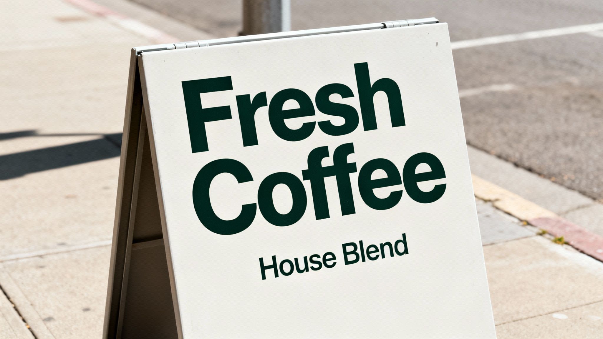
- Chalkboard Signs: These are brilliant for a rustic, personal touch. Think cafés, bakeries, and bars. They're perfect for messages that change daily, like a "Soup of the Day" or a happy hour special.
- Interchangeable Panel Signs: These are the chameleons of the sign world, often using corflute inserts. You can get multiple panels printed for different promotions—a "Summer Sale" this week, "New Arrivals" the next. This makes them a really smart, cost-effective choice for the long run.
Here's a simple way to think about it: a chalkboard sign is like a daily conversation with your customers, while a sign with interchangeable panels is like having a library of pre-written announcements, ready to go whenever you need them.
Local figures from New Zealand’s retail scene really drive this point home. Businesses using well-designed sandwich boards saw a 25-40% jump in walk-ins, particularly in high-foot-traffic areas like you'd find in Auckland and Wellington. You can read more about how A-frame signs boost foot traffic to see what a difference they can make.
This simple flowchart can help you figure out if an A-frame is the right move for you.
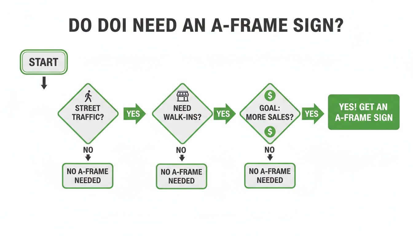
As you can see, if you've got street traffic and you’re looking to turn those passers-by into paying customers, an A-frame sign is a pretty logical next step.
Selecting the Best Material
Once you've settled on a sign type, the next piece of the puzzle is the frame material. This decision is a balancing act between durability, how easy it is to move, and the overall look you're going for.
- Powder-Coated Steel: This is the heavy-duty champion. If your business is in a notoriously windy spot—Wellington, we're looking at you—the weight of a steel frame gives it fantastic stability. Your sign will stay put.
- Aluminium: Lightweight and rust-proof, aluminium frames are a breeze to transport. This makes them a great pick for market stalls, trade shows, or any business that brings its sign inside every night.
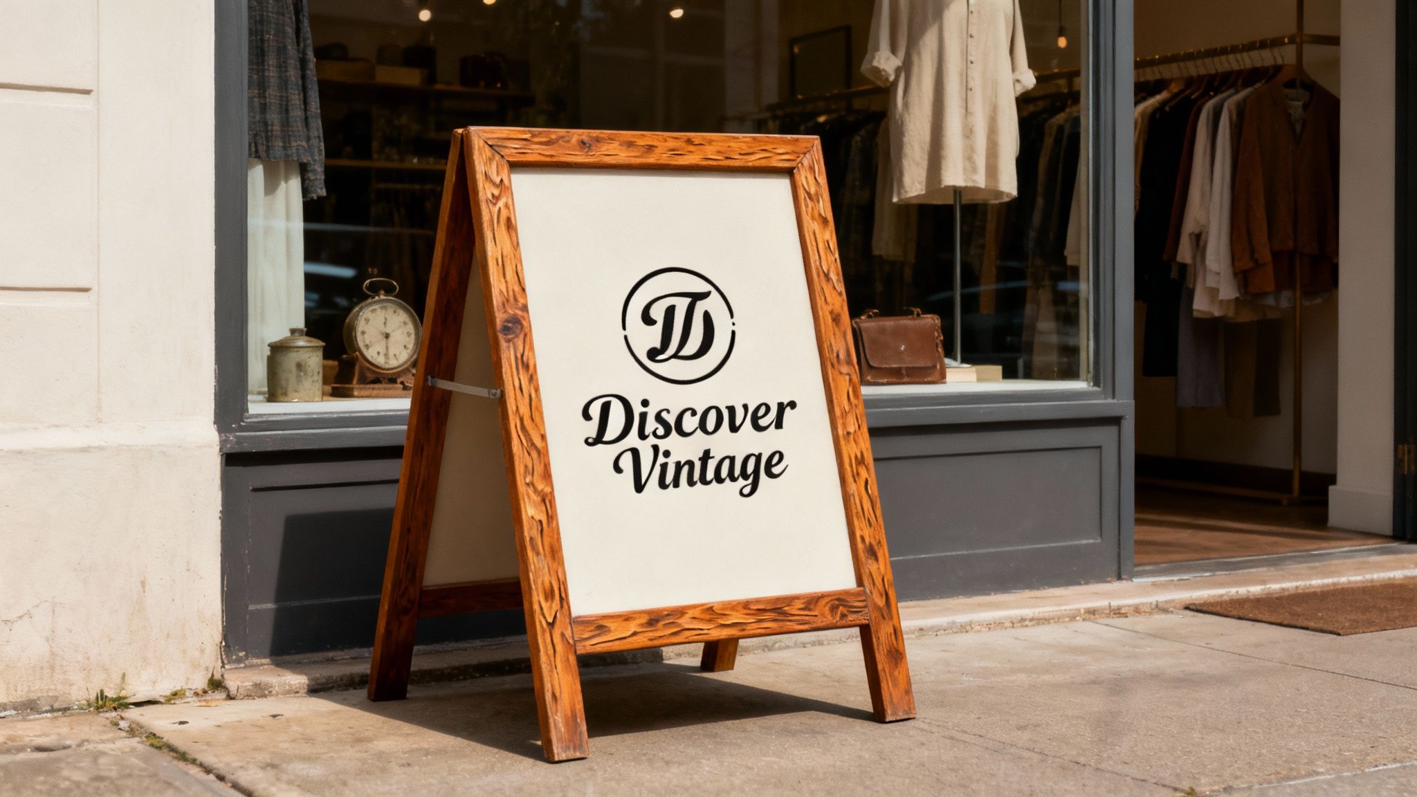
- Wood: There's a reason wooden A-frame signs are a classic. They have a warm, inviting, and timeless feel that’s hard to beat. It's a go-to choice for artisanal shops, boutique retailers, and anyone wanting to project a traditional or eco-conscious brand image.
Designing a Sign That Stops People in Their Tracks
A great A-frame sign is much more than just a bit of plastic or wood sitting on the pavement; it’s a customer magnet. But its real power comes from thoughtful design. A cluttered, confusing sign is just footpath noise, easily ignored. A sharp, well-designed one, on the other hand, can stop a potential customer mid-stride and pull them right through your door.
The secret is to get inside the head of a busy passerby. They aren't stopping to read an essay. They’re glancing for a split second while walking, talking, or scrolling on their phone. This gives your sign a tiny window of opportunity to make an impression.
That’s where the “3-second rule” comes in, and it's a game-changer. If someone can't grasp your main message in three seconds flat, you’ve probably lost them for good. Your design has to be clean, punchy, and instantly understood.
Mastering Visual Hierarchy and Readability
Think of visual hierarchy as directing traffic for the human eye. It’s the art of arranging text and images to guide the viewer, showing them what’s most important first. For an A-frame sign, this means your most compelling offer needs to be the biggest and boldest thing they see.
It's just like a newspaper headline. The top story gets the largest font. Your sign should follow that exact same logic.
- Headline: This is your big hook (e.g., "50% Off Today"). Make it the largest text on the board.
- Supporting Details: Add the essential context (e.g., "All Winter Coats"). Keep it smaller but still perfectly legible.
- Call to Action: Tell them what to do next (e.g., "Come Inside!"). Be clear, direct, and inviting.
Readability from a distance is another non-negotiable. A beautiful, ornate font is completely useless if no one can read it from the other side of the street. Your best bet is to stick with simple, bold, and clean fonts. Classic sans-serif choices like Helvetica or Arial are popular for a reason—they just work.
Using Colour and Space to Your Advantage
Colour isn't just for decoration; it triggers emotions and, most importantly, grabs attention. High-contrast colour combinations are your best friend. We're talking dark text on a light background or the other way around.
Black on yellow is one of the most visible colour combinations known, which is exactly why it’s used for so many traffic and warning signs. It’s a powerful duo that screams urgency and importance—perfect for a limited-time offer.
Just as crucial is what you don't put on the sign. Negative space, the empty area around your text and graphics, is essential. It’s tempting to cram every last centimetre with information, but that's a classic mistake. A cluttered sign is overwhelming and hard to read. Giving your message some breathing room makes the whole design feel more professional and organised.
Common A Frame Sign Sizes And Their Best Use Cases
In New Zealand, the most common sign sizes are built for this kind of high-impact, uncluttered messaging. To help you choose, here's a quick guide to some standard sizes and where they shine.
| Size (mm) | Typical Use Case | Best For | Considerations |
|---|---|---|---|
| 450x600 | Narrow footpaths, indoor displays, market stalls | Cafés with limited space, small retail boutiques, event directional signs | Best for close-range viewing; may get lost on a very wide or busy street. |
| 600x900 | Standard high street, retail storefronts, real estate | The all-rounder. Great for most retail, hospitality, and service businesses. | The most popular size for a reason—balances visibility and footprint perfectly. |
| 900x1200 | Main roads, carparks, large-scale events | Businesses with significant street frontage or needing to attract attention from a distance. | Requires more space and may be subject to stricter council regulations. |
Choosing the right size is a key first step. After all, the footprint of A-frame signs in NZ's promotional landscape is compact yet powerful, with standard sizes making up 90% of sales. Data reveals that 600x900mm models account for 45% of all orders, a size perfectly suited for the footpaths on 75% of Kiwi high streets. You can explore popular A frame sign sizes in NZ to get a feel for what works for local businesses.
At SONI DESIGN, we specialise in helping you nail this balance. We understand that a brilliant A-frame sign isn't just about what you say, but how you say it—ensuring your message gets seen, understood, and gets results.
Telling Your Brand Story Through Custom Signage
An A-frame sign can do so much more than just list your hours or announce a sale. Think of it as a canvas for your brand’s personality—it's often the very first thing a potential customer learns about you. When you move past the basics of size and material, this is where the real magic happens: infusing your unique character into the design.
It’s about turning a standard bit of marketing gear into a true brand ambassador. Your sign should feel like a natural extension of the experience people can expect inside. By using your specific colour palette, unique fonts, and a distinct tone of voice, you start building an emotional connection before they even walk through the door.
Bringing Your Brand to Life
First, think about the story you want to tell. Are you a sleek, modern professional service, or a quirky, creative shop? Your sign needs to reflect that identity from a single glance.
- A Modern Tech Repair Shop: This business would benefit from a clean, minimalist design on a sleek metal frame. Using a precise, sans-serif font and a simple colour scheme (like black, white, and one pop of colour) instantly communicates expertise, efficiency, and trust.
- A Vintage Clothing Store: On the other hand, this sign can be far more artistic. A classic wooden A-frame sign with hand-lettered or script-style fonts can evoke a sense of nostalgia and hint at the unique treasures waiting inside.
Your A-frame sign isn't just an advertisement; it's a preview. It sets the tone and expectation for the entire customer journey, making your brand’s story tangible and inviting right from the footpath.
Aligning Voice and Visuals
Consistency is absolutely key to building a memorable brand. The language you use on your sign should be the same voice you use everywhere else—from your website to how you chat with customers in-store. A playful café might use witty puns or casual slang, while a financial advisor would naturally opt for a more formal and reassuring tone.
This alignment between what people see and what they read makes your message feel authentic and powerful. When someone glances at your sign, they should get an immediate sense of who you are and what you're all about.
At SONI DESIGN, we specialise in helping you tell that story. We work closely with you to understand your brand's identity and translate it into a custom A-frame sign that not only looks fantastic but also works hard to connect with your ideal customers. We're here to turn your vision into a compelling invitation.
Navigating Council Rules and Footpath Placement
Popping an A-frame sign on the footpath is a brilliant way to catch the eye of passers-by, but it's not quite a free-for-all. You've got to play by the local rules. Think of the footpath as a shared space—your sign is a guest, and it needs to be a well-behaved one.
The whole point of council regulations is to keep things safe and accessible for everyone. That means your sign can't become a trip hazard or block the way for pedestrians, people using wheelchairs, or parents with prams. It's important to remember that every local council in New Zealand has its own set of bylaws, so what's perfectly acceptable in Christchurch might not fly in downtown Auckland.
Key Rules to Keep in Mind
While the nitty-gritty can change from one town to the next, most councils follow a few common-sense principles. Getting these wrong can earn you a warning or even a fine, so it's best to get it right from day one.
- Leave Room to Move: Most councils insist on a minimum clear path for people to walk, usually somewhere between 1.5 to 1.8 metres. This ensures there's plenty of space for everyone to get by easily.
- Steer Clear of Hazard Zones: You'll generally be banned from placing signs near pedestrian crossings, bus stops, busy intersections, or right in front of fire hydrants.
- Make Sure It's Stable: Your A-frame needs to be solid enough that a gust of wind won't send it tumbling into someone's path.
Getting your head around the rules for outdoor displays is just part of the game. For instance, the process of getting permits for outdoor event structures has a similar logic—it all comes down to public safety and using shared spaces responsibly.
The smartest move? Be proactive. Before you even think about putting your sign out, jump onto your local council's website and search for "footpath signs" or "sandwich board bylaws". This will give you the exact rulebook for your area.
Taking a few minutes to do this ensures your A-frame can work its magic without causing any headaches. It’s a simple step that shows you're a considerate part of the community and lets your sign focus on its real job: bringing customers through your door.
Got Questions About A-Frame Signs? We've Got Answers
Even after walking through all the options, you probably still have a few questions buzzing around. That’s perfectly normal. We’ve put together some of the most common queries we hear from Kiwi business owners to help you get those final details sorted.
Let’s dive into the practical stuff.
How Do I Stop My A-Frame Sign from Blowing Over?
Ah, the classic Kiwi weather problem! A gusty day can turn your sign into a footpath hazard if you're not prepared. The secret is all in the stability.
Your best bet is to go for a sign made from a heavier material, like powder-coated steel, which has some real heft to it. Another great option is a model with a base you can fill with water or sand, giving it a solid anchor right where you need it.
Look for designs with a low centre of gravity and sturdy hinges, as these will stand up much better to the wind. If you're in a particularly exposed spot, some top-tier signs even come with a wind rating for total peace of mind.
What's Better: A Printed Sign or a Chalkboard?
This really boils down to what you need the sign to do and how often you plan on changing your message.
- A professionally printed sign is your go-to for a crisp, permanent brand message. It looks sharp, holds up against the rain, and is perfect for displaying your logo or a promotion that's running for a while.
- A chalkboard sign is all about flexibility. It’s ideal for things that change daily, like a café’s soup of the day or a pub’s happy hour special. It adds a bit of handcrafted charm.
While chalkboards have a great, personal feel, they do need a bit of daily love and aren't much fun in a downpour. Often, the winning formula is a mix of both: a printed sign for your core branding and a smaller chalkboard to shout about the daily specials.
Think of it like this: your printed sign is the permanent business card on the footpath, while the chalkboard is your daily conversation starter.
How Much Should I Expect to Pay for a Good Sign?
The price tag on an A-frame sign can swing quite a bit depending on its size, the materials used, and how much custom work is involved.
You could pick up a basic, lightweight sign with simple corflute inserts for around $100. But if you’re looking for something more robust—say, a heavy-duty steel frame with high-quality, double-sided printing—you’ll likely be investing somewhere between $250 and $400, or even more.
It feels like an upfront cost, but it's much better to think of it as an investment in your street-front visibility. A well-placed, eye-catching A-frame can pay for itself many times over by consistently pulling new customers through your door.
Ready to create an A-frame sign that tells your unique brand story and gets more people walking in? The team at SONI DESIGN is here to help bring your vision to life. Explore our custom signage solutions today
Leave a Comment
Stay home & get your daily
needs from our shop
Start You'r Daily Shopping with Nest Mart