
Your cart is currently empty.
When you're talking about posters, A1 is often the go-to size, and for good reason. It measures 594 x 841 mm (or 23.4 x 33.1 inches), hitting that perfect balance between being large enough to grab attention and small enough to fit in most spaces. Think of it as the ideal choice when a small flyer won't cut it, but a massive billboard is overkill.
Getting a Feel for A1 Poster Dimensions
The easiest way to picture an A1 poster is to imagine eight standard A4 sheets of paper laid out together—two across and four down. This gives you a generous amount of space to work with, allowing for striking visuals and text that people can actually read from a distance.
This size is part of the ISO 216 paper standard, which is used pretty much everywhere, including here in New Zealand. It's a clever system that ensures an A1 sheet printed in Auckland will be the exact same size as one printed in London. You can find a deeper dive into the history of A series sizes on majisign.co.uk.
This infographic neatly sums up everything you need to know about the A1 format.
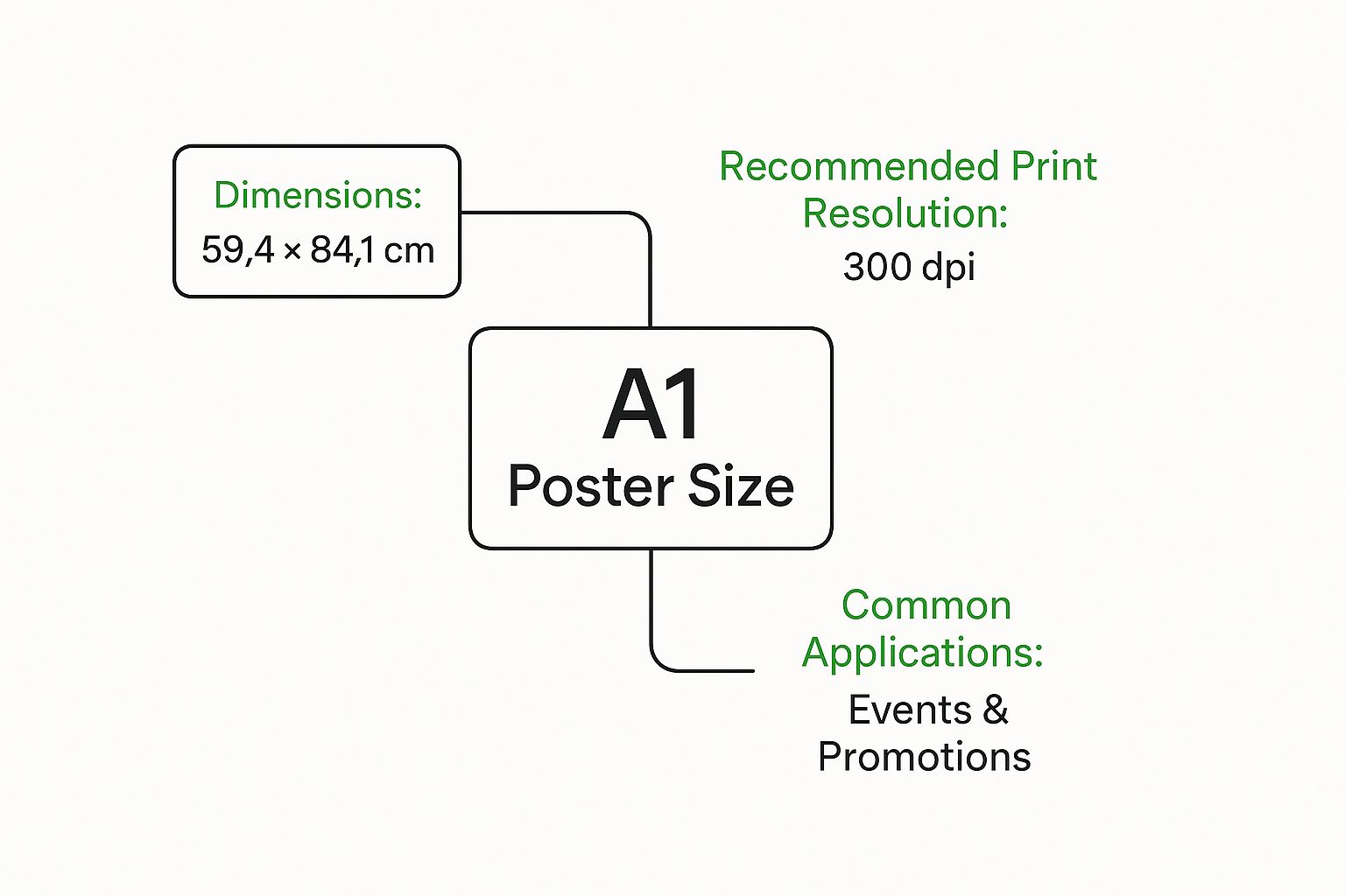
As you can see, the size, resolution, and common uses are all connected. A larger canvas like A1 naturally needs a higher resolution to look sharp and professional, which is essential for the promotional work it's typically used for.
The real genius of the A-series paper system is its simplicity. Each size is precisely half the area of the one before it. So, an A1 is half of an A0, an A2 is half of an A1, and so on, with every size keeping the exact same aspect ratio.
How A1 Became New Zealand's Go-To Poster Size
The A1 poster didn't just appear out of nowhere and become a Kiwi favourite. Its story is really about moving from a messy, complicated system to one that’s beautifully simple, giving designers, printers, and businesses a common language to work with.
Believe it or not, before these international standards took hold, New Zealand's print world was a bit of a muddle. We were stuck using old British Imperial measurements, which lacked the logical flow we're used to now. This often made designing and printing a lot more frustrating and inefficient than it needed to be.
The real change started to gather pace in the second half of the 20th century. As New Zealand's trade relationships grew stronger internationally, it became obvious that we needed a universal standard. The ISO 216 system, with its clever, mathematically-sound A-series of paper sizes, was the perfect answer.
The Shift to a Universal Standard
The big push towards standardisation really kicked off in the 1980s and 1990s. As Kiwi industries started adopting global best practices, the A1 poster naturally stood out as a reliable, predictable option. This move got rid of all the guesswork that came with the old measurements. If you're keen to dive deeper, there's a great rundown on the history of poster sizes on PaperSizesWiki.com.
Adopting this standard brought a few game-changing benefits that sealed A1's popularity:
- Predictable Results: Suddenly, a designer in Christchurch knew their A1 file would print at the exact same size as one in Wellington. No more surprises.
- Cost-Efficiency: Printers could now stock standard paper sizes, which cut down on waste. Those savings were often passed on to the customer, making printing more affordable.
- Simplified Workflows: The reliable consistency of the A1 poster size made it much easier to create design templates and bridge the gap between digital concepts and physical prints.
By adopting the ISO 216 standard, New Zealand's creative and commercial industries created a seamless bridge between a designer's screen and the final printed product. This fundamental shift paved the way for the efficient, high-quality printing we rely on today.
Putting A1 Posters to Work in NZ
The real magic of the A1 poster size happens when you see it out in the wild here in New Zealand. It’s got this Goldilocks quality—big enough to grab your eye in a busy space, but not so huge that it takes over the whole wall.
That’s why it’s become the go-to for so many different uses. Whether it’s a bustling café in Wellington or a quiet university hallway in Dunedin, the A1 poster just works. It gives you plenty of room for striking graphics and text that people can actually read from a distance.
Event Promotion and Local Gigs
Take a walk down any main street in Aotearoa, and you’ll see them. A1 posters are the lifeblood of grassroots promotion, advertising everything from a local band’s next gig to the weekend farmers’ market. They're big enough for a killer design and all the crucial details, something a small flyer just can’t manage.
Picture a local theatre production trying to sell tickets. A well-designed A1 poster can splash dramatic photos of the cast across the top, with showtimes and booking info clearly visible below. It’s a simple, effective way to get bums on seats and create a bit of buzz.
Retail and In-Store Marketing
In the cut-throat world of retail, an A1 poster acts as your silent salesperson. Shops along Lambton Quay or Queen Street use them to shout about sales, launch new products, or highlight a special offer right where people can see it. Their size is perfect for catching the attention of foot traffic and pulling customers inside.
- New Arrivals: A sharp, high-quality photo of a new product on an A1 poster can stop shoppers in their tracks.
- Seasonal Sales: Think bold, colourful designs screaming "End of Season Sale!" to create a bit of FOMO.
- Store Navigation: They’re also brilliant for simple, clear signage during massive sales or special events.
The A1 poster size hits the sweet spot for visual communication. It’s substantial enough to command attention in a crowded retail space but refined enough to fit elegantly within a professional or academic setting.
Academic and Professional Displays
It’s not all about selling things, though. The A1 format is a staple in universities and professional settings. At academic conferences, researchers use A1 posters to lay out their findings, blending text, graphs, and images into a digestible format for attendees.
Architects and engineers also lean heavily on this size for displaying detailed plans and project renderings. The generous canvas of an A1 sheet means every crucial detail—from structural beams to finishing touches—is presented with total clarity. It’s a non-negotiable for client presentations and on-site work.
Designing Your A1 Poster for Maximum Impact
An A1 poster gives you a fantastic amount of space to work with, but its size is both a blessing and a curse. You can't just scale up a small flyer design and expect it to work. You've got to design with distance in mind, thinking about how someone will see it from across the room, not just up close.
First things first, let’s get the technical setup right. This is the foundation for a great print. For a sharp, professional-looking poster without a hint of blurriness, you absolutely must set your design file to 300 DPI (Dots Per Inch). For an A1 poster, that translates to a specific pixel dimension: 7016 x 9933 pixels. Getting this right from the start is non-negotiable if you want a quality result.
Once the technical side is sorted, we can get into the creative part – making your poster actually work.
Creating a Clear Visual Path
A good poster tells a story at a glance. It needs to guide a person's eye through the most important information in a logical order. We call this visual hierarchy, and it's all about making certain elements stand out more than others.
- Headline First: Your main message or event title needs to be the biggest, boldest thing on the page. It's the hook that grabs people's attention.
- Key Visuals Second: A compelling photo, illustration, or graphic should be the next thing they see. It should support the headline and create an emotional connection.
- Details Last: All the other stuff—dates, locations, websites, contact info—should be smaller. It needs to be perfectly clear and easy to read, but it doesn't need to shout.
This structure means someone walking past can understand your main point in a couple of seconds, which might be all the time you get.
Good design on an A1 poster isn't about filling every centimetre with information. It’s about using the space strategically to make one core message impossible to ignore.
Technical Details for Perfect Printing
Before you even think about sending your file to the printer, you need to know about two critical concepts: bleed and safe zones. Getting these wrong is a classic rookie mistake that can ruin your final print.
A bleed is a little bit of extra background or image—usually 3-5mm—that extends past the final trim line of your poster. Why? Because industrial cutting machines aren't always perfect to the micromillimetre. This bleed ensures that even if the cut is slightly off, you won't end up with ugly white slivers along the edge of your beautiful design.
The safe zone is the opposite. It's an internal margin where you should keep all your vital text and logos. Think of it as a buffer zone that guarantees nothing important gets accidentally chopped off during trimming. It's always a good idea to check with your print shop for their exact bleed and safe zone specifications.
If you're looking for a hand in the creative process, modern technology offers some interesting assists. You can explore AI tools for designers to see how they can help generate layout ideas or create unique visual assets for your poster.
Choosing the Right Paper and Finish

Your A1 poster's design is only half the story; the paper it’s printed on tells the other half. Getting the paper stock right gives your poster a feeling of substance and durability, while the finish dictates how light plays across the surface and how viewers perceive your colours.
Think about paper weight like the thickness of a business card. A flimsy card feels cheap, doesn’t it? A thick, heavy one, on the other hand, just feels like quality. Poster paper is measured in gsm (grams per square metre), and for an A1 poster, you’ll want to aim for a weight between 170gsm and 250gsm.
This heavier stock provides the sturdiness needed to stop tearing and wrinkling, which is especially important for posters in high-traffic spots like shop windows or outdoor noticeboards. Lighter paper, maybe around 130-150gsm, is perfectly fine for temporary indoor displays where being long-lasting isn't the top priority.
Matte vs Gloss: Which Finish is Best?
Once you’ve settled on the paper's weight, the next big decision is the finish. This choice can completely change the final look and feel, so it's crucial to match it to your design and where it will be displayed. Each finish brings its own personality to the table.
-
Matte Finish: This gives you a smooth, non-reflective surface that feels sophisticated and modern. It's the perfect choice for art prints or designs heavy on text, as it cuts out glare and makes everything easy to read, even under bright lights.
-
Gloss Finish: A gloss finish creates a shiny, vibrant look that makes colours pop right off the page. This is fantastic for photographic posters or bold, eye-catching ads that need to grab attention. The downside? It can create a lot of glare under direct lighting.
A simple rule of thumb: go for a matte finish for elegance and readability in well-lit indoor spaces. Choose a gloss finish when you need maximum visual punch and colour vibrancy for promotional material.
To make the decision easier, here's a quick breakdown of common options and what they're best for.
Choosing Your Poster Paper and Finish
| Material Type | Best For | Pros | Cons |
|---|---|---|---|
| 170gsm Silk/Matte | Fine art prints, detailed text-based posters, sophisticated indoor advertising. | Reduces glare, premium feel, great for readability. | Colours can appear slightly less vibrant than gloss. |
| 190gsm Satin/Lustre | Photographic prints, movie posters, high-quality event promotions. | A beautiful middle ground between matte and gloss, rich colours with low glare. | Can be more expensive than standard finishes. |
| 200-250gsm Gloss | Eye-catching advertisements, retail promotions, vibrant photo displays. | Makes colours pop, highly durable, attention-grabbing. | Can be highly reflective and cause glare in bright lighting. |
| Weatherproof PVC | Outdoor signage, A-frame boards, long-term displays exposed to the elements. | Waterproof and tear-resistant, built for durability. | Higher cost and less of a "premium print" feel. |
Ultimately, the material you choose should always serve the poster’s purpose. A high-end art print for a gallery wall deserves a premium, heavy matte paper. In contrast, a short-term promotion for a local concert might be perfectly served by a lighter, more affordable gloss stock. Thinking about these details ensures your final A1 poster not only looks fantastic but is also perfectly suited for its environment.
A Few Common Questions About A1 Poster Size
Getting into the world of printing can feel a bit technical at first, but a few key details make all the difference. When it comes to the A1 poster size, understanding the basics will help you get a flawless result every single time.
Let's clear up some of the most common questions people ask.
How Many Pixels Should My A1 Design Be?
For a sharp, professional-looking print, you need to be working at 300 DPI (Dots Per Inch). This is the gold standard in the printing industry for making sure your images and text are crisp, not fuzzy.
To hit that 300 DPI mark on an A1 poster, your design file needs to be 7016 x 9933 pixels. It's really important to set this up right from the start, as you can't just magically add in this level of detail later on.
Can't I Just Blow Up an A4 Design to A1?
Technically, yes, you can stretch an A4 file to fit an A1 canvas. But you really, really shouldn't. An A1 sheet has eight times the surface area of an A4, so you'd be asking a small number of pixels to cover a huge amount of space.
The result is almost always a blurry, pixelated mess that looks unprofessional. The best practice is always to build your artwork in its final A1 size from the beginning.
Imagine stretching a small piece of fabric. The more you pull it, the thinner the threads get and the more you can see through it. It's the same idea with pixels—stretch them too far, and the quality completely falls apart.
What's the Difference Between A1 and A0?
It's simple: an A0 poster is exactly twice the size of an A1.
- A1 Dimensions: 594 x 841 mm
- A0 Dimensions: 841 x 1189 mm
An A0 poster is an absolute giant, perfect for making a massive statement in places like shopping centres or on outdoor billboards. The A1, however, is often the more versatile choice. It has plenty of visual punch for shop windows, trade shows, and indoor displays without completely taking over the space.
Ready to see your big idea come to life on an A1 poster? At SONI DESIGN, we specialise in creating high-quality, vibrant prints that get noticed. Let’s work together to create something extraordinary that reflects your unique story and vision!
Leave a Comment
Stay home & get your daily
needs from our shop
Start You'r Daily Shopping with Nest Mart